Subscribe now and get the latest podcast releases delivered straight to your inbox.
5 Ways to Ensure Your Website is Making a Good First Impression

Apr 19, 2016
Do you remember your first job interview?
Most people do because it was either extremely successful and they got the job or they stumbled through the entire thing.
Often times, the outcome didn't have anything to do with the interview itself, but from the employer’s first impression of you.
Within seven seconds of meeting someone new, they've already judged you.
Maybe they've developed an opinion about you based on your appearance or facial expressions, or you could just remind them of someone they aren’t exactly friendly with.
In a similar way, people judge your website. If it isn’t branded in an attractive way or its user experience is confusing, your users won’t take the time to learn about your product (even if it fits their solution).
Elements of a Poor First Impression
Long load time, crazy colors, your logo, layout, popups and ease of navigation can all play a factor in your visitor's first impression of your website.
Even the slightest imperfections can add up and cause a significant amount of your visitors to leave. On average, visitors spend fewer than 15 seconds on a website, this means you have a finite amount of time to impress your visitors.
The worst part about one bad first impression is it can keep them from returning to your site and take its toll on your bounce rate.
So, where do you start? Check out these five tactics your website should practice to make sure your users are receiving the right first impression of your company and want to stick around to learn more about you.
1. Introductory Video
When you only have seconds to make a great first impression, the faster you can get someone the information they need to know, the better.
This is where an introductory video can be highly effective; it acts as an excellent way for users to not only learn how your product works but for them to see it in action as well.
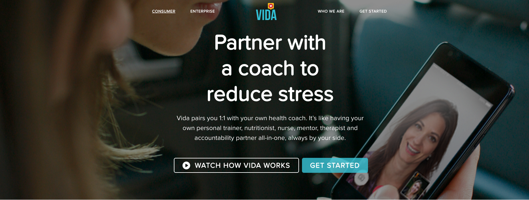
Vida used this on their website to preview visitors on how their application works.

One of the main reasons bounce rates are so high is because visitors are overwhelmed with the amount of information being placed in front of them.
This is why quickly grabbing their attention with a video can be useful. According to TMG Custom Media, 60% of respondents said they would watch videos prior to reading text on the same webpage, and 22% said they generally liked watching videos more than browsing text for examining business information."
With a plethora of text and information on your homepage, you are sure to leave your visitors feeling confused and overwhelmed.
With an introductory video around one to two minutes in length, you can quickly summarize your company, your product, and brief visitors on how it works in an interactive and visually attentive way.
2. Value Proposition
What's the one reason why your ideal prospects need you?
You and everyone in your company should be able to answer that in a matter of seconds by looking at your website. But are you communicating that to your visitors fast enough?
If not, you should be. Visitors are coming to your site because you have the solution to their problem or can fulfill their needs.
Your value proposition is the statement that tells the world what you do and why anyone should care. Don't place it at the bottom of the page; who is going to read it there? Your visitor will most likely leave the page before they even reach it.
In a prominent location, use two to three sentences grab their attention, conveying what you do in as few words as possible. They didn't come to your site to read a Dicken's novel.
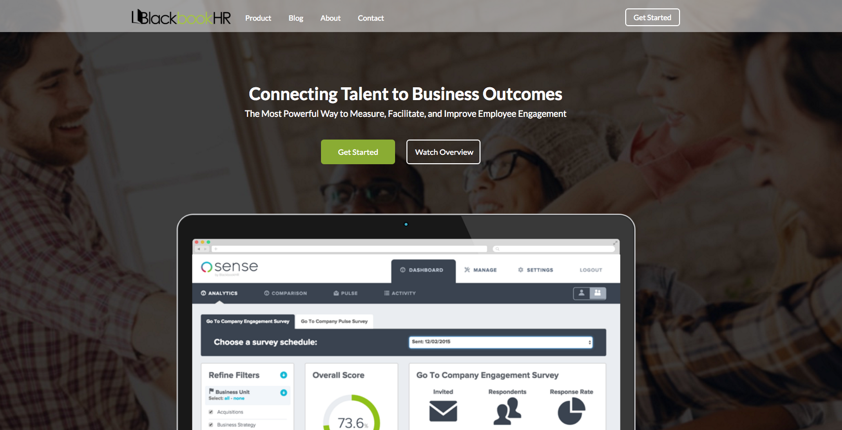
BlackbookHR’s value proposition gives users a large overview as to what their product is meant to accomplish and is also accompanied by an image showing visitors visually what it looks like.

3. Let Them Scroll
As much as I loved them, there are some things from the 90s that shouldn't make a return -- and web design trends are one of them. (Along with scrunchies, wallets with chains and spiky bleach-tipped hair.)
-- But back to your website.
Throw above the fold out the window. Don't constrict your visitors short, overly condensed site pages, because today’s users expect to scroll.
With visual content and user experience becoming both a priority and essential to keeping your visitors on your site, let them do it.
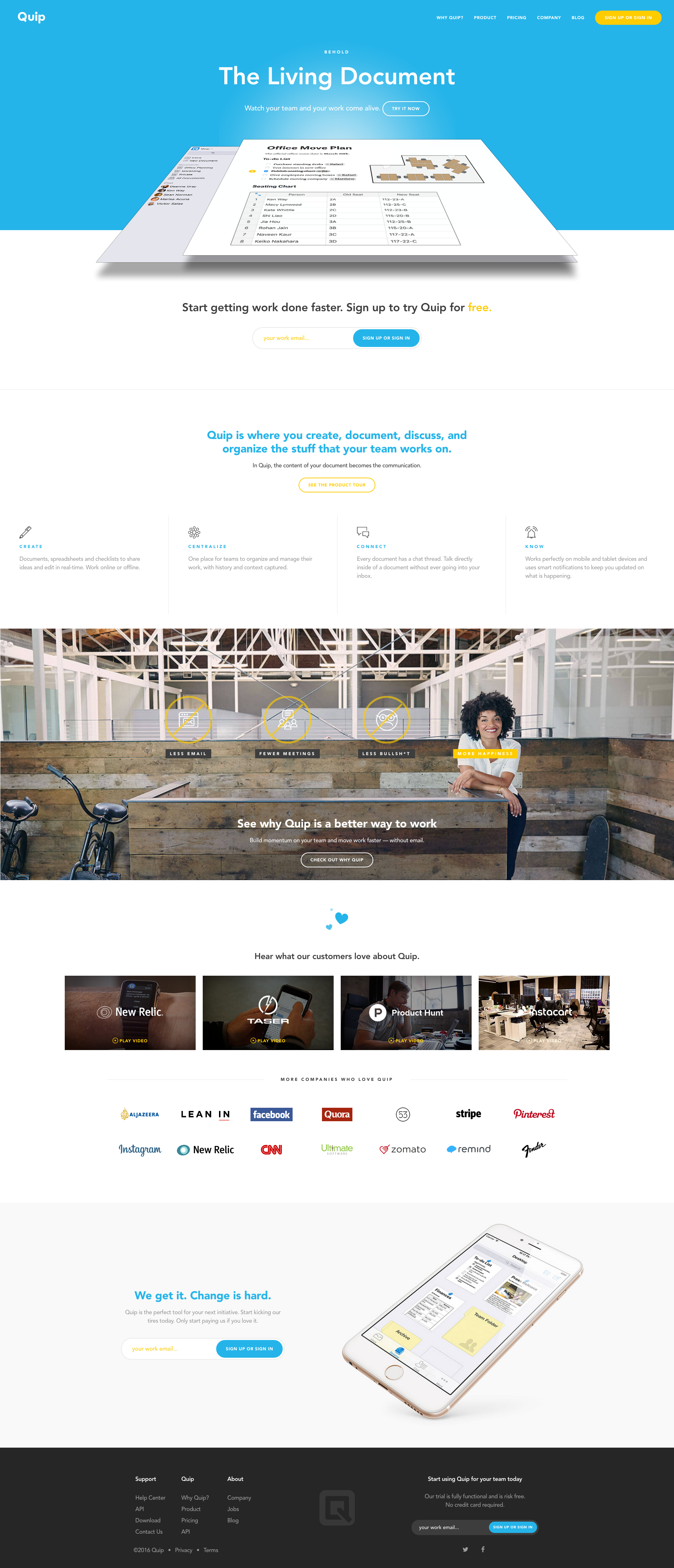
Take this page for example. Quip redesigned their website to look much more lean, using images to help visually stimulate users as they travel down the page.

A longer and more robust page gives you the opportunity to highlight key sections of your website that visitors should look at. Sections could include service areas, testimonials, case studies, an about section, and don't forget an offer.
Give them reasons to explore the rest of your site.
4. Direct their Eyes
Are you providing your visitors with some sort of direction? Do they know what they should do or where they should look?
If not, calls-to-action are great for directing your visitors throughout your website.
The color, size, placement, and imagery can affect the experience of your visitors, so make sure you utilize them in a cohesive manner to highlight the proper visual weight for each section.
And don't be afraid of white space, you’d be surprised at how carried away we can get after we start to throw a few new visual elements onto our website.
Using white space effectively can help properly frame content you want your users to read and help highlight areas you want your users to perform an action on.
Swrve uses orange as an accent color for graphics, but also as its main call-to-action color. This stands out significantly on top of this turquoise background.

Remember, don't just use your company's regular colors. A call-to-action can get lost in the sea of the same color. Use a color others may not have thought of. It will make your call-to-action pop off the page.
5. Develop a Connection and Build Trust
Don't make your site all about you. Your users want to know how your product can help solve their problems, not why you're the most amazing mobile app company to ever exist.
Aside from expressing how your product is the perfect solution to their core issue, you also need to make sure the resource areas of your website are easy to locate.
Allowing your target audience to read your blog articles, download eBooks, and view infographics about the information they would be interested in help build credibility and authority in your brand.
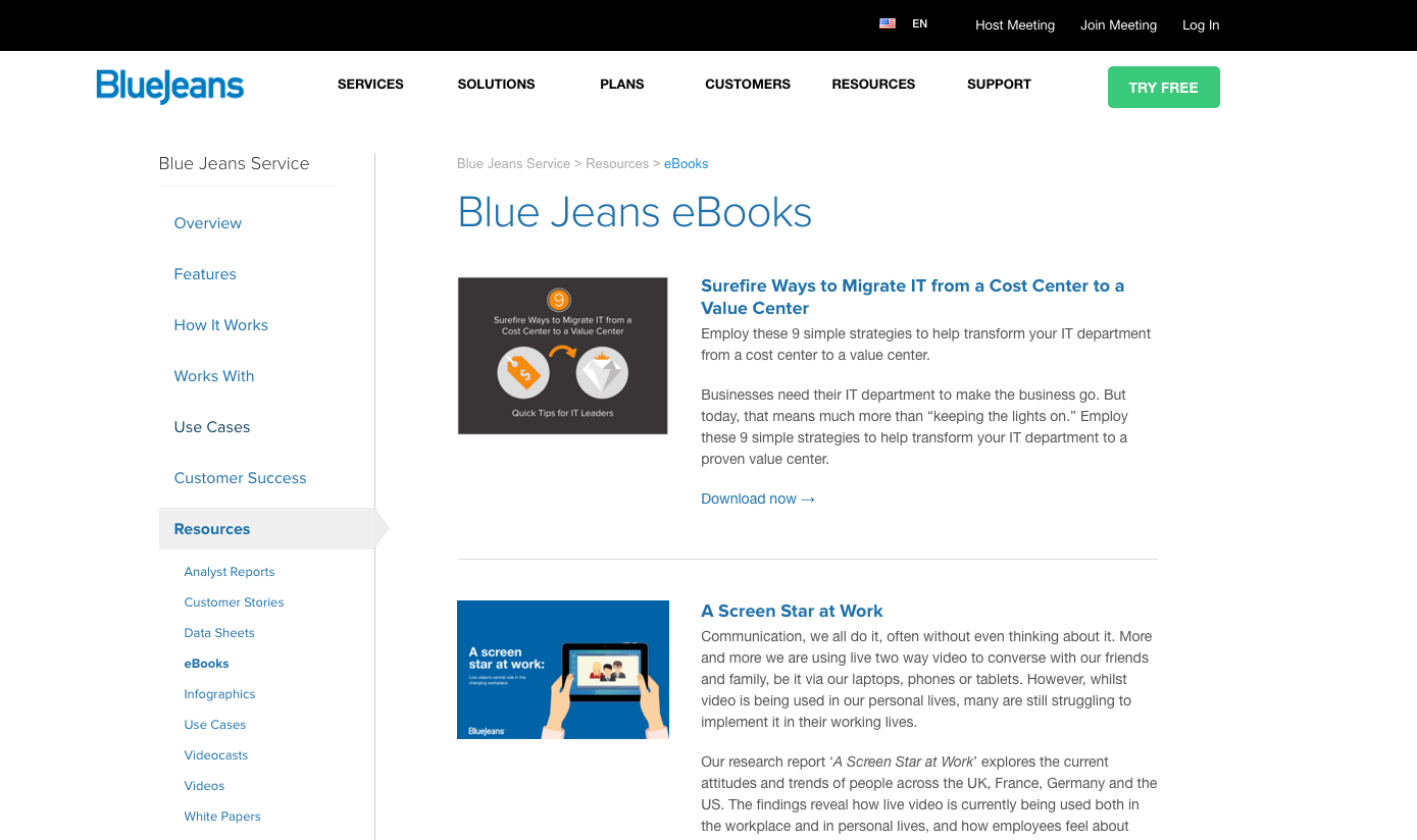
BlueJeans, for example, makes it really easy to find any of their resources by housing them in a sub-navigation to the left side of their resources page.

Having and accessible knowledge base shows you have the capability to provide solutions to your audiences smaller problems, allowing them to build trust in you until they become comfortable converting on your product.
You also need to make sure you make your information accessible through social media channels so people have the ability to follow your brand to keep better track of any new information you release.
Key Takeaways
Users aren’t looking to be bothered with fluffed up content and inconsistent imagery, they want to find out what your company does quickly and easily. If they find your website meets their expectations, they will continue returning to your website to seek further information when they desire it.
It’s these people who will become promoters of your brand, commenters on articles, and possible customers. As long as you manage to create an ideal first impression your target audience is pleased with, you will start to build a successful website, following, and community.
Free: Assessment