Topics:
Lead GenerationSubscribe now and get the latest podcast releases delivered straight to your inbox.
Conversion rate optimization (CRO) is one of the defining tactics that separates the modern digital mastermind from marketers and advertisers of the past.
In fact, CRO is what allows us to improve our marketing efforts exponentially quicker than marketers with traditional advertising methods ever could.
With traditional advertising (what we usually refer to as outbound marketing), you would usually run a campaign for an extended period of time and then wait for it to end before seeing the results.
Once the campaign ended, you would review the performance (typically just an estimate of its reach) and take a guess at what changes to make, if any, to improve the next campaign.
Thanks to CRO, you can stop just guessing.
Before we get deeper into this, let’s start with the basics.
Make sure to bookmark this page and use the links below to jump around as you continue to explore conversion rate optimzation.
Table of Contents
-
Chapter 1: What is Conversion Rate Optimization?
-
Chapter 2: Conversion Rate Optimization 101
-
Chapter 3: The Conversion Rate Optimization Process
-
Chapter 4: Website Conversion Rate Optimization Checklist
-
Chapter 5: Conversion Rate Optimization in HubSpot
-
Chapter 6: Conversion Rate Optimization Using Hotjar
-
Chapter 7: The Top 50 Conversion Rate Optimization Tools
-
Chapter 8: 12 Amazing Conversion Rate Optimization Case Studies
-
Chapter 9: 30 Conversion Rate Optimization Experts Worth Following on Twitter
Chapter 1: What is Conversion Rate Optimization?
Simply put, a conversion is when a prospect takes a desired action on your website.
This could be by signing up to your newsletter, requesting a free demo, or purchasing a product, among other things, but in most cases, the two most inbound marketers focus on are email subscriptions and purchases.
A conversion rate is the percentage of people who convert on a specific offer or piece of content. For example, if 100 people visit your landing page and 13 of them opt-in through the form, you have a conversion rate of 13%.
The ability to measure conversion rates in real-time is one of the most powerful features of inbound marketing because it allows you to accurately measure ROI and compare performance between different initiatives.
What is Conversion Rate Optimization (CRO)?
The purpose of CRO is to increase your conversion rates by measuring the performance of an ad, landing page, etc., experimenting with new adjustments to improve the conversion rate, and comparing the results.
The process is repeated over and over until you reach your target conversion rate or you finally hit a point of diminishing returns.
Here are a few qualities that define CRO:
- The goal is maximizing the value of the traffic you already have
- Success is measured by your specific objectives and target KPIs
- The approach is structured and data-driven, informed by analytics and user feedback
The key defining characteristic is that CRO is data-driven – that’s what makes it so powerful.
You’re dealing with cold, hard facts, not opinions, and you get a truly accurate measurement of ROI. Decisions are much easier to make when they’re driven by analytical data.
The Role of A/B Testing
Conversion rate optimization is most often executed through A/B testing (sometimes referred to as split testing), where you run two different versions of an ad, landing page, or other content against each other in real-time to see which performs better.
For example, let’s say you have a landing page where prospects can opt-in to receive a free eBook and you want to test a different headline.
To do this you would use A/B testing software to display the original version (A) to half of the visitors and an alternate landing page with the new headline (B) to the other half.
By tracking the performance of each, you see which elicits better results from your audience, allowing you to confidently discard the weaker headline.
From there, you can repeat the process with a new headline or you could test a different element on the landing page.
As you can imagine, this process gives you a lot of elements to test and improv. The biggest companies are running multiple A/B test campaigns non-stop, always trying to squeeze every bit of value out of their traffic.
This is why I mentioned early on that marketers today can get better results much quicker than marketers could in the past -- CRO and testing gives them all the data they need to take action without hesitation.
What Conversion Rate Optimization (CRO) is Not
CRO is not driven by guesses, hunches, “gut feelings” or even trends. It’s about real-world testing and refining.
That doesn’t, however, mean you can’t test a new headline if you have a hunch that it will be better. It just means you shouldn’t blindly use that headline based on your hunch without measuring its performance. Fair enough, right?
CRO also doesn’t care about your opinion, the highest-paid person’s opinion (HPPO), or the opinion of any board of directors. It only cares about data and results.
That being said --- adopting CRO is the easiest way to eliminate conflict caused by differences in opinion.
Conversion rate optimization is not the same as search engine optimization (SEO) either. The goal of SEO is to bring more organic web traffic to your website from search engines, while the goal of CRO is to get the most value from the traffic you already have.
The two play well together, but they are completely different strategies.
Lastly, and this is important, CRO is not about simply increasing conversion rates for the sake of a vanity metric.
The purpose of optimizing conversion rates is to make your marketing more efficient and effective. Increasing leads doesn’t add any value if they aren’t qualified leads and becoming customers.
In most cases, increasing conversion rates on the right actions will increase sales, but not always. There’s no need to overthink this, but you just don’t want to get caught up in focusing 100% on the conversion rate without keeping the big picture in mind.
Back to table of contents
Chapter 2: Conversion Rate Optimization 101
Conversion rate optimization (CRO) is one of the most powerful weapons in the Inbound Marketer’s arsenal. In fact, if you look closely at most of the high-profile growth hacking case studies, you’ll find that CRO is often the fundamental strategy.
CRO helps you maximize the value of the traffic you’re already getting by improving how efficiently you convert that traffic into leads and customers. It works for businesses of all sizes and requires very little ongoing time or cost.
So… what’s the catch?
There’s no catch, but, there is a small learning curve. For example, before you can dive into the world of CRO, you’ll need to be familiar with some key terms.
The Metrics and Terms You Need to Know
You know a conversion is when a website visitor performs the action you want (i.e. opting-in on a landing page, purchasing product, etc.) and your conversion rate is the percentage of users that convert out of the total traffic sent to that page.
Now, let’s look at a few other metrics that are relevant to CRO:
Bounce Rate
Whenever someone visits a page on your website and immediately clicks “back” to leave, that’s known as a bounce. Your Bounce Rate is the percentage of visitors who click away within a couple of seconds of landing on that particular page.
This is an important metric because a high Bounce Rate indicates people aren’t seeing what they’re looking for and you need to make some adjustments. Learn how here.
Exit Rate
Your Exit Rate is similar to the Bounce Rate, except it measures the percentage of people who leave your website entirely from a specific page.
An interested user will tend to jump around different pages on your website until they find what they’re looking for or they find a reason to leave. A page with a high exit rate indicates that something about that page is sending people away from your website.
Average Time on Site
Engagement is important to monitor and the Average Time on Site is a metric that indicates how long, on average, people are exploring your website.
Generally speaking, the higher your Average Time on Site is, the more engaging your content is.
Average Page Views
Average Page Views is another metric that measures engagement by indicating how many pages, on average, a user visits before they leave your website.
In general, Average Page Views indicates one of two things:
- The user is engaged and wants to see more and more of your content
- The user is engaged, but can’t quite find what they’re looking for
Usually a high Average Page Views is good, unless it correlates with low conversions. Seeing this could indicate that people aren’t being directed on a clear path towards conversion.
There are many other metrics to consider aside from those listed above, but for now, these are all you need to worry about.
Now, let’s briefly discuss the key terms and concepts used in CRO.
Call-to-Action (CTA)
A Call-to-Action is exactly what it sounds like – a statement telling the user what action to perform. A conversion in this context is the result of a user performing the action following the CTA.
Examples of CTAs include a “Download” button on a demo page, “Buy Now” on a product page, or any other button or link that directs the user to perform a specific action.
Need help boosting conversions on your CTAs? We’ll dive deeper into this here, but you can also learn more in this free guide.
Conversion Funnel
A Conversion Funnel is a path you create to guide web visitors towards a conversion.
For example, if a visitor lands on your homepage and clicks through a CTA to your product description page, then clicks a CTA to visit the pricing page where they add your product to their cart and are directed to the checkout page.
Most websites will have multiple Conversion Funnels, with several paths leading towards the same offer, as well as paths leading to others such as a newsletter opt-in or purchase.
A/B Testing
Also referred to as Split Testing, A/B Testing is when you test two versions of a page element against each other to see which performs better.
For example, if you wanted to test a headline on a landing page, you would send half of your traffic to the original page (A) and the other half of your traffic to an alternate page with the new headline (B) and compare the results. After finding a winner, you could then run another test with your new headline as the default and an alternate headline as the competitor.
A/B Testing is commonly used to improve headlines, page structure, button colors, CTA copy, and virtually anything else. Softwares like HubSpot and Optimizely can help you perform this.
Multivariate Testing (MVT)
MVT is an advanced version of A/B Testing where you test multiple variations of different page elements at once. You can test multiple elements and multiple combinations of various elements to identify the ideal combination of the ideal variations.
The Conversion Rate Optimization Process
The CRO process is fairly simple, but it requires you to do some heavy research upfront. From there, the ongoing process is a repetition of testing, reviewing, and refining.
- The Planning Stage – You’ll follow a six-step data gathering process to collect all of the insights and analytics you’ll need to conduct valuable CRO experiments. This stage is the most time-consuming, but it’s also the most crucial for getting results. Fortunately, once you’ve finished the initial planning, the rest of the process gets much easier. After you’ve gathered your data, you’ll decide what hypothesis you want to test and set objectives.
- The Testing Stage – This is where the fun begins. You’ll create your experiments based on what you want to test and ensure that they are applicable to your brand. Then, using A/B testing software, you’ll implement your tests. With the right tools, this part of the process is super easy.
- The Review Stage – Once your experiment is complete, you’ll need to review the results and decide what to do next based on whether your experiment was successful or not.
We go into greater detail about the CRO process in Chapter 4.
Conversion Rate Optimization in HubSpot
In addition to all of the other Inbound Marketing functions you can perform with HubSpot, there are also several ways to use their software for CRO.
HubSpot, our software of choice, has built-in A/B testing that allows you to quickly build and test a wide selection of variables on your landing pages and monitor the results in real-time. You can also run A/B tests in your emails and CTAs improve conversions.
One of the more unique CRO features provided by HubSpot is their Content Optimization System, which you might know as “Smart Content.”
This feature allows you to create different versions of your web pages that include personalized content, such as addressing the user by their name in a headline or showing them a different offering based on the industry they work in.
Back to table of contents
Chapter 3: The Conversion Rate Optimization Process
In theory, the Conversion Rate Optimization (CRO) process is simple, but it requires planning and the results don’t come overnight.
The biggest challenge is figuring out what to change and having the persistence to stick with it until you've reached a conversion rate that you're happy with.
Although we’re dealing with concrete data, data is always open to interpretation and that’s why you need to have a solid plan going in.
Without wasting any time, let’s jump right in.
The Planning Stage
This first stage in the CRO process is the most important and time-consuming stage. However, by frontloading the work here, you will make the rest of the process much easier and more effective.
It all begins with:
Data Gathering
Deciding what to test is the hardest part of CRO when you don’t have the appropriate data at your disposal.
Sure, you can just decide to test a headline here or a CTA button there, but you’re barely scratching the surface of what CRO can do by limiting yourself to those two tests or simply guessing.
We need deep insights and valuable analytical data to conduct informed experiments.
ConversionXL has arguably the best data gathering process around called ResearchXL. It is broken down into 6 steps.
Step 1: Heuristic Analysis
The goal here is to conduct an “experience-based assessment where the outcome is not guaranteed to be optimal, but might be good enough.”
Perform this task by assessing each page for the following criteria:
- Relevancy – Do the content and design meet user expectations, and if not, what can be improved?
- Clarity – Are your offer and other messages as clear as they can be? How could you make them more clear?
- Value – Are you effectively explaining your value proposition? Does your value proposition appeal to users?
- Friction – What content or page elements make a user hesitant or uncertain about converting? Can you improve trust, credibility, and authority?
- Distraction – Is there a natural flow of direction from headline to CTA? Are there areas where content is cluttered or visual elements distract the eye?
Step 2: Technical Analysis
There are often many small technical glitches killing conversions that you’re unaware of. These are usually easy to fix, so you want to catch them early through testing.
Cross-Browser and Cross-Device Testing, for example, allows you to view your conversions by browser and by device to look for any obvious outliers in performance.
To view your website from multiple browsers, you can use a tool such as CrossBrowserTesting of BrowserStack.
Slow loading times are also terrible for conversion, so you should consider running a speed test. Use Google’s PageSpeed Insights to see how your website is performing.
Step 3: Web Analytics Analysis
Comb through Google Analytics or your HubSpot analytics to see how people are interacting with the page. The following are insightful analytics to monitor:
- Bounce Rate
- Exit Rate
- Average Time on Site
- Average Page Views
Step 4: Mouse Tracking Analysis
Technology makes our job as a marketer so much easier. You can use software to generate heat maps (click maps) to show you exactly where users are moving their mouse on the page and where they’re scrolling to see which page elements get the most attention.
A powerful tool that we recommend is Hotjar, which shows you mouse activity, allows you to watch videos of actual user sessions, and provides more powerful insights for your marketing endeavors. Besides Hotjar, here are a few other popular choices:
Step 5: Qualitative Surveys
Customer surveys provide insights that you can’t get anywhere else and they’re very useful for CRO. For on-site surveys, you should check out Hotjar and Qualaroo, but, you can also send surveys to customers through your email list using SurveyMonkey or Google Forms.
Step 6: User Testing
In this step you want to sit down with an actual user and assign them a task, such as researching a product or opting-in to download an eBook on your site.
Observe them as they navigate through your website and take note of their feedback. You especially want to pay attention to which pages they click-through and what captures their attention. You can perform this kind of test on your own or services like UserTesting can help as well.
Deciding What to Test
Once you have all the data you could possibly need, you can start outlining the experiments you want/need to run. You should have identified several high-priority areas that need improvement in your data discovery and ask yourself:
- What am I testing? (Headline, CTA, page layout, colors, etc.)
- Who am I testing? (Organic traffic, leads, customers, etc.)
- Where am I testing? (The specific page)
Now you just need to create a hypothesis and outline an objective for each test and you’re ready to move on.
The Experiment Stage
So, this is where the fun really starts with your A/B tests.
Outline Your Test Elements
Depending on how technical the page elements are that you’re going to test, you may need to create a wireframe. Otherwise, this won’t take too long with the right software.
As you create your test layout, consider the following:
- Are the changes you’re testing specific to your hypothesis and objective?
- Will the changes remain consistent with your brand and overall marketing message?
When the answer to both questions is “yes” you’re ready to implement your test.
Implement Your Test
You can create A/B tests quickly within HubSpot, but If you’re not a HubSpot customer, or you want something a little more advanced, you should consider Optimizely or Visual Website Optimizer.
Running an A/B test without one of these software can be very technical and time-consuming. Considering the immense value of CRO, I recommend using A/B testing software to run your experiments. It will make your life much easier.
The Review Stage
Here it’s time to see if your experiment worked or not, and how well.
Did your conversion rates go up? If so, you can start sending 100% of the traffic to the winning version of that page to see if any noticeable changes occur.
Once you feel confident in your results, you can begin another experiment to try to improve conversion rates even more or you can start testing a new element.
If you tested something such as the color of a CTA button, you can roll out the changes site-wide or opt to test every page individually.
If your conversion rates didn’t change or decreased from your hypothesis, don’t feel discouraged. Not every test is going to be a winner. In fact, many of them won’t.
Simply go back to your data and apply your new information to formulate a better hypothesis.
So, Remember...
The point of CRO is to implement small changes over and over to create big results with time.
Most of the big brands are running endless CRO tests 24/7 because this is an ongoing process. Once you find your winning formulas, you’ll build strong momentum and start seeing rapid improvements!
Back to table of contents
Chapter 4: Website Conversion Rate Optimization Checklist
Getting Started
Remember, CRO is data-driven so these initial steps are crucial for getting the best results from your A/B tests. If you need more detail on each step, review The Conversion Rate Optimization Process here.
Gather Data
Following the ResearchXL model for data gathering, perform the following analysis for each page you want to improve conversions on.
- Heuristic analysis – Review the page for any obvious errors in relevancy, clarity, value, friction, and distraction.
- Technical analysis – Look for technical glitches by running cross-browser and cross-device tests, as well as speed tests.
- Web analytics analysis – Review your analytics and look for pages with high bounce rates and exit rates to identify holes in your conversion funnel.
- Mouse-tracking analysis – Use mouse-tracking software to see which areas on the page get the most attention and which areas are being ignored.
- Qualitative testing – Send email surveys or run on-site surveys to get feedback from users.
- User testing – Assign a user a specific task and watch them in-person to see how they interact with your website and get real-time feedback.
Collect all of this information into a master document that you can refer to, and update, as you implement CRO tests.
Review Key Metrics
Make note of the following metrics as they are often key performance indicators (KPIs) for CRO:
- Visits
- Page views
- Average time on site
- Average page views
- Bounce rate
- Exit rate
- Total conversions
- Conversion rate
- Revenue
These are the metrics that are most likely to be affected by your A/B tests. If a test doesn’t impact conversion rates very much, you can refer back to these metrics to see if the test had any impact at all.
Decide What to Test (Form a Hypothesis)
You should always be testing and refining your website. It’s never-ending because online user behavior is always evolving and your website will always need to keep up.
For each test you will form a hypothesis:
If I change X, I estimate I will get Y result.
As mentioned earlier, to ensure you have a clear understanding of the A/B test you are about to run, ask yourself the following:
- What am I testing? (Headline, CTA, page layout, colors, etc.)
- Who am I testing? (Organic traffic, leads, customers, etc.)
- Where am I testing? (The specific page)
There are virtually unlimited options for things to test, but here are some of the most prominent to start with:
Copy
Test headlines, subject lines, and titles. Try different variations using intriguing adjectives, specificity, urgency, numbers, and making a bold statement.
Recommended resources:
- 5 Irresistible Headline Writing Strategies to Live and Breathe By
- 5 Characteristics Of High Converting Headlines
Test short-form vs long-form copy.
The general rule of thumb is the more complicated and/or expensive the offer is, the longer the copy needs to be, however, each situation is unique and that’s why we do CRO.
Recommended resource:
Test features versus benefits.
Our first instinct when describing a product or offer is to list the features.
This makes sense logically but it’s not very persuasive and isn’t the best for improving conversion rates. Instead, test various benefits that you can extract from those features.
This article can help show you how:
Design
How your page looks is just as important for conversion rates as what your page says. Some design elements you should tweak and A/B test include:
- Colors and contrast
- Layout
- Directional cues
- Type of images
- Images instead of text
- Whitespace
- Font type and font size
These resources can help you go about this:
- How Do Color & Design Actually Affect Inbound Conversion Rates?
- 5 Design Principles To Instantly Boost The Conversion Rate Of Your Website
- How We Removed Our Blog Sidebar and Increased Conversion Rates
Elements of Trust
People are more likely to buy (or opt-in) from those they trust. Poor conversion rates are often attributed to your page not feeling trustworthy. So, consider testing the effects of things like:
- Text testimonials
- Video testimonials
- “As featured in” logos (News, industry blogs, etc.)
- Security logos (SSL, BBB, etc.)
- Guarantees and warranty information
- Data and statistics to back claims
Recommended resources:
- 5 Can’t-Miss Ways to Boost Trust (& Conversions) On Your Pricing Page
- Your Ecommerce Site Will Die Without These 3 Trust Signals
Call to Action (CTA)
You CTA is critical to conversions because it asks the user to take the final step. The last thing you want is for a prospect to venture through your conversion funnel and walk away because of a weak CTA.
Here are some ways to tweak your CTA for better conversions:
- CTA location (above/below the fold, center vs right, etc.)
- CTA button color, shape, and size
- CTA copy (don’t say “click here”)
- Multiple CTAs throughout the page
Recommended resources:
- 6 CTA Best Practices to Push All the Right Buttons for Your Audience
- 17 Best Practices for Crazy-Effective Call-To-Action Buttons
Test Your Hypothesis
Once you’ve formed your hypothesis, it’s time to put it to the test. Before doing so, create a wireframe or outline to make sure your test is viable.
Create a Wireframe or Outline
You don’t have to create a wireframe if you’re only making a small tweak, such as a headline variation, but, any alterations that affect the layout of the page should be visually outlined before you implement so you can do a final evaluation.
Before implementing a test, answer the following questions:
- Where are visitors coming from?
- Is there a clear path to conversion?
- Is the CTA easy to find and attention-grabbing?
- Does the design match the message of the content?
- How does the new element look on the mobile layout of the page?
Once you’re confident that the new change will improve the page, proceed to implement your test.
Implement Your Test
Run your A/B test using CRO software or the A/B testing feature in HubSpot. Don’t stop your A/B test until you’ve reached statistical significance and met the required sample size.
Popular CRO tools include Optimizely, Visual Website Optimizer, and Unbounce, while this A/B Test Sample Size Calculator can help you choose the right audience size.
Review Your Results
After you’ve completed your A/B test, review the results and apply the winning version of your test to your website as the new default version.
When reviewing the results, answer the following:
- What was the change in conversion rate?
- How was revenue affected?
- Did any other KPIs noticeably change?
From there, you can either repeat the same test with a new alternate version or you can move on to different tests.
Repeat this entire process over and over until your website can’t possibly get any better. (Hint – it can always get better!)
Back to table of contents
Chapter 5: Conversion Rate Optimization in HubSpot
HubSpot is the only true all-in-one Inbound Marketing platform on the market.
Since its inception, the company has constantly expanded its collection of features and tools to keep up with marketing best practices.
Even as the demand for conversion rate optimization (CRO) tools has increased in the last several years, for example. HubSpot has faithfully accommodated us with powerful and seamless tools to improve conversions.
In usual HubSpot fashion, it allows you to focus on strategy over technicality by performing various CRO tasks without having to enter a line of code.
In this chapter, we’re going to show you the two biggest CRO tools in HubSpot and discuss how you can get the most value from them.
A/B Testing
One of the best features of HubSpot is that is has A/B testing built into the Enterprise package, allowing you to easily test a variety of elements on your landing pages using these simple steps:
Step 1
Create a landing page if you don’t already have one in mind that you’d like to optimize conversions on.
Step 2
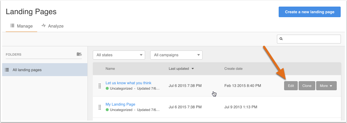
Click Edit to open the landing page for editing.
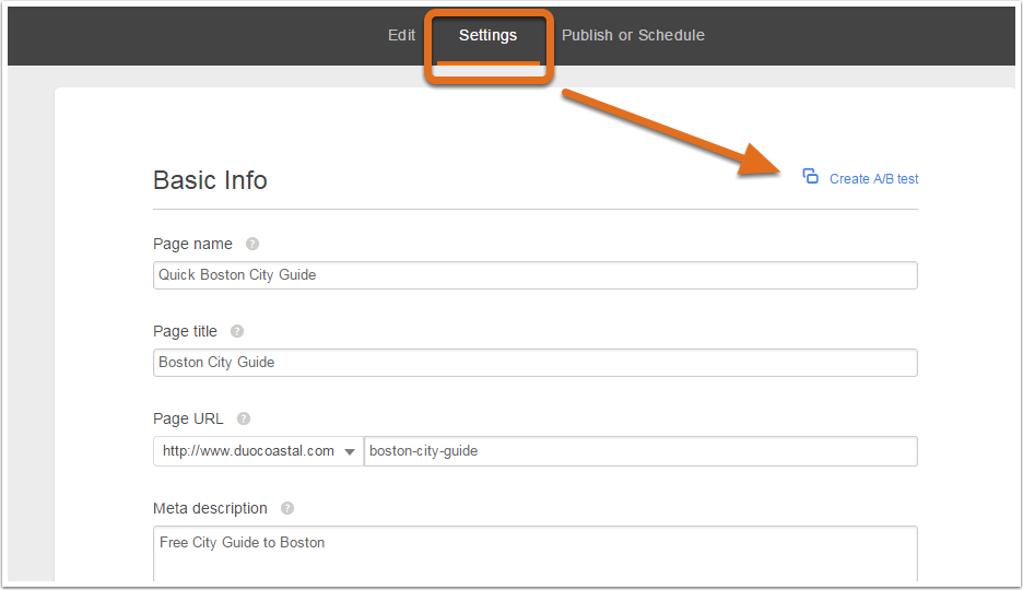
Then navigate to Settings and click the Create A/B Test link.
Step 3
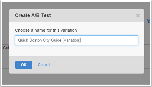
Give your new variation (the element you’re testing) a name.
Step 4
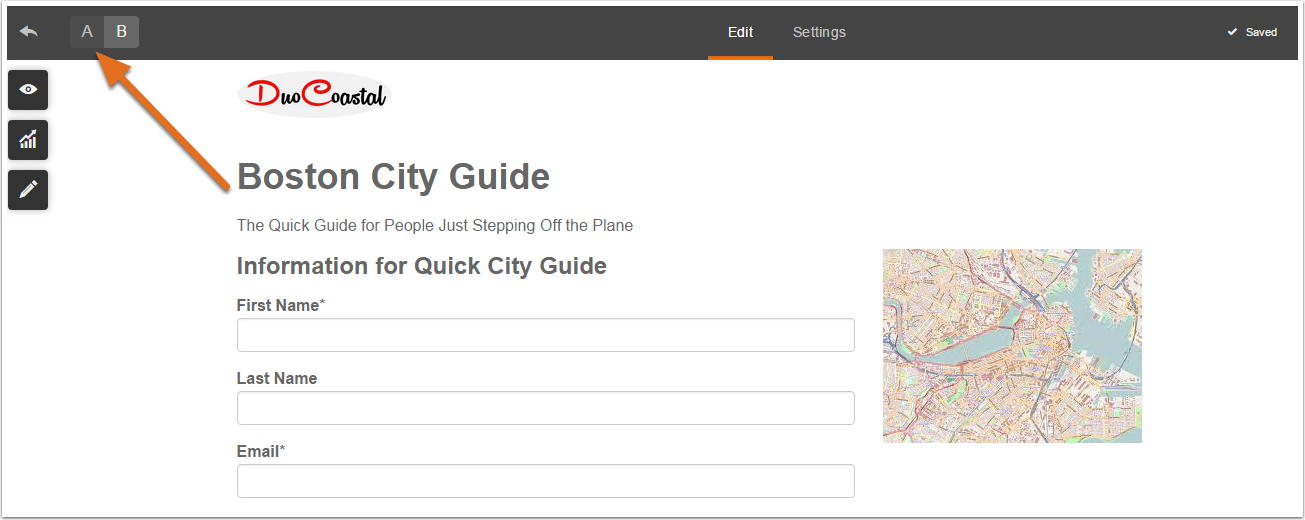
Edit the element you are testing on the B version of your landing page.
These are the variables you should consider testing:
- Offers – Test out different types of Offers, such as eBooks and whitepapers.
- Copy – Try different headline variations, paragraph formatting, benefit descriptions, etc.
- Image – Test different images, such as images with/without people, your product in the wild, screenshots, etc.
- Form Fields – In general, more form fields equals less conversions. However, you need to collect enough information to qualify leads. Keep testing until you find the right balance.
Step 5
To view the results of your A/B test(s), click on the Variations tab from the landing page details. From there you can filter by Submissions, New Contacts, and Customers.
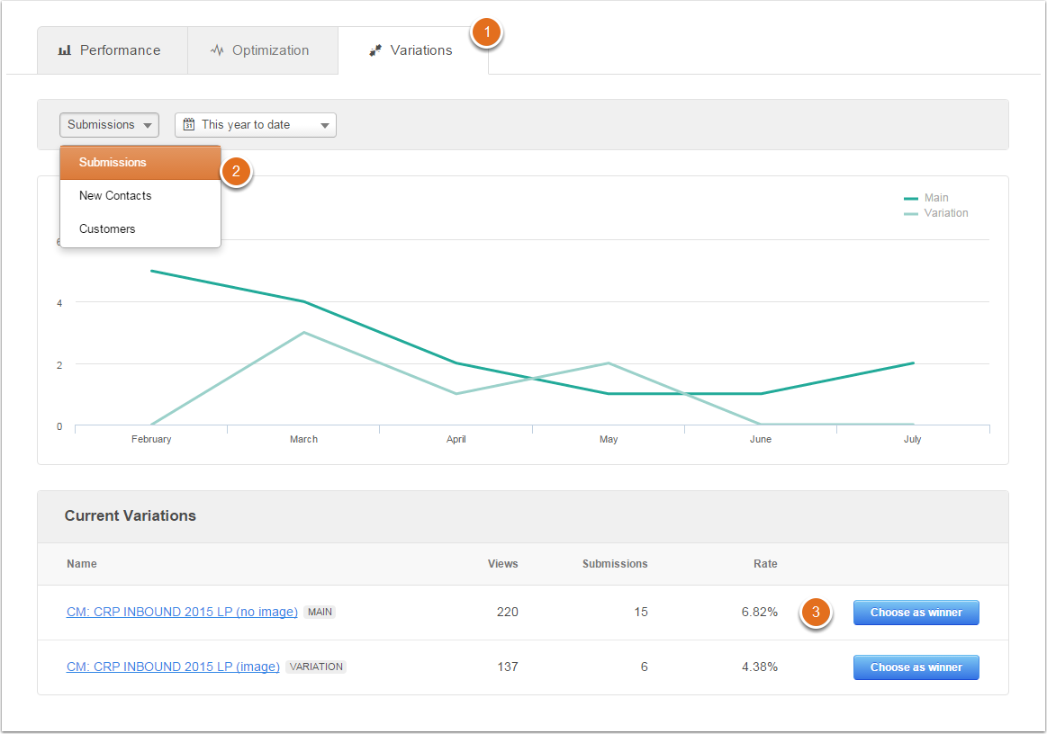
Once you are satisfied with your results, you can click Choose a winner by the winning variation, which will instruct HubSpot to stop showing other variations to website visitors.
How to Get the Most From A/B Tests in HubSpot
HubSpot provides several guidelines for effective A/B testing, whether its with or without their software.
- Run one test per page at a time to ensure you are clearly tracking the results of each test. If you run multiple tests on one page simultaneously it will be difficult to figure out which test is directly contributing to the change in conversion rates.
- For the same reasons as above, only test one variable at a time on a landing page.
- Once you’ve singled out several variables, you can A/B test an entire page. For example, instead of testing button color or background color, you can change everything and test this completely new page against the original. If the new variation wins, start singling out specific variables again to refine those results.
- Don’t focus exclusively on conversion rates. Also monitor how your A/B tests affect click-through rates, leads, traffic-to-lead conversion rates, and demo requests.
- Always include a “control” in your A/B tests – the version you are testing a new variable against. Otherwise, you won’t be able to accurately measure results and progressively improve conversions.
Please note, you can also run A/B tests on CTAs and emails through HubSpot using a similar process. Learn more here.
Smart Content
Personalization is the future of marketing and advertising.
It’s also the natural next step for improving Inbound Marketing – which has always aimed to deliver a more personalized marketing experience. Fortunately, HubSpot allows you to implement smart content through their Content Optimization System.
According to HubSpot, personalized content dramatically improves a website’s lead generating performance and engagement with users. After examining over 93,000 calls-to-action created by the company over a 12 month period, HubSpot found that personalized calls-to-action performed 42% better than generic calls-to-action.
HubSpot’s Content Optimization System
When a new user visits your website, they view the “default” content that’s created for anyone that visits your website. Take a look at the images below to see this in action.
Here is an example of default content served to first-time visitors.
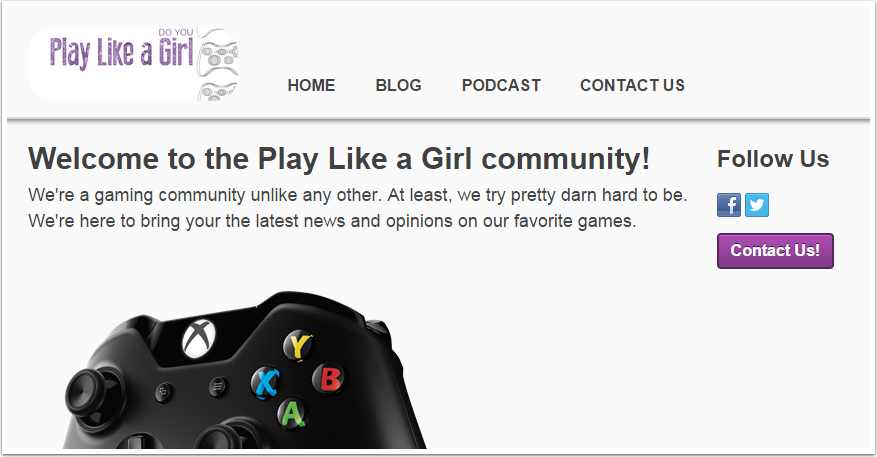
Once someone becomes a Contact in HubSpot by filling out a form or becoming a customer, you will be able to serve them personalized content based on their information.
You can see the difference illustrated in the image below.
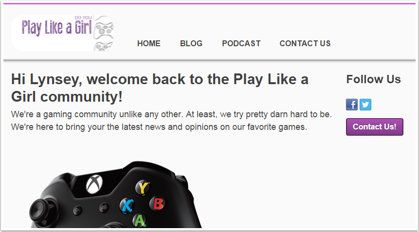
The smart content knows the name of your visitor and addresses them personally, making the experience more friendly and engaging.
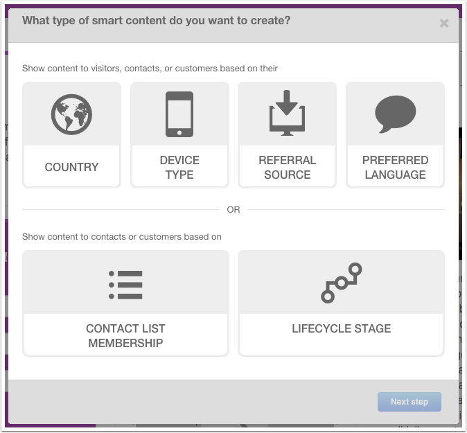
There are five different segments you can use to target visitors with Smart Content:
- Country (only available on website/landing pages) – Determined by the IP address of the visitor.
- Device Type (only available on website/landing pages) – If your page has a lot of copy, you should consider creating a condensed version for mobile visitors to create a better user experience.
- Referral Source (only available on website/landing pages) – Show smart content based on the visitor’s traffic source, which is especially useful for advertising campaigns.
- Preferred Language (only available on website/landing pages) – Content is personalized based on the language set in the user's web browser.
- Contact List Membership – Show smart content based on whether or not the user is on one of your lists or based on which list they’re subscribed to. This is a great way to follow-up after a visitor downloaded an offer, attended an event, or anything else related to that particular list.
- Lifecycle Stage – Customize content based on which lifecycle stage a Contact is in. This feature is very powerful for lead nurturing and moving leads down the funnel towards converting to a customer.
For Personalization, you can choose between four different categories:
- Contact – Includes First name, Last name, and Email Address.
- Company – Includes Total Revenue, Industry, and Company Name.
- Office Location – Includes City, State, and Zip Code.
- HubSpot Owner – Includes First Name, Last Name, and Signature (all of which belong to the HubSpot user).
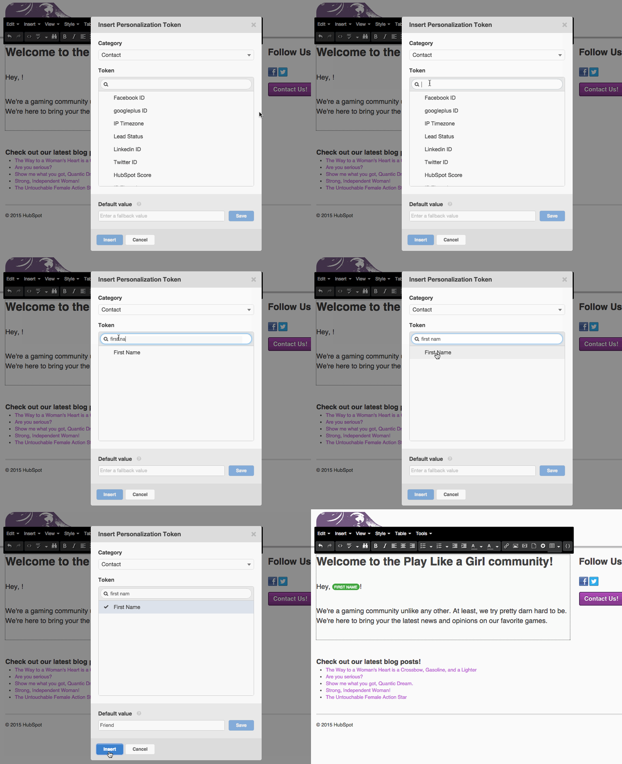
It’s a good idea to keep your personalization limited to scenarios where it makes sense or sounds natural, and even if it does, you’ll want to create a “default value” just in case this field is not available for a contact.
Recommended resources:
- How to create smart text
- How to create a smart form
- How to create a smart Call-to-Action (CTA)
- How to create smart content in a HubSpot email
Back to table of contents
Chapter 6: Conversion Rate Optimization using Hotjar
Hotjar is one of the newest, and most powerful, conversion rate optimization (CRO) tools available to marketers right now.
It combines features such as A/B testing, multivariate testing, heat mapping, scroll mapping, web analytics, funnel analysis, mobile analytics, user testing, expert feedback, and concept testing all into one easy-to-use and affordable software.
After a successful launch in 2015, Hotjar has quickly become a favorite CRO tool for marketers and there really isn’t another platform with this level of functionality at the same price point.
If you’re looking to focus heavily on CRO for your business, Hotjar is the perfect solution.
The Key Concepts of CRO With Hotjar
Before optimizing conversions using Hotjar, you’ll want to familiarize yourself with the following terms:
- Drivers – The things that attract visitors to your website. Drivers are problems people want to solve, goals they want to accomplish, products they want to purchase, a recommendation, or anything else that drives people to search for answers online.
- Barriers – The things that prevent conversions or cause people to leave your website. Barriers could be slow loading time, poor copy, pricing that exceeds perceived value, or anything else that gets in the way of a prospect converting.
- Hooks – The things that persuade prospects to convert. Hooks can be a specific benefit or feature, perceived status, social proof, or anything else that hooked a prospect to make the final decision to convert.
CRO is highly strategic and understanding these three concepts is vital to your success. All of the tools within Hotjar exist to help you define them on your website.
By understanding what drives people to your website, you can double-down on those factors to further convince prospects that they are in the right place, while identifying barriers allows you to correct and eliminate them, making it as easy as possible for a prospect to convert.
Finally, identifying the hooks helps you figure out why people are really buying your product or service, which is the most valuable marketing information you can have.
5 Ways to Optimize Conversion Rates With Hotjar
There are MANY ways to use Hotjar for CRO, but these are the five action steps recommended by Hotjar based on the results achieved on thousands of websites across a wide variety of industries.
1. Set Up a Heat Map on Pages with High Traffic and Bounce Rates
A page that has high traffic shows that you have key drivers sending people to your website and those high traffic pages often have the biggest revenue-earning potential. High bounce rates on these pages, however, indicate significant barriers and/or a lack of strong hooks.
Setting up a Heat map allows you to see which elements on your page get the most engagement from users, where people are clicking, how far they are scrolling, and other information that helps you pinpoint the causes of your bounce rates.

Recommended resource:
2. Use Feedback Polls to Identify Drivers on Landing Pages with High Traffic
The easiest way to deliver value and create compelling hooks is to identify the drivers that bring traffic to your website in the first place.
With Hotjar, you can create a Feedback Poll that pops up after five seconds and asks an open-ended question.
Then you can have Hotjar create a wordmap to help you visualize those answers, in addition to going through and reading the answers, as well.

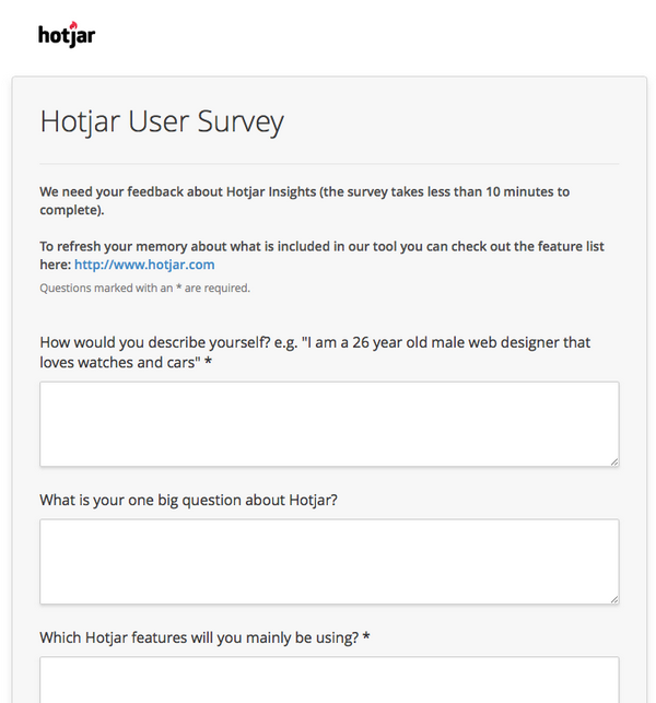
3. Send a Hotjar User Survey via Email
Your existing customers are your best resource for CRO because your business exists to serve paying customers, not just website visitors.
Unlike prospects and leads, your customers have the best, most accurate insight into your company’s drivers, barriers, and hooks.
Hotjar suggests creating a survey with open-ended questions, such as the following:
- "What led you to look for [service / product type]? Explain in as much detail as possible how it will make your life easier / better.”
- "What nearly stopped you from using us? List as many items as you can think of"
- "What persuaded you to [action e.g. buy / signup]. List as many items you can think of."
- "What could we have done to make your decision easier?"
You don’t want to ask too many questions or people will be less likely to complete the survey.
A couple of easy tricks to increase the response rate is to add an incentive, such as providing a free gift for a random participant, as well as setting a short deadline for the survey to be completed to be eligible for the prize.
4. Identify the Barriers in Your Funnel
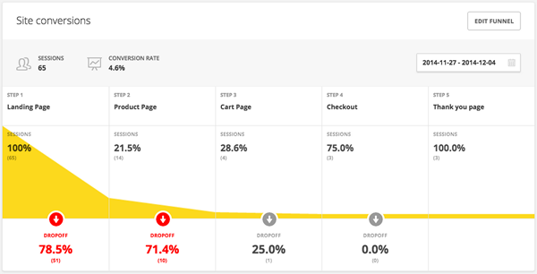
Funnels are pathways on your website that lead prospects towards conversion, whether that be converting to a lead or converting to a customer.
A funnel might look like:
- Homepage > Product Page > Checkout Page > Thank You Page
- Blog Post > Offer Landing Page > Thank You Page
Sometimes funnels only have a few stages and other times they have many. The longer your funnel is, the more difficult it is to get people all the way to the end.
A barrier in your funnel is a page where the most people tend to drop-out of the funnel, meaning they don’t continue on to the next stage. Hotjar allows you track your funnel performance to find barriers so you know which page(s) needs your immediate attention.
5. Add a Feedback Poll to Barrier Pages
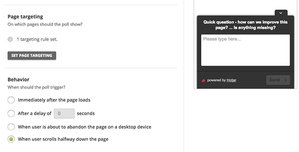
Once you’ve identified barriers in your funnel, you want to start figuring out what exactly makes people leave. The quickest way is to get feedback from users with a Feedback Poll.
You can set your Feedback Poll to appear on exit or whenever a user scrolls halfway through a page, as well as by a timer. If people are leaving quickly, you probably want to have it appear as they exit the page.
Hotjar suggests the following questions as starting templates:
- "Quick Question – if you decided not to [action e.g. signup / buy] today what stopped you?"
- "Quick Question – What is your biggest concern or fear about using us?"
- "Quick Question – What is missing on this page?"
This should get some quick, actionable feedback for you to use to remove the Barriers on this page and keep users moving down your funnel.
Back to table of contents
Chapter 7: The Top 50 Conversion Rate Optimization Tools
Whether you’re looking for a simple A/B testing tool or you need an all-in-one Conversion Rate Optimization (CRO) machine, there are tons of different software to choose from with new products hitting the market regularly.
The question many are asking is “Which CRO tool is right for me?”.
Ultimately, you and your team will have to make that decision, but we can at least narrow down your search. We use HubSpot’s A/B testing tools and we really like the functionality of Hotjar, but there might be other combinations of software better suited for your organization.
Some tools come with a price tag, but the majority also have free plans and all of them are valuable. Below are the top 50 CRO tools listed in alphabetical order:
1. A/B Tasty
A/B Tasty is a France-based testing tool that provides A/B testing, Multivariate testing, as well as content personalization.
2. Adobe Analytics
Adobe Analytics is Adobe’s answer to Google Analytics and is part of Adobe’s Marketing Suite.
3. Adobe Target
Adobe Target is an enterprise testing tool that allows you to perform A/B tests and automate website personalization.
4. Browserling
Browserling offers live interaction, web-based browser testing from real browsers on real computers.
5. BrowserStack
BrowserStack is a live, web-based browser testing tool for mobile and desktop browsers.
6. Projects by GrowthHackers
Projects by GrowthHackers takes you through the entire process of growth hacking, which includes CRO.
7. ChangeAgain.me
ChangeAgain.me provides a visual editor for A/B Testing that integrates with Google Analytics.
8. ClickTale
Clicktale is a consumer insights tool that provides session replays, heatmaps, and conversion funnels for CRO.
9. Clicky
Clicky is a full-featured alternative to Google Analytics with a heat-mapping tool.
10. Conductrics
Conductrics is an advanced CRO tool that provides various methods for automating optimization of your website, mobile application, and online campaigns.
11. Convert Experiment
Convert Experiment is similar to VWO and Optimizely, but more suited for enterprise and agencies.
12. Crazy Egg
Crazy Egg is on the shortlist of favorite CRO tools of many marketers. Crazy Egg offers heat maps, click maps, scroll maps, and other features to better visualize how users interact with your site.
13. Decibel Insight
Decibel Insight is an enterprise ready CX analytics tool with powerful features such as session replay, dynamic heatmaps, form analytics, behavioral alerts, and error reporting.
14. Effective Experiments
Effective Experiments is a comprehensive project management and workflow platform to help CRO teams collaborate and keep everyone up to date.
15. Ethnio
Ethnio helps you find the right participants for your in-person and remote UX research, online exercises, and surveys.
16. Experiment Engine
Experiment Engine is a CRO platform that offers workflow management, A/B testing, and detailed reporting and analytics.
17. Formisimo
Formisimo allows you to track behavior and conduct CRO in the forms on your website.
18. Google Analytics
Google Analytics is the most commonly used analytics tool and it’s completely free.
19. Google Content Experiments
Google Content Experiments is Google’s CRO tool that integrates with Google Analytics.
20. Google Forms
Google Forms provide a free and easy tool for creating surveys and other types of forms.
21. Google Pagespeed Insights
Google PageSpeed Insights analyzes your website’s loading time and user experience, providing suggestions to improve the issues they find.
22. Heap Analytics
Heap automatically captures every user action in your web or iOS app and lets you measure it all after the fact – including clicks, taps, swipes, form submissions, and page views.
23. Hotjar
Hotjar is one of our personal favorite CRO tools and it includes nearly all of the features that a marketer could need, including triggered polls, funnel tracking, session cams, heat maps, and more.
24. HubSpot
HubSpot offers marketing automation software that allows you to build a complete inbound marketing funnel on your website, as well as perform A/B tests and deploy personalized content for enhanced CRO.
25. Inspectlet
Inspectlet provides rich insights behind the analytics of your website. Features include form analytics, session recording, and heat maps.
26. Kampyle
Kampyle offers a variety of on-page polling tools including a form builder, user segmentation and profiling, and more.
27. KISSMetrics
KISSmetrics is one of the most popular CRO tools that allows you to track users through the buyer journey, segment your optimization, and much more.
28. Lucky Orange
Lucky Orange is an all-in-one CRO suite that includes analytics, web recordings, heat maps, live chat, conversion funnels, form analytics, and polls.
29. Marketizator
Marketizator is a newer tool that offers triggered surveys, A/B testing, web personalization, and segmentation.
30. Maxymiser
Maxymiser is a powerful enterprise tool that allows marketers to tap into first, second, and third-party data for testing and optimizing initiatives.
31. Mixpanel
Mixpanel is a popular tool for funnel analysis and user behavior analysis for applications and websites.
32. Mouseflow
Mouseflow lets you see visitors' behavior and fix pain points with recordings, heatmaps, funnels, and form analytics.
33. Open Hallway
Open Hallway is a usability testing tool that allows you to create scenarios, record users remotely or locally, and watch recordings from their web-based app.
34. Optimizely
Optimizely is by far the most popular A/B test tool, and it’s one that we’ve used successfully.
35. Pingdom Website Speed Test
Pingdom Website Speed Test is a more advanced form of Google Pagespeed Insights.
36. Piwik
Piwik is the open source alternative to Google Analytics that offers 100% data ownership and user privacy protection.
37. Qualaroo
Qualaroo is a leading on-page survey tool that integrates with all of the other most popular marketing tools.
38. Qualtrics
Qualtrics is an enterprise survey tool that allows you to manage the entire customer experience from surveys, to insights, to action.
39. ScreenFly
ScreenFly is one of the tools in a suite of comprised by quirktools.com that offers a useful cross-browser and cross-device tester.
40. SessionCam
SessionCam is a leading usability tool that offers session playback, analytics, heat maps, conversion funnels, and mouse tracking.
41. SiteSpect
SiteSpect is a great testing tool with A/B testing, MVT, web personalization, mobile optimization, and site speed improvement capabilities.
42. Survey Gizmo
SurveyGizmo allows you to quickly and easily create online surveys to collect any kind of data you need.
43. Survey Monkey
Survey Monkey is one of the leading tools for creating and distributing surveys.
44. TryMyUI
TryMyUI is a usability testing tool with features such as remote testing, concept mapping, wireframe testing, impression testing, demographic curation, and much more.
45. TypeForm
TypeForm surveys allows you to easily create highly attractive and user-friendly surveys and other forms.
46. UserTesting
UserTesting.com is a giant marketplace to find testers for your website or application.
47. Visual Website Optimizer
VWO is one of the leading, and easiest-to-use, A/B testing tools.
48. WebEngage
Webengage allows you to create highly relevant and personalised marketing campaigns across your website, email, push notifications, text messages, and more.
49. WebPageTest
WebPageTest can run free site speed tests from a variety of locations using real web browsers.
50. Woopra
Woopra is a real-time digital analytics tool that allows you to track your website, apps, emails, and more to truly understand your customers.
Back to table of contents
Chapter 8: 12 Amazing Conversion Rate Optimization Case Studies
There’s a lot of hype around Conversion Rate Optimization (CRO) and you’re probably wondering if that hype is real.
Well, you’re in luck. We’re going to share 12 real CRO case studies with fascinating results that may sound too good to be true, but are.
The best part of all is that every single one of these case studies involved small changes that any company could test for themselves.
Take a look and see for yourself how powerful CRO can be.
1. Adding a Human Image Increases Sign-Ups by 102%
People relate to people better than they relate to products or services. Whenever you can add a human element to your offer, it will be more engaging in most cases.
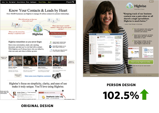
When 37Signals (Now Basecamp) sought to improve conversions on their landing page, they tried several different tests with marginal results. Finally, they decided to start from scratch and added an image of a woman smiling to make the page warm and inviting.
The result – conversions spiked by 102.5%!
Key takeaways:
- Don’t be afraid to start from scratch and test completely new ideas
- Test human elements whenever appropriate
2. Changing CTA Location Increases Conversions 591%
Where your CTA is located on the page is often just as important as what the CTA says.
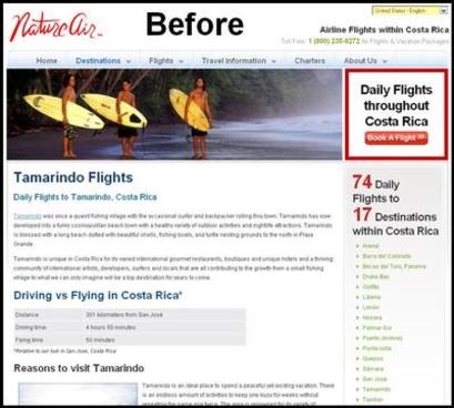
Nature Air had several landing pages with conversion rates they weren’t satisfied with. After some research, they ran an A/B test on each landing page, one of which moved the CTA to a more prominent location.
Here is the control page:
Here is one of the test pages that has the CTA in a prominent position on the page.
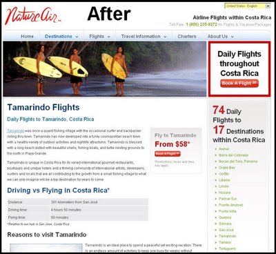
As a result, the conversion rate increased from 2.78% to almost 19% – a 591% increase!
Key takeaways:
- You might have an attractive offer, but users won’t know unless they see it
- A/B test different locations for your CTA -- i.e. above the fold, when users attention is usually at its highest
3. A 3-Step Website Update Increases Conversions by 400%
The team at Conversion Rate Experts created 11 experiments for Voices.com targeting various stages of their sales funnel. Their challenges included targeting multiple audiences and adding perceived value for a “middle man” service.
Of the experiments they ran, the following are the three that had the most significant impact on their conversion rates.
They added logos of previous clients to instill trust in prospects.

They created two different CTAs to segment their audience based on their two primary buyer personas.

They also added a useful video to eliminate confusion over how the service worked.

Key takeaways:
- Visitors should feel your company is safe and trustworthy
- Your website should make it crystal clear which steps to take, especially if you serve multiple buyer personas
- The easier you make it for prospects to convert, the more likely they are to do so
4. A Pricing Page Redesign Increases Conversions by 25%
Sometimes it only takes a few small tweaks to increase conversions and that’s the case with BaseKit. The company felt their original pricing page wasn’t performing as well as it could and decided to test a redesign that resulted in a 25% increase in conversion rate.
Here is what the old design looked like:
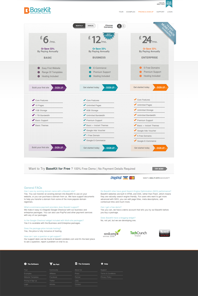
Here is the new design:
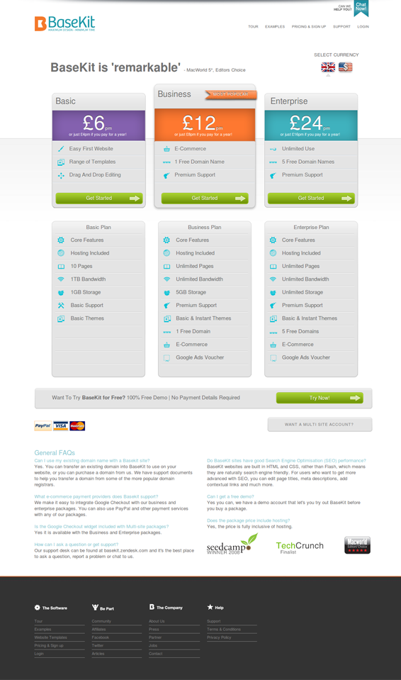
As you can see, they’ve added color behind the prices and to the “Try Now” button to make them stand out more. They also made currency selection more eye-catching and made their recommended plan more visually prominent through color and positioning. Overall the design looks cleaner and easier to read.
Key takeaways:
- Your pricing page is critical and even though a prospect has made it that far in your conversion funnel, poor design (or copy) can still lead to drop off
- Clean, clear design performs well because people want to know exactly what they’re getting before they make a purchase
5. Changing the CTA Button Color Increases Conversions by 21%
Different colors evoke different emotions from users and as simple as it sounds, the color of your CTA buttons matters. Performable (now HubSpot) tested their homepage CTA button with green and red colors, while keeping the copy the same.
The result was a 21% increase in conversions.

Key takeaways:
- The smallest details can have a big impact
- Red is an action color and often performs best on buttons and links
6. Implementing Live Chat Improves Conversion Rates by 211%
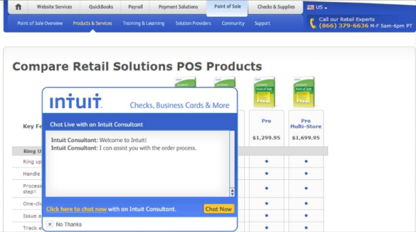
Intuit added proactive chat to several areas on their website to better serve their prospects and customers. Each area saw an uptick in conversions.
After adding chat to their checkout page, their conversions went up by 20%, and even better, the average order value increased by 43%.
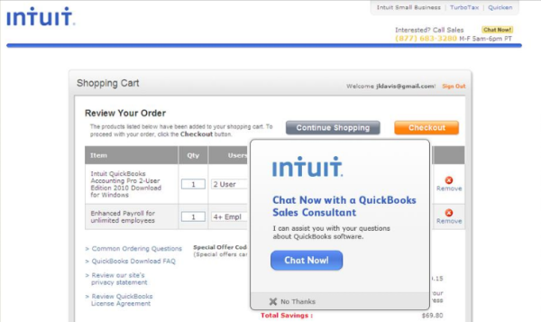
Implementing live chat on a product comparison page increased sales by 211%.
Key takeaways:
- There are virtually unlimited ways to improve conversions and you shouldn’t feel limited to the standard A/B tests such as headlines and button color
- Live chat is a valuable tool because many prospects will have questions, but they don’t want to take the time to email your company or call your sales reps
7. Removing Trust Image Increases Conversion Rate 400%
Normally, we associate an increase in conversion rates with adding elements of trust, but in the case of Bradley Spencer, they saw the opposite effect.
Here is the original page with a big secure image:
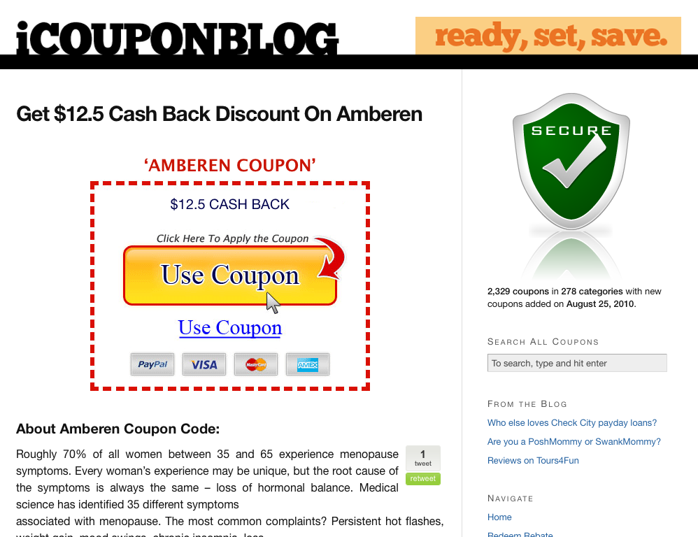
Below is the new version without the big secure image:
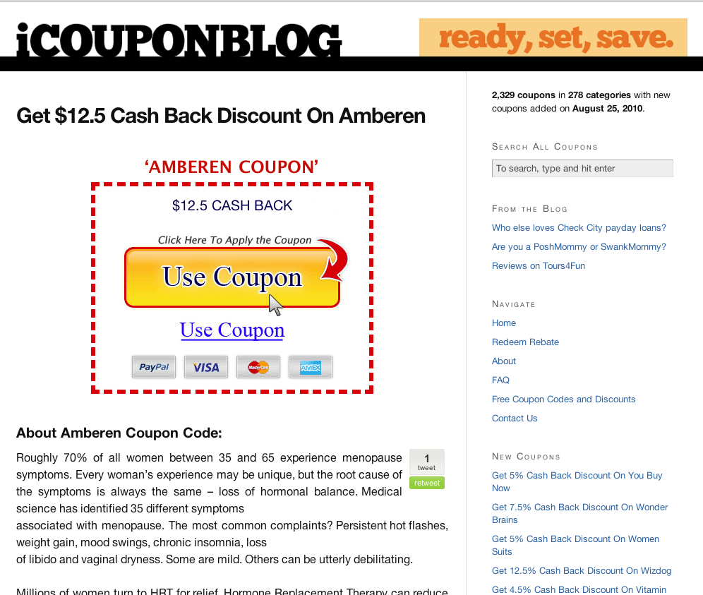
It only took around 3 days for conversions to increase by 400%, most likely because the image was too distracting from the offer.
Key takeaways:
- Don’t trust anything as fact until you’ve tested it
- By default, trust images don’t improve your website’s trust and should be carefully selected
8. Proving Authenticity Boosts Sales by 107%
Express Watches is an online watch retailer and one of the biggest concerns of their customers is that they are buying authentic brands.
They decided to test a seal of authenticity to see if it had an effect on sales. Below is the control page.
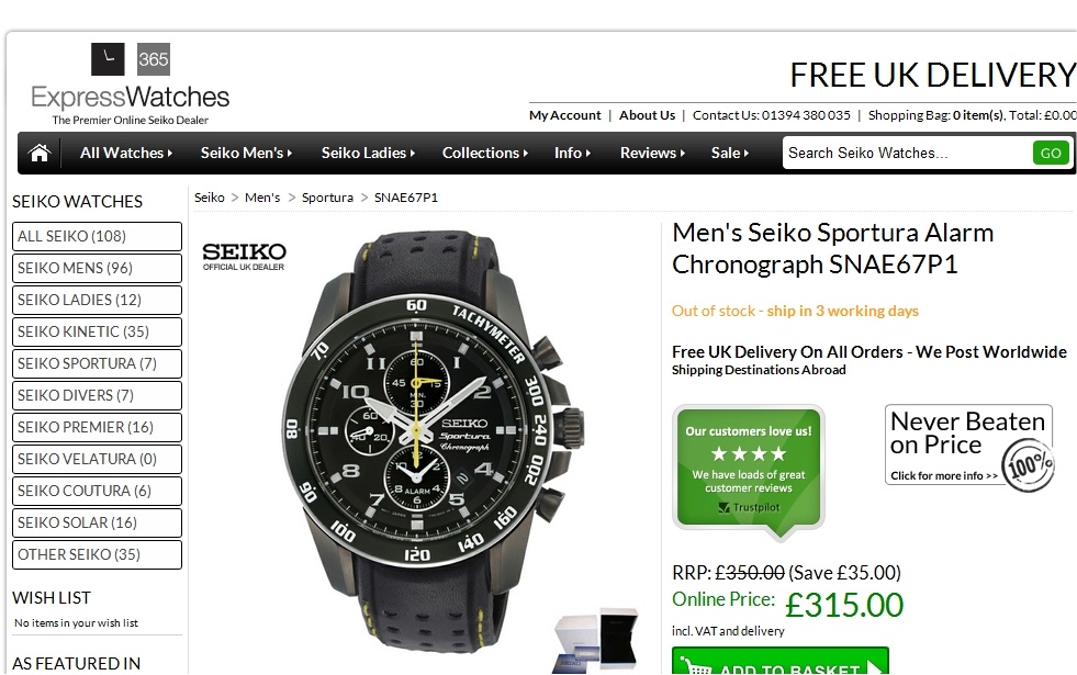
Then here is the variation page with a seal of authenticity:
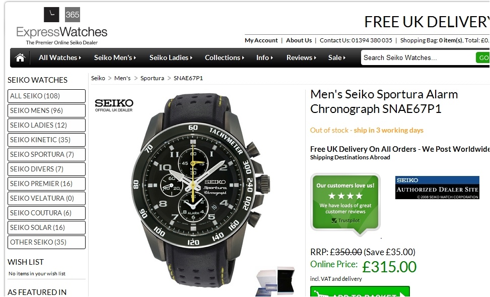
The result was an increase in sales by 107% with the variation page.
Key takeaways:
- Phrases like “Authorized Dealer” or “Certified Partner” build trust with online shoppers
- If your industry has known issues with fraud, elements of trust can have a big impact on conversions
9. Sales Increased 41% After Adding a Guarantee
Horloges.nl is another online store that sells watches, based in the Netherlands.
They made some tweaks to a banner on their landing page for the Casio G-Shock line of watches that resulted in a 41% increase in sales.
Here is the original banner:

The copy translates as:
- Official G-Shock dealer
- Free shipping
- Tomorrow at home (aka “Delivered the next day”)
Here is the version they tested:

The copy translates to:
- Free shipping – Familiar with PostNL (aka “reliably with PostNL”)
- Tomorrow at home – Order before 16:00
- Official Dealer – 2 year guarantee on watches
By slightly changing the design and adding trust building elements, they improved conversions and also increased the average sale by 6%.
Key takeaways:
- Backing your products or services with a guarantee allows people to feel more comfortable about purchasing
- You can also test different types of guarantees (30-day, 60-day, etc.)
10. Improving Generic Form Copy Boosts Sales by 22%
Kaya Skin Clinic is a beauty clinic that wanted to book more appointments and close more sales from their website. After analyzing their landing page, they decided to test a new form copy to replace their generic one.
Here is the control page:

Here is the new variation:

Simply changing the form copy from a generic consultation to an “expert opinion” increased conversions by 137.5%, which resulted in a 22% rise in sales.
Key takeaways:
- Look for ways to use more conversational, relatable language in your copy because generic copy doesn’t resonate as well with people
- Focus less on what you’re offering and more on what your buyer persona actually wants (an expert opinion in this case)
11. Reducing Form Questions Improves Conversions by 35%
Flying Scot provides airport parking in Edinburgh, Scotland. They had the goal of increasing conversions on their website and after some research they discovered the number of questions/fields in their forms were creating barrier in their conversion funnel.
This is the original details page where too many prospects were bouncing:
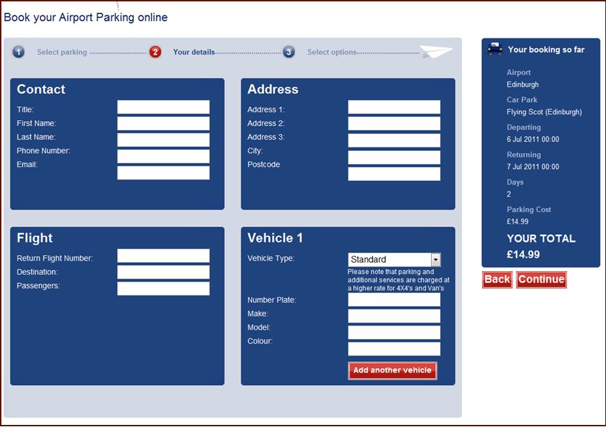
Here is the variation page with significantly less questions:
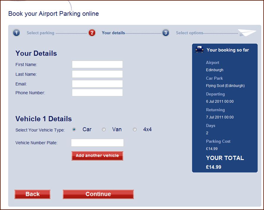
By reducing the amount of work required to convert, the company saw an increase of 45.45% in visitors moving to the next step and a 35% increase in form conversions.
Key takeaways:
- Keep forms limited to the information you need and don’t ask unnecessary questions
- If you require a lot of information, try to break it up into multiple steps so each page doesn’t look intimidating
12. Adding Video Improves Email Opt-ins by 100%
Vidyard wanted to increase email opt-ins for their alpha product, so they tested a landing page with and without video to see which performed better.
Here is an image of the page:
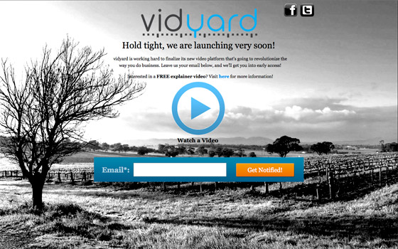
The version of the landing page with a video saw a 100% increase in conversions.
Key takeaways:
- In most cases, video is more engaging and converts higher, but only when the content is good
- If you’re marketing a service, especially a digital service, your landing page should feature that service in action
Back to table of contents
Chapter 9: 30 Conversion Rate Optimization Experts Worth Following on Twitter
Conversion Rate Optimization (CRO) is among the most valuable skills a marketer can have, but like any skill, it requires guidance, practice, and fine-tuning.
One of the easiest ways to stay up-to-date with all things CRO is to follow experts on Twitter where they provide new resources and insights on the latest trends.
To help you get started, we’ve narrowed down the sea of CRO experts to 30 of our favorite.
1. Peep Laja
Peep Laja is the founder of ConversionXL and one of the most highly-regarded optimization experts in the world. He works directly with clients to optimize their sites at ConversionXL and he trains others to do the same with their own websites online and in-person.
2. Joanna Wiebe
Joanna is a veteran copywriter that focuses heavily on conversions. She currently runs Copyhackers where marketers and startups go for incredible copywriting advice.
Check out Joanna’s Website Throwdown Episode with IMPACT to see her expertise in action.
3. Tara Robertson
Tara has 15 years of business experience and is the former VP of Marketing at Hotjar, one of the leading CRO tools.
Throughout her career, Tara has helped hundreds of companies develop marketing strategies and achieve data driven results.
Tara also appeared on IMPACT’s Website Throwdown recently.
4. Bryan Eisenberg
Bryan is a CRO expert who co-authored the New York Times bestsellers Call to Action and Waiting for Your Cat to Bark.
5. Brian Massey
Brian is the lead Conversion Scientist at Conversion Sciences and author of Your Customer Creation Equation: Unexpected Website Formulas of The Conversion Scientist.
6. Neil Patel
Co-founder of KissMetrics and well-known consultant, Neil Patel specializes in helping marketers improve their website traffic and generate more leads through higher quality content and conversion rate optimization. His website and blog get over 100,000 views a month from marketers looking for knowledge.
7. Oli Gardner
Oli Gardner is the co-founder and Creative Director of Unbounce, a conversion-focused landing page builder. He writes for the Unbounce blog and shares the latest in CRO tips and trends.
8. Pamela Vaughan
Pamela is a Principal Marketing Manager on HubSpot's optimization team who specializes in blog optimization. She shares insights and advice for marketers interested in CRO.
9. Nir Eyal
Nir Eyal writes, consults, and teaches about the intersection of psychology, technology, and business. He is also the author of the bestselling book, Hooked: How to Build Habit-Forming Products, one of the most beloved books among digital marketers.
10. Annie Cushing
Annie strives to make data sexy and she provides training and consulting for SEO, analytics, and reporting. She blogs about all things data on her website Annielytics.
11. Rand Fishkin
Rand is a well-known digital marketer, author, blogger, and founder of Moz, one of the leading marketing software companies. His speciality is search engine optimization and getting people to click through on your listing.
12. Ronny Kohavi
Ronny Kohavi is a Microsoft Distinguished Engineer and the General Manager of the Analysis and Experimentation at Microsoft. His papers have over 27,000 citations and three of his papers are in the top 1,000 most-cited papers in Computer Science.
13. Roger Dooley
Roger is a speaker, blogger, and author of Brainfluence: 100 Ways to Persuade and Convince Consumers with Neuromarketing. His insights into the human brain have helped marketers understand and improve their the effectiveness of their marketing for years.
14. Karl Wirth
Karl is the co-founder and CEO of Evergage, a real-time personalization tool used to enhance marketing efforts, increase customer engagement, and drive greater revenue.
15. Brian Balfour
Brian is the VP of Growth at HubSpot. He leads the growth team for Sidekick and other new products.
16. Joel Harvey
Joel is a veteran digital marketing executive and entrepreneur with 11 years of experience in CRO. He and his team design run hundreds of optimization tests each year.
17. Angie Schottmuller
Angie was ranked by Forbes as a Top 10 Online Marketer in 2015. She helps businesses get more value from their existing marketing efforts through better understanding of their customers, data-driven technology, and persuasive marketing psychology.
18. Dan Siroker
Dan is the co-founder and CEO of Optimizely, a popular A/B testing tool. He’s also the co-author of A/B Testing: The Most Powerful Way to Turn Clicks into Customers and served as Director of Analytics for the 2008 Obama Presidential campaign.
19. Rick Perreault
Rick is a co-founder and the CEO of Unbounce. He has dedicated his career to design and marketing, where he has sought to solve the challenges of creating high-converting landing pages.
20. Bob Ruffolo
Bob Ruffolo is the founder and CEO of IMPACT, one of the top inbound marketing agencies in the country and a HubSpot Diamond Partner Agency. Bob is a HubSpot expert and specializes in CRO using HubSpot.
21. Talia Wolf
Talia is the founder of Conversioner, a CRO agency specializing in consumer psychology and behavioral data.
22. Stephen Pavlovich
Stephen is the CEO of Conversion.com, a conversion optimization agency. Deploying their data-driven approach, he's generated increases of over $1 billion for his clients.
23. Morgan Brown
Morgan is a co-founder of Growthhackers.com, author of Unlocking Growth, and COO of Inman News.
24. Ton Wesseling
Ton is a CRO expert, working in the conversion business since 1999. He is the founder and CEO of Testing.Agency, providing an A/B-test support team to businesses.
25. Justin Rondeau
Justin is the Conversion Optimization Manager at Digital Marketer who specializes in hands-on testing and conversion optimization in both B2B and ecommerce.
26. Tim Ash
Tim is the CEO of SiteTuners and the author of the bestselling book Landing Page Optimization. His expertise focuses on user-centered design, understanding online behavior, and landing page testing.
27. Sean Ellis
Sean is the CEO and co-founder of Qualaroo and Growth Hackers. He was also the first at Dropbox, Lookout, Xobni, LogMeIn, and Uproar.
28. Chris Goward
Chris is the founder of WiderFunnel, a conversion optimization agency. He is also a keynote speaker and the author of You Should Test That!.
29. Craig Sullivan
Craig is a UX expert who has experience with UX, usability testing, user centered design, online marketing, customer insight, web analytics, and multi-variate testing.
30. Hiten Shah
Hiten is a co-founder of Crazy Egg and KISSmetrics. He’s well-known for his CRO knowledge and experience from both companies and tweets advice regularly.
Back to table of contents
Now, Give it a Try!
Sure, it all sounds great in theory, but the only way to know what we’re really talking about is to give HubSpot a try for yourself. Talk to us here at IMPACT and we’ll help you set up a free 30-day unlimited trial of HubSpot and walk you through how to use it to achieve your marketing and business goals.

Order Your Copy of Marcus Sheridan's New Book — Endless Customers!

