Subscribe now and get the latest podcast releases delivered straight to your inbox.
8 B2B Brands That Tell Memorable Stories on Their Website

Feb 23, 2016

Being able to tell a captivating story on your website is an internet trend that has quickly taken off.
In the past, we have traditionally seen brands position themselves in a much more logical and mathematical way. Their website's purpose was to try to get all the technical talk into the visitors' ear so they knew what they offered, but people just can’t hold enough interest to read that anymore.
This means people need to be engaged in a more unique way that captivates them to read the text and scroll.
This is where utilizing storytelling comes into play, especially with B2B companies. For them, narratives can often get lost especially since the audience may be a more abstract concept. However, it's important to remember that there is a human at the other end of each potential sale and they aren’t going to do business with you if they know they aren’t captivated by the website.
To help give you some inspiration to create your own story on your site, check out these B2B brands that successfully incorporate narrative into their website.
1. SurveyGizmo
SurveyGizmo advertises their software as something “that will make you smile”. This, along with the beautiful illustrations helps initially alleviate the stress you may have about using their software.
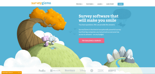
Though used by many big name companies, the site refuses to keep a cold, corporate appearance, and instead, utilizes bright colors to maintain its friendly, "smile-worthy" message. SurveyGIzmo's content and graphics throughout their homepage also give users the sense that anyone can use their software with ease and at an affordable price.
2. Wun Systems
After introducing their software, Wun focuses on the people who come to their website and initially ask them what type of workspace they work in. If you choose to click on any of those links, you are redirected to a page of products that suit your workspace.
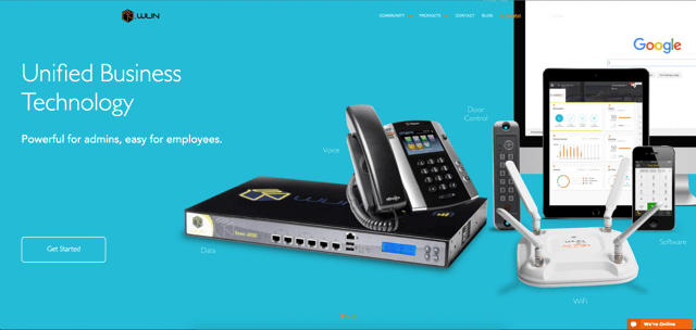
If you choose to stay on the homepage, the remainder of it focuses on how companies just like yours have benefitted from the products Wun offers.
Their use of space, large text, graphics, and directional cues (illustrated with the large white ‘arrows’) helps keep the attention of users and drives them down the page.
3. TicketLeap
TicketLeap puts their emphasis on the hype buying a ticket to an event gives you and the anticipation one feels when waiting for the event.
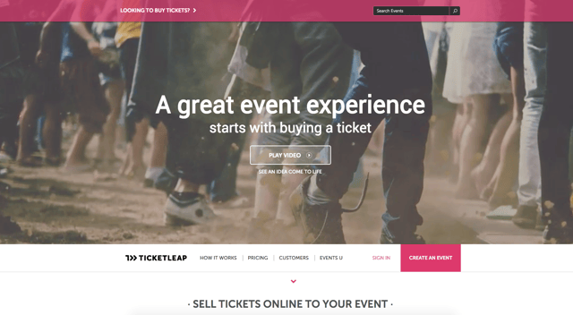
To help further drive this point, the site has a video that shows the entire process of setting up a website for users to buy tickets for your event.
The homepage also uses compelling pictures of the software as well as a list of upcoming events. This creates the desire to start using the software and get your ticket sales jump started with everyone else's.
4. Zendesk
As a customer service software, Zendesk gets into the mind of their target audience and addresses exactly how their users can get close to their own customers with their product.
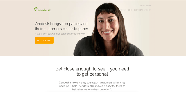
They also comfort the users and let them know that as they grow and scale up, Zendesk will continue to stay with you. This shows users that they don’t need to worry about Zendesk abandoning them after they become customers.
Other areas of the site, such as their product pages, are riddled with beautiful interactive graphics that illustrate the content that's accompanied with it.
5. Kelser
Kesler uses their website to position themselves as a company that makes it easy to figure out your IT solutions. They use storytelling to try to show how frustrating working with technology issues can be and how the accessibility of their tools can help you fix them.
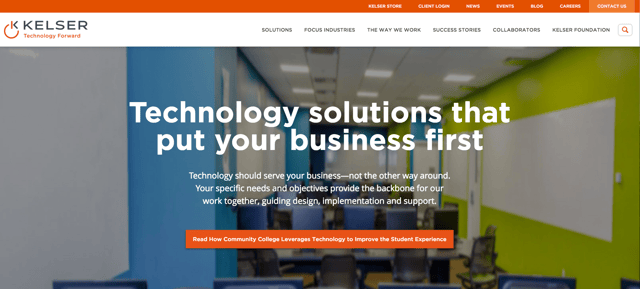
The video on their homepage shows regardless of the size of your business, the company wants to work personally with you to figure out custom solutions for your IT issues. It allows the user to feel comfortable knowing that the company wants to hold your hand throughout the entire solution process.
Their language throughout the site gives the visitor a sense that the company enjoys practicing transparency with its customers and wants to make sure they aren't overwhelmed by the software.
6. Freshdesk
Freshdesk, a company similar in service to Zendesk, sells customer support software so users can better measure their client’s happiness.
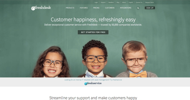
They primarily capitalize on how well their software can affect your client's mood. They even utilize a variety of cute, smiling children across the website to help emanate the satisfied feeling you want your clients to have.
With more than 50,000 customers who have already had success with the product, how could you not try it for yourself?
7. MyMoriam
MyMoriam focuses on people who are looking to achieve great dreams, goals, and create memories. Using the application, you can create a bucket list for all those activities you want to do so you can hold yourself accountable for them.
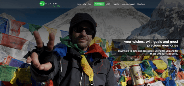
The website makes you feel as if you have the ability to do anything, even activities you thought you’d never be able to complete.
The testimonials on the homepage also give you a chance to read stories of what others have been able to accomplish using the app. This is an excellent way to get users excited and hopeful that the application can do the same for them.
Weirdly
Weirdly creates a story of what it's like for you to go through the process of using their screen applicant software to achieve your goals.
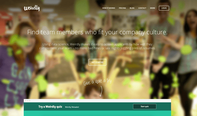
Since the website gears itself to companies who put an emphasis on culture, they took a creative and colorful design approach to bring their site to life. The imagery also shows people expressing a variety of silly moods to help drive the idea of hiring someone who fits your company's personality.
The video on their features page also helps show the user how easy it is to use the software in a fun, quick, engaging manner that makes looking at CVs a thing of the past.


Order Your Copy of Marcus Sheridan's New Book — Endless Customers!