Subscribe now and get the latest podcast releases delivered straight to your inbox.
15 effective re-engagement email examples you’ll want to steal in 2021

Sep 11, 2020
Re-engagement email examples
- Blue Apron
- Duolingo
- H&M
- Laura Belgray
- FabFitFun
- Moe’s
- Kickstarter
- Express
- Path
- Circle Furniture
- Hired
- Ma-ka-rohn
- Charming Charlie
- ReturnPath
- Disney+
Editor's Note: This article was originally published in 2015 by Carly Stec. It has been fully updated to reflect all-new examples, data, and current best practices.
In the last decade, MarketingSherpa research has found that B2B marketing lists tend to decay at a rate of 2.1% per month. This is an annualized rate of 22.5%.
Holy depreciation, Batman.
Even if your inactive contacts remain subscribed, they are likely skewing your analytics and could be hurting your deliverability, engagement, and, in turn, overall effectiveness. So, it’s best not to let them linger.
Like old flames, once beloved subscribers and users can ghost you for a variety of reasons.
Maybe they’re no longer in the market for what you offer. Maybe they found a better alternative. Maybe they simply don’t find value in your emails or product anymore. Whatever their reason, you should still make your best effort to rekindle the relationship and remind them of what you once had before saying goodbye.
A re-engagement email may be just what you need.
What is a re-engagement email exactly?
Now, if you searched and clicked on this article, you can skip over this section, but when I was crowdsourcing examples for this article, I realized some people may not know exactly what the term re-engagement email means.
Simply put, it’s exactly what it sounds like — an email sent in an attempt to re-engage a contact or user after you have not seen any activity from them in an extended period of time.
Activities may include not:
- Clicking or opening emails
- Visiting your website
- Making a purchase
- Using your app or software
- Completing a purchase
With email still being one of the most effective ways to reach your audience and garner conversions, it only makes sense that you take advantage of this avenue in your re-engagement efforts.
In this article, I’ve rounded up 15 examples of noteworthy re-engagement emails from a variety of industries and businesses to inspire your campaign.
Some of them are emails sent in an effort to keep email databases clean, others are to get customers or users back on the platform or site. For each one, I’ll share what they did right and why it’s effective.
1. Blue Apron: “Come back for these exclusive recipes”

What I love about this Blue Apron example is that it doesn’t feel like a plea to win me back. While, as a marketer, I knew exactly what was their goal when I saw it hit my inbox shortly after I deactivated, an average consumer likely wouldn’t.
Rather than harping on the fact that I deactivated, they showed big, vibrant photos of some of the delicious recipes that I was going to be missing out on in the coming weeks. With minimal copy, these were the focus.
The only acknowledgment of my absence (aside from the subject line) is a sentence above the footer that says “come back and cook with us!” They simply let my FOMO do the work.
2. Duolingo: “We Miss You!”
(Source: Really Good Emails)
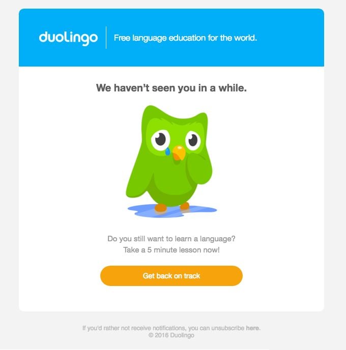
Duolingo’s re-engagement email is simple but bold. This is an email I know I’ve received several times after not using the language learning app for a few days and I’m sure many users have as well.
It grabs you with a striking image of its green mascot upset that it hasn’t seen you in a while and emphasizes that a lesson will only take five minutes of your time.
Following up with a bold orange button reading “get back on track,” they almost make you feel guilty for not clicking through.
3. H&M: “Here’s 15% off to say we miss you”
Online retail therapy has certainly been a source of solace for me while social distancing, but evidently, I didn’t turn to H&M.
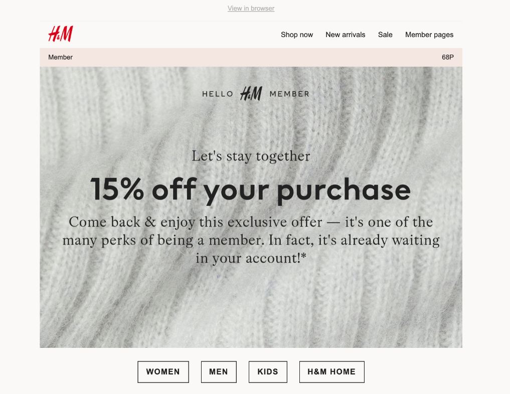
In this example, the clothing company uses an incentive of 15% of my next purchase in order to “stay together” then places convenient department buttons below its message to make it easy for me to use it.
4. Laura Belgray: “Are we over…”
I’ve praised Laura Belgray’s emails a bit in the past so it should be no surprise that she’s making an appearance here.
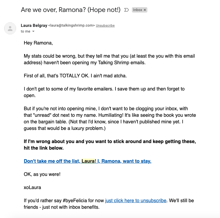
In this example, Laura uses her signature humor and friendly copy to let me know that I haven’t opened her messages in a while. She then gives me the option to either unsubscribe or let her know I’m not going anywhere.
It’s no-frills, full of personality, and more importantly, genuine.
5. FabFitFun: “This will perk you up ;)”

In a similar approach to Blue Apron, subscription box FabFitFun uses their re-engagement email to remind me of the cool perks and features I’m missing out on by deactivating my subscription.
Then, to sweeten the idea of returning to the brand and create a sense of urgency, they offer me a limited time offer of a “free mystery bundle” worth $125 with my next box.
6. Moe’s Southwest Grill: “Just checking in…”
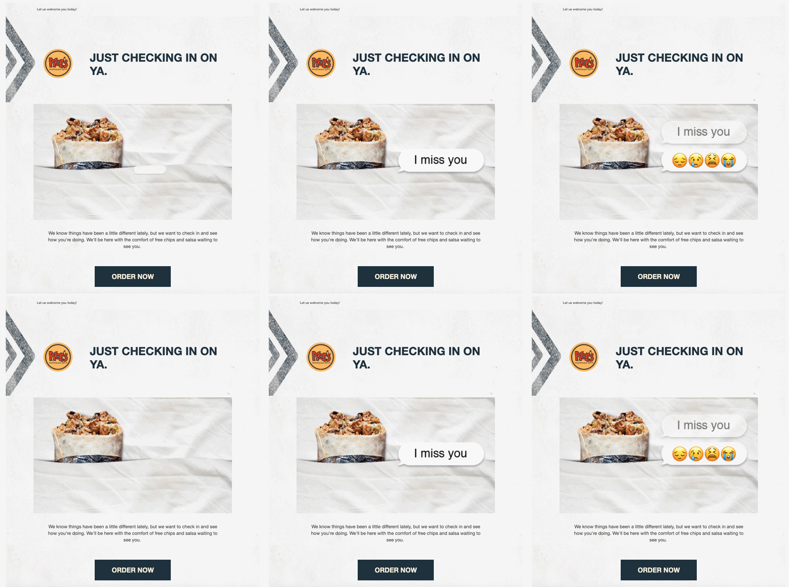
The Moe’s Southwest Grill brand is casual and fun and this example from them is no different.
Rather than trying to win you back with an offer or gimmick, they opt to simply “check in on ya” as a good friend would. They even use playful animated text message bubbles and emojis to drive home the friendly sentiment of the approach.
7. Kickstarter: “The power of updates”
(Source: Really Good Emails)
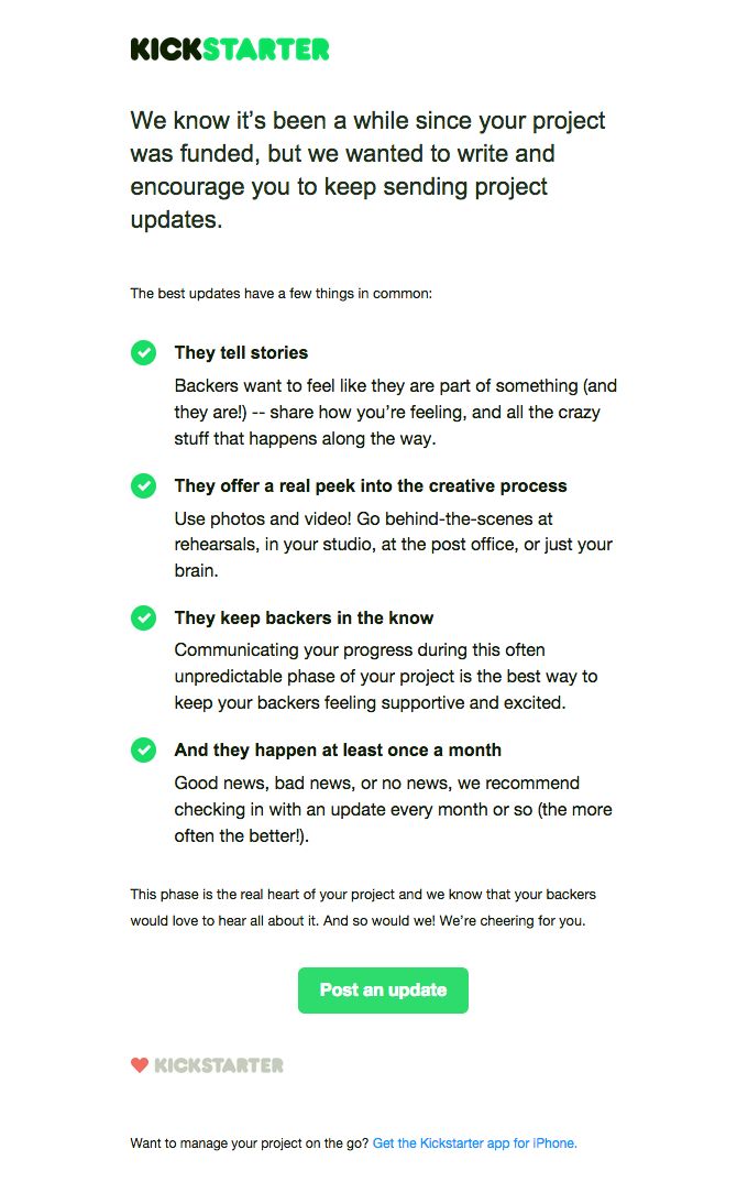
Strategically, this email from Kickstarter is probably my favorite on the list. This message is sent to users when the platform notices your project has been successfully funded, but that you haven’t been back to the site since.
To get you to do so, it cleverly gives you advice on exactly what you should do next and how it’ll help you find more success on the platform in the future.
Its use of the brand’s lime green in bullet points and the call-to-action, draw your eye to the most important elements of the email and guide you down the entire message. I love it.
8. Express: “Here’s free shipping to get what’s in your cart!”

Here we have a great example of a cart abandonment email from Express. Not only do they show me what I left behind and create FOMO with copy “get it or regret it,” they also incentivize completing the order right now with a time-sensitive offer of free shipping.
On top of that, they even show me similar products to possibly add to my cart at the same time. Smart move, Express!
9. Path
(Source: HubSpot)
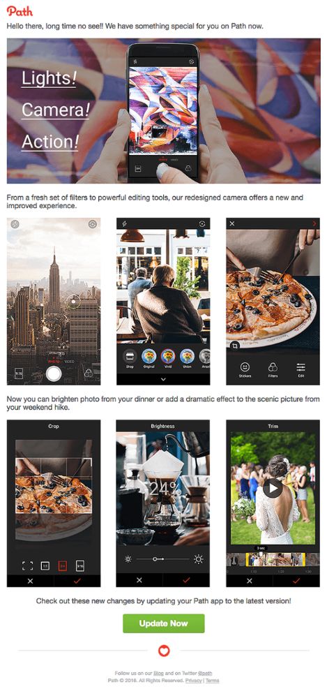
For those of you not familiar with it, Path is a photo editing app. In this re-engagement email sent to users who haven’t been active
in some time, they use large, high-quality visuals to highlight new features and encourage the user to update their app.
The images grab your eye and do a great job of showcasing exactly what the user will be getting by returning to the app.
10. Circle Furniture
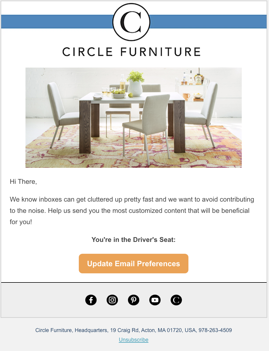
IMPACT client Circle Furniture keeps it simple with this example, but is effective because of its helpful tone. They’re not angry or upset that you haven’t been engaging; they understand that inboxes are really cluttered today and they want to help by letting you know you can update your email preferences.
11. Hired: “Action Requested: Your Hired application is missing information”
(Source: Really Good Emails)
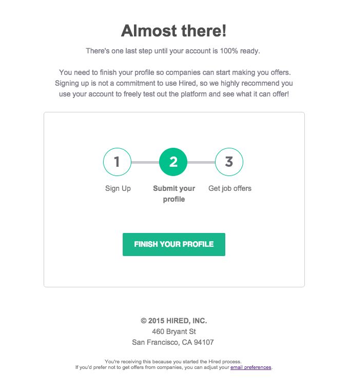
Ok, yes, this could be considered a transactional email (especially with that subject line), but the goal is still to re-engage you. In this example, job search site Hired uses a simple visual approach to show you you’re just one step away from the job offers you’re looking for.
In this minimalist design, they use green to draw your eye to the fact that you stopped halfway through the registration process and to the button that will take you to complete it.
It’s crystal clear about what you need to do and why you should do it right now.
12. Disney+
 (Source: Really Good Emails)
In this re-engagement email, the streaming platform uses holiday nostalgia to win deactivated users back.
Clearly sent during the Christmas season, the platform cleverly highlights some of beloved holiday movies, TV shows, and specials it has available and you could enjoy too if you simply reactivate your subscription.
Smart example of delivering the right content at the appropriate time.
13. Ma-ka-rohn

Here we have another cart abandonment email. Unlike Express, however, there is no added incentive to act.
Rather, they let the images of the glorious macarons you left in your cart speak for themselves and let you know that these are only available in small batches, creating a sense of exclusivity.
They also share that they are a small, family-owned business, further humanizing their brand. If you want these exclusive treats and to support this small business, it’s now or never!
14. Charming Charlie

In this example, accessory retailer Charming Charlie does a great job of creating a sense of urgency with its clock-focused imagery and copy. It’s direct about why they’re writing — you haven’t used a reward — let you know when it’s expiring and give you two ways to use it immediately.
I also love the colorful, un-brand design of the email, which is reminiscent of their retail stores where everything is organized by color.
15. ReturnPath: “Get an extra life and keep your emails going”
 (Source: Really Good Emails)
Last, but not least we have ReturnPath.
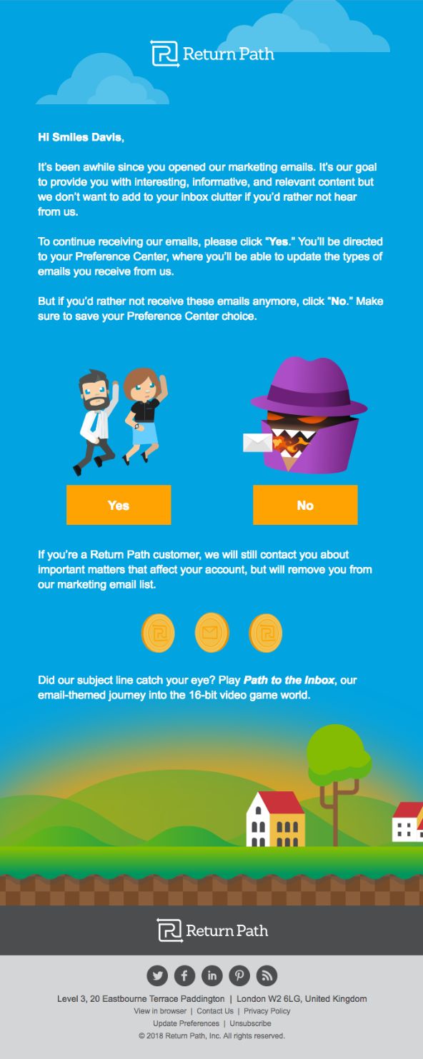
Like Laura Belgray, the email company uses their message to ask their contacts if they would like to stay subscribed or say farewell to their emails. However, instead of a plain text email, they opt for a full, custom illustrated design. This grabs the eye and makes it clear and easy to see which button you should be clicking.
In an interesting move, the email also doubles as a subtle promotion of a game the brand has designed. So, even if you choose to unsubscribe perhaps their game may engage you in another way.
Refresh your list with a clever campaign
As you can see from these 15 examples, there are a number of different approaches you can take with your re-engagement emails and a variety of use cases where they may be helpful.
With this inspiration in hand, think about your audience and what just might be the perfect messaging or offer to rekindle the magic your relationship once had. And hey, if it doesn’t work, at least you know how to refresh your lists for the next campaign!

Order Your Copy of Marcus Sheridan's New Book — Endless Customers!