Topics:
Marketing StrategySubscribe now and get the latest podcast releases delivered straight to your inbox.
10 Tips and Examples for Building a Better Contact Us Page

May 3, 2016

 It’s the focus of content and CTAs on the internal pages of your site where you want your visitors to learn more or reach out, however, despite being such an important page, the contact us is also sometimes overlooked.
The contact page is a vital location for many people who want to just talk to you directly and the number one way visitors will get in touch with your business. It should be easy to find, easy to use, and prompt action. If your page is hard to find or too complicated to navigate, you could be losing out on potential customers and irritating your existing ones.
To help make your contact page more inviting (and convert more people), take some inspiration from these 10 creative contact us pages below!
#1. Make Sure Your Visitor is Contacting the Right Person
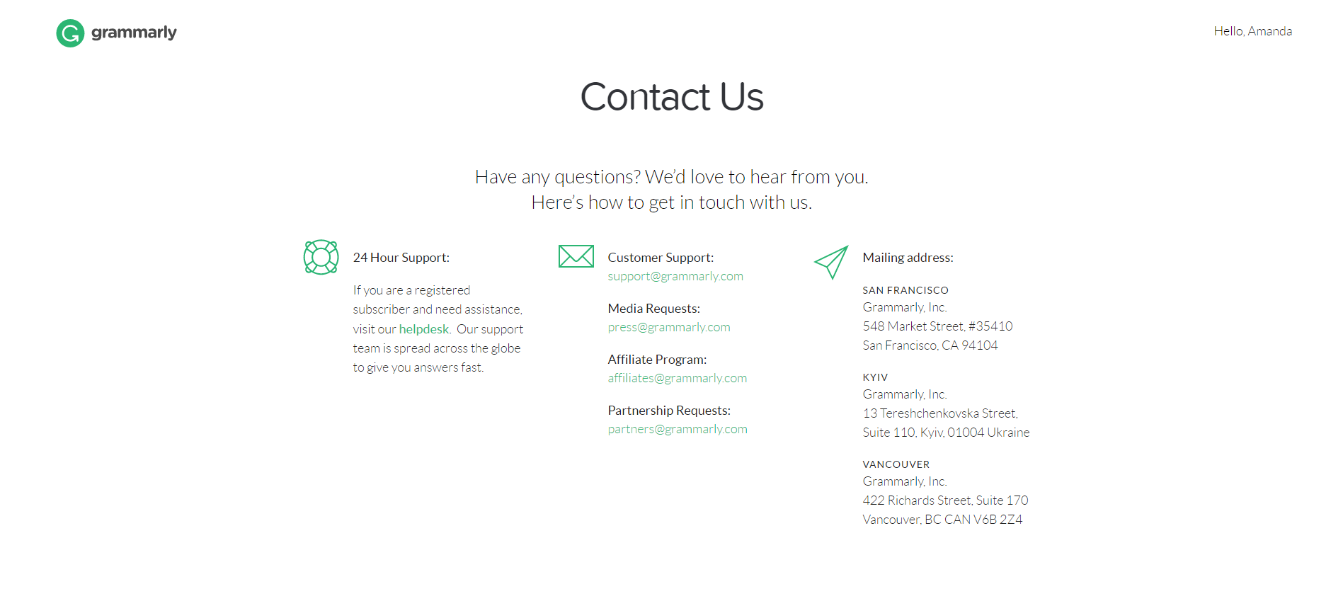
If your business has multiple departments, make it easy for your visitors to reach the right person with their question.
Grammarly clearly labels their contacts and links directly with outlook so there’s no unnecessary copying and pasting.
#2. Use the Same Language as Your Visitors
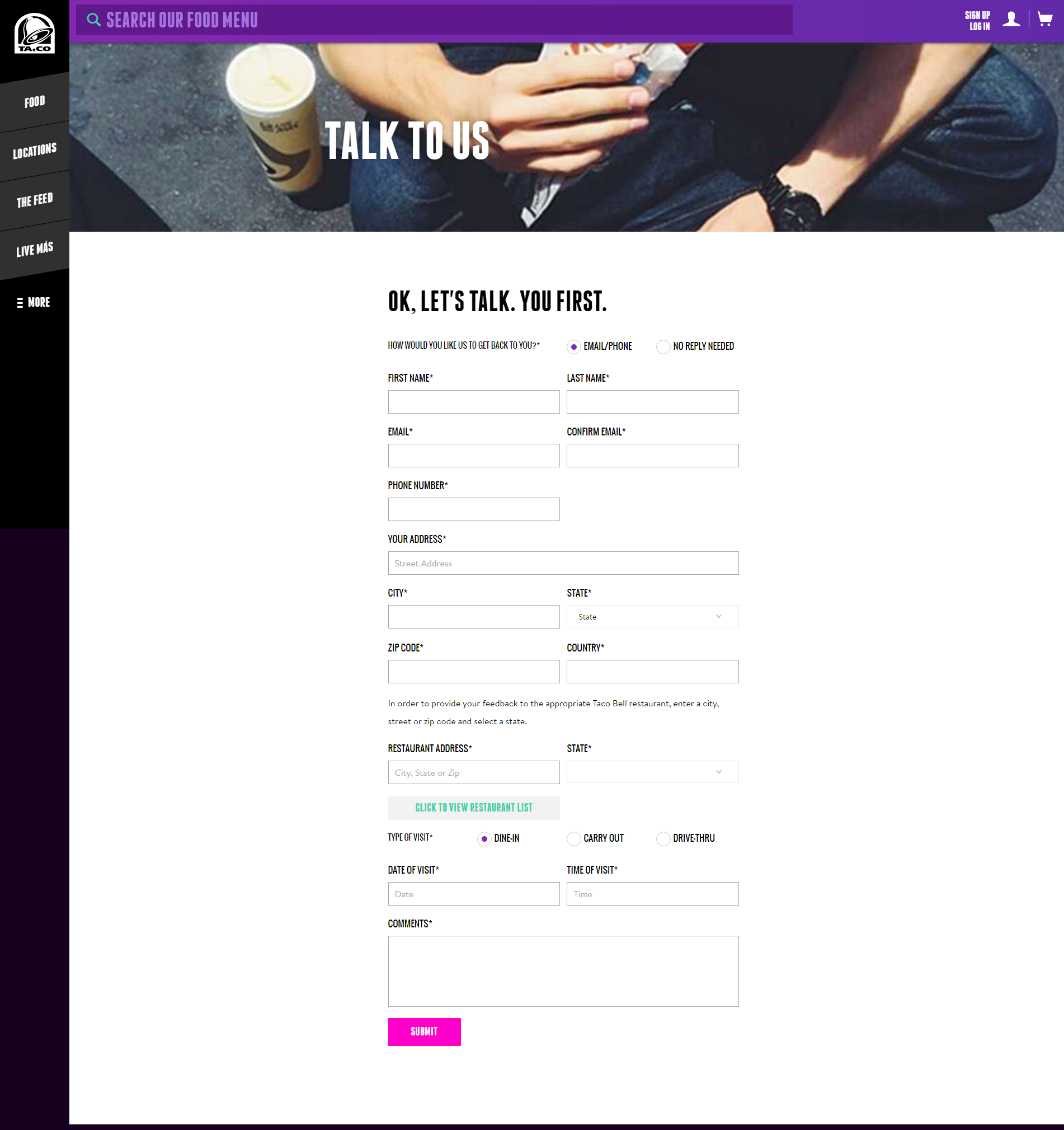
Taco Bell knows their audience and when that audience does decide to reach out via their contact us page, it feels more like talking to an old friend rather than a company.
They also make it clear that they want to hear your feedback (“Ok, let’s talk. You first.”) and will reach back out to make sure you were satisfied by their service. You’re leading the conversation, not them.
My only fault with this page is the form. In this particular instance, why do you need to know the personal address of your visitor?
Asking for too much information (or too personal of questions) can deter a visitor from filling out your form impacting your conversion rates. Test out what information your audience is more willing to give up and base your form off of your results.
#3. Be Helpful
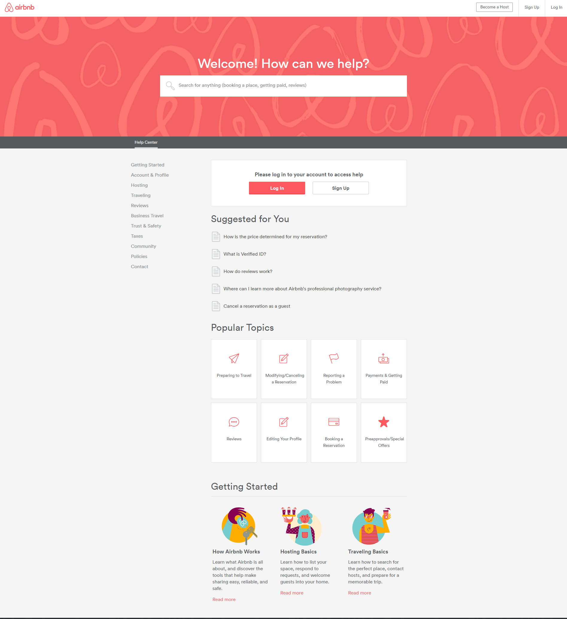
Airbnb does a great job of making their contact page inviting to visitors with this friendly, helpful headline. Their contact us page doubles as a FAQ page, providing visitors the opportunity to find the answer to their question immediately rather than waiting for a response from a member of their team.
One goal to keep in mind, no matter the page, is to be helpful.
By providing visitors with information that can help them solve their problem on their own, in the form of a FAQ page or a premium resource for example, will create a better user experience, share your experience, and keep them on your website a bit longer.
#4. Show Your Visitors Why They Should Reach Out
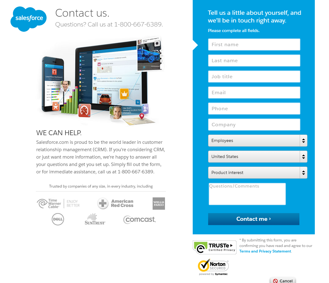
When asking someone to contact you, don’t just assume they’re ready for a purchase. Visitors who stumble upon your contact page are at a variety of stages in your pipeline. When crafting your page, make sure to address that.
Salesforce does this nicely by talking to those considering a CRM and to those who just want some more information. I also really like the use of color behind their form. It stands out from the page and makes it clear what they want visitors to do, “Tell us a little about yourself...”
#5. Try Something Original and Unique
You don’t stumble across a contact page like this too often.
QuickSprout has taken the contact page to a new level by incorporating an actual infographic.
Neil Patel makes it clear why you shouldn’t and should reach out to him and implores visitors to “keep it concise” to help him out because now we know, we’re actually going to be reaching out to the real Neil Patel. Our email won’t be going to a general spam box. This page is visually appealing, informational, and endearing all at the same time.
#6. Show Some Personality
InDesign incorporates a little cheeky humor to their contact page (“We’re here for you and we’re wearing our thinking caps”). So, don’t be afraid to show some personality on your page! This humanizes your brand and better connects with your visitors. Just make sure that even with clever wording, your visitors will still clearly know the action you want them to take.
#7. Streamline Communication
Grubhub streamlined their communication process by separating the reasons why you should reach out into four clear categories. I also really love that they utilized unique CTAs for each option. By choosing your button text wisely and conveying value, you can better prompt visitors to take the next step.
#8. Add a Picture
Many times, people have submitted a contact form just to be met with an auto-response from a general inbox.
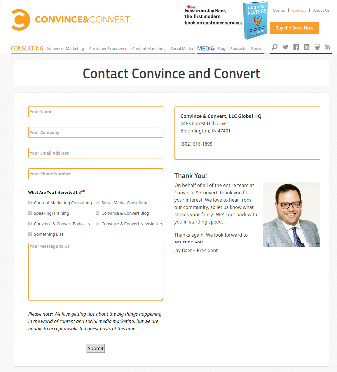
If you can, add in the photo of the person that your visitors will be contacting like Convince and Convert does! It adds a level of personalization and helps put a face to your company. Plus, personally, I am way more apt to submit my information when I know who I’m going to talk to. No stranger danger here!
#9. Let People Know Where They Can Find You
BambooHR has an office and doesn’t mind people dropping by, so on their contact page they added in their address and a handy map graphic. Adding this information to your contact us page, adds credibility and let’s people know that they can come find you if need be.
#10. Include Your Hours of Operation
If your website is for a store, restaurant, or offers customer service include your operating hours prominently on your contact us page so visitors know if/when to expect a response. Stony Creek Brewery displays this information not once, but twice on its contact page to make sure people don’t miss that important information. (Note: We’re hosting a one-day marketing and sales conference here on Friday, June 3rd. Click here to learn more or get tickets to join us!)
Now it’s your turn!
Go to your own contact page and analyze it. It should be the easiest (and most friction free) page for your visitors to find and convert on! Look for things like:
- Is your CTA clear and does it stand out?
- Is your form converting well or at all?
- Does your contact page blend with the rest of your site?
- Does your content make it clear to your visitors what you want them to do and how to contact you?
- Can you make the communication process easier or faster?
Most importantly, don’t be afraid to be creative and add some personality. You don’t have to right your contact page for everyone on the internet. Make it connect with your personas, their preferences, and their problems.

Order Your Copy of Marcus Sheridan's New Book — Endless Customers!
