Subscribe now and get the latest podcast releases delivered straight to your inbox.
Keeping an active blog does wonders for marketers and businesses alike. In fact, B2B companies with a blog receive more leads than those that don't.
By creating relevant and interesting content on your websites you’re giving visitors an easy-to-find place to start solving some of their pain points, interact with your brand, and build trust and while showing off your expertise.
These things, however, only happen if people are actually reading your content.
At the end of the day, the fundamental key to a successful blog is creating (and growing) a subscriber base -- individuals who love your content so much, they’ve said they want to receive it directly in their email inbox and will come back time and time again.
The easiest way to get more subscribers is to give them a clear, distinct place to subscribe via a dedicated landing page.
I can’t tell you how many blogs I’ve gone to looking to subscribe and haven’t found an easy way to do so.
By creating a subscribe landing page, you’re not only establishing this point but:
Giving yourself an opportunity to fully sell the value of your blog/content- In order to build your subscriber list, you need to convince them to subscribe and a dedicated landing page gives you plenty of real estate to do this. In the examples below, you’ll see how these companies are really selling why users should be subscribing.
- The more pages you have (and optimize), the more Google can crawl. A dedicated subscribe landing page is another to be indexed and ranked! It also creates an opportunity for your subscription to be found in search engines rather than relying on people having to stumble upon it on your site.
- Having a dedicated subscribe landing page makes it easy to direct and guide people to it via CTAs, email copy, or even in your navigation.
- 92% of people will trust a recommendation from a peer, and 70% of people will trust a recommendation from someone they don’t even know. So using this to build trust and convince people to subscribe to your content is important. Incorporating statistics or testimonials from your subscribers on your landing page is invaluable.
Use these 15 examples of a dedicated blog subscription page to start optimizing or creating your blog subscription page today.
1. HubSpot
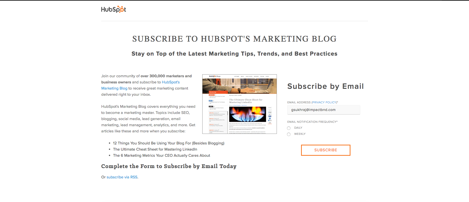
Notice how HubSpot incorporates social proof, a preview of what subscribers will receive, and gives subscribers control over how often they want to receive notifications in their subscription page.
You know that once you subscribe you’ll be getting exactly what’s laid out and you even know how many other subscribers you’ll be joining. This page leaves nothing to the imagination when it comes to your blog subscription.
2. Copyblogger
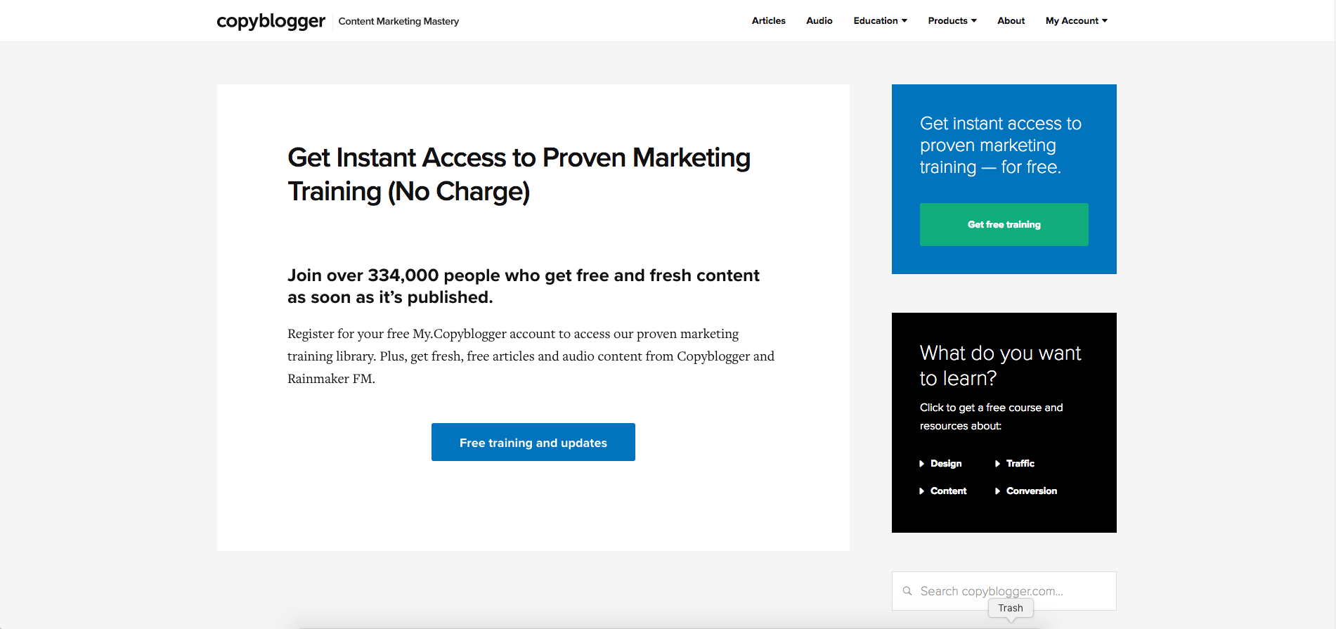
Along the same lines as HubSpot, Copyblogger really sells the value of their content with your messaging by saying you’ll receive a “treasure chest of proven marketing training.”
They’re appealing to prospective subscribers by making it clear that they'll get a ton of useful info for free
3. Salesforce
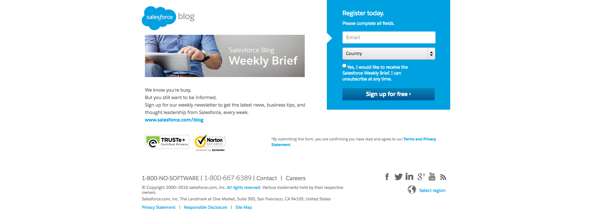
Salesforce makes sure to show off their brand personality with the direct but casual messaging on the subscribe page. They also make sure to let you know exactly how often they’ll receive information and everything else you can expect from the Salesforce blog. They also include a country form field which shows they’re a worldwide brand and want to deliver content specific/relevant to your region.
Salesforce also makes sure to build your trust by adding in security logos so you know you’re information and data is safe when you sign-ups. This helps build trust in the brand and makes you more willing to share your contact information with them.
4. Content Marketing Institute
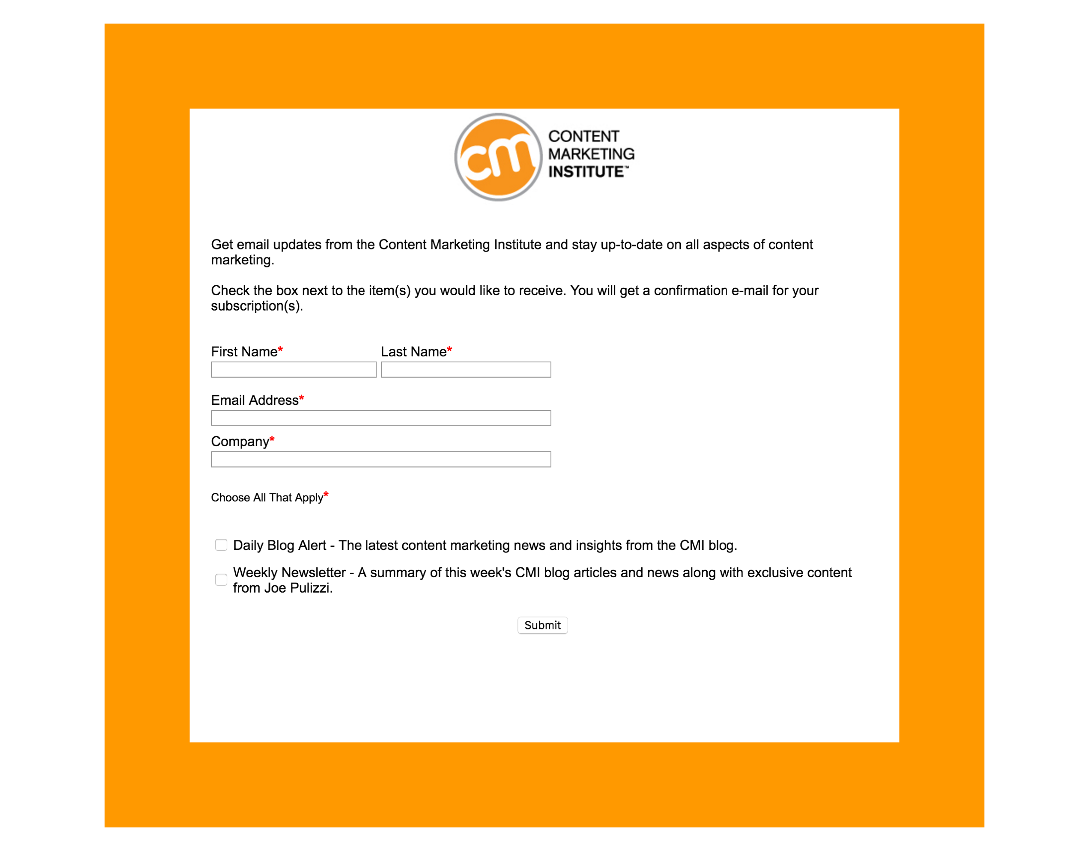
The Content Marketing Institute subscribe page is very straightforward. It doesn’t give a ton of value up front, but as you get towards the end of the form you’re given the option to choose your subscription option. This gives subscribers a sense of power and fills them in with a bit more information that they may have felt was missing from the content before the form.
5. Invision
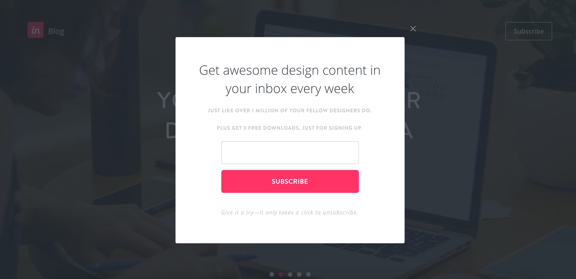
Ok, this isn't a dedicated subscription page, but it's a great alternative.
In this easy to find pop up, the user doesn’t get pulled away from what they’re already doing on the site, but attention is definitely drawn to the offer.
Invision also gives subscribers the incentive of three free downloads if they provide their email address. This way they feel that they’re getting something a bit more valuable than just the blog when subscribing.
6. Social Media Examiner
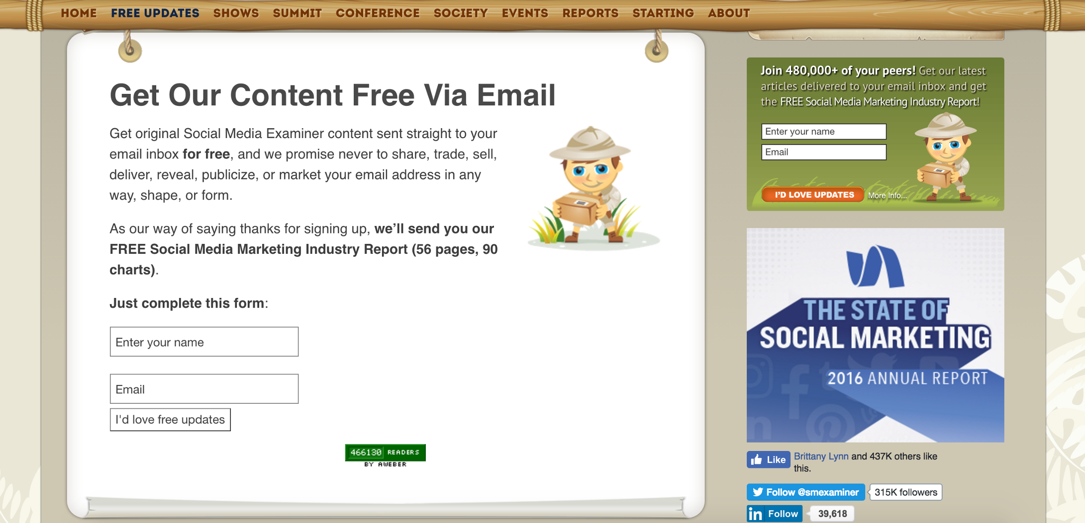
Social Media Examiner makes their subscribe page easy for visitors to skim through and see the value in subscribing.
They bold important words and include a relevant lead magnet to encourage subscribers as well.
Another thing that Social Media Examiner does is build trust with its prospective subscribers by promising to them never “share, trade, sell, deliver, reveal, publicize, or market your email address in any way, shape, or form.”
Especially in today's environment, it’s important that your visitors know that you have their best interest in mind.
7. Etsy
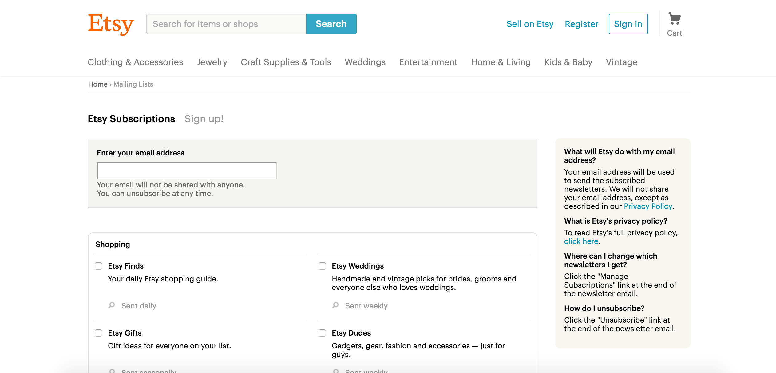
Though not a blog, this online marketplace houses a variety of products, so it’s only fitting that it offer a variety of subscription options.
The company gives readers full control over the exact information they want to receive. They also keep their international customers in mind by including the option to include a special email catered to your country.
8. Dan Zarrella
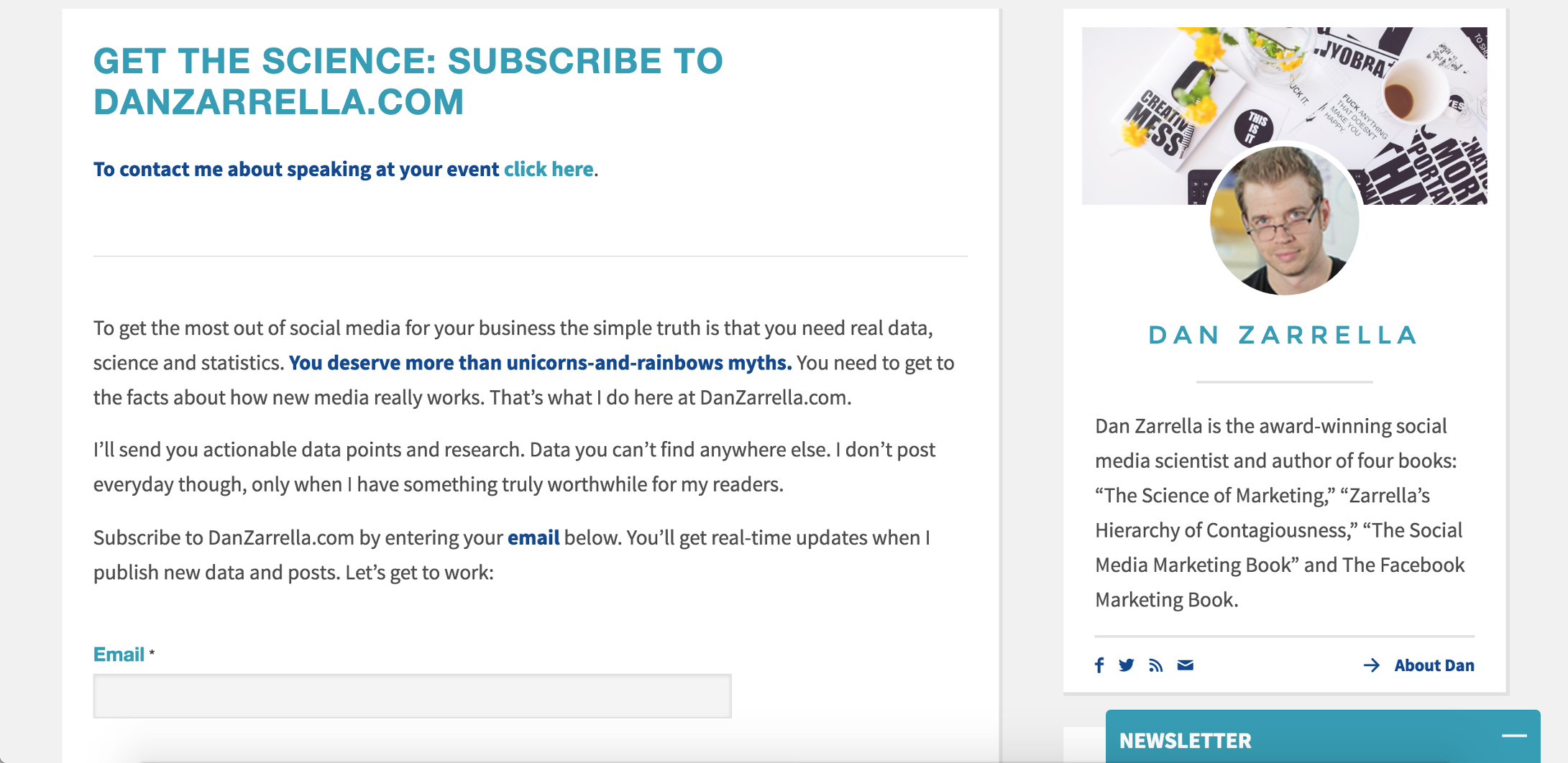
Dan knows his readers and many of the pain points they typically face.
He uses his blog subscription page to lay out the benefits of subscribing, finally getting “the facts about how new media really works,” and wraps it up in a compelling offer of getting the science.
He also sells himself beautifully by making a subscription to his blog seem as exclusive as possible “I’ll send you actionable data points and research. Data you can’t find anywhere else.” This makes the reader feel that they’re part of an elite group by subscribing to Dan’s blog.
9. theSkimm
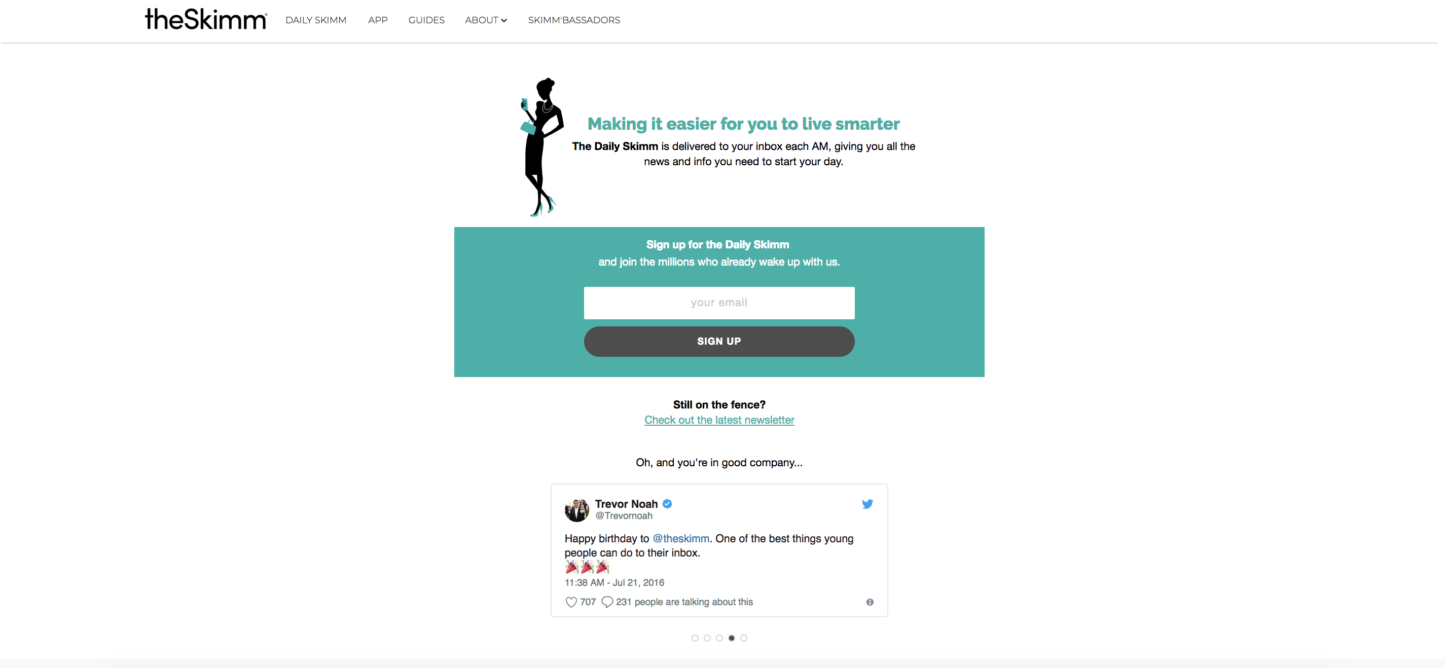
So theSkimm isn’t your typical blog, but rather a daily newsletter that catches you up on the top things happening in the news today.
I included them in this list because the strategy behind growing their subscriber list is basically the same as it would be for a conventional business blog.
On their landing page, they do a great job of highlighting their social proof by including the number of subscribers and celebrities that have tweeted about them. While your customer base may not be full of high profile celebrities adding in testimonials from highly recognized companies in your space can have the same effect. They also keep the copy and form short, allowing the social proof to speak for itself.
10. Vidyard

Vidyard uses their blog subscribe to really showcase what they do; video.
They include a quick 1-minute video that highlights why a visitor should subscribe to the Vidyard blog, really selling themselves through the medium they focus on. Plus, the dinosaur moving across the screen really pulled me in to click play and is a great nod to their playful brand.
11. Moz
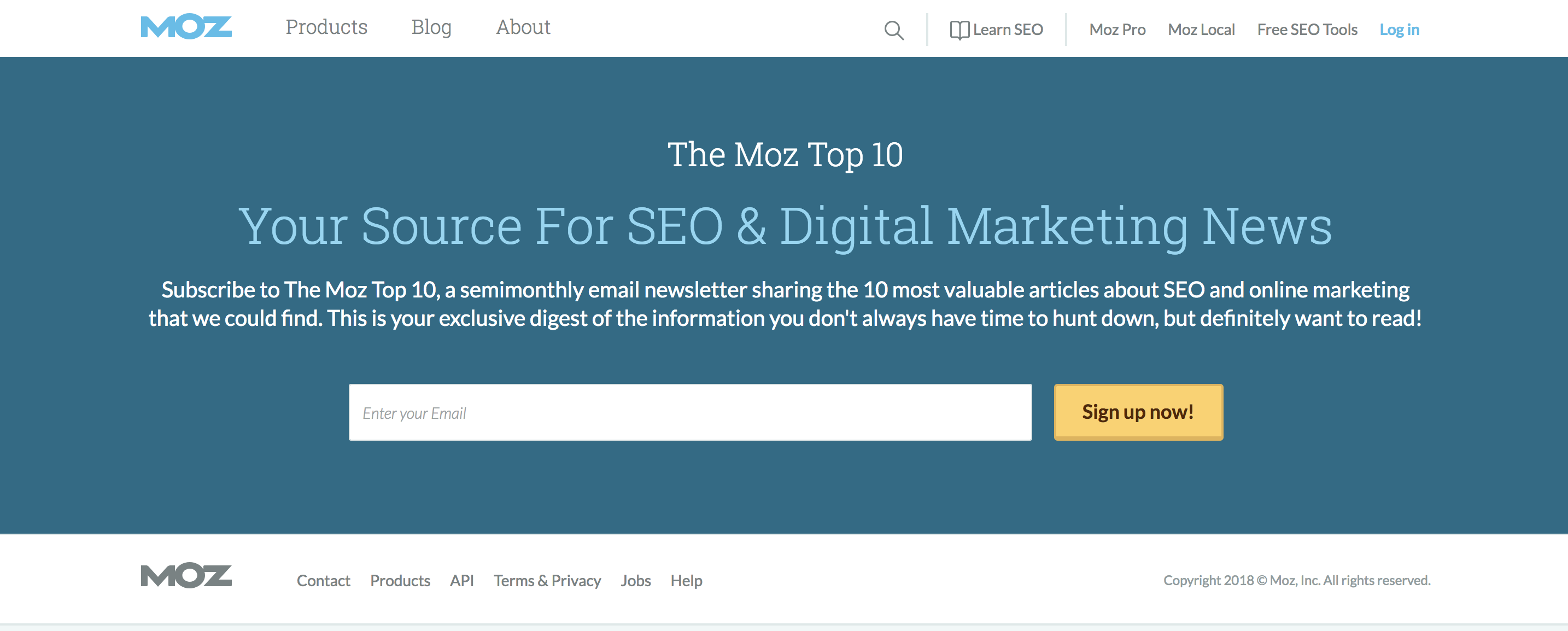
Moz keeps it simple. They focus on selling the value behind a subscription and solving their personas pain points saying, “This is your exclusive digest of the information you don't always have time to hunt down, but definitely want to read!”
Moz knows their customers are busy people so they make sure they address that, but also show why they should take the time to read what they have to offer.
12. Basecamp
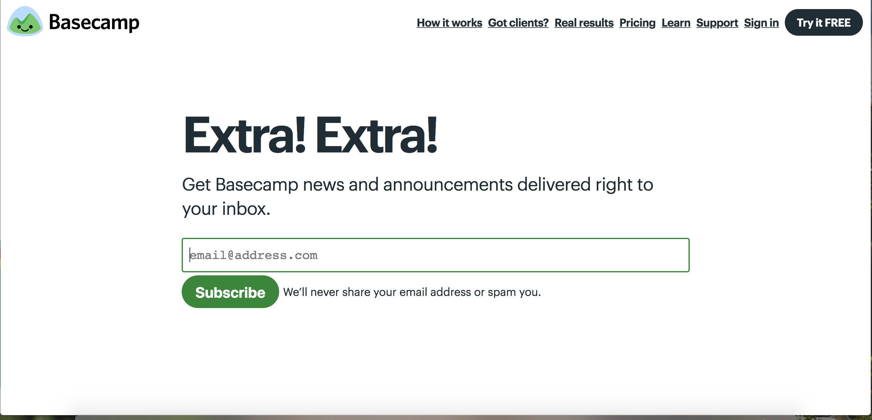
Basecamp is another company that keeps it simple. They’re to the point, letting you know exactly what you’ll get by subscribing to their blog and what you won’t get (your information shared). Since Basecamp is a platform to help you feel less busy this speaks to their brand perfectly and showcases the type of content you’ll receive from them.
13. Drift
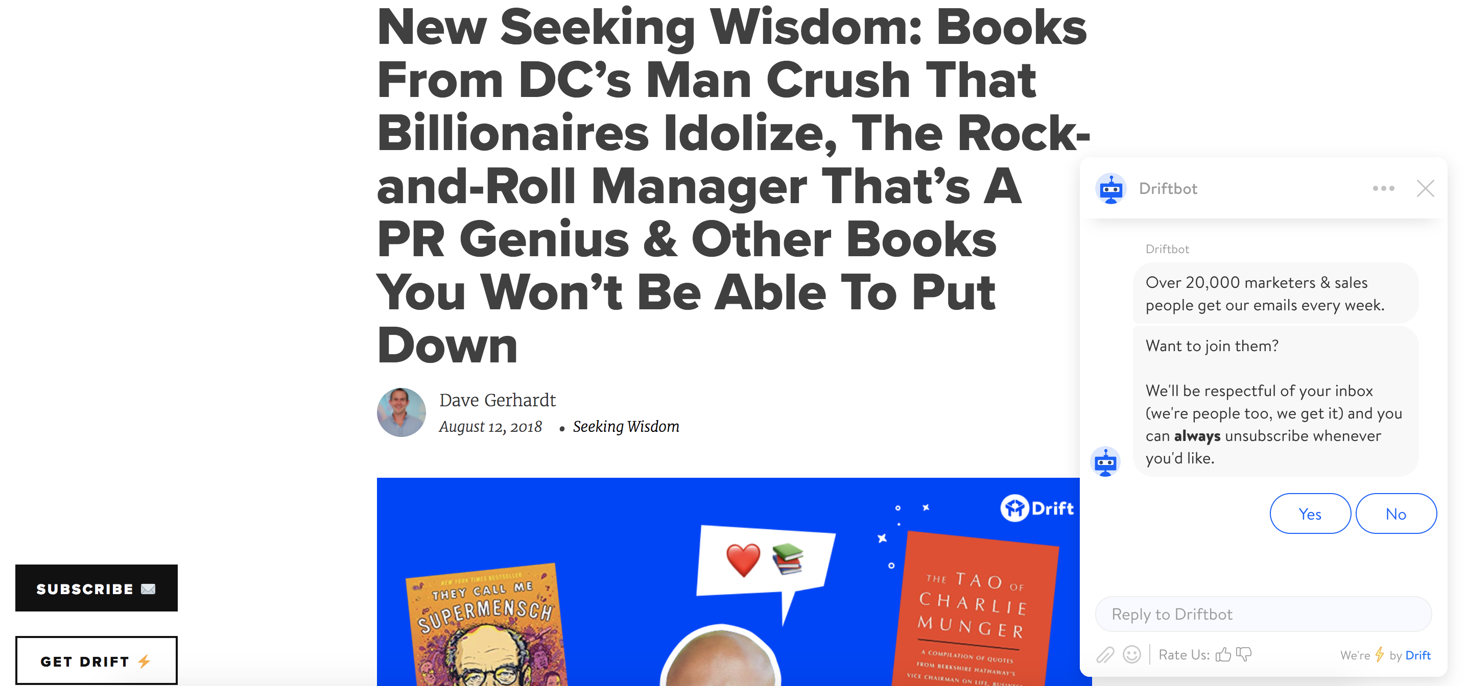
I love the way Drift does their blog subscription because like the two companies above, it’s so perfectly on-brand!
Known for getting rid of forms, on this landing page, you use Drift’s chatbot to subscribe to the blog.
In the copy, you’re also hit with some social proof to encourage you to subscribe, but actually getting to test out their product while doing so is a clever touch.
This is a great way to nurture leads since they’re experiencing what they would actually get if they become a Drift customer.
14. Seth’s Blog
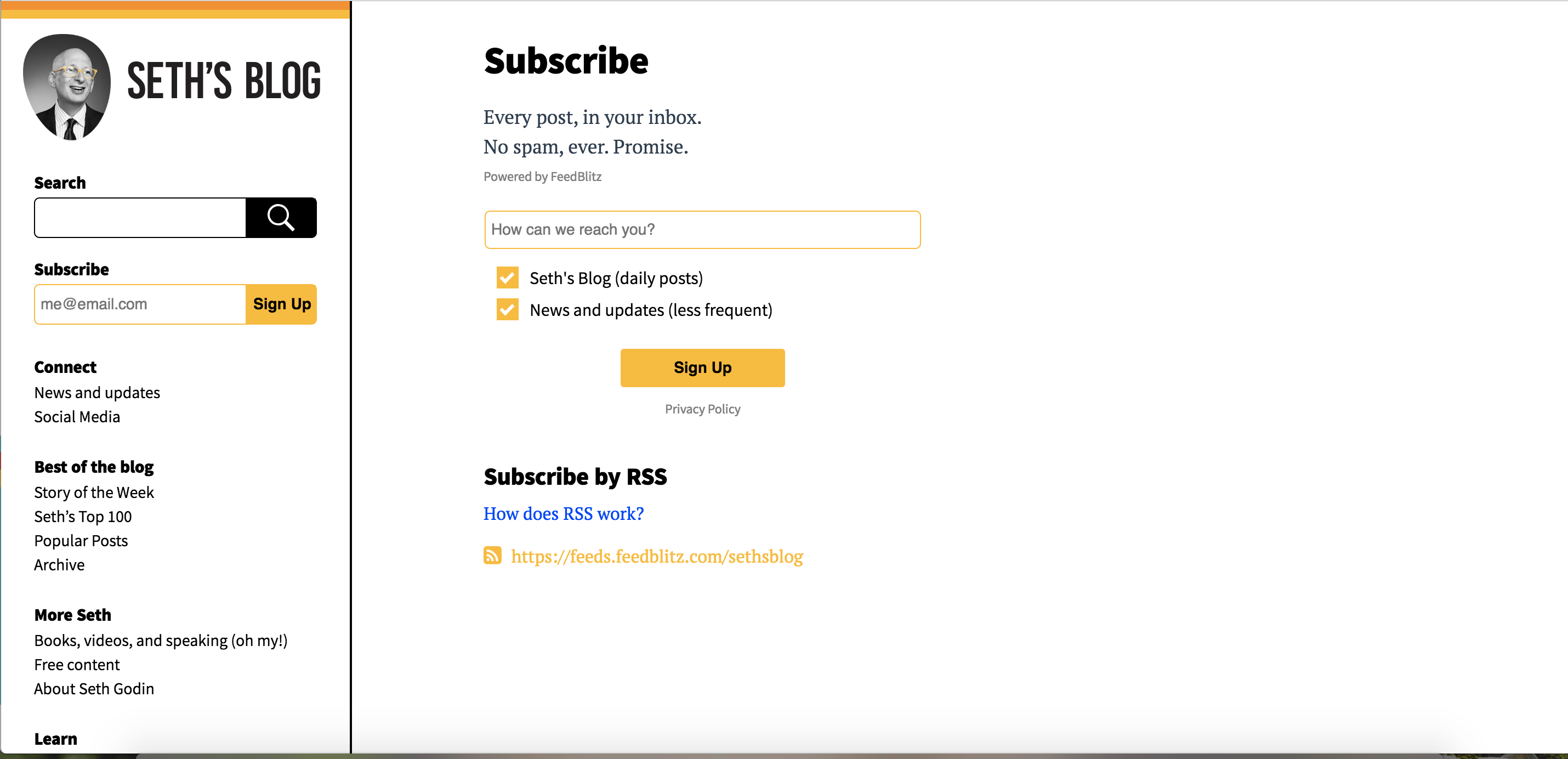
Seth Godin’s blog is another one that’s right to the point while informing subscribers exactly what they’ll get.
He makes the process easy for you to quickly subscribe and then continue on reading his content. Seth also builds trusts, making the subscriber a promise to never spam them.
15. Tableau
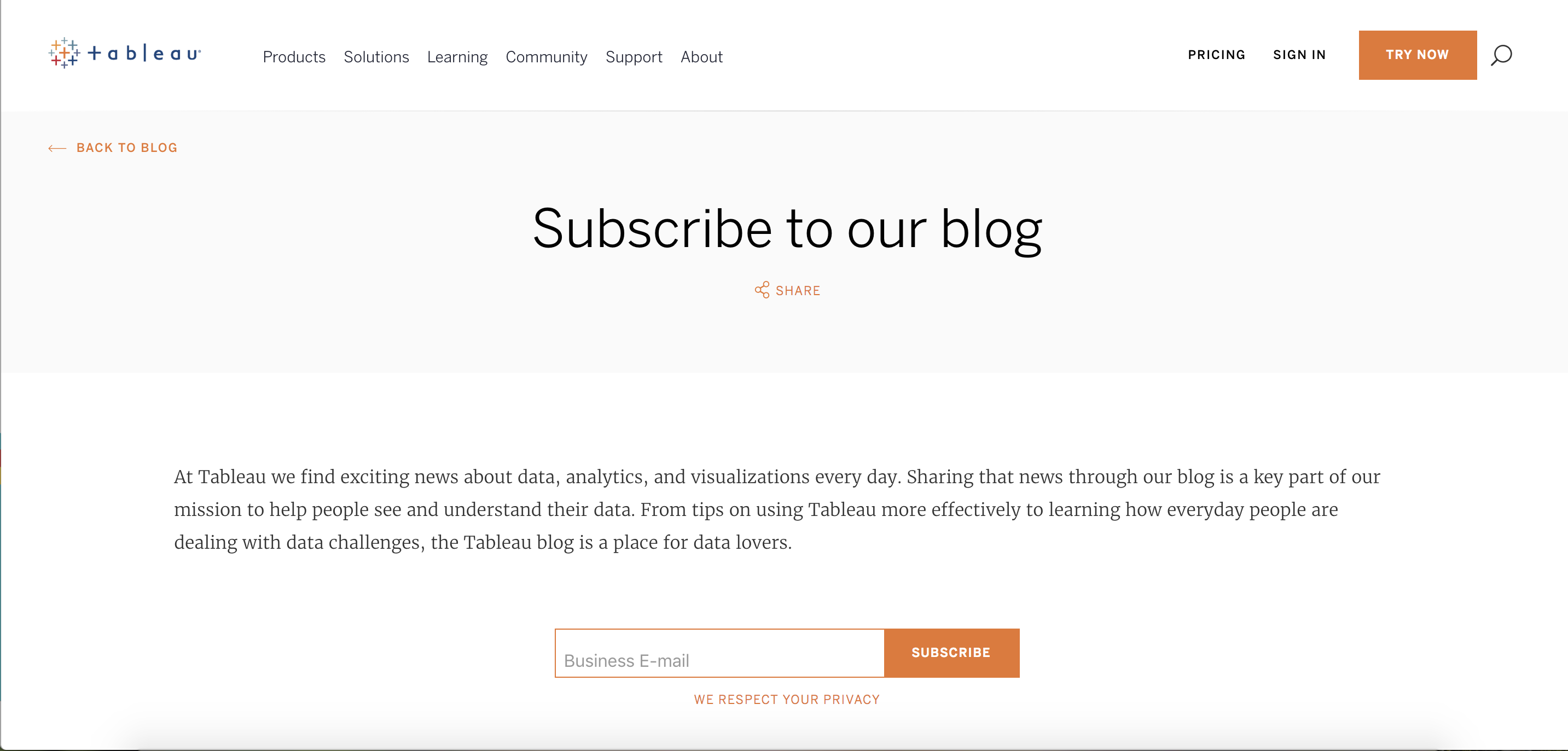
Tableau puts a unique twist on a typical social proof, encouraging the person subscribing to share with their friends.
They know that people are subscribing for a reason so why not capitalize on that by having them refer their friends in the process? It’s a fast and effective to spread awareness and build your subscriber list quickly!
As you can see, in order to bring in leads from your blog, you need a strong subscriber base and to get a strong subscriber base, and a strong subscribe page can help you get there.
Blog subscriptions are often the first touch point in a future customer’s relationship with a brand, so you want to make sure you make that as easy and appealing as possible. Get started either creating or optimizing your subscription page today and share with us your pages below!
(And if you're using video — and you should be — we have a great article on how to get more YouTube subscribers you should check out.)

Order Your Copy of Marcus Sheridan's New Book — Endless Customers!

