Topics:
Marketing StrategySubscribe now and get the latest podcast releases delivered straight to your inbox.
 "I know what good design is, but I don't know why.”
This is probably a thought you’re super familiar with. Good design is intuitive, expressive, structured, and informative; all of the elements you hope would present on your website, especially on your landing pages.
Designing a landing page is tougher than it may seem.
Figuring out what elements go into one that is both beautifully designed and high converting can be extremely difficult.
Even if you are familiar with some basic design principles, there are so many pieces that go into the puzzle of an effective design, it can be hard to arrange them into a full, functioning picture.
With this pain point in mind, here are 3 tactics that I find essential when designing a successful landing page.
1. Strategic Positioning
So you have a sweet new offer that the world is ready to see, but what does it matter if the user doesn’t know what to do or where to go when they get to the page?
As a designer and a marketer, you need to guide them. Consider strategically placing elements around your page to direct the user to where you need them to be in order to convert and also provide them with crucial decision-making information.
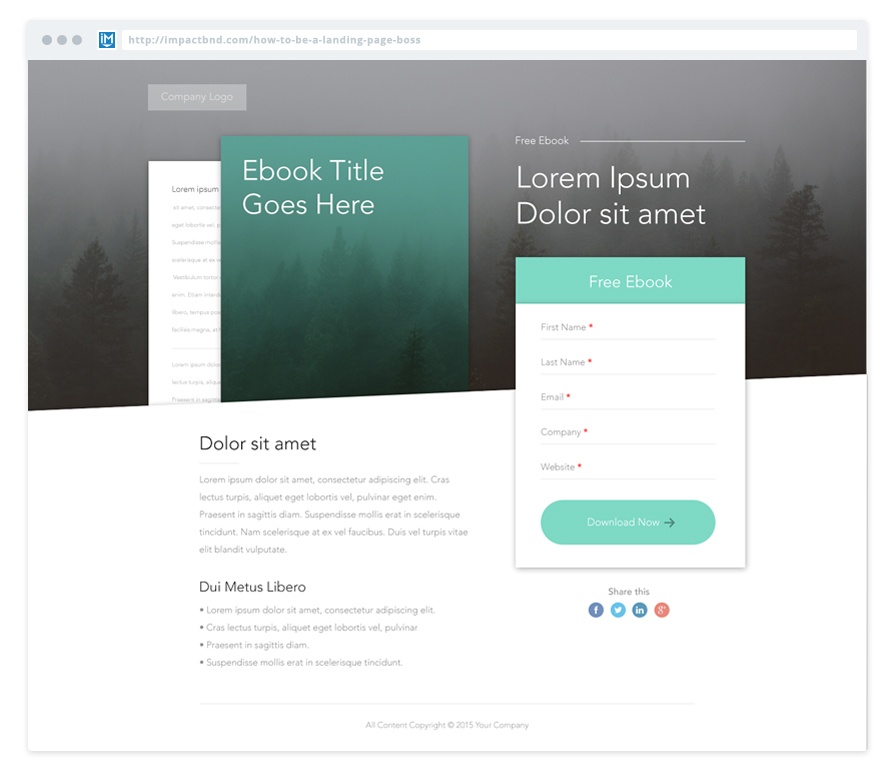
To illustrate, take into account what is immediately visible above the fold when you first land on the page in the image below.

Here you’ll see that the form is above the fold, along with other important pieces like the offer title, company logo, and resource artwork.
These are all things that people look for when they first arrive on an offer landing page. With them, they know that they're still on the same site, what they're getting, and even how to get it, without scrolling. The conversion path is simple, clear, and free of clutter.
Also, like the example above, you can position pieces to compliment and contrast each other. Your positioning can stress visual hierarchy and help with readability (i.e. the ebook artwork is the largest element of the page, reflecting its importance in relation to everything else.)
2. Color Choice
Color choice and positioning work hand-in-hand. In combination with cleverly positioned elements, color can tell the user what to do and where to go at a single glance.
For example, contrasting colored elements that you want the user to notice (i.e. a CTA button) with other, less important, elements on the page, can catch the eye and inspire action.
One way to make sure that your use of contrasting color is communicating to the user properly is to perform “The Squint Test.”

Squint your eyes and look at the landing page in our example. What elements appear to be the heaviest?
The form header, form button, and eBook artwork should appear to be the heaviest, even with the hero being so dark. The green contrasts with both the white and black backgrounds calling the most attention to them.
3. Visualizing Written Content
At a glance, text is text. It all looks the same. It doesn’t inspire emotion or action. The only way to get the message is to read it and today, not many people are willing to take the time to do that.
Reading takes more effort than visualization. Knowing this, compliment your written content with visual elements to break it up into smaller chunks. For example, use icons, bulleted lists, or photography to compliment the written idea on the page.
In the example above, a hero image related to the design or topic of the eBook adds a larger visual cue of what the user might be getting, without confining it to the limitations of the cover.
You’ll also notice in the right-hand corner, a faint line leading to “free eBook.” Consider adding more subtle visual aids like this to draw attention to important information that is otherwise overpowered by other elements color or size.
Key Takeaway
Overall, the best performing landing pages use a combination of all three of these conversion-focused design elements.
Applying these are critical to the success of your landing pages because they transform your content from plain text to a visual road map.
It’s critical to define a clear hierarchy on your landing page for the user to easily understand.
It’s just as important to add visual cues that tell the user what is interactive, important, and where to go as it is to tell them in text.
On top of it all, a polished, presentable landing page helps improve your overall user experience, “delighting” your audience, and helping mold a positive image on your business and offer.
Still need a place to start? Download this free PSD and start plugging in the elements of your landing page.


Order Your Copy of Marcus Sheridan's New Book — Endless Customers!

