Subscribe now and get the latest podcast releases delivered straight to your inbox.
4 Copywriting Mistakes That Are Killing Your Blog Conversions

May 11, 2015

 Was it something I said?
Hate to break it to you, but if people are not subscribing or converting on your blog, it probably was.
As an integral part of the awareness phase, your blog is often the first interaction a consumer has with your website and brand, so it’s crucial that you get the conversation started off right.
79% of companies with a blog reported having a positive ROI in 2013, but if you don’t know your buyer persona or have a thorough blog strategy in place, you could very easily alienate a large part of your audience.
To help you avoid this and increase your blog performance overall, here’s how to fix some of the most common copywriting mistakes.
1.“Sensationalized” Headlines
Nothing leaves someone rolling their eyes more than a sensationalized headline. Think of it like the evening news:
Yes, these headlines grab your attention and pique curiosity, but it is usually in a negative and over-the-top way.
More often than not, these headlines also don’t deliver on the promised “sensation”, and readers are left feeling tricked and their curiosity unsatisfied.
A misleading experience like this shines a negative light on your organization. It “cheapens” the quality of your content and also creates the impression that your brand will do anything to close the deal (which definitely doesn’t help in building trust.)
Fortunately, when done right, curiosity can be an invaluable copywriting tool. In fact, in a recent test performed by Copyhackers Joanne Wiebe, use of the “Curiosity Gap” increased clicks on the MadMimi pricing page by 927%.
What Can You Do? Avoid the tabloid approach of over-promising in your headlines with flashy words or putting a dramatic spin on your story/offer. Instead, tastefully open the curiosity gap in your copy by:
- Asking a Question
- Taking a Bold Position (on a controversial or trending topic)
- Probing Self-Reflection
- Omitting Key Information
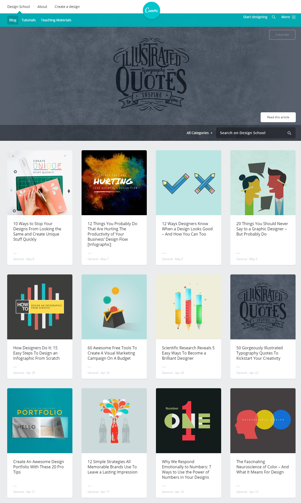
Canva does a brilliant job of incorporating these approaches into its Design Studio blog:

Much like Buzzfeed and Mashable, Canva uses listicles, omissions, and bold positioning to grab the reader’s attention. Unlike its counterparts, however, Canva aims for subtlety and ensures that the “sensation” ignited by its headline is equal to the value delivered on the click. Take these titles for example,
- 10 Ways to Stop Your Designs From Looking the Same and Create Unique Stuff Quickly
- Scientific Research Reveals 5 Easy Ways To Become a Brilliant Designer
- Create An Awesome Design Portfolio With These 20 Pro Tips
- How Sleeping And Afternoon Naps Make You More Creative
Instead of making outrageous claims about what their readers will get out of clicking through, they create a clear and direct knowledge gap by omitting the underlined information. By doing this, the reader knows exactly what they are missing out on and also what they’ll receive clicking through. No unrealistic expectations, no disappointments.
2. Buzzword Abuse
Buzzwords, by the very nature of their name, are designed to generate “buzz” amongst an industry audience, but let’s face it, their meaning is fleeting and extremely niche.
One day buzzwords are popular and easily-recognizable, the next they are so overused and misused that they no longer have an impact. (Not so helpful in the pursuit of evergreen content, right?)
What Can You Do? Overusing jargon or buzzwords not only date your content, but it can date your brand overall. When it comes to your blog headlines and copy, put these words aside and speak to your audience as you would in person to them.
Use words and a tone of voice that reflects the way you and your team actually communicate and that is consistent with your overall brand.
By using this tone that your buyer persona will respond to, you will be more likely to attract and resonate with them and, in turn, make them more willing to convert.
With this in mind, here are a few popular buzzwords from KissMetrics’ Neil Patel to put on your copywriting backburner:
- Collaborative
- Synergy
- Innovative
- Passionate
- Revolutionary
- Dynamic
- Driven
- Paradigm-Shifting
- Strategic
- Leverage
- Engagement
- Cutting-Edge
- Results-Oriented
3. Neglecting Customer Value
No matter what your line of business, most consumers couldn’t care less about what you do. They want to know what it’s in it for them; what the benefit is to them to keep reading.
Knowing this, whether it’s your headline, call-to-action, or article copy, frame your content in terms of its value to the consumer.
What Can You Do? The simplest way to do this is to opt for “you” and “your” statements over “our, “we”, and others referring to your company. Consider these two examples of headlines:
Which would you rather click? While Version A sounds like a boastful sales pitch, Version B sounds friendly and educational and speaks directly to the audience. It keeps the focus on the reader and tells you exactly what you will get by clicking through to the full article.
4. Poor Formatting
In our acronym-riddled, face-time generation, it doesn’t take a genius to see that heavy reading is not on many people’s regular to-do lists.
As a copywriter, you have to make the experience as easy and inviting as possible in order to attract and retain an audience and one of the smallest ways you can do this is through proper formatting.
You may have written the most useful and entertaining blog article in the history of blog articles, but if its presentation is intimidating and difficult to digest, no one will read passed the introduction (let alone, subscribe or convert on a full-blown offer.)
What Can You Do? Break up your content into small, easy-to-read chunks. Today, people are more likely to skim then read an article in its entirety, so use Visual Hierarchy to highlight your most important nuggets of information and guide the reader’s eye towards them. Consider formatting your content using:
- Short Paragraphs
- Bulleted Lists
- Numbered Lists
- Italics, Bolding, and Underlining
- Section Headers
- Charts
- Diagrams
- Relevant Images


Order Your Copy of Marcus Sheridan's New Book — Endless Customers!