Subscribe now and get the latest podcast releases delivered straight to your inbox.
 Think of your landing page as a gated community.
Beyond the gate lies access to all of your most valuable resources. I'm talking about ebooks, webinars, whitepapers, oh my!
It would be rude to leave your potential customers out, so instead you invite them in to explore the content that you've worked hard to produce.
However, the hardest part of converting visitors is finding a way to create an environment that encourages them to travel beyond the gate. Finding a way to leverage your landing page is a great place to start.
If your business is interested in lifting your current landing page conversion rates, we've supplied you with 4 simple ways to go about it.
Rethink Your Headline
On average, 8 out of 10 people will read headline copy, but only 2 out of 10 will read the rest. (Source: CopyBlogger)
While your headline may seem like a teeny tiny part of the collective whole, it is largely responsible for the rise or fall of the entire landing page.
Through the perspective of your audience, a stale headline ultimately alludes to a string of content that is zestless and trivial.
One of the most important things to keep in mind when brainstorming a headline that performs is leave behind the fluff. You want to put forth a headline that explicit enough to sustain itself. With no need to further explain the purpose, the perfect title will pack an actionable punch to kick start user interest.
Additionally, it is important to keep in mind how your audience behaves online. More than often they are turning to the Internet in an attempt to find a solution to their current problem.
What problem does your content aim to solve?
If your landing page boasts a headline that focuses on how the consumer will benefit from it, it will serve as the reassurance they need to move forward with your product or resource.
Scale Down Your Forms

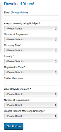
How many form fields does it take to scare away potential leads?
It's though to hammer down the exact number, however research has revealed that the optimal number of form fields is lucky number 7.
However we are firm believers that anywhere between 5-10 fields is a safe place to land. In fact, according to Eloqua, 61% of forms have 5-10 fields and convert 40% of unique visitors. Not bad, right?
Considering the size of your lead capture forms directly correlates to your conversion rate, learning how to scale down the number of fields you require.
Keep in mind that the goal of a form on a landing page is to collect the type of information necessary to advise your future marketing and sales efforts. You are specifically looking for information that will help you guide assessments, personalize user experience, and lend itself well to lead nurturing campaigns.
Alter the Color of Your Buttons
When it comes to the appearance of your landing page calls-to-action, a/b testing is the best way to come about a stylistic variation that will produce the best results.
It turns out that the color you choose for each of your CTAs has the ability to determine whether or not it will encourages conversions.
Forget 50 Shades of Grey, Gmail once tested out 50 different shades of blue until they found the shade that achieved the highest conversion rates. (Source: Quick Sprout)
While 50 may seem a bit extreme, the point is you want to implement a color that is going to stand out against everything else on the page. For us, blue does the job quite well!
We've placed these two landing page CTAs side by side so that you can clearly see the difference a little contrast can make:


While the first variation nearly pops off the page, the second one has us squinting in an attempt to make out the words. Don't make your visitors work for it! The conversion path should be as straightforward as possible.
Implement an Explainer Video
When it comes time to create content for your landing page, feel free to leave your long-winded poetry and fancy industry jargon at the door.
Strong landing pages are designed to clearly convey just enough information to hook you in the least amount of time.
On our landing page for our free eBook: Proving the ROI of Inbound Marketing, we created this video to do the talking for us..
While we still advise you to include a handful of informative bullet points to explain what exactly your audience can expect if they chose to fill out your form, a quick video like the one above is a great way to spark their interest.
Use the video as an attention grabber that can accompany a brief description of what it is you are trying to convert these leads on. Don't be afraid to use bold or italics text to emphasize the important keywords, and make the information as easily digestible as possible.


Order Your Copy of Marcus Sheridan's New Book — Endless Customers!

