Subscribe now and get the latest podcast releases delivered straight to your inbox.
These big brand blogs are designed for aesthetics and conversions. Takes notes.
We often hear the saying famously dubbed by Bill Gates - “Content is King.” Well if content is the king, your blog is your ambassador; it’s how you spread your message to the rest of the world.
This is why it’s absolutely crucial to have a blog that sets you up for success.
Having a well-designed blog that is easy to navigate will boost engagement and keep people coming back to read (and hopefully subscribing to) your content.
I know from personal experience that deciding where to start when it comes to a blog design can be a difficult task. That’s why I’ve compiled five of my favorite blogs to help get your design started off on the right track and fully optimized for conversion.
If you’re in the marketing industry, you’ve probably heard of Neil Patel.
Whether you’ve seen him talk at any of the industry's biggest conferences or read one of his many insightful articles, there’s no doubt that this guy knows his stuff.
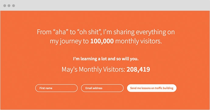
Looking at his blog, Neil does an incredible job of including key elements to keep users engaged and interacting with his content.
What It Does Right:
A Timeline Themed Layout
One thing you’ll quickly notice is the blog’s unique layout. Neil keeps his branding and design consistent with the rest of his site by integrating a timeline feel to his posts. This makes it easy to see which article is the most recent.
Bonus Points: He’s also taken advantage of an “Infinite Scroll” script that allows a person to keep scrolling through articles without ever having to hit a next/previous page button.
Strong Exit Intent
We’re starting to see exit intents, for lack of a better word, pop-up on more and more websites. These pop-ups are an effective way of getting your readers’ attention before they leave your site and offers them a reason to stay.
Neil uses this technique on his blog to offer his visitors free traffic building lessons.
2. Ambassador
![blog-design-example-ambassador.jpg]()
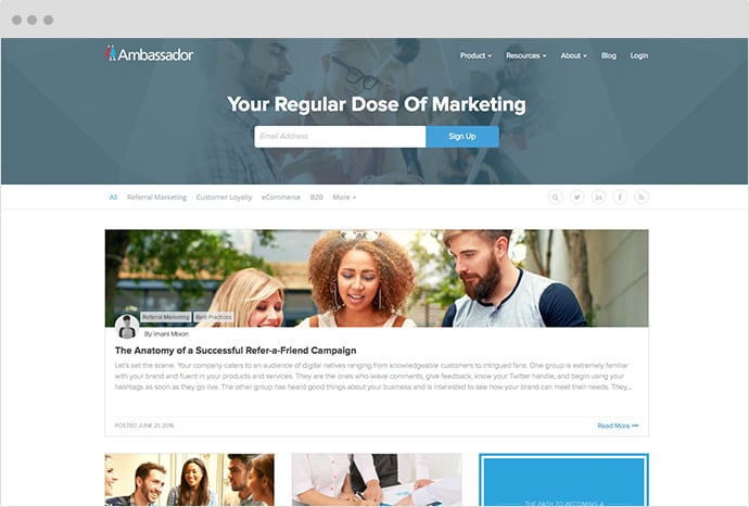
The folks at former IMPACT client, Ambassador are known for helping clients create profitable referral campaigns, but people may not know that they are also on top of their game when it comes to design.
One glance at the company’s blog and this becomes immediately apparent. They've implemented a clean, minimal card-based design, making it easy for viewers to sift through the latest articles.
What It Does Right:
Having a Card-Style Layout
We’ve become familiar with the “Card-Style” layout from sites such as Pinterest and Twitter.
Ambassador has taken advantage of this familiarity and worked it into it’s blog. Using this approach presents first-time visitors with a familiar interface which removes any initial friction and makes it easy for people to get the information they’re looking for. It also capitalizes on visuals.
Displaying an Author Headshot
In a physically-disconnected world, it can be easy for readers to forget that there’s actually a human being on the other side of the computer; someone who’s writing beautiful, engaging content for them to read.
You want your readers to sense your authenticity and personality while on your blog; you want to humanize your brand. Ambassador accomplishes this by including an author name and headshot right on the card of every post.
This helps put a face to a name and creates a human connection before a user even clicks into an article.
3. Canva
![blog-design-example-canva.jpg]()
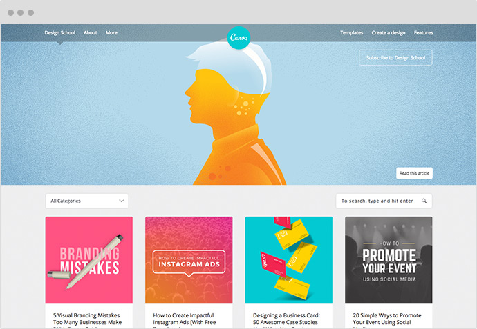
With Canva being a go-to design tool for many marketers, it isn’t surprising that the company has a killer blog design.
What it Does Right:
A Responsive Experience
Another important benefit of a card-based blog design is the consistent user experience it creates regardless of what type of device you’re on.
View Canva’s blog on any device (or in any browser) and you’ll notice every card sizes down perfectly without sacrificing the featured image visibility or readability.
Contrast of Color to Make Cards Standout
One of my favorite things that Canva does on its blog is the use of a subtle gray background that contrasts the white color of each card. This makes each card more prominent. Using contrasting colors like this on your blog is a useful technique to give more visual importance to different elements.
4. Wrike
![blog-design-example-wrike.jpg]()
Wrike, a project management software, welcomes users to its blog with a striking hero image, paired with content that introduces users to the type of information they can find on the blog.
What it Does Right:
Visible Subscribe to Blog Area
Creating opportunities for your readers to easily subscribe and receive regular updates from your blog is essential to any inbound marketing campaign -- yet it’s often overlooked.
Wrike gives people the opportunity to subscribe right at the top of its blog. Its subscribe button contrasts nicely with the background image making it easy to find and its subscribe form also opens in a pop-up box allowing users to subscribe without the added step of having to go to a new page.
CTAs Built into Layout
It’s no secret that giving a user more conversion points is going to help you increase your overall conversion rate. Wrike includes different conversion points in its blog design that speak to people who are different parts of the sales funnel.
5. Kissmetrics
![blog-design-example-kissmetrics.jpg]()
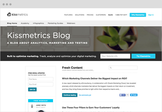
Now, Kissmetrics takes a different approach to their blog design than the other blogs in this post. With longer post excerpts and no featured images its layout puts more of a focus on the content they create.
What it Does Right:
Sticky Subscribe Form
Earlier I mentioned the importance of giving readers the ability to subscribe to your blog.
Kissmetrics takes this one step further by giving its readers the ability to subscribe from anywhere on the page. To do this, it has implemented a subscribe form that follows users down the page as they scroll through blog articles.
Social Sharing Counts
A simple hack to entice users to read an article is including social share counts. Kissmetrics displays the amount of Facebook and Twitter shares an article has. Although someone may not want to share an article before reading it, seeing a high number of shares can pique attention and curiosity to see what the article is all about.
Want a business blog up to par with these examples?
For $799, you can get the same exact design we use on the IMPACT blog along with all of the subscription features we use on your company’s website!
Our team has just created and launched an exclusive, fully-optimized HubSpot COS Blog that will implement several of these tactics for you as well as be entirely mobile responsive, cross-browser tested, and load quickly to bring the best experience possible to your readers.
Want it for your business website? Get it here right now!
Free: Assessment


