Subscribe now and get the latest podcast releases delivered straight to your inbox.
5 Best UX Practices to Increase User Flow on Your Consultation Pages

Jul 16, 2015

When you're in the self-checkout line at the supermarket, you typically don't have to think too hard about the actions you'll need to take to successfully purchase your groceries (and if you do, well, that's just poor UX).
This was the goal the designers of the machine planned for when creating it; the ability, for you, a typical shopper, to be able to purchase your products with ease. This is done by breaking up the actions into easy-to-follow steps using voice commands to describe each, then creating an interface and machine that reflects how to complete these actions.
Just like a self-checkout machine, your consultation page should avoid making the user second guess where they are, what they need to do, and what steps will be happening next.
This is why you need to mold your consultation page into a lean, visually understandable location that users will feel comfortable converting on. Once you manage to get it right, you'll be that much closer to successfully growing your business.
To understand what elements are a necessity in keeping your users fluently funneling through your consultation page, here are 10 best practices to help simplify the path to convert.
Get the Page to Load Quickly
It’s no secret that people like websites to load quickly, even Google agrees.
So why even bother thinking about the layout of your consultation page if your users have to wait too long to get to it?
Surveys by Akamai and Gomez.com show that users expect sites to load in 2 seconds or less and will even abandon sites that take 3 seconds or longer. Even just a 1 second delay in your pages responsiveness has shown to cause a 7% reduction in conversions.
To try and recognize if this could be causing issues for your conversions, try testing your website on WebsitePageTest, Pingdom, or Google's good ol’ Page Speed Tool which is available both as a chrome extension and a web tool.
If you notice you could benefit from increasing the sites speed, try asking your developers to use these tips to help optimize it. Once you get that squared away, you’re now ready to begin looking into the page itself.
Use Appropriate Imagery and Icons
So your users have arrived on your consultation page, and to make sure they immediately understand where they are, you need to create a visual environment on the page that relates to its purpose and goal.
Take a look as Let’s Travel Somewheres contact page for example. The websites goal is to display the beauty of the world through captivating images and stories as the websites owner travels.

To keep the theme of travel consistent, they decided to use a postcard as the container for their content, stamp and all, while also adding in some smaller icons that signify different modes of transportation.
Utilizing specific elements like these not only keep the theme of one’s site consistent, but also adds delight and personality to the page, something a plain black and white page tends to not achieve.
Keep The Content Short, Engaging, and Accessible
By the time your users reach your consultation page, they typically already know what your company does and are beginning to consider utilizing your services/products.
That being said, the content on this page shouldn’t be displayed in long, daunting paragraphs discussing more information about your company, or steps further down the line your user isn’t thinking about taking yet.
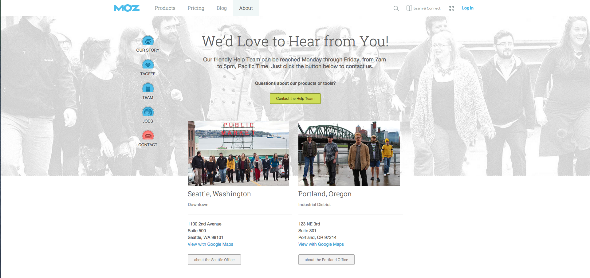
Instead, keep it short like Moz did. Let the user know immediately of what will happen next (receive a phone call, email, smoke signal, etc.) and, if applicable, bullet points of what it will achieve.

After you shorten up the content to only the bare essentials, try making the font size larger than normal to fill up some of the extra space you created. This also draws the visitors attention to your content first, rather than a large form you may have waiting nearby.
Get the Form Above the Fold
Since filling out the form is the last step people tend to take on your consultation pages, we’ve become accustomed to putting it at the bottom of the page below the hero, content, images, and testimonials.
While your page may be decently short despite all this information, it is that many more sections the user has to go through to get to the form.
To get rid of those steps, try moving the form above the fold like Salesforce did with necessary information in close proximity. Put any information that doesn’t directly affect what happens after submitting the form below the fold, so it’s out of the way.

In the case that your form is too long to fit, try removing the labels and put placeholder text inside the fields instead. If you happen to already have their information, take it a step further and pre-populate the fields with that information to reduce how much they need to fill out before pressing that submit button. If it’s still not working out, consider doing a step by step form fill like Chipotle did.
Add Tooltip Hints and Utilize Early Error Checking
We all make mistakes when it comes to filling out forms, whether it’s due to our own mechanical mistypes or a lack of understanding of a step causing us to enter something incorrectly.
In most cases, users aren't notified of their mistakes until they press the submit button and errors pop up.
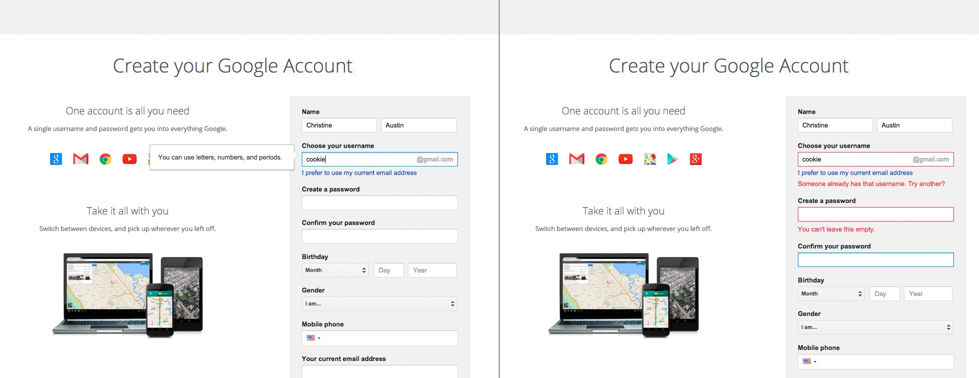
Rather than showing the errors after the user presses submit, try incorporating what Gmail does and make it so your forms give helpful tips and error checks as you fill out the form indicating when something is wrong and why.

This functionality allows users to go back immediately and correct the mistake they made, rather than adding friction since the user will need to repeatedly press the submit button to figure out whether or not the information they’ve entered is correct.
Free: Assessment