Topics:
Lead GenerationSubscribe now and get the latest podcast releases delivered straight to your inbox.
When I was growing up, I learned a lot from my older brother's mistakes.
(One time, Derrick said the "f-word" at the table and he got his portable CD player and Game Boy taken away for two weeks!)
While these lessons definitely helped me dodge a couple bullets, I'll admit that there was nothing more telling than the lessons I learned from my own mistakes.
Sure, it's easy to play it safe, but the following studies are proof that there is value in shaking things up.
While their outcomes shouldn't serve as the end all be all, the goal is to provide you with enough inspiration to fuel your own conversion rate optimization tests.
Location, location, location
Having CTAs on your website doesn't guarantee conversions. Factors like copy, color, and perhaps most importantly, placement all contribute to the performance of your button.
This isn't to denounce the importance of those other factors, but when it comes down to it, it doesn't matter if your CTA is red or green if no one can find it in the first place.
Aware of the importance of placement, Kimberly Snyder decided to run a test to determine whether she should incorporate her "Add to Cart" CTA above or below her explainer video.

After analyzing a heat map of the page, she noticed that people stopped scrolling after the video, leaving her CTA underneath untouched.
By relocating the CTA to the top of the video, she saw a 38% increase in conversions. (Source: QuickSprout)
Actionable tip: Heat maps can be used to reveal strategic opportunities for improved conversions on your website. Understanding the way people are behaving on your website makes it easier for you to design a format that aligns with their actions. Not sure how to get started? We suggest checking out CrazyEgg.
Be mindful of details
Addressing a pain point up front will helps to transform skeptics into leads.
If your audience is crunched for time, your solution has to be time-friendly. Remember, your goal is to reduce pain, not pile on.
A simple landing page test from Unbounce's Michael Aagaard revealed that positioning your content to speak to a visitor's apprehensions has the ability to increase conversions.
Aagaard took to the landing page for his ebook 7 Universal Conversion Optimization Principles to test two different bullet points.
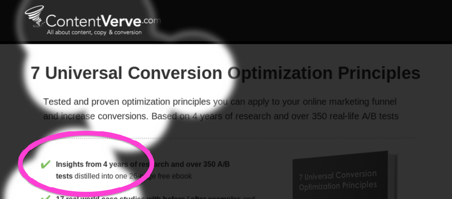
A) Insights and experience from 4 years of research and over 350 A/B tests distilled into one 26-page free ebook
B) Read the book in just 25 minutes and get insights from 4 years of research and over 350 A/B tests
391 downloads later, he found that variation B increased conversions by 18.59%.
Actionable tip: When writing landing page content, question every sentence you put forth. Why should my audience care? How does this make their life easier? Does this appeal to their pain points? By addressing the time issue upfront, Aagaard was able to position his offer has something that seemed more manageable for his audience.
Less is more
Psychologist Barry Schwartz explains that while choice provides people with freedom, which translates to welfare, too much choice has been known to have a crippling effect on our ability to make decisions.
The reason being that too many choices lead to too many decisions which ultimately increases buyer anxiety.
Worried about overwhelming his audience, QuickSprout's Neil Patel decided to test whether or not the number of social sharing choices has an effect on his audience's decision to take action.
In doing so, he increased the sharing options by adding both LinkedIn and Pinterest to the Facebook, Twitter, and Google+ buttons he already had in place. The results revealed that increasing choice actually led to a 29% decrease in sharing.

Actionable tip: More options don't automatically translate to more action. When determining which buttons to include on your website, be sure to reference your buyer personas. Just because Patel chose to stick with Facebook, Twitter, and Google+ doesn't mean that you have to. If your ideal audience spends a great deal of time on Pinterest, swap one out as you see fit.
Simplify everything
Kilt shopping can be stressful (or so I'd assume.)
Aware of their overwhelming inventory, Buyakilt.com decided to incorporate a product filter option on their website to determine whether or not it would influence conversions.
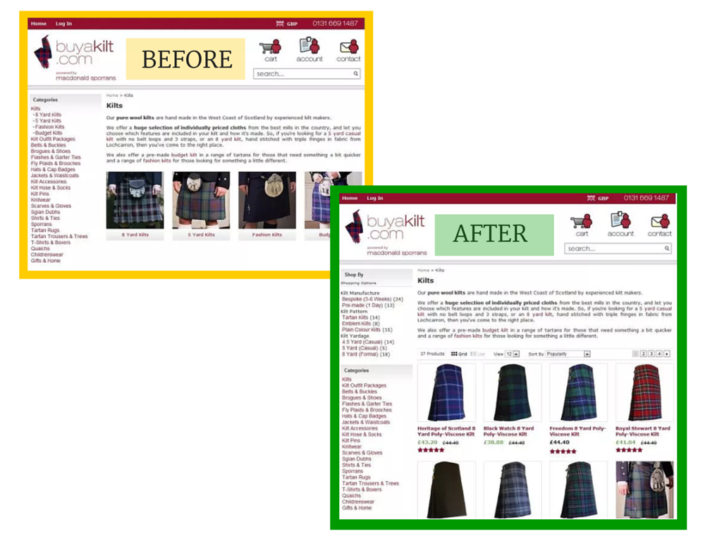
They found that implementing filters lead to the following:
- 76.1% increase in revenue
- 26% increase in conversions
- 19.76% increase in shopping cart visits
(Source: Visual Website Optimizer)
Not bad, right?
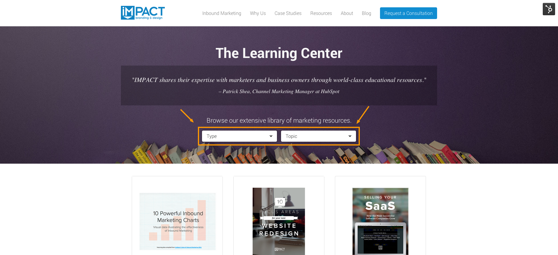
Actionable tip: Don't sell kilts? No problem. There are handful of alternative ways to incorporate filters on your website to improve the user experience. We added drop-down menus to IMPACT's Learning Center to make it easier for people to uncover the resources that best suit their needs. Check it out:
Give to receive
This case study is a bit of a throwback, but the lesson learned remains valuable.
If you offer a service or software as a service, it's likely that you're offering some sort of free trial to prospective customers.
While HubSpot initially offered a free 7-day trial, they couldn't help but wonder if extending the trial period would have any influence on conversions.
Was 7 days really enough time for a prospect to make a decision?
Here's what they tested:
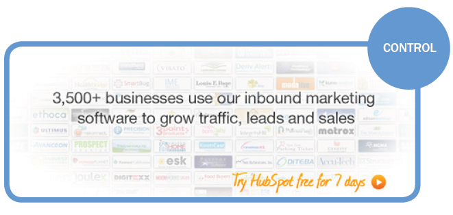
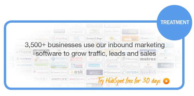
In doing so, they found that the 30-day trial was able to create a 110% increase in free trial requests. (Source: HubSpot)
Actionable tip: Don't be afraid to give away a little more than you're used to. While this approach proved beneficial for HubSpot in terms of free trial submissions, there are tons of other ways to apply this lesson to your marketing. If you just uncovered an awesome hack that helped you double your email list, detail it on your blog. Giving away your secrets is a great way to earn the respect of your audience, and in turn, receive more from them.

Order Your Copy of Marcus Sheridan's New Book — Endless Customers!

