Topics:
Marketing StrategySubscribe now and get the latest podcast releases delivered straight to your inbox.
5 Killer Ways for Optimizing Your Marketing for Mobile

Nov 21, 2014

 The following is a guest post by Derek Moryson, the Content Marketing Fellow at Unbounce.
As 2014 draws to a close, smartphone penetration in the U.S. is nearing 75%.
After years of predictions about mobile being the future of marketing, Eric Schmidt of Google put it best: Mobile has won.
As a result, we're begining to hear terms like "mobile first" and "responsive design" being tossed around pretty generously. However, hearing and understanding are two very different things.
Aware that I can’t be the only one who reaches for my phone from bed first thing in the morning, it's important that as marketers we understand what "optimizing your marketing" campaigns really means.
Let's set the record straight.
Optimizing your marketing campaigns for mobile is really about understanding:
- Your prospect’s device - What screens are they using and does your campaign work on all of them?
- Your prospect’s intent - Where are they in the conversion funnel? Are they ready to buy or just doing research?
- Your prospect’s context - Does your campaign take into account where your prospect is and what they’re doing when they’re engaging with your offer?
With that said, below is a list of terms and tactics that will help you optimize your online campaigns for mobile, create better experiences for your prospects, reduce friction, and ultimately drive more conversions.
1. Build a mobile-responsive landing page
First, let’s be clear. As Conversioner’s Talia Wolf has said, responsive design is not a mobile optimization strategy in itself. However, if you’re sending campaign traffic to a dedicated landing page (as you should be) and it doesn’t render well on just about every screen size, then you’re missing out on conversions.
Here are some “best practices” to keep in mind when building mobile-responsive landing pages:
Reduce the number of touch events
As digital marketer Ray Pun points out, “your prospects don’t want to touch, pinch, drag or swipe five times to get to the end zone.” Design your mobile landing page experiences to get your prospects to conversion as easily as possible. This means shortening forms and reducing clicks. (More on this later.)
Make sure your CTA appears front and center
In a perfect world, your CTA should appear above the fold. However, sometimes you need to do a little more convincing before making the sale. In those cases, Angie Schotmuller recommends creating a smaller version of your form CTA at the very top page, typically below the logo.
Limit the number of mobile landing page elements
Whether they’re on the go or simply constrained by a smaller screen, mobile users are more likely to be deterred by landing page experiences that cause friction. Don’t give them a reason to bounce by cramming your pages with too many elements. Here’s where that buzzword mobile first comes in. When designing your landing pages, focus on the elements that support your call to action and eliminate the rest. This won’t just improve your mobile campaigns but will make your landing pages cleaner, clearer and higher-converting in general.
Scale your page to fit both portrait and landscape views
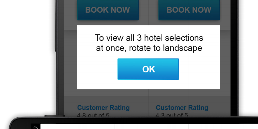
There are hundreds of different screen sizes. Your job is to ensure your landing page adjusts to as many as possible. If your landing page functions better in landscape, tell your users to rotate their device right on the page - see below:

Don’t be afraid to guide your users. Image via Google.
Creating a mobile-responsive landing page for every campaign doesn’t have to be difficult. Check out some of Unbounce’s responsive templates to get started.
2. Write mobile-optimized copy
The mobile first approach also applies when writing your landing page copy. Tailoring your copy for mobile users from the get-go will force you to cut the fluff and focus on messaging that serves your campaign goal.
To boost conversions on your mobile landing pages, try the following copywriting tactics:
Have a strong unique value proposition
You unique value proposition or UVP is a clear statement that describes the benefit of your offer, how you solve your customer's needs and what distinguishes you from the competition. This needs to be clearly communicated on any landing pages, but in the mobile context it’s especially important that it’s the first thing prospects see on your page.
Maintain strong message match
Remember that your landing page doesn’t exist in a bubble. Prospects arrived there via an email blast, social update, blog post or pay-per-click ad. In any case, but especially for PPC ads (not least of all because you’re paying for them) make sure the headline on your landing page matches the message in the ad that brought people there. If they search for red shoes and clicked an ad promising red sneakers, don’t send them to a landing page with the headline “order awesome blue speakers.” Again, strong message match is important on any landing page but it’s critical when you’re targeting users in the mobile context where any bit of friction is conversion killer.
Keep your headlines and bullet points short
Mobile users scan first and read second (if they read at all). As a rule of thumb, your mobile headlines should be short and focused. According to Outbrain, 4 to 8 words is ideal when it comes to clickable headlines. Longer headlines and copy could make sense if your offer is complicated, but save the essays for the desktop version of your page.
Make sure your content loads quickly
This is more about the images and videos on your page than the copy, but it’s all related. Not only do mobile users have short attention spans; they probably have slow internet connections (especially if they’re on a 3G network). Make sure your image and video files aren’t weighing your page down.
3. Create mobile-friendly forms
If you’re running a lead generation campaign, you’ll be using a form to obtain your prospect’s deets.
Given everything we’ve learned about mobile users, that means your lead gen forms need to be super easy to understand and fill out. Recent Google research suggests that when designing forms for mobile pages, digital marketers should:
Design forms to automatically present number keypads
For example, if you click on the zip code field you’ll automatically be presented with the numeric keyboard. It’s a small detail, but one that goes a long way in reducing friction.
Ensure forms automatically advance visitors through fields as they enter their information
Again, don’t make them do more work than they have to.
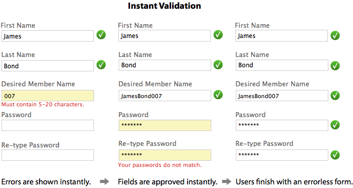
Validate information entered into forms immediately
You don’t want your prospect to have to submit a form multiple times before they get it right.

Image via Ux Movement.
Include a click-to-call button
Be sure to include a CTA on landing pages that feature complex products or services. Your prospects may have more involved questions that you don’t have space to answer on a landing page. Give them the option to reach out to you for an answer – if you have the bandwidth to offer support, that is!
The best way to reduce friction on a mobile form is through speed. If it takes too long for someone to complete a form, your conversion rate is going to feel it. Save yourself and your prospects unnecessary pain by doing as much work for them as you can.
4. Optimize your campaign for users in the searching phase
Although people certainly do make purchases on their mobile devices, some research suggests that prospects are more likely to browse on mobile first and then later convert on desktop.
Understanding user intent – that is, your prospect’s needs and intentions when they land on your page – is key to optimizing your landing page for mobile.
What does this mean for your campaigns? It means that you should:
Create a dedicated landing page for each phase in the marketing funnel
If you’re running PPC campaigns, this means isolating keywords with different levels of conversion intent in their own ad groups and sometimes their own campaigns – and creating dedicated landing pages for each one. For example, a search phrase like “buy Nike shoes” suggests someone is ready to open their wallet, while a phrase like “best running shoes” suggests that they’re still in the research phase. You don’t want to send those people to the same landing page.
Maintain a strong conversion scent throughout any given campaign
The message people see on your mobile landing page should match that of your desktop landing page; and both should match the ad they clicked on in the first place (message match). Remember that mobile and desktop users are often the same people so optimize for stages of intent, not for desktop vs. mobile.
Offer content that helps people make a decision
As Brian Massey says, if users are in the research phase, act as a consultant. Try to solve their problem with an ebook or whitepaper. They’ll love you for it and you’ll have more success generating leads than trying to sell stuff for people who just aren’t ready to buy.
5. Use geo-fencing paired with SMS messages to target and engage specific segments more effectively
Once you’ve created and optimized your mobile-responsive landing page, it’s time to start running mobile campaigns. Smartphone technology has made it possible to reach mobile users when and where they’re most likely to take action.
Take Geo-fencing for example, which involves using a prospect’s location to send them targeted offers. It can be a very effective way to boost conversions because you’re messaging prospects who actually want to be contacted – so long as you have their permission.
One geo-fencing success story involves Kiehl’s, the skincare company. Kiehl’s asked people via a landing page sent out through email and social if they’d like to opt-in for ‘Kiehl’s Alerts’ – SMS messages that informed customers of discounts when they were physically close to a Kiehl’s location.

Kiehl’s used a dedicated landing page as part of their mobile campaign to obtain customer’s consent as well as product interests.
After the six-month mark, approximately 73% of Kiehl’s customers that opted-in had made a purchase.
Again, if you’re going to experiment with geo-fencing and other location-based tactics, you need get people’s permission first. Otherwise it’s just creepy. And creepy doesn’t convert.
Don’t listen to anything you just read – Test it
As with any piece of conversion marketing advice, the tactics above aren’t a prescription. They’re ideas for what to test on your own marketing campaigns.
For the most part, you can optimize and improve your conversion rates using the same tools and techniques you use for desktop. Just don’t forget to take into account how (on what screen), where (in what context or location) and, most importantly, why (for what purpose) people are engaging with your campaign while on a mobile device.
This means understanding what problem your prospect is looking to solve and making the solution as frictionless as possible.
Ready to optimize your marketing campaigns for mobile? Sign up for a free 30-day trial of Unbounce and start building (and testing) mobile-responsive landing pages now.


Order Your Copy of Marcus Sheridan's New Book — Endless Customers!