Topics:
Lead GenerationSubscribe now and get the latest podcast releases delivered straight to your inbox.
5 Must-Have Features For A Killer SaaS Homepage That Actually Converts

Jun 12, 2015

 Have you ever heard the term Curb Appeal?
It’s a phrase used in real-estate referring to how attractive a house is from the street.
When homeowners put their house up for sale, they often try to do as much as possible to up their Curb Appeal and make the best first impression on potential buyers -- new paint, new shutters, landscaping, perhaps a tasteful Greek statue.
In Inbound Marketing, your homepage is your business’ Curb Appeal. It’s often the first thing people see when they discover your brand and it could very well be your only chance to make the right first impression.
With this in mind, I’ve analyzed and picked apart some of the biggest SaaS company websites to put together this list of five must-have features for a killer SaaS homepage.
1. An Above-The Fold Value Proposition
When someone finds your homepage via organic search, chances are they don’t know who you are or what you really do.
With 55% of people spending less than 15 seconds on a website, don’t waste any time telling them.
Showcase your value proposition above the fold on your homepage boldly and clearly. You want to make the benefit of your organization and SaaS to be front and center to effectively set the stage for all of the information to follow.
By including it above the fold, your visitors don’t have to go hunting for what it is that you do. They will know exactly what to expect and it will stay with them as they continue to explore.
Pro Who Got it Right: Contently. When you arrive on the Contently homepage you are met by a minimalist Splash Screen stating flat-out what it is that the company does: “Tell Great Stories / Contently helps leading brands build loyal audiences through premium, original content.”

It’s physical positioning and clever use of contrasting colors make the value proposition stand out on the page and grab the reader’s attention immediately. It’s clean, concise, and most importantly, it can’t be missed.
2. A Free Demo or Trial
As any Marketer knows, it’s not likely that people will be ready and willing to convert the first time they discover your SaaS. SaaS shoppers want to know exactly what it’s like using your product and working with your organization before they commit to a long-term contract.
The best way to accomplish this is by offering a free trial or demo on your homepage. Doing this gives your visitor the first-hand experience they need to feel comfortable converting, and also:
- establishes a personal connection
- begins the nurturing process, and
- increases the likelihood of a return visit.
Pro Who Got it Right: Zendesk. No matter which variation of the Zendesk homepage you land on (this one’s my favorite) you are immediately given the opportunity to begin a free 30-day trial.
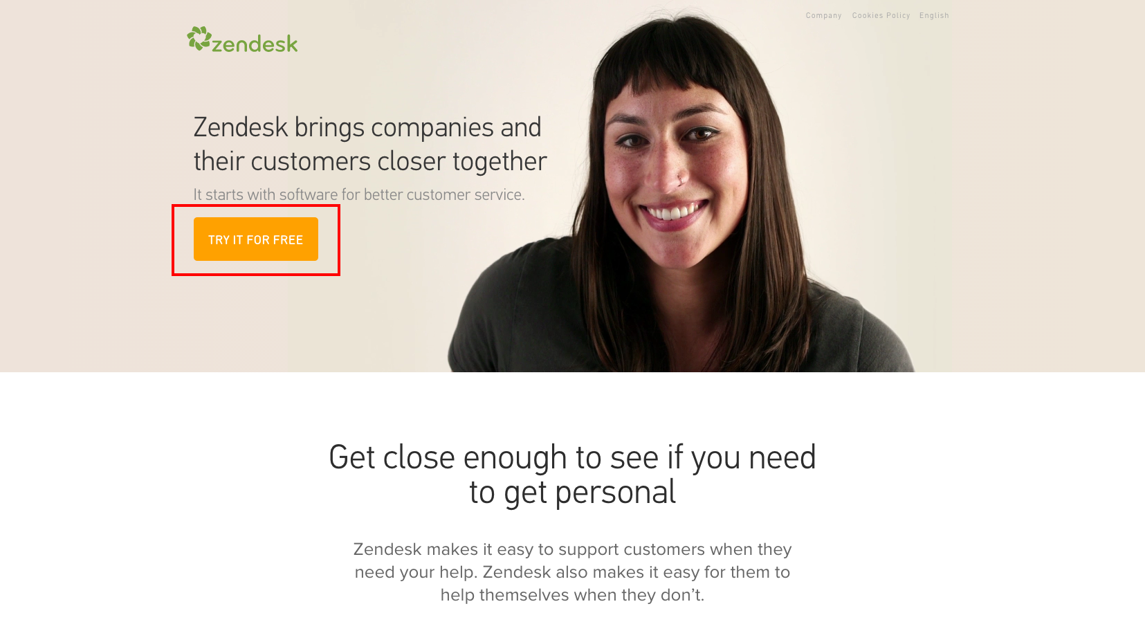
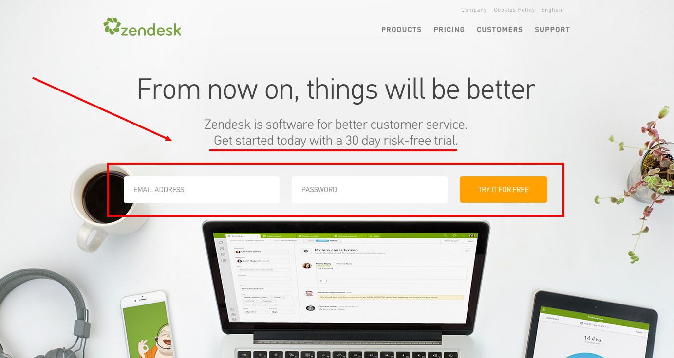
With this strategic move, Zendesk gets the visitor’s foot in the door right away and collects valuable contact information that can be used to nurture them down the sales funnel during or after their trial.
3. A Complete List of Features
This one may seem like stating the obvious, but you’d be surprised at just how many SaaS companies neglect to include their features on their homepage.
Like your value proposition, including a complete list of your product features is essential to establishing your value to your audience.
Not only does this give potential buyers a fuller picture of your offering, it also helps optimize your website for those keywords in search engines.
Pro Who Got it Right: GatherContent. As you scroll, the website content platform does an awesome job of highlighting their features on their homepage.
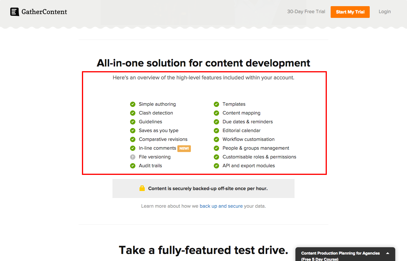
Complete with screenshots, arrows, and useful notes to guide your eye, GatherContent leaves no stone unturned when it comes to showcasing what it is their SaaS has to offer. (They also do a brilliant job with their value proposition and inclusion of a free trial, but I don’t want to gush.)
4. A Product Video
Screenshots are useful, but for someone who wants a realistic picture of your UX and UI (and don’t have the time to go through a trial), a product video is a powerful tool.
Using a video on your homepage tells your visitors how users actually interact with and benefit from your SaaS in real-life.
Pro Who Got it Right: Wistia. Living up to their reputation, Wistia knocks it out of the park with its homepage product video.

Alternating between cuts of the company’s software dashboards, brands that use it, and members of their team, it does a great job highlighting their unique value in an informative and high-energy 30-second clip.
5. Social & Industry Proof
So you’ve told your visitors what your software will do for them, but how do they know it actually works?
Leveraging social and industry proof on your homepage is an easy way to support your claims and prove to prospective buyers that your SaaS will deliver on its promises.
Seeing third-party or data-driven confirmation of your value early on in the sales funnel, helps build trust and make people feel more comfortable converting right-off-the-bat.
To achieve this, consider sharing on your homepage:
- Customer Testimonials
- Social/User Stats
- Case Studies
- Industry Certifications
- Partner Logos
- Industry Awards
Pro Who Got it Right: InvisionApp. Displaying video testimonials and client logos at the bottom of their homepage, InvisionApp offers impressive proof of their claim to be changing the game in web design.
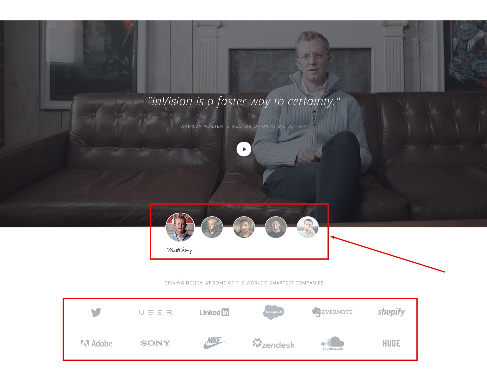
“Votes-of-confidence” and on-going business from big-name clients like Netflix, Twitter, Adobe, and Sony speak very highly of the quality of InvisionApp’s product, and by including them on their homepage the SaaS company quickly gains the confidence and trust of even the most skeptical of shoppers.
Getting Started
Just like putting a house on the market, you need to put your best foot forward when it comes to your SaaS homepage.
Put yourself in your buyer persona's shoes and ask what it is you would want to know about your product if you just discovered it. With this insight, work with your team to share and highlight that information creatively on your homepage. After all, there are no second chances in first impressions.

Order Your Copy of Marcus Sheridan's New Book — Endless Customers!