Topics:
Lead GenerationSubscribe now and get the latest podcast releases delivered straight to your inbox.
In order to generate leads, your website needs to employ effective calls-to-action that prompt visitors to carry out a particular action.
This isn't anything we haven't heard before.
However lead generating calls-to-action must not only deliver a message, but they must be designed to present the right visitors with the right message at the right time in the right way.
It sounds complex, but I assure you we can work through this.
If you have calls-to-action in place that simply aren't living up to your conversion expectations, we've laid out 6 examples of lead generation CTAs that work to help guide your process.
Align the Offer
When it comes to setting up a call-to-action for the greatest possible performance, a lot of it has to do with location, location, location. If you're not including a call-to-action at the bottom of every blog post already, this is a great place to start.
The reason being that presenting an action after supplying the reader with information, they are often times looking for a next step.
Enter the CTA.
While the location is key in this situation, the alignment between the page's subject matter and the call-to-action is what really drives people to click.
Think about it this way, if you're looking to learn more about business blogging it's likely that you'll turn to Google to feed your interest. From here you might land on a instructional blog post about different ways to format a post and at the end the writer might include a call-to-action about social media (which you don't click.) Do you see the disconnect?
If the writer had included a call-to-action for an offer about how to drive traffic to your business blog, it would logically make more sense as a next step. Point being, if you're not thinking in terms of alignment, it's time to adjust your approach.
Check out how HubSpot seamlessly segued from a blog article about landing page conversions to an offer for a free landing page assessment:

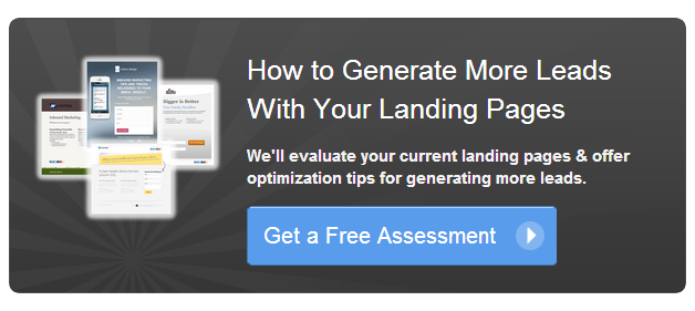
This call-to-action works so well because it speaks to a visitor at the right time. It takes into consideration that they are reading this post for a reason, and seeks to provide them with a pertinent suggestion while they're already engaged.
Additionally, the call-to-action you incorporate must appeal to the stage of the sales cycle in which the ideal reader is living in. If it's a top-of-the-funnel blog post, a bottom-of-the-funnel offer simply won't resonate.
Not to toot our own horn, but we've gotten pretty good at this ourselves. I mean, if I expect you to take anything that I'm saying here to heart, It wouldn't hurt to highlight that we actually know what we're doing, right? Hear me out on this one:


This blog topic/call-to-action combination works because not only are the two concepts fairly top-of-the-funnel, but they appeal to the same persona. The persona reading the article is clearly seeking out tools to help them improve their approach to content, which is why an offer geared toward providing them with tools to improve their overall strategy serves as a compelling continuation.
Be Really, Really Clear
It's no secret that consumers are skeptical. In order to convince someone to click let alone actually carry out an action it takes some careful persuasion.
If you want to ensure that your calls-to-action are doing the trick, you have to strive for clarity above all else. Does the audience know exactly what they will get if they choose to click?
While a simple "Click Here" might leave the visitor with questions as to where the click will take them, a more specific prompt like "Download the Ebook" or "Schedule a Free Assessment" gives visitors the direction they need.
Spell out your intentions with conviction.
The worst thing you can do when creating the copy for a call-to-action is mislead the visitor. The old "bait-and-switch" technique will not only land you in some hot water but it will instantly diminish your credibility.
You're job is to help prospects come about an appropriate solution for their problem. You're not here to trick them.
Check out how crazyegg and EventBrite spell out the expectation and leave nothing up to the imagination:


These call-to-actions work particularly well because they're not just nudging you to "click" or "download", but instead they illustrate exactly what it is that the visitor should expect next.
Make Strategic Design Decisions
An effective call-to-action should be regarded as an aesthetic composition.
If color seems like a trivial aspect to you, pay close attention to what I'm about to say:
According to an infographic from KISSmetrics, the marketing software platform Performable reported that they saw a 21% increase in conversions after switching their call-to-action button from red to green. (Source: KISSmetrics)
Simply put, color matters. Not only should you be thinking strategically about the color choice for your button, but the contrasting color that it sits on as well.
A basic understanding of how colors work together or against each other will help you to carry out these decisions. However, if you're still unsure you can A/B test until something clicks, or check out this example:
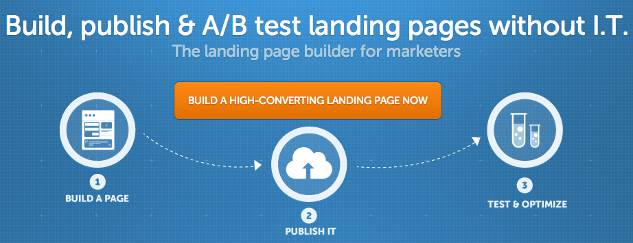
Additionally, white space, or the area of a page left unmarked, is one of the most underrated elements of an effective call-to-action.
In my college art classes, I often times found that I would tread a fine line between too much and too little because anyone who knows anything about design knows that it's a tricky thing to master really.
Too much and my professor would tell me that my composition felt incomplete. On the contrary, too little made it easy for certain elements to get lost and lose their effect.
In order for the content within your call-to-action to hold any weight, there has to be a balance. Check out how Dropbox used simplicity to their advantage with this homepage call-to-action:
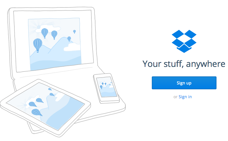
While a content heavy call-to-action might spell out everything you think you want your visitors to know, this call-to-action proves that sometimes less it more.


Order Your Copy of Marcus Sheridan's New Book — Endless Customers!

