Topics:
Marketing StrategySubscribe now and get the latest podcast releases delivered straight to your inbox.
 There is a battle going on between Inbound Marketers - to popup or not to popup.
Some go “*gasp* Never use them! They irritate visitors”, while others swear by their effectiveness and can’t encourage you enough to give them a shot.
Website popups (or Popup Calls-to-Action) can provide your visitors with a valuable extra chance to convert and when designed and implemented properly, increase your conversions.
What are Popups?
Popups are lightboxes of content that appear over a page on a website. In Inbound Marketing, they are usually promoting an offer (i.e. a subscription, newsletter, eBook, etc.) and include a simple form that the visitor can take action on immediately.
There are three common kinds of popups:
- Come and Go: These popups appear automatically when a visitor is either entering or exiting a site (also known as Exit-Intent Popups.)
- Timed: After a set amount of time (usually around five seconds), these popups will appear on the page.
- Sticky: This popup usually appears in the corner of a page and doesn’t disappear no matter how high or low you scroll (the visitor must exit out of it if it even has that option.)
How, Where, and Why Should You Use Popups?
The action you want your visitor to take or the offer you want to provide them with, will determine the popup to use and where to place it.
However, no matter what type you pick, or where you place it, when done correctly, a popup is meant to present a visitor with the exact thing they want at the exact time they want it.
It needs to be intuitive.
A popup isn’t meant to be obstructive or negatively impact how your visitor is interacting with your site.
It’s meant to provide a benefit to your visitors and solve for their pain points, just like a regular CTA. This is key to reducing friction and making your visitor comfortable enough to convert.
Sound hard? Let’s take a look at these 6 website popups that make it look easy:
1. Toms shoes
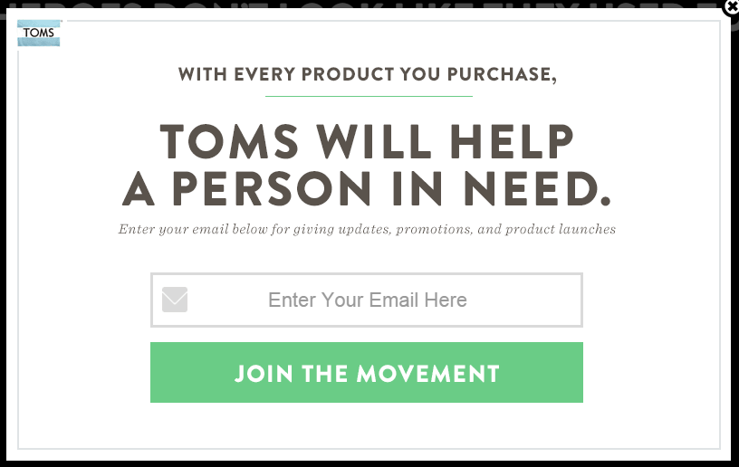 The shoes are cool, the website is cool, but what’s even cooler? Joining a movement. Instead of Toms begging me to subscribe, they highlight the result of giving my email address to them - joining an exclusive Toms community. This Come and Go popup connects with my emotions and highlights one of the perks of buying the brand.
2. Elegant Themes
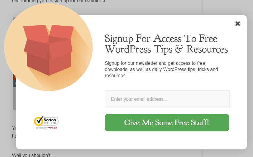
This Timed popup incentivizes visitors to give up a minor piece of information for access to valuable resources and tips, all for free. And come on, who doesn’t love free stuff?! By giving visitors helpful information before they even ask, proves to them that you are in it for all the right reasons, aka. them.
3. Kissmetrics

Don’t be afraid to get into your visitors’ heads a little and remind them of what they’ll be missing out on if they don’t click through. Kissmetrics does this subtly in their Exit-Intent popup, saying “I’d rather not know how my marketing is performing” next to their opt-out button.
When someone clicks a button, they’re accepting the action that follows. As a Marketer, it’s hard to “accept” that I’d rather not know how my work is performing. Seeing this text makes me think that I’m missing out on something that will really help me in that area.
4. Toolbox.com
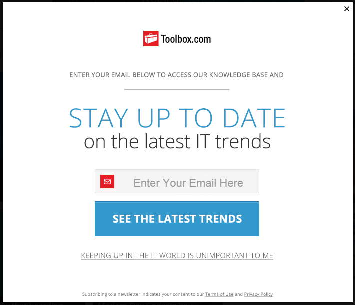
This is another great example of clever opt-out copy. By adding a little humor into their Exit-intent popup, Toolbox.com is creating a unique experience for visitors while also addressing what they’ll be missing out on if they don’t subscribe. And for IT professionals in an ever-evolving industry, it’s the opposite of “unimportant” to keep up with the latest trends.
5. Green Mountain Mustard
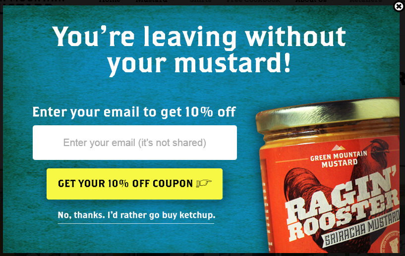
Green Mountain Mustard is doing everything right in this Exit-Intent popup. They smartly put their CTA in yellow to draw visitor attention to it (and quite possibly to symbolize slow down, see what I’m offering.), are providing an incentive to their visitors to convert, and also use humor to create a memorable experience. I will definitely remember this clever jab the next time I’m grabbing the ketchup.
6. ConversionXL
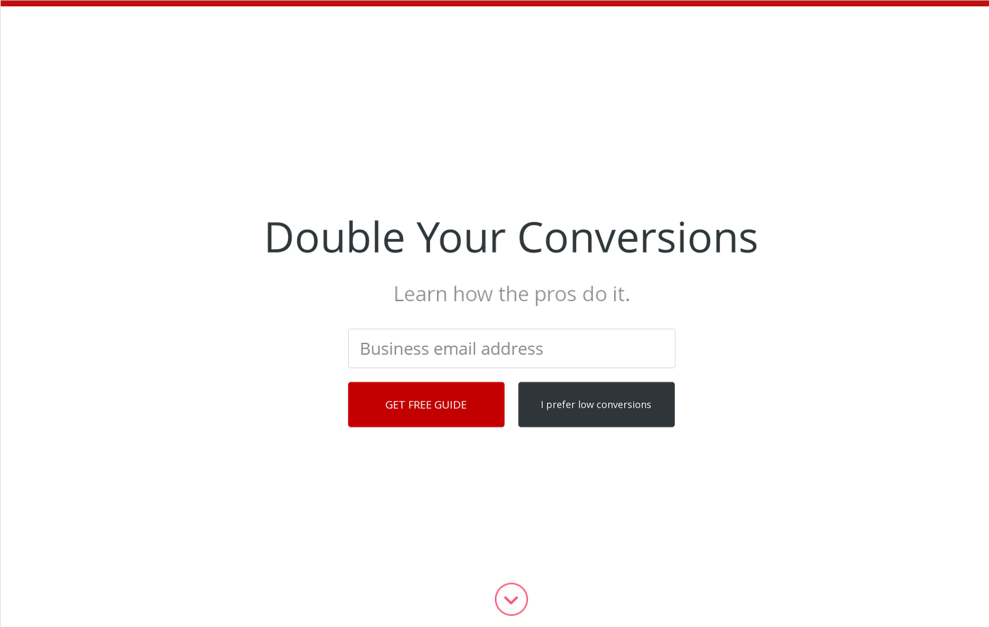
CoversionXL used their buyer persona research to create this Timed popup. By knowing who visits their site, and what they are looking for (conversion tips), they are immediately presenting visitors with an answer to a question. They also made sure their action buttons were crystal clear so that visitors understood quickly what they will get by subscribing (a free guide), and what they will get by not subscribing (low conversions).
Key Takeaways
Tempted to try using a popup on your site? Make sure that you follow these best practices to engage with your visitors and increase your conversions:
- Use a clear CTA button: Don’t mumble with the wording; Make sure the action you want your visitor to take is clear and concise.
- Make it stand out: The popup grabs visitor attention immediately (because it’s now in the middle of their screen), but the button you include in it must also stand out visually so there is no question about what to do next.
- Be relevant: I can’t stress this enough - don’t use a popup just to use a popup; Make sure what you’re offering connects with your visitors and what they search for on your site.
- Add an incentive: How many times have you passed up a coupon or a free item? (Need I say more?)
- Include social proof (where possible): Don’t be afraid to add a little social proof to help prompt visitors to convert; I’d be more willing to join an email list if I know 5 million other Marketers already have.
- Be funny: Give humor a try; Not only will it make your visitor laugh, it will also give them a memorable experience.

Order Your Copy of Marcus Sheridan's New Book — Endless Customers!

