Topics:
Marketing StrategySubscribe now and get the latest podcast releases delivered straight to your inbox.
 The only thing standing between you and an expansive email list is your approach.
In fact, the reason why no one is subscribing to your blog or newsletter is quite simple.
You're not giving them a reason to.
You see, capturing email addresses isn't an "ask and you shall receive" type of exchange. It requires careful persuasion, incentive, and context.
You know it can be done.
You've seen countless companies boasting "100,000+ subscribers."
But somehow your numbers keep coming up short.
Why?
Make people feel important
It's no secret that exclusivity is directly related to appeal.
People love to feel like they're part of something.
Let's take a look at these examples from J.Crew and J.Crew Factory:
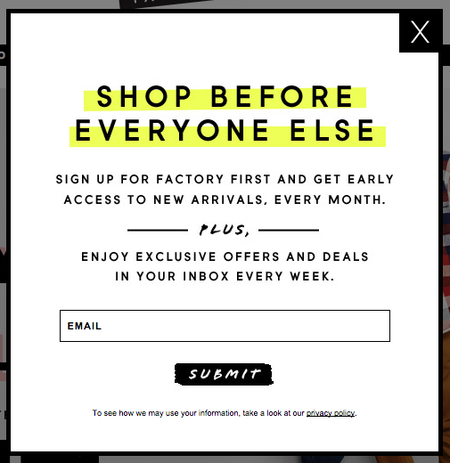

In an effort to capture more emails, J.Crew found a way to repackage the reveal of new products, news, and special offers in a way that's intriguing.
Granting early access to the latest news to those who sign-up requires little to no added time and resources on their end, yet it's powerful enough to persuade people to hand out their email.
It's like they're having their cake and eating it too.
Be considerate of timing
There's no doubt that pop-ups are well, popular.
While in many cases they do the job just fine, I have noticed a common trend that just doesn't make sense.
You've just landed on a page and you're met instantly with a pop-up shadowing the rest of the content on the page. Sure, It's caught your attention, but you didn't have a chance to read anything on the page yet, therefore you're probably not ready to commit.
The timing is off.
It's like asking someone out on a date before introducing yourself. You run the risk off coming on too strong (or worse, looking creepy.)
Here's a great solution from Sixteen Ventures:

Slide-in subscribe options are often triggered by scrolling. This allows visitors an opportunity to extract a little value before you ask them for their contact information.
More timely, less creepy.
Attach less risk
Trust directly impacts conversions.
While we're often told not to "sweat the small stuff", small inclusions like this bit of microcopy on Litmus's newsletter sign-up page have the ability to make a big difference:

While it seems like everyone wants to get their hands on our email address these days, people have grown wary of dishing it out to just anyone.
This bit of reassuring copy works to eliminate risk, and provide people with the justification they need to take the next step.
Be human about it
Industry jargon and ten-dollar words don't warrant conversions.
In fact, overly complicated language does little to convince a visitor to stop, drop, and submit their email. If anything it reduces any shred of persuasiveness by convoluting the overall message.
Ann Handley's subscribe box is a different story:
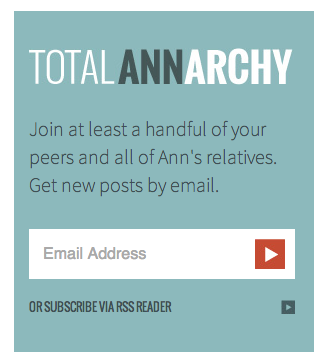
The copy that accompanies the email field is light-hearted and relatable. It says a lot about her ability to connect with her audience in a way that's memorable.
If she can manage to do all that in just two sentences, one can only imagine how much value she can provide given three sentences, a paragraph, or better yet, a whole blog post.
Point being, don't be afraid to be personal. At the end of the day, people want to do business with other people.
Leverage social proof
Social proof will help you to earn more subscribers, however, you need subscribers in order to display social proof.
Brian Dean from BackLinko call this concept the "Social Proof Paradox."
This is why it's important to remember that social proof isn't limited to a subscribe CTA accompanied by a one-liner like, "join 50 trillion other marketers."
While this tactic works if you're fortunate enough to have an estimable number of existing subscribers, there's just something about "join 45 other marketers" that doesn't have quite the same ring to it.
Point being, you'll want to leverage the most attractive social proof you've got.
If it's not the number of existing subscribers you have, try the number of monthly visits your blog receives. If it's neither, work towards putting forth at least one or two awesome testimonials.
Check out this example from OkDork:

Noah Kagan's subscribe page is an excellent source of inspiration.
As long as you work with the best numbers you've got, you'll eventually have enough social proof to sandwich your subscribe field in between numbers and testimonials like Noah.
Make it hard to say no
I wrote a post a few months that aimed to spark a debate around whether or not passive aggressive calls-to-action had a positive influence on conversion rates.
When I say passive aggressive calls-to-action I'm referring to instances where you present a visitor with two choices, but position the desired action you want them to take as the only logical choice.
Perhaps I've been rubbed the wrong way by one too many, but I'm usually against this type of assumptive marketing initiative.
However, this post is about you, not me, so let's check out this example:
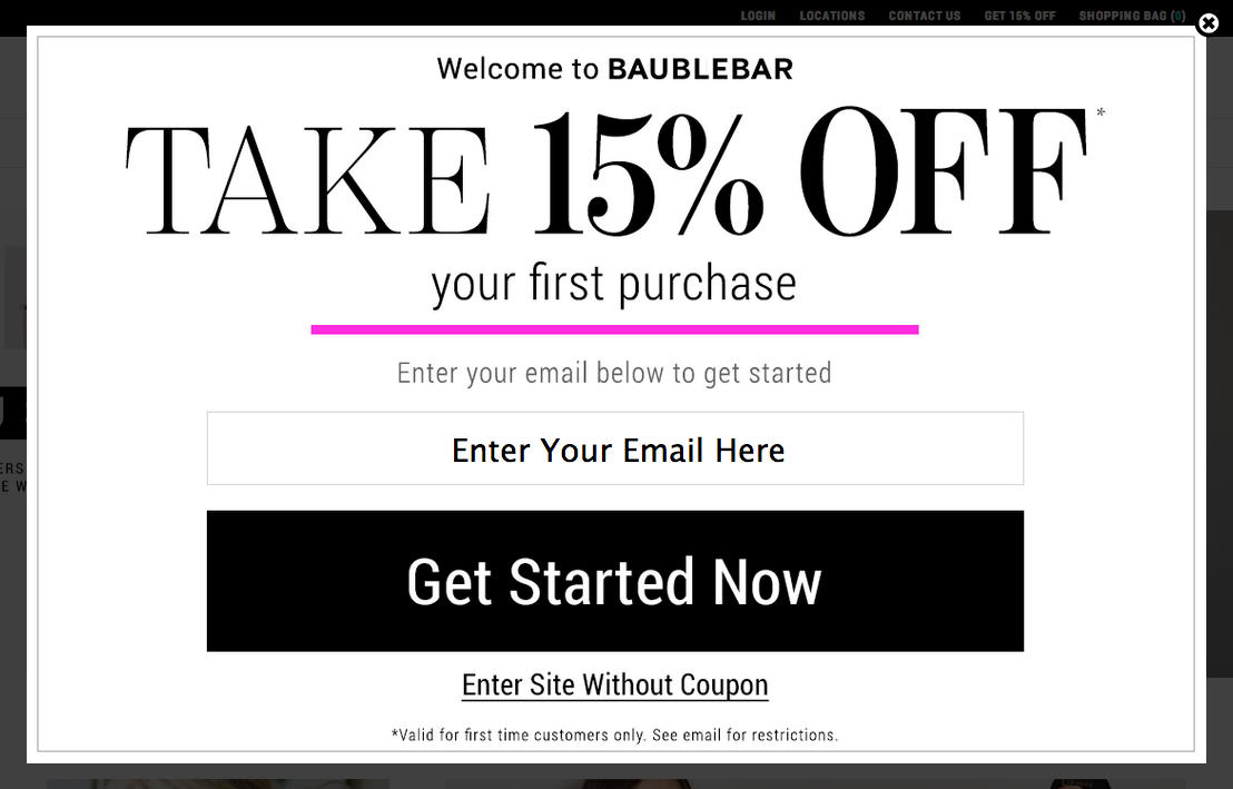
Well played, BaubleBar.
By forcing the visitors to admit that they're willing to enter the site "without coupon", you're effectively getting inside their head.
With that being said, you may have just earned yourself another email.
(Sidenote: I'd still love to hear what you all think about this technique. Yay? Nay?)

Order Your Copy of Marcus Sheridan's New Book — Endless Customers!

