Topics:
Lead GenerationSubscribe now and get the latest podcast releases delivered straight to your inbox.
6 Tips & Tactics for Getting More Leads From Your BOFU Landing Page

Oct 14, 2015

 A significant part of the buyer’s journey is the consideration stage. They’ve identified the problem (probably have read every informative and educational piece of content on your site) and they’re interested in learning more, but will your bottom-of-the-funnel (BOFU) landing page make them convert?
You probably already know that your BOFU landing page needs to have an attention grabbing page title and a compelling description, but what else can you do to improve your conversion rate? Give these simple hacks a try.
1. Target Your Persona’s Pain Points
Before you even start writing a word, get into your persona’s mindset. If you truly understand your buyer personas, you’ll know exactly what hinders them from doing their job or keeping them from being successful. Once you know these, don’t shy away from hitting those pain points.
Your solution should make their lives / jobs easier. What are they trying to do? For example,
-
Maximize the ROI of sales / Marketing / client relationship tools.
-
Harness data to validate and make smarter business decisions.
-
Identify areas of improvement to increase traffic, increase conversions from leads to customers and ultimately revenue.
2. Highlight Value, Not Features
Refrain from talking about yourself.
When creating the copy for your BOFU landing page, use trigger words that identify the end-benefits of your offering rather than what your product or service features. Within 8 seconds or less of landing on your page, your persona needs to know exactly what they’re going to get and if it will be worth converting for them. To get them to act quickly, value has to stand out to them.
Two examples I want to focus on are Applango and Dropbox.
IMPACT client, Applango, understands that their audience is trying to maximize the ROI of their Salesforce account.
In order to maximize the adoption of Salesforce, you need to know how often your sales team is utilizing the software, as well as the necessary resources to do so.

If you were to scroll a little lower on this BOFU landing page, Applango identifies how you can use the data the software compiled to:
-
Understand not just what users are doing but how they are doing it.
-
Show all user behaviors that are currently using Salesforce.com.
-
Show you the users that are struggling or not fully engaged in the system.
-
Identify the users that need more mentoring and training.
Dropbox is another great example of a big brand that understands its persona’s needs. As a company, you’re always looking for ways to take your team to the next level, and there’s nothing better than having a secure platform for sharing files and keeping all of your documents in one place.
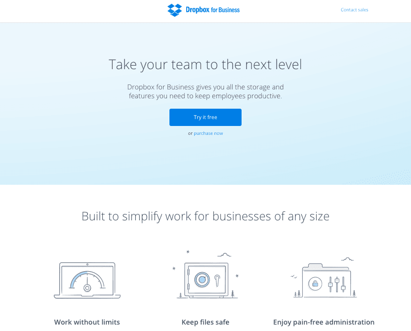
Dropbox also makes it clear that they know their persona’s pain points. You won’t have to worry about your team never being able to access their dropbox account, or corrupted or lost files, and it’s easy to manage. Who wouldn’t want to click on the try for free button?
3. Identify the Right Length of Your Landing Page
How much is too much?
That’s a great question to ask when you’re developing your bottom-of-the-funnel landing page.
One element that will help you answer the question is the type of offer.Is it a consultation, a demo, a FREE trial, a FREE assessment, or maybe even an evaluation?
With the offer in mind, here are few guidelines to help you decide how long your copy should be:
-
Short Copy: This can be used when the offer on the page require little commitment from your visitors and has very little risk associated to the outcome of them filling out the form.
-
Long Copy: Use long copy when there’s a higher level of scrutiny and commitment as well as a greater perceived risk associated with converting. Remember, the bigger the commitment the longer the page.
Take a look at these examples from Birchbox and Kissmetrics.
Long Copy: Birchbox
With a number of other subscription boxes out there, you might be wondering what makes Birchbox different or unique. For the beauty-obsessed girls out there, $10 might be a small fee, but some of you might be wondering “will I actually get my money's worth and receive products that I’ll love or that I’ve been waiting to try”? For that reason, I absolutely love the landing page for their monthly subscription.
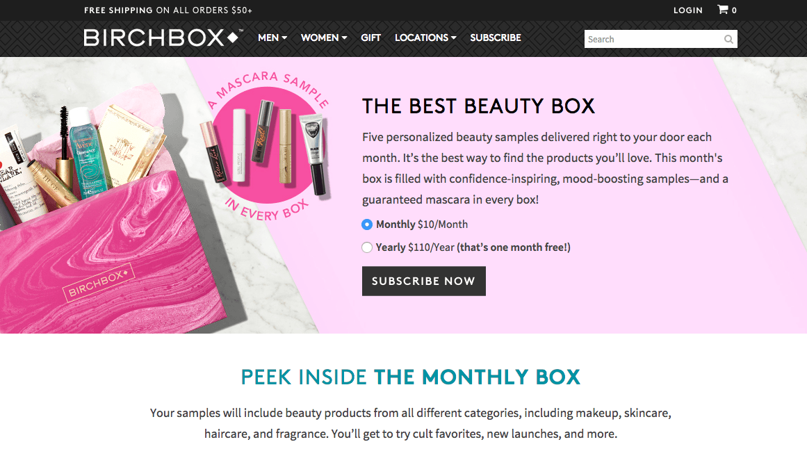
The reason they’re using a longer landing page is so that they can highlight exactly what you’re going to get and you can even peek inside this month’s box.
Because no two people are alike, they talk about how your box will be personalized just for you. You’re not just signing up for a subscription with the hope that you’ll get something amazing; it’s actually tailored to your specific hair type, skin tone, style, and other various characteristics.
Still not sure if Birchbox is for you? On their landing page, you can also see what some of their subscribers are sharing, as well as some of the products they’ve received in their boxes.
Plus, they offer incentives for engagement. Did you get something you absolutely loved? Just for reviewing all five samples, you’ll get $5 to spend on a full-size of your favorite product.
Short Copy: KissMetrics
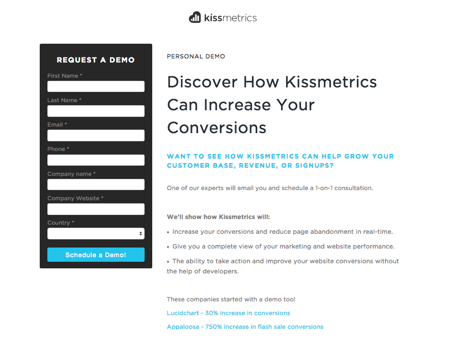
Kissmetrics, unlike Birchbox, gets directly to the point with their personal demo landing page.
On their short page, they want to show you exactly what you’re getting for your form submission. You can quickly scan the content and identify the following elements:
-
It’s a one-on-one consultation, and someone will contact you
-
There are links to case studies
-
You’ll get a 1200 ft overview of your Marketing and website performance
-
They highlight areas where you might want to increase performance and conversions
4. Use Visuals
Depending on the type of offer you’re promoting, providing images or even a product overview video is a great element to feature your software or platform.
Show the visitor exactly what your platform looks like from a user experience POV.
We all know there’s nothing worse than signing up for a demo or free trial and realizing that the user interface and experience are horrible.
People love to see what they’re going to get.
I’m going to jump back to Applango for a minute because I love how they provide images of what your dashboard would look like as well what your FREE Salesforce adoption health check.
It also doesn’t hurt that they provide success stories on how their clients were impacted.
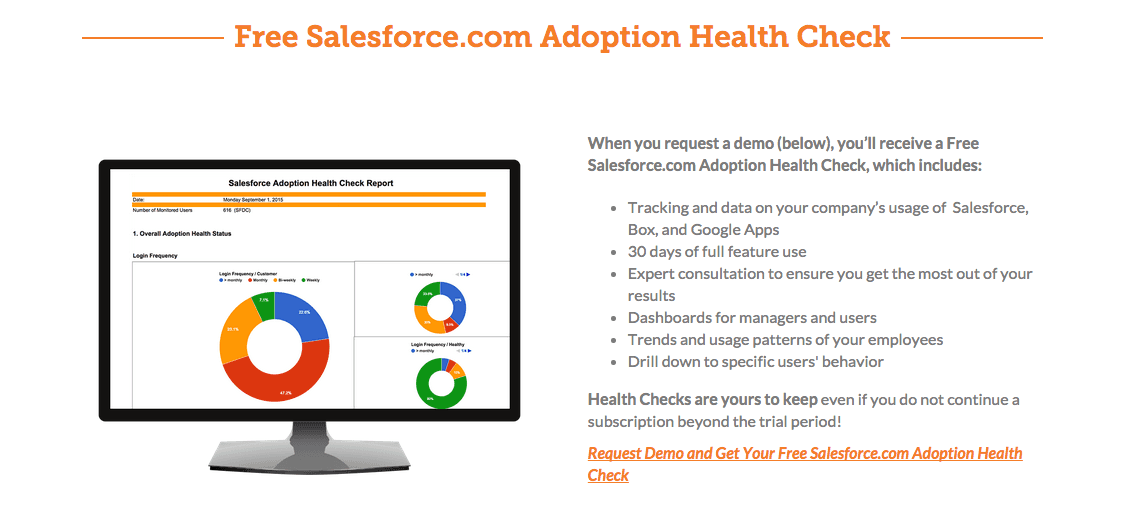
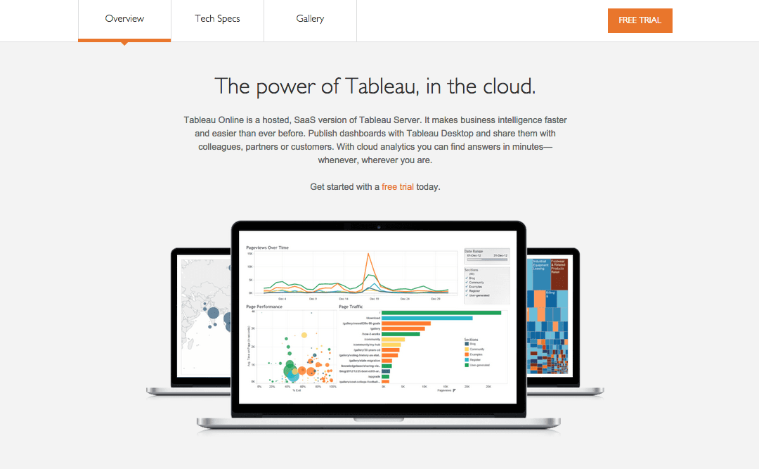
Tableau is another great example of a company that utilizes visual elements on their landing page. The SaaS company uses visuals to show the interface, what you can do and get from the cloud based analytics SaaS company, as well as the different ways you can present the data.
5. Provide Testimonials & Social Proof
By now, we all know how valuable customer testimonials and social proof can be in helping visitors convert. Social proof like case studies, testimonials, embedded social media posts, trust seals, as well as the number of users, help make people feel more comfortable with your brand and the idea of converting. Just check out these statistics:
-
Over 70% of Americans say they look at product reviews before making a purchase. (source)
-
Nearly 63% of consumers indicate they are more likely to purchase from a site if it has product ratings and reviews. (source)
-
Consumers trust social proof reviews 12x more than manufacturer's descriptions. (source)
Think about it this way: if you’re the one that is always talking about how awesome your product or platform is, it comes off more as boasting. Social proof helps add credibility to your claims and helps show your potential buyer that you’re not just full of hot air.
If you are going to showcase social proof or customer testimonials, make sure to add the human element by including a picture of that person as well as their name and what company they’re from. If you’re just adding a testimonial on your site without providing any human elements, unfortunately, it won’t be very believable. Make it easy for your visitors to connect and put themselves into the shoes of your current customers.
Freckle is a great example of a company that uses customer testimonials to showcase how their software can make time tracking easier and more effective for both you and your employees.


6. Include a Compelling Call-to-Action
You’ve showed them the value of your offer, but is your CTA making them convert? Be aware of the initial conversion points that brought your visitors to your BOFU landing page. Make sure that the copy and value on your CTA fits and aligns with what you’re offering on the landing page.
One thing to keep in mind of is the terminology you’re using. If you’re going to say “free in-home estimate”, don’t interchange or switch to “in-home consultation”. This could be seen as a “bait and switch” and will confuse people about what they’re actually signing up for.
What else?
What elements am I missing? I’d love to know what you’re doing on your BOFU landing page to help convert visitors into contacts or even free users.

Order Your Copy of Marcus Sheridan's New Book — Endless Customers!