Subscribe now and get the latest podcast releases delivered straight to your inbox.
7 Little-Known Factors that Can Improve the Performance of Your Ebook

May 3, 2013

 Besides being well written and targeted to your companies buyer personas, you need to ensure that your ebooks are successful and generating leads.
Readers love ebooks! But there are some things you can do to improve their performance. Did you know that call to actions promoting ebooks get almost twice the click through rate as emails promoting webinars? Don't forget to add a CTA to bring more people to your ebook.
You also want to ensure your optimizing and maximizing the impact and reach of your ebooks, consider including these 7 little known factors that can improve the performance of your ebook.
7 Factors Improving the Performance of Your Ebook
An ebook is a great way for companies to share content and information with buyer personas and target audience. Whether its 20-pages or 200-pages, you want to provider your visitors with the essentials to click the download and social sharing buttons. Your ebook isn't just an opportunity to convert those visitors into leads but to expand your reach.
Descriptive Title
There is no better way to grab the attention of website visitors. Your title is extremely important, and should not be overlooked. As one of the first things your visitors see, you not only want to impress them but you also want to grab their attention. Making them download your ebook.
Don't just make your title interesting, you need to tell the reader what your ebook is about. Tell them what they will learn.
Lets look at this ebook by Advanced Data Systems, "The Benefits of Connecting RIS Software with Your Referring Physicians' EHR Software."
[display_fullsize] [/display_fullsize]
[display_mobile]

[/display_mobile]
When developing your ebook, it is important to remember that you're not writing a blog article. Due to the length of an ebook or whitepaper, you need to make sure you're demonstrating the value up front.
Use of Visuals
In today's day and age, visuals are a great way to push through all the clutter and attract your visitors attention. Remember: don't just add any old image to the cover of your ebook or the inside pages, you don't want to send them mixed signals.
When developing your ebooks, keep the layout and structure of your cover consistent. The cover of your ebook should fit the brand and image of your company. When designing your cover put an emphasis on social media. Make it appealing and easy to read when it's in the dimensions of a timeline photo thumbnail (403px by 403px).
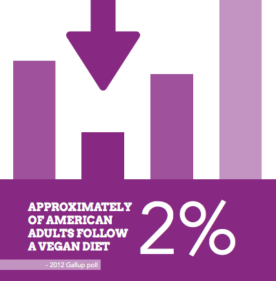
Your ebook shouldn't just contain thousands of words, consider adding visual elements such as photos and graphics . Break up all those big chunks of copy. Don't forget to use visual elements to help explain concepts that are difficult to explain through text alone. When adding graphics to your email, keep them inline with your brand style and color scheme.
Here's a great example of utilizing visual elements from Joan Landino Says, "Myths of Veganism: DEBUNKED."
 |
 |
Author Page
A great way to engage with your readers is through an author page. This is extremely helpful if you have multiple members of your team developing premium content. When adding an author page to your ebook, consider including the authors bio, headshot, and possibly even a way for your readers to get in touch with the author.
Here is an example from one of our lastest ebooks, "Inbound Marketing: In-House vs. Agency," written by our Director of Marketing John Bonini.
[display_fullsize] [/display_fullsize]
[display_mobile]

[/display_mobile]
Table of Content
This a staple of any book, whether it's print or digital. Give your readers an indication of how your ebook is organized. It also makes it easier for them to find a section if they need to reference a section of your content.
Make use of your table of content. Don't just include it because you have to. Consider making this page interactive by hyperlinking chapters/sections, allowing your readers to automatically go to a certain section of the ebook.
Social Sharing Buttons
Ebooks are a way to generate new leads. You will however, miss the opportunity to increase the amount of leads your company attains if you don't add social sharing links to the bottom. Wouldn't you want someone who loved your ebook to share it with their network and connections?
Don't just add social sharing links to the last page of your ebook. Consider adding them to the bottom of every page of your ebook (either in the header or footer). Readers can easily share your ebook with friends, family, and co-workers instantly no matter what page they are on.
Here is a great example from FotoBridge.

Calls to Action
What should your readers do after they finish reading your ebook? Tell them. Help move them down the sales funnel. Utilize the last page of your ebook to push your readers to another offer or to perform a certain action.
CTA's are also great to place throughout your ebook. Do you have a really great offers that will help push them down the sales funnel? Connect that offer to the ebook your readers are currently viewing. Use the opportunity to educate and nurture your leads.
Here's a great example from United Methodist Homes ebook, "The Essential Guide to Touring a Senior Living Community" about adding a call to action to the end of your ebook.
[display_fullsize] [/display_fullsize]
[display_mobile]

[/display_mobile]
Mobile Friendly
Not everyone is going to read your ebook on their desktop or laptop. More and more consumers and specifically your target audience are reading content on mobile devices. Hence the importance of making sure your ebook is mobile friendly. Does your ebook view well on a smartphone and various e-readers/tablets? Not sure, test it out!


Order Your Copy of Marcus Sheridan's New Book — Endless Customers!