Topics:
Marketing StrategySubscribe now and get the latest podcast releases delivered straight to your inbox.
 Baseball players look up to Babe Ruth. Musicians look up to The Beatles, or maybe Kurt Cobain or Bob Marley. Like artists in any other field, Marketers and Designers have big name brands and influencers that they admire and aspire to be like as well.
Their accomplishments inspire our ideas, the work we do for our clients, and in many ways, who become as professionals in our careers. With this thought in mind, I went to my IMPACT colleagues and posed the question, “What brand’s design or marketing do admire most and why?”
Here’s what they had to say:
Slack: “I’ve never seen Slack advertised except in a Sandwich Video, and even then, the video let the product really do the talking.
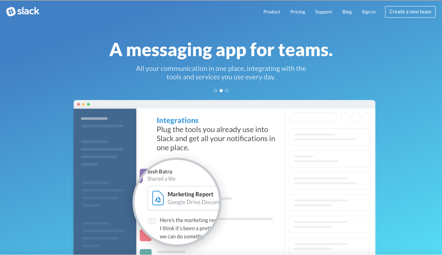
If you’ve got a good product you don’t need to do extensive marketing; it’ll get around on its own, like Slack has. Good things don’t need to tell you they’re great, they speak for themselves and spread by Word-of-Mouth. Slack has mastered that.” - Kyle Sheldon, Sr. Front-End Developer/Tech Architect
Dropbox: Dropbox uses simple designs that completely encompass the idea and value of its app.
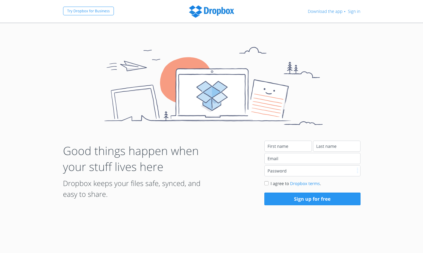
From a marketing/business standpoint, they have a product that can easily be explained in the length of a tweet. Their design follows the same philosophy with its clear, minimal, and very targeted look. It just works. I also really like their use of illustration. They clearly have a very strong group of designers. - Donny Wilson, Creative Lead
Carrot Creatives: A company’s branding and design communicates their characteristics and values; who they are as an organization. I always love to see the quality work that comes out of Carrot Creatives in New York. I think they’re an agency that has really done an amazing job with their branding and making sure that you know exactly who they are from the first time you interact with them.
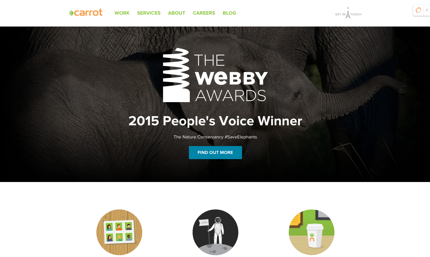
At their core, they position themselves as a fun, trendy, digital agency that takes their clients “on a digital adventure that others have said are impossible” and right from their homepage you pick up on that vibe.
They use a combination of bright, lively colors to get you excited about their brand. They also integrate clever illustrations throughout the site that are not only visually striking, but show the talent and range of their team. Best of all is their use of b-roll video that gives you behind-the-scenes glimpses of their office. In my opinion they’re doing all the right things to evoke all the right emotions. - Joe Rinaldi, Creative Supervisor
BirchBox: I've been a subscriber to BirchBox for about a year and am absolutely in love with their idea, products, and marketing.
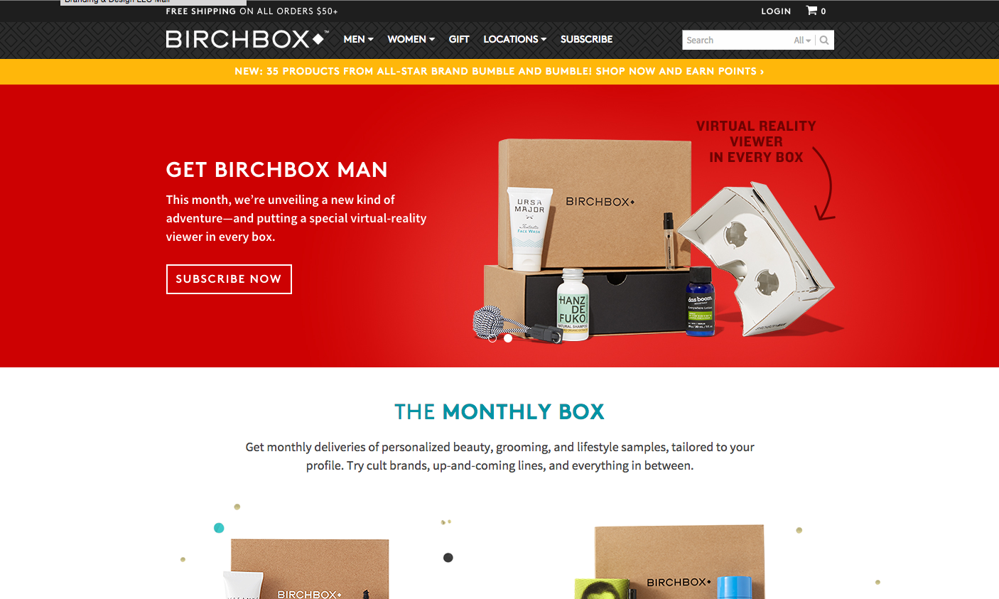
When I moved from CT to CA, I had to unsubscribe for a bit since I didn't know where I was going to be living. When I went to cancel, their re-engagement marketing was amazing. First they asked me why I was canceling with a long list of common reasons. When I chose "moving" they brought me to a new page that asked for me to just update my address instead of canceling. Though I opted not to, I loved that they had a strategy in place for every scenario.
After requesting feedback and learning that I did enjoy my subscription despite cancelling, they offered me a promo code as a "welcome back" gift once I moved and was settled in. Each month that I was not subscribed, they even sent me an email with "what you missed in your box this month." That definitely got me jealous and wanting to subscribe again!
I also love the fact that you can review the products you receive and get points for discounts in their store. The more you review and share the products/reviews - the more points you get. It’s a genius way to keep people active and engaged.
Last, but not least, I love their email marketing. I open EVERY message I receive from them (which is crazy because, like everyone, I rarely have time to sift through all the spam.) I love their emails because they provide video tutorials on using the products they send you and suggest others you might like. I watch a ton of these videos and their team always convince me to purchase whatever they’re use. They’re super entertaining and educational at the same time. - Erica Dube, Account Strategist
Beyoncé: Beyoncé! She has to live/breathe/speak/walk/etc. her personal brand and does it flawlessly whether the platform is Instagram or an actual stage. She is a genius at molding the media’s view of herself and keeping the adoration of her fans (Yes, Queen Bey of Customer Delight.) I especially loved her recent post-launch campaign of creating and selling a line of black sweatshirts with only one or two words bright pink words on them. They executed her brand perfectly both in terms of design and messaging. It was consistent and unforgettable.
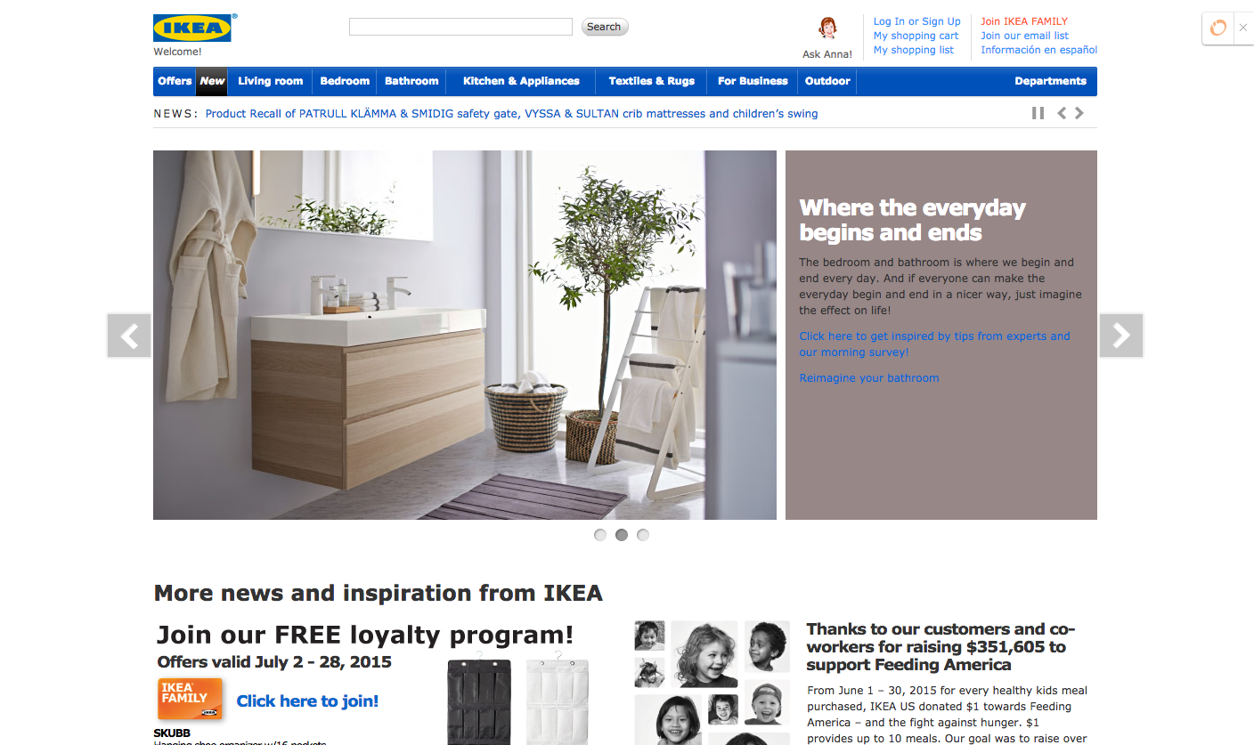
On a more serious note, I have also always loved Ikea’s design and marketing. Both are clean and organized (like their products) while maintaining a friendly aesthetic that is not only extremely relatable, but timeless. Though a direct marketing approach, I’ve had my eye on the Ikea catalogue for years. It is so well-executed that many elements have remained the same over the years. It doesn’t follow trends, so there’s been no need to change. Their brand is consistent and tasteful. - Marcella Jalbert, Creative Lead
Airbnb: Airbnb’s marketing is clear and visual. It’s is all about living as a local anywhere, and the enticing teaser video on their homepage shapes this idea into something that is extremely relatable and piques your curiosity.
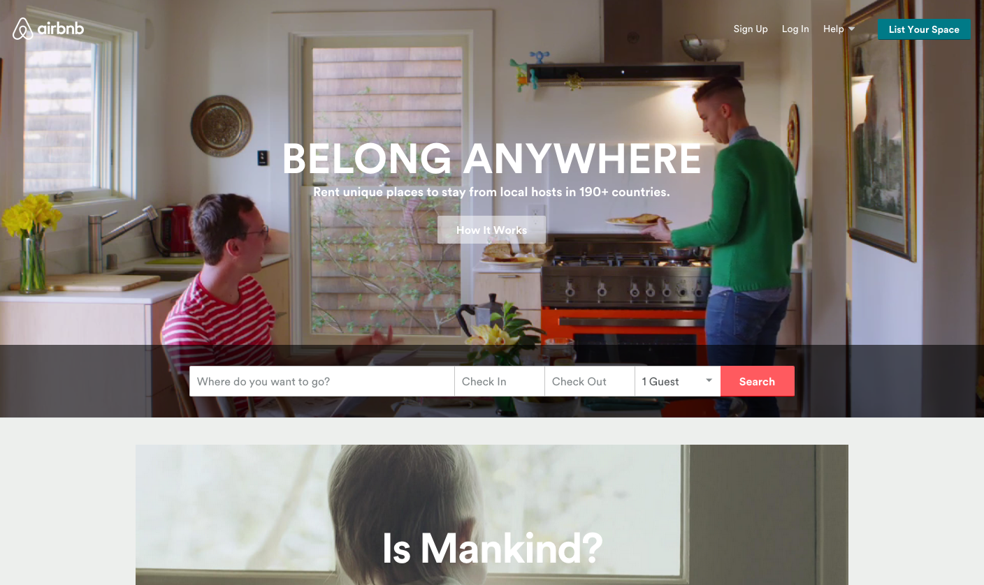
Even if you’ve never heard of the company, Airbnb makes easy to figure out what they do. The first time you’re on their homepage, you see the coolest things they have to offer immediately and get a realistic picture of what to expect. My first Airbnb experience was exactly as welcoming and fun as it was portrayed to be on the site. That delivery delighted me, and I’ll definitely be using the service again because of it. - Derrick Weiss, Account Executive
PetSmart: I was riding in the car the other day when I heard a commercial on the radio. It was a PetSmart commercial. Now, I have no idea what it was promoting; the only thing I remember is them saying “pet parent” and that got my attention real quick.
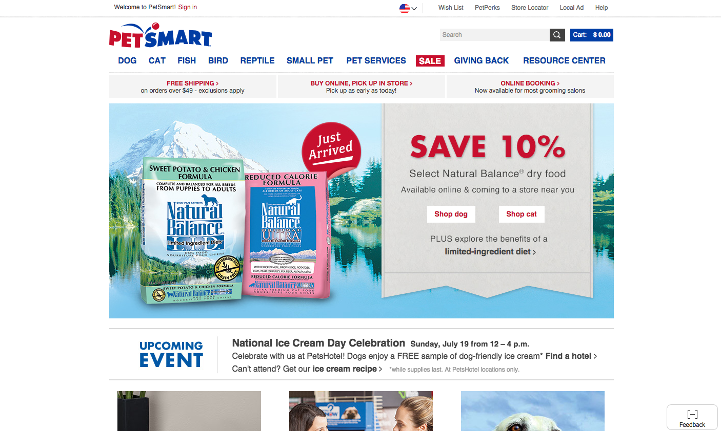
I love my little pup, and I would definitely consider myself a dog mom, not a dog owner. PetSmart totally nailed my persona with this messaging. By simply saying “pet parent” instead of “pet owner,” I immediately resonated with them and felt as if they understood me and the relationship I have with my dog.
It’s super important to know your persona and use content and keywords that will attract them and allow them to really resonate with your brand. Nice job, PetSmart.” - Kaitlyn Petro, Account Strategist


Order Your Copy of Marcus Sheridan's New Book — Endless Customers!

