Subscribe now and get the latest podcast releases delivered straight to your inbox.
8 Creatively Effective Unsubscribe Pages You Should Take Notes From

Jun 6, 2017

So what's your unsubscribe page look like? You probably have no idea, am I right?
The unsubscribe page is undeniably one of the most ignored pages on your website, but it's actually one of the most important.
While a user finding themselves on this page may seem like a lost cause, there is a chance you can change their mind with witty humor, great branding, and by giving them options to customize their email preferences.
People don't want to be bombarded with emails they don't care about, so ideally, you want to take the time to get to know your subscribers' wants and pain points before they reach the unsubscribe page.
However, even if you aren't able to stop them from wanting to opt out of email communication, you can always maintain a relationship with them elsewhere.
The following eight brands follow the most effective unsubscribe page best practices.
Check them out, take some notes, and reposition your unsubscribe page to decrease the amount of unsubscribers and increase the amount of loyal brand followers.
1. BarkBox
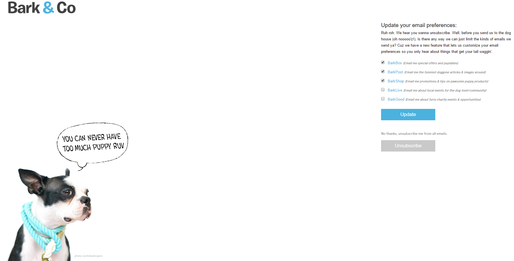
I gotta say, I love BarkBox (and so does my little pup). Their brand is one of my favorites, and it really shines through in their unsubscribe page. Along with their doggy lingo (which really resonates with dog moms and dads like myself), they give you the choice to subscribe to other things you may be more interested in before saying goodbye for good. It's a great way to segment their persona to make sure they're sending the right content to the right people. Two paws up for BarkBox.
2. Grammarly
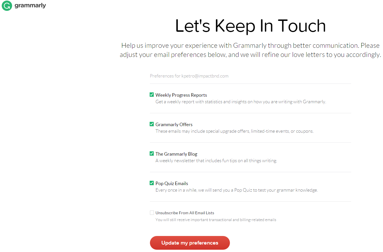
Grammarly does something similar to BarkBox. They actually address the pain point right on their unsubscribe page when they say, "Help us improve your experience...through better communication."
Somewhere along the lines, the reader didn't want at least one type of content Grammarly was sending them, and this is where they can resolve that. Giving people a choice puts them in charge, and in today's world, everyone knows that the user dictates action.
3. J. Crew
One really cool about J. Crew's page is that you can subscribe to only emails regarding a specific type of clothing (i.e. Men's, Women's, etc.) This is a great tactic for eCommerce sites to use with their products and will help them nurture their leads even more down the line. J. Crew also let's their contact adjust their email frequency.

4. Vimeo
Similar to Grammarly, Vimeo addresses the pain point right away, but they do it with cute robot figures and some mild humor.
They make sure they give their subscriber the option to change their mind by simply updating what they will receive, leaving their inbox less cluttered. After all, a subscriber who receives even one piece of content a month from you is better than a lost contact.

5. 1-800 CONTACTS
I know what you're thinking: "She already wrote an entire blog article about everything they're doing right." I know, but this unsubscribe page is too great not to include.
1-800 Contacts uses a bunch of effective elements on this page. Besides the obvious humor, they also consider the fact that the subscriber could have ended up on this page by mistake or simply wanted to update their email address without losing their profile information.
The real winner here is the option to continue the relationship in a less-obtrusive way: through social media.

6. Bonobos
This is one of my favorites. It gives you multiple choices to pick how often you'd like to receive emails, while also connecting it with some emotion, which really gets their company brand across.
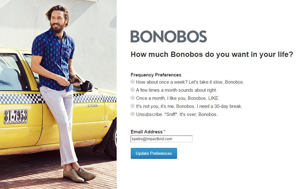
And if that's not enough, check out what happens after you update your preferences. They allow you to connect with the brand via social media, and they also give you another call-to-action that brings you right back to their site. Maybe when you see their new products, you'll rethink your unsubscribe decision...

7. PetSmart
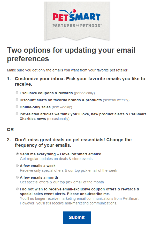
PetSmart gives their subscribers two options. One, they can customize their inbox by choosing which articles or pieces of content they'll receive or two, they can receive what PetSmart calls their "top picks" by changing the frequency of their emails. Depending on how often this person shops for their pet, this may be the best option so that they don't get bombarded with emails they're simply not going to read.
8. Yankee Candle
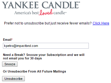
This is an example of a simple, yet extremely effective unsubscribe page. I LOVE Yankee Candle's Snooze option. This gets them out of your hair for 30 days, but it ensures you'll continue to receive emails from them later on when you've had a break. (If you don't want to get bombarded by all those sales emails during the Holiday season, this is a great option.)
Like some of our other examples, Yankee Candle also gives you the option to change the frequency of the emails you receive.
Now It's Your Turn
The brands above are totally crushing it when it comes to their unsubscribe pages. The good news is that it's really not that hard. A Usabilla article suggests you work six key elements into your unsubscribe page to ensure the most effective UX:
- Show your personality.
- Keep to the point.
- Show that you care.
- Offer a re-subscribe option.
- Offer alternatives.
- Keep it simple, but relevant.
Remember, just because someone unsubscribes from your emails, that doesn't mean they're gone for good. Make sure you make their exit memorable and give them the option to change their mind. Show them why they should continue to receive content from you, and set yourself apart from the competition.
Free: Assessment