Subscribe now and get the latest podcast releases delivered straight to your inbox.
9 Companies Creating Killer Email Newsletters (& Why We Love Them)

Aug 27, 2015

 On any given day, I have about 65 emails to open every morning before getting to work. Some are important, but most are just junk telling me about a sale, an update, or an upcoming webinar that I have zero interest in.
There are, however, those select few that have me anticipating their next appearance in my inbox. Each knows exactly how to catch my eye, what I’m interested in reading, and how to get me to click through.
Here are several companies that I love to find in my inbox any given day. What are some of your favorites? Let me know below in our comment section!
1. Airbnb
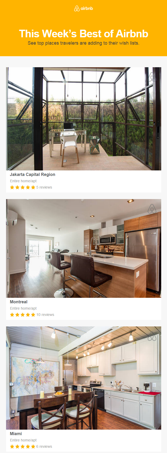
Why We Love It: A photo is worth a thousand words; as a subscriber, you can quickly scroll down the email to see if a place catches your eye. When it does, Airbnb has incorporated user reviews directly underneath each photo to boost trust and prompt a further look-see.
2. Copyblogger

Why We Love It: Even though it’s usually one of the longer newsletters in my inbox, it’s also one of the best. Their newsletter is mainly composed of podcast episode suggestions. The variety ensures that there is at least one that their subscribers will listen to every time.
3. Darby Smart
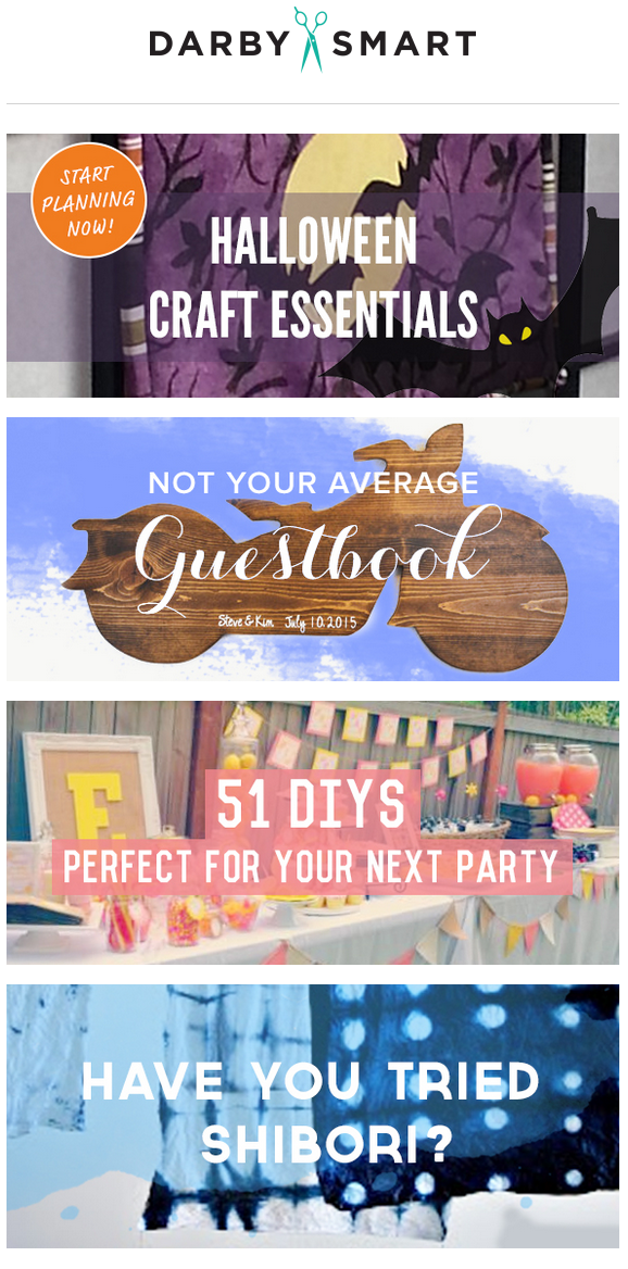
Why We Love It: This newsletter has absolutely zero written content. Darby Smart uses only pictures to prompt subscribers to their site. They take the time to perfectly craft each image to visually capture what the subscriber will see before and after they click.
5. Food 52
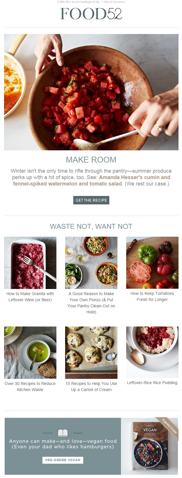
Why We Love It: Besides the almost edible photographs, Food 52 uses a fun conversational tone to relate to their subscribers. It’s all about catching and keeping subscriber attention, so they opt to keep their newsletter minimal to only titles, pictures, and the occasional offer written in the same fun tone.
5. Litmus
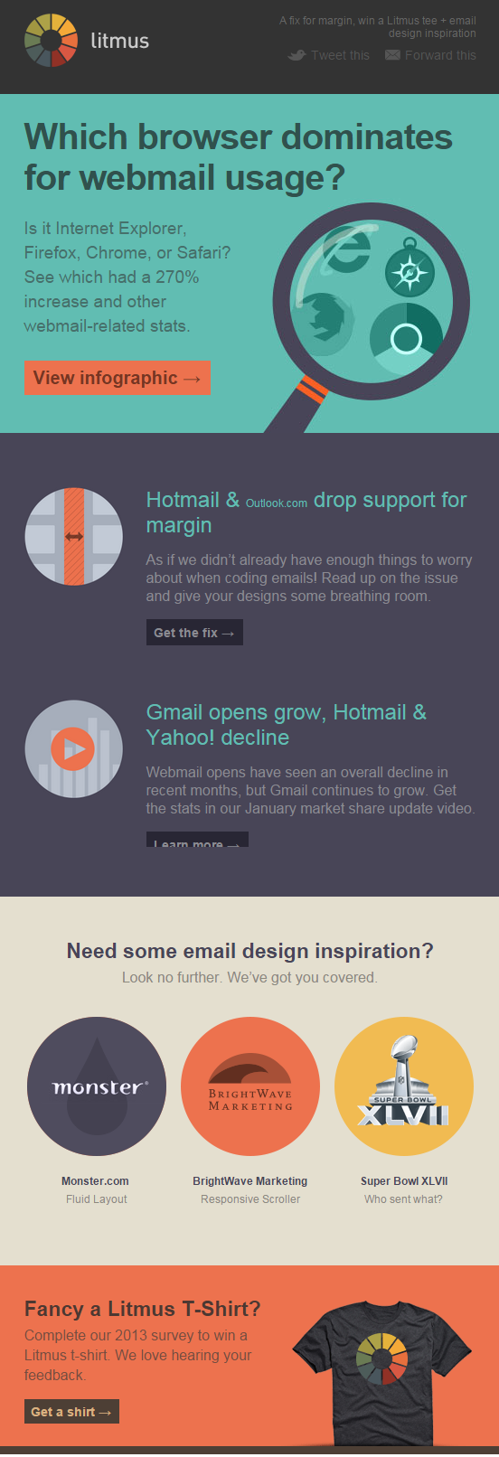
Why We Love It: Litmus always has great and useful content that they somehow condense into just a couple of really well-crafted sentences that always prompt me to read more. They also have a really unique color block design -- it’s the only one in my inbox like it!
6. Notegraphy

Why We Love It: The Notegraphy newsletter showcases beautifully crafted user designs. This newsletter is totally focused on what can be created using the app by anyone using it. It’s inspirational to see what a little creativity and typography can do to bring a sentence to life.
7. Uncommon Goods

Why We Love It: This newsletter proves that there is a way to promote products without being pushy. They craft a creative storyline around their products and create a path for subscribers to follow. At the end of it all is a clear but delicate call-to-action (“Shop”.)
8. Vimeo

Why We Love It: Their clutter free newsletter is easy to scan with bold pictures and CTAs to catch subscriber attention as they scroll through. They understand that their subscriber’s are busy, so they keep their newsletter short and to the point.
9. Invision App

Why We Love It: This newsletter is designed for creatives. It speaks in a fun, relatable tone and focuses on giving designers resources to get better at what they do. My favorite part are the buttons. The unique wording always captures my attention.


Order Your Copy of Marcus Sheridan's New Book — Endless Customers!