Subscribe now and get the latest podcast releases delivered straight to your inbox.
10 Pricing Page Examples for Business Websites (Updated for 2024)

Nov 30, 2023
Pricing page examples for business
- Vidyard: Video software
- COEO: IT solutions
- Berry Insurance: Insurance
- Design Pickle: Design services
- RoofCrafters: Home improvement
- Zirtual: Virtual assistants
- Riomax: Agricultural products
- Basecamp: Project management
- Reclaim.ai: AI-powered scheduling
- HubSpot: Marketing automation software
Making a big purchase — think a car or business software — can send even the calmest person's anxiety through the roof.
There may be many options to sift through, and if you make the wrong decision, it could have rippling effects across your daily life.
That's a lot of pressure.
What's one thing that can easily make the shopping experience worse? When a business has a website where you can't find anything about pricing. Or worse, when your only option is to contact them for a quote.
Too many businesses are afraid to talk about the most important question their buyers want to ask:
"How much will it cost?"
These businesses are afraid they'll scare people away and lose sales. Or they think there are so many factors that affect what they charge that they don’t see the point.
Maybe they're even worried competitors will use it against them.
But if you put your buyer hat on, you’ll realize you’re frustrating more potential buyers than winning them over.
At IMPACT, we help teach our clients and community members how to talk openly about price on their website. Below, you'll explore 10 unique examples of pricing pages from a range of industries, business models, and page setups.
Some of these examples are our clients and some are not. By the end of this article, we're confident you'll have a clear vision of how your business can talk openly about what your buyers can expect to pay.
Why do you need a pricing page on your website?
It doesn't matter how high or "complicated" you think your pricing is, your ideal buyers want and expect to find pricing information on your website.
In fact, 60% of consumers consider price as the primary factor of their purchase, while 86% think it’s important to compare prices from different sellers before taking action.
When you make it hard for your buyers to understand what you charge, a large percentage may abandon you for a competitor who does give them more upfront pricing information without the hassle.
In order for customers to buy from you, they need to trust you. (In fact, Microsoft Advertising found that 85% of today’s consumers say they’ll only consider buying from a brand if they trust it.)
The surest way to build trust is to be open and honest. If you refuse to share your pricing, buyers will think you're hiding information from them. They'll assume you'll overcharge or upsell them once they enter the sales process.
Best pricing page examples
But what do successful pricing pages look like? And how can you have a great pricing page if you have a product or service with variable or complex pricing strategy? Those are great questions, and if you're asking them you've come to the right place.
Those are the exact questions we're going to answer together by examining the following rockstar pricing page examples.
1. Vidyard: Video software
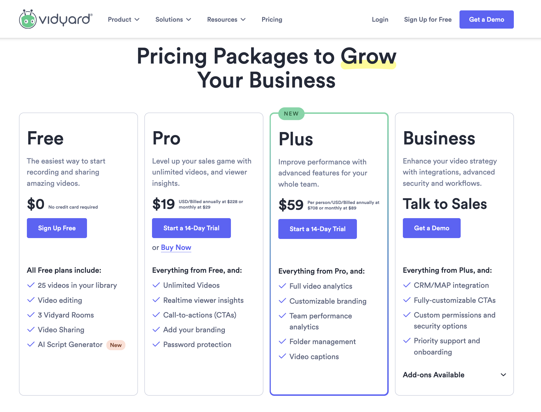
Vidyard is one of our favorite tools at IMPACT, and I’m a fan of a lot of their marketing moves, including this pricing page.
Why exactly? I particularly love how clear their pricing options are with the use of a structured pricing table for easy comparison.
Moreover, I love how they integrated a chatbot on their pricing page, so if anyone has questions, it's clear and easy how to get more information or even contact sales.
That means an ideal buyer is more likely to take that next step. Overall, I just love how user-friendly this page is, and how it's clearly built to meet the needs of the website visitor.
2. COEO: IT solutions
For an example with seemingly endless options, see COEO's pricing page, which handles the intricacies of IT solutions with great clarity.
.gif)
You get a clear breakdown of price, along with explanations of features and frequently asked questions. Whether you're a tech expert or a relative novice just looking to solve for your business, COEO's page can give you the answers you're looking for.
Beyond this main pricing page, there's an assessment tool to help you understand exactly what you and your business will need.
3. Berry Insurance: Personal and Business Insurance
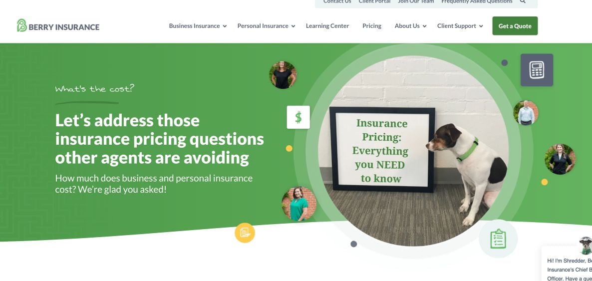
Insurance is one of the most intricately-priced things you can buy. But Berry Insurance offers a high-level overview that helps you know the ballpark you're playing in:
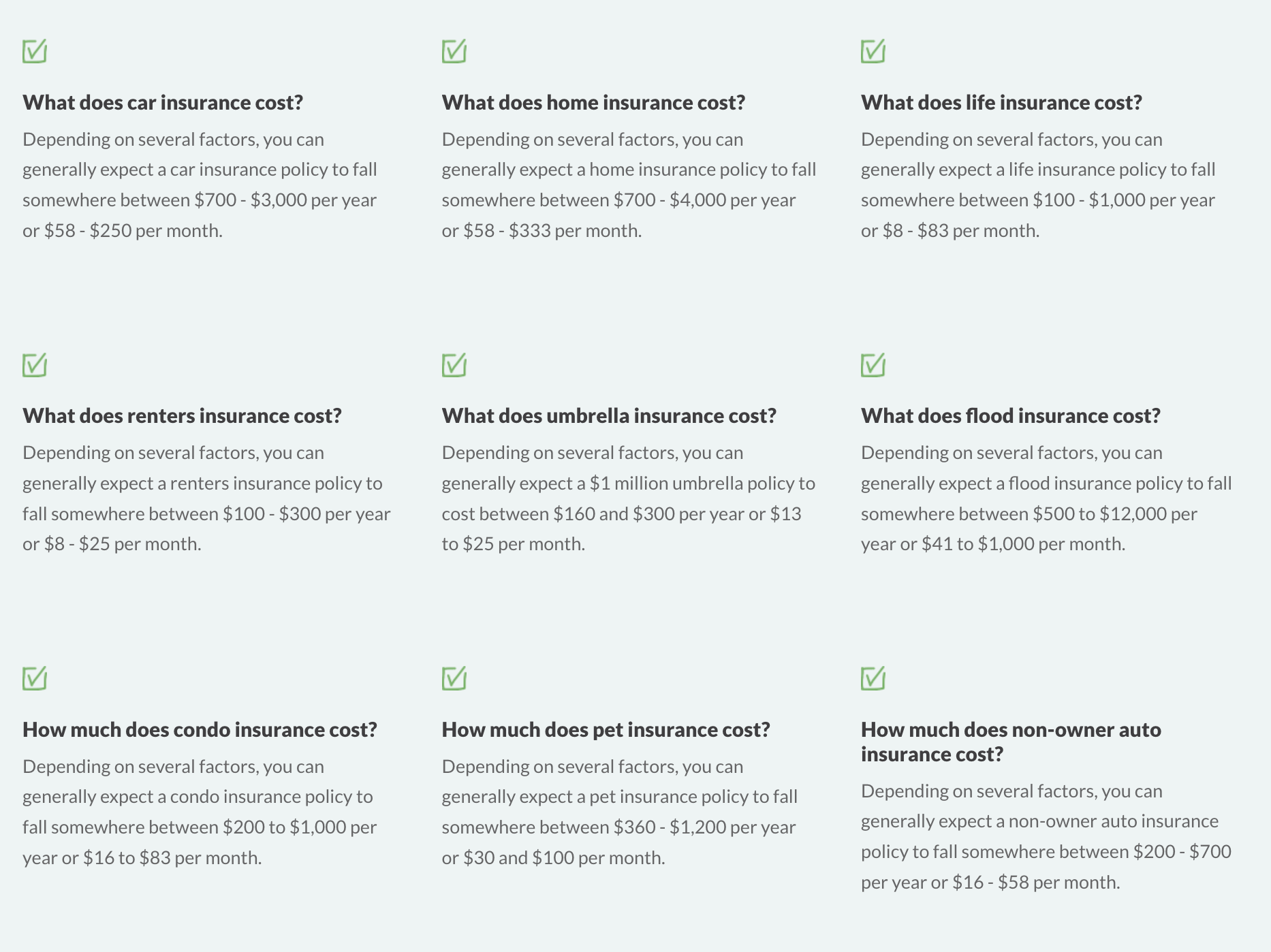 The design here feels like an FAQ page, with quick answers and pricing ranges for nine different insurance options.
To get a full sense, here's one section up close:
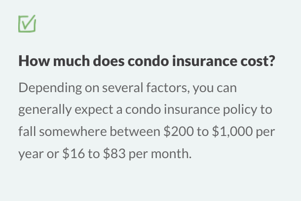 I love this example because it dispels a common myth: People won't be satisfied with a price range. Here, Berry gives a pretty wide range, but it's still helpful. Any consumer can look at this and derive value.
If I'm looking for condo insurance as a first-time buyer, this gives me some understanding of what I can expect to pay. I know I'll get more specifics when I talk to an agent about my specific policy.
Berry's site also allows you to switch between Personal and Business, to find exactly what you need with unique videos explaining how pricing works for each.
4. Design Pickle: Digital design services
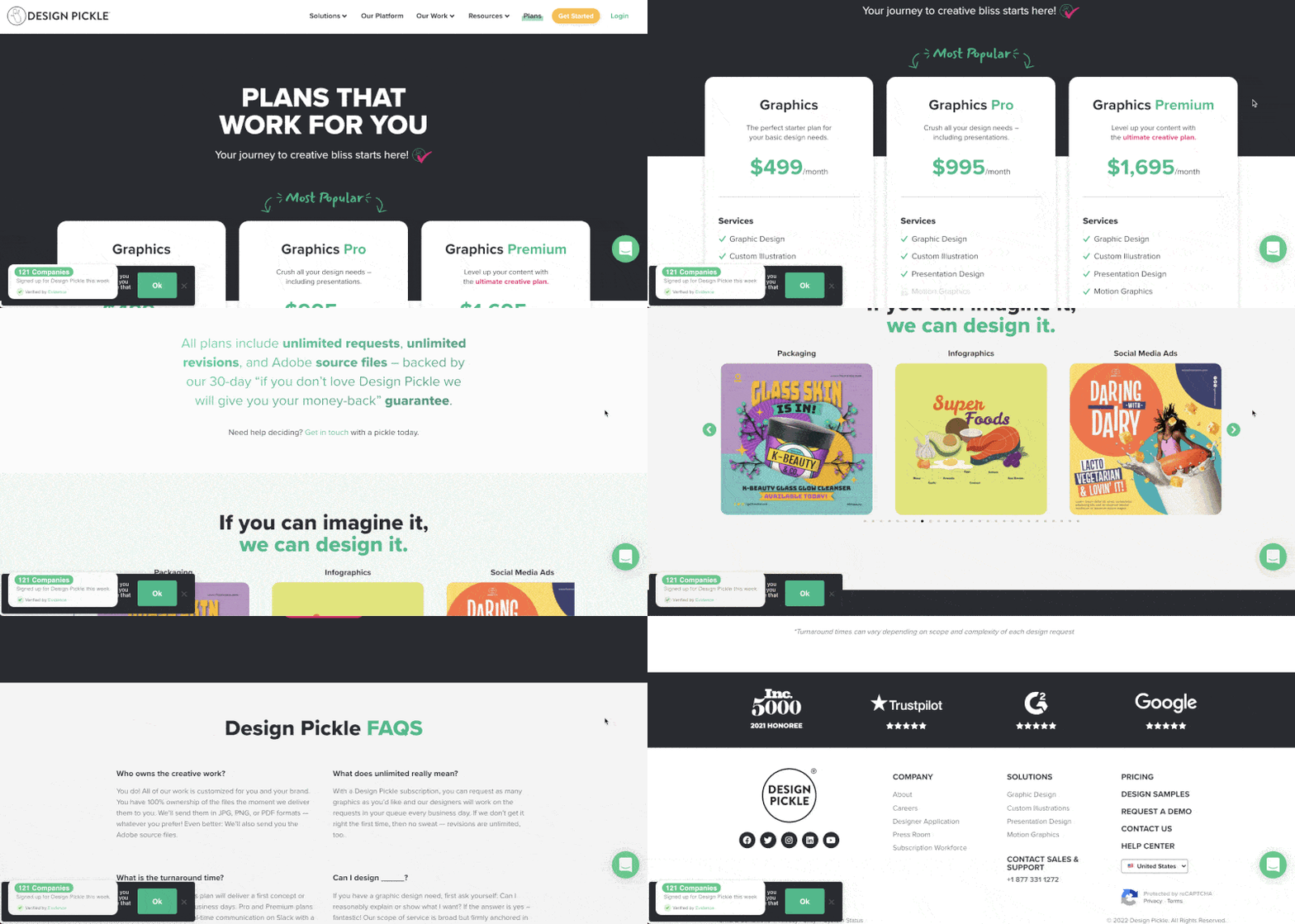
Design Pickle, a graphic design agency, is a great example of a services-based, B2B company that absolutely nails their pricing page.
They aren't afraid to list big pricing, highlight tier differences with a handy table design, and make sure to put their most popular plan front and center. They also include a healthy dose of social proof through real reviews from trusted websites, as well as FAQs.
5. RoofCrafters: Home improvement
Florida-based RoofCrafters offers an additional pricing solution: A pricing calculator.
Installing a roof involves tons of variables — size, shape, pitch, materials, etc. — so the price for one roof could be way different than the price for another.
To solve this, RoofCrafters provides a four-step pricing calculator tool to provide pricing information.
What I love here is that this isn't just a ruse to get more leads. You know what I mean: you get to the end and have to put in your email address to get the results.
This also isn't a super in-depth process that will have you out on a ladder with a tape measure.
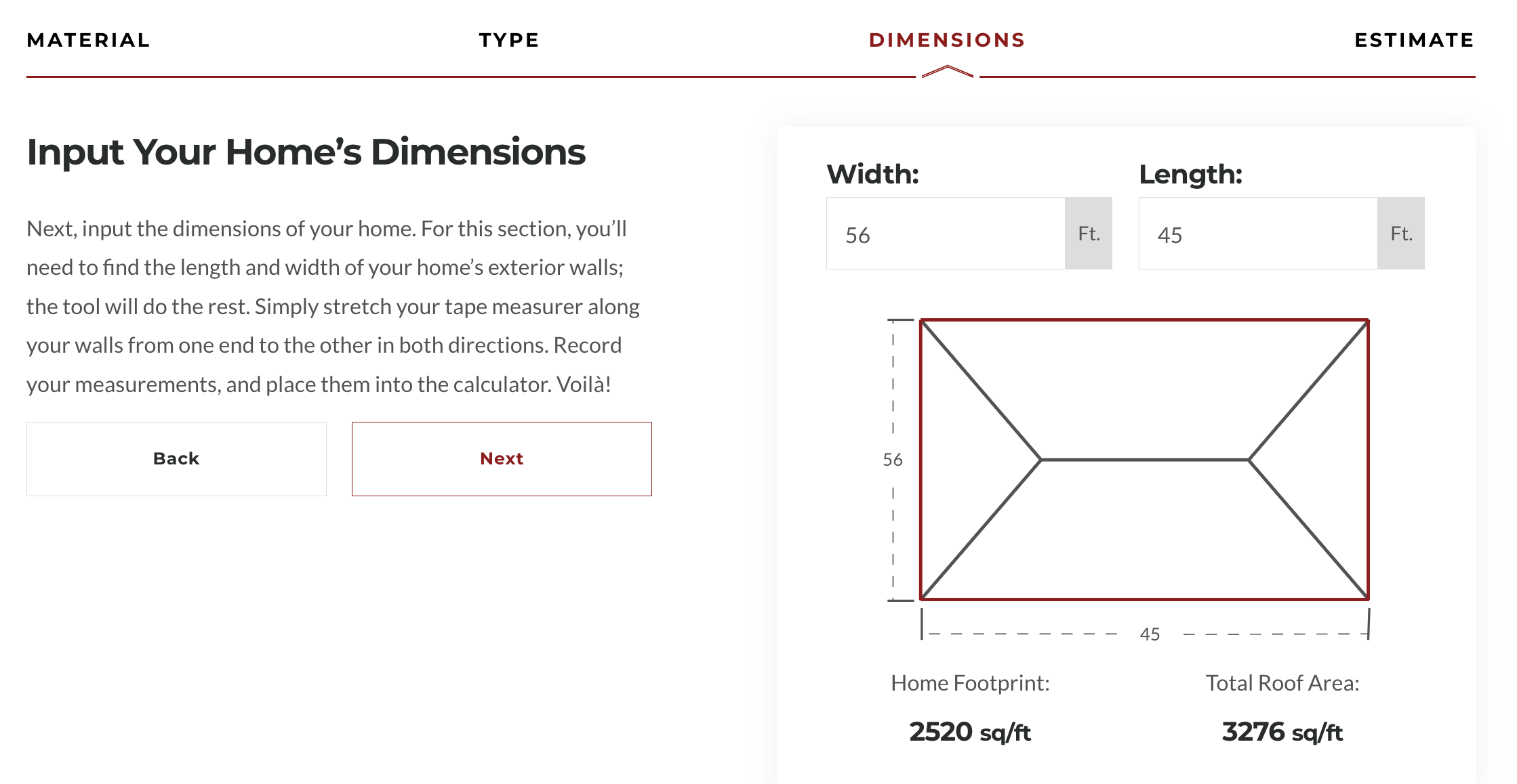
Just choose a material and provide some general information and you'll get a quote. No email address required.
6. Zirtual: Virtual assistants
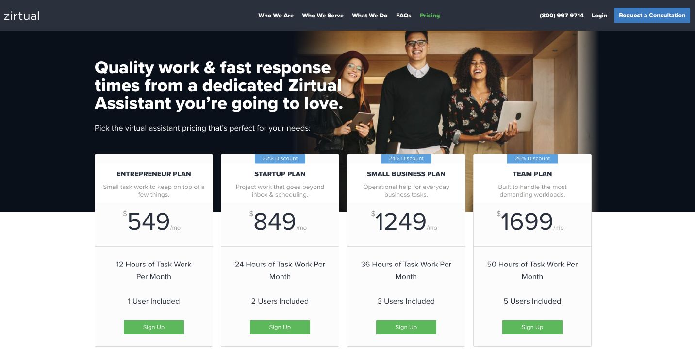
One of the most understandable concerns a services-based business might have about showcasing pricing is if they cater to a broad base of different types of clients — from individuals to larger businesses.
How do you present all of those different pricing plans and ranges? If you fall into this bucket, then look no further than Zirtual for inspiration.
Zirtual, a virtual assistant company, offers its support services for individual entrepreneurs — all the way up to large teams. This page not only does a great job of presenting clear pricing for each tier and making comparison easy, it also shows how the pricing becomes more discounted as you scale up from tier to tier.
As you go down the page, they also highlight additional benefits, FAQs, and social proof.
7. Riomax: Agricultural products
Cattle feed producer Riomax makes it clear: You can go elsewhere and spend way less. But Riomax's products are higher quality, more concentrated, and provide a better value long-term.
For any high-quality producers out there that charge more, you know this can be a hard conversation to have. And you end up losing some business to the cheaper alternatives.
 The page goes on to acknowledge the elephant in the room. Riomax pulls no punches about what it charges. In fact, it pretty much celebrates it.
The page includes two videos:
- One of a Riomax employee explaining their pricing
- One of the ranchers who initially balked at the price but now swear by the product.
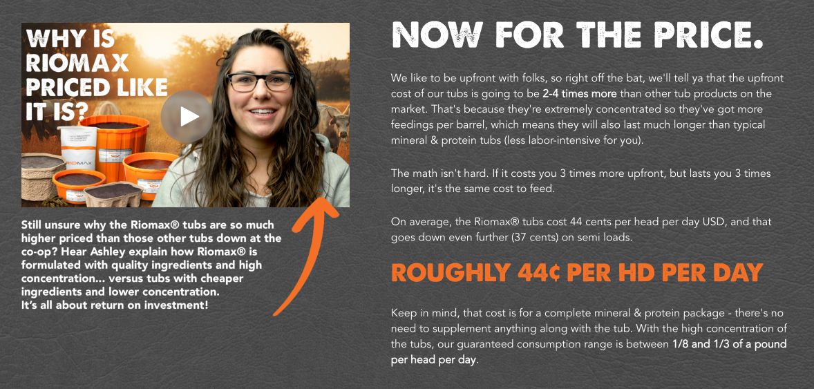 By being upfront about what it charges and why, Riomax gets in front of a central objection it hears from buyers. This way, it controls the conversation from the get-go.
8. Basecamp: Project management
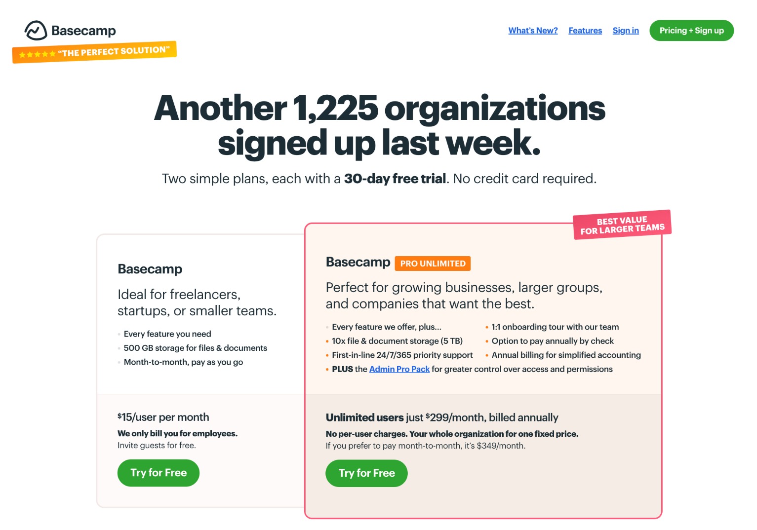
Of course, organization and project management giant Basecamp has an out-of-this-world, detailed pricing page, but here are the specific things I love about it:
- It leads with the most common use case (pro unlimited) but also includes the smaller plan.
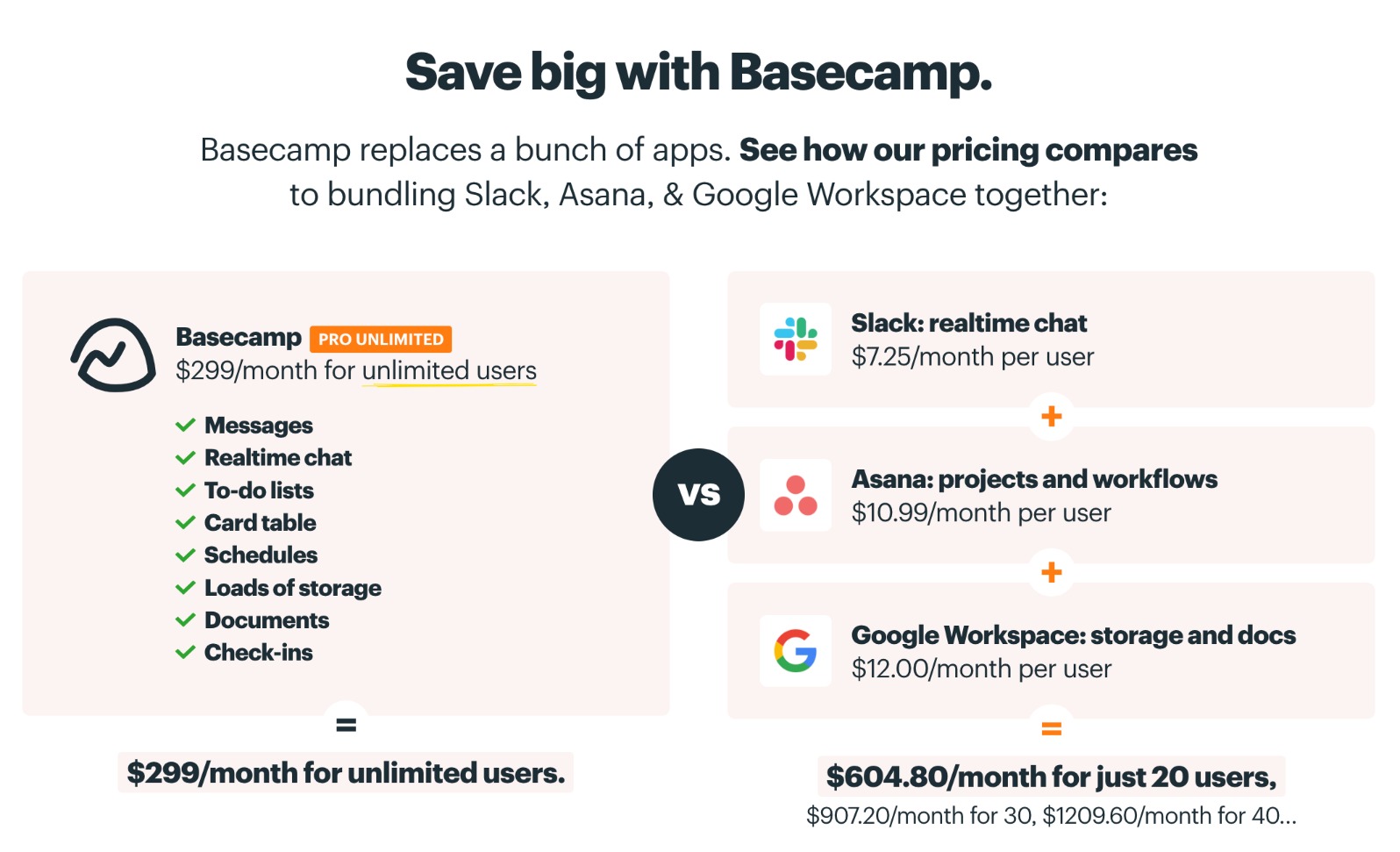
- They not only include their own pricing, they include pricing against their competitors right on the same page! That's so helpful for companies and brands trying to do comparison shopping and hesitating at the all-in-one cost vs split-up costs that add up.
9. Reclaim.ai: AI-powered scheduling
Reclaim has become a favorite around the IMPACT office for its ease of use and helpful features. As many AI businesses struggle to monetize, Reclaim is doing it right, and that's reflected in the company's pricing page.
.gif)
This page starts with the standard tier structure, but as you scroll down you see a more in-depth comparison with explanations of various features and capabilities.
There's also a pricing calculator and a list of discounts if you're a nonprofit, educator, or a startup.

In the ever-changing world of AI, pricing can seem half-baked. Reclaim's pricing page shows its offers have been carefully thought through.
10. HubSpot: Marketing automation software
If you have a business with multiple products and audiences, where you're concerned your pricing strategy is too complex, look no further than HubSpot for an absolute masterclass in how to nail a pricing page.
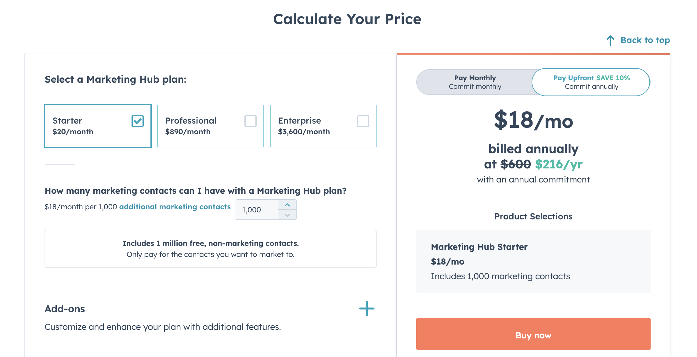
They sell five different automation platforms — sales, marketing, service, web, and operations — with three subscription tiers that don't have a single price and even a free version.
So, how did they tackle it?
- They included the language "starts at" for the price noted in each tier.
- They offer recommended bundles, depending on your business needs.
- Allow you to toggle paying monthly versus upfront.
- Show cost in different currencies for buyers around the world.
- Offer a "calculate your price" tool (shown above) to help you configure your options.
- They give even more transparency and control to their ideal buyers by giving them a pricing calculator, so they can see what influences cost and why.
Bottom line, they don't shy away from the complexity of their pricing — and why should they? Marketing technology buyers (who are serious, good-fit buyers) know what HubSpot sells is going to be an investment. A big one, depending on what they need.
So, by giving them more autonomy and power to understand what they're getting into from a money standpoint only serves to create more educated buyers and empower bad-fit prospects (who will never pull the trigger on something so expensive) the chance to self-select out before sales wastes time with them.
Remember, you can't avoid the money talk
When we talk to companies who are cost-avoidant on their website, usually they fall into one of three buckets with their concerns (if not more):
- "We'll scare away potential customers with a price tag before they understand what value we really provide."
- "We don't want our competitors to know our rates."
- "Our (products/services) are too complex when it comes to pricing, so there's no way we can actually create a pricing page."
Well, here is what I have to say to each of those:
- You'll only scare away those who are likely bad fits to begin with. This means you're actually just saving your sales team the wasted time they would have otherwise had to spend with those folks.
- Your competitors already know. Trust me, they know, because (beyond obvious industry pricing standards and ranges) you all are vying for the same business, and prospects talk. Don't hide your pricing from a place of fear. Your ideal buyers will go running to those very competitors you're trying to dupe if you don't share your pricing.
- You totally can create a pricing page experience for complex pricing models that empower your ideal buyers and make them feel more confident in reaching out to schedule a demo or talk to you more about your services.
Having a pricing page, and more importantly, a transparent pricing page, is an essential part of building trust with your audience before they’ve even spoken to you. A detailed pricing page is just another tool that helps enable them to do their purchase research as independently as possible.
As you look ahead to how you want to transform your business website in 2024, add “create a detailed, transparent pricing page that puts the needs of your buyers first” as a part of your new business website strategy.
Now more than ever, your ideal buyers are more budget-conscious and in search of companies they can trust to be forthright.
So, don't let fear result in you leaving money on the table. Moreover, understand that the most profitable and easy way to stand out from your competition is by clearly declaring on your business website, "We're happy to make it easy to understand what our products and services cost, and why. We’re here to help.”
Free: Assessment