Subscribe now and get the latest podcast releases delivered straight to your inbox.
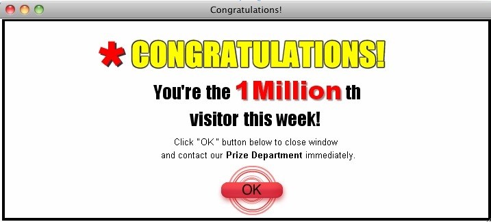
For many, hearing the word “pop-ups” instantly makes them cringe and think back to the days of those obtrusive, spammy, and often poorly timed ads that we used to see littered all over the web.
You know the ones I’m talking about:

Those pop-ups left us with a bad taste in our mouths and taught us to be weary of anything resembling those awful ads.
With that in mind, you can imagine my initial reaction when Bob, our founder and CEO, suggested we start integrating exit pop-ups on our client’s website a few years ago. Then again when HubSpot released their pop-up forms tool.
“Is this a joke? We’re talking about those cheesy pop-up windows that always interrupt while I’m viewing a page?”
Welp, turns out it wasn’t a joke.
I quickly learned that these were an entirely new breed of pop-ups that focused on delighting and re-engaging with visitors that are about to leave your site.
And the crazy thing about these pop-ups was they actually worked.
Rather than being intrusive and spammy, when done right, they help build a better user experience by giving visitors a helpful piece of content to take with them as they leave your site.
They get some valuable content to help them in the buying process and you get another chance to re-engage with what would otherwise be a lost opportunity.
While using exit-intent pop-ups can be a great opportunity to re-engage users, if done incorrectly it can also come across as spammy and hurt your brand’s reputation.
So, what goes into creating an effective, delightful exit pop-up?
The folks over at Visme, an online presentation software, have put together an infographic to walk you through seven foolproof tips for implementing some that convert.
The infographic also outlines the anatomy of a successful pop-up as well as the advantages of using these pop-ups.
Some of my favorite tips:
Put Your Pop-up Into Context
Make sure your pop-ups are related to a user’s session and interests. Think about why they came to a page and what information they’re expecting to get.
For example, if a visitor is on one of your product pages, maybe you can present them with a pop-up for a free trial.
Let Them Quit (If They Want To)
This is one of the most important pieces of making sure a pop-up doesn’t hurt the user experience of your site. Your exit pop-up should always have a very clear and evident close button. You don’t want users to feel forced to fill out your offer just to escape. Making the user feel stuck on your site is only going to leave them feeling frustrated and unlikely to return to your site in the future.
Don’t Be Annoying
If you visitors choose to close out your exit pop-up, refrain from showing them that same pop-up again for at least a couple weeks. You don’t want to keep bombarding them with the same pop-up over and over again if they’re not interested.
Check out the full infographic below to learn everything you need to know about getting started with exit pop-ups:


Order Your Copy of Marcus Sheridan's New Book — Endless Customers!

![A Visual Guide to Exit Pop-Ups People Won’t Hate [Infographic]](https://www.impactplus.com/hs-fs/hubfs/Popup-Hero.jpg?width=768&height=400&name=Popup-Hero.jpg)