Subscribe now and get the latest podcast releases delivered straight to your inbox.
5 A/B UX Tests You Can Run on Your Landing Pages Right Now

Apr 4, 2017
We all like to think our landing pages are following the rules and exercising user best practices.
Yet, sometimes, you may realize there are further opportunities for improvement you never thought to try.
This means you need to dig into your pages’ anatomy and discover what might not be resonating with your users. From here, you can create a hypothesis that will allow you to test what needs improvement.A/B or multivariate tests are incredible ways to do this. A/B tests allow you to launch variations of your pages so you can then monitor user behavior on each to see whether or not the changes you've made had any effect on conversion rate, traffic, UX, etc.
Figuring out what to test can come across as a struggle, especially if you’re worried about the changes decreasing your page's conversion rate, but it's better to split test something initially and view the results, then to launch something fully before discovering it’s not work.
To calm your nerves, I’ve assembled several A/B testing case studies and reasons explaining why their techniques worked so you can understand why you should run similar tests on your landing pages.
1. Anchors vs Modals
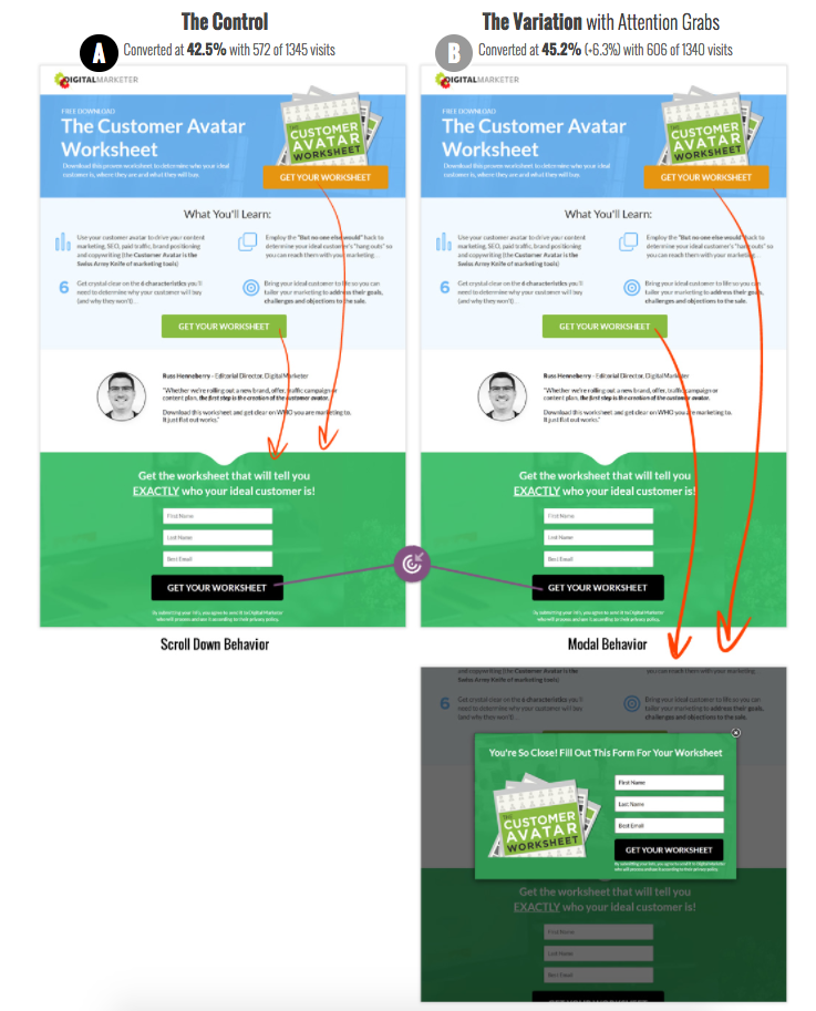
In this case study, DigitalMarketer looked at how anchoring the buttons to scroll to the form versus a click-to-modal form would affect their conversions. At first glance, it might appear variation A would be the winner since the popup would appear more annoying to users, but surprisingly, it was variation B that took the cake. But why?
While variation A still brings them directly to the form, the movement down the page may be disorienting for the user. They may even scroll back up the page to review all the content they missed and ultimately decide not to convert.
Triggering the modal with the form in it provides a very clear and expected next step that doesn't confuse the user. They are also still left with the ability to close it if they decide they want to read more into the offer.
2. Images of Offers/Different Covers
When you have a subscriber base as big as Netflix, you can be sure you should be testing every ounce of your UI, imagery, and content to assure users are getting the most out of your website.
One of the more interesting tests Netflix performed is how sensitive users are to different artwork and what provokes users to click through to watch shows.
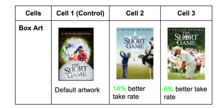
They ran similar tests on a variety of different shows and ended up discovering a few different trends with the winning variations. For example, they found images with facial emotion that convey the tone of the title typically perform better. Any artwork that also highlighted recognizable or polarizing characters from the show also aided in a better take rate (click-through rate on shows).
But what does this mean for your landing pages?
For those landing pages where imagery is important, try experimenting with different images to see how strongly they play a role in credibility and appeal.
For example, if you have a landing page for your eBook, try creating 2-3 different versions of your cover and using it on three different landing page variations. (Note: The rest of the page should be the same.)
If you have a landing page for a specific product, try different images of the product's functionality or features. You could even experiment with GIFs or animations. You may end up discovering design trends that help bump your conversion rate up, even if it small.
3. Clear Labels, Immediate Errors, & Example Inputs on Forms
If you have a long form on your landing page, containing fields that are all necessary for the user to fill out, then additional measures need to be taken to reduce any fiction.
Easycredit decided to analyze whether or not including labels, notifying error messages early, and explaining what goes into each field would help guide people through the form easier.
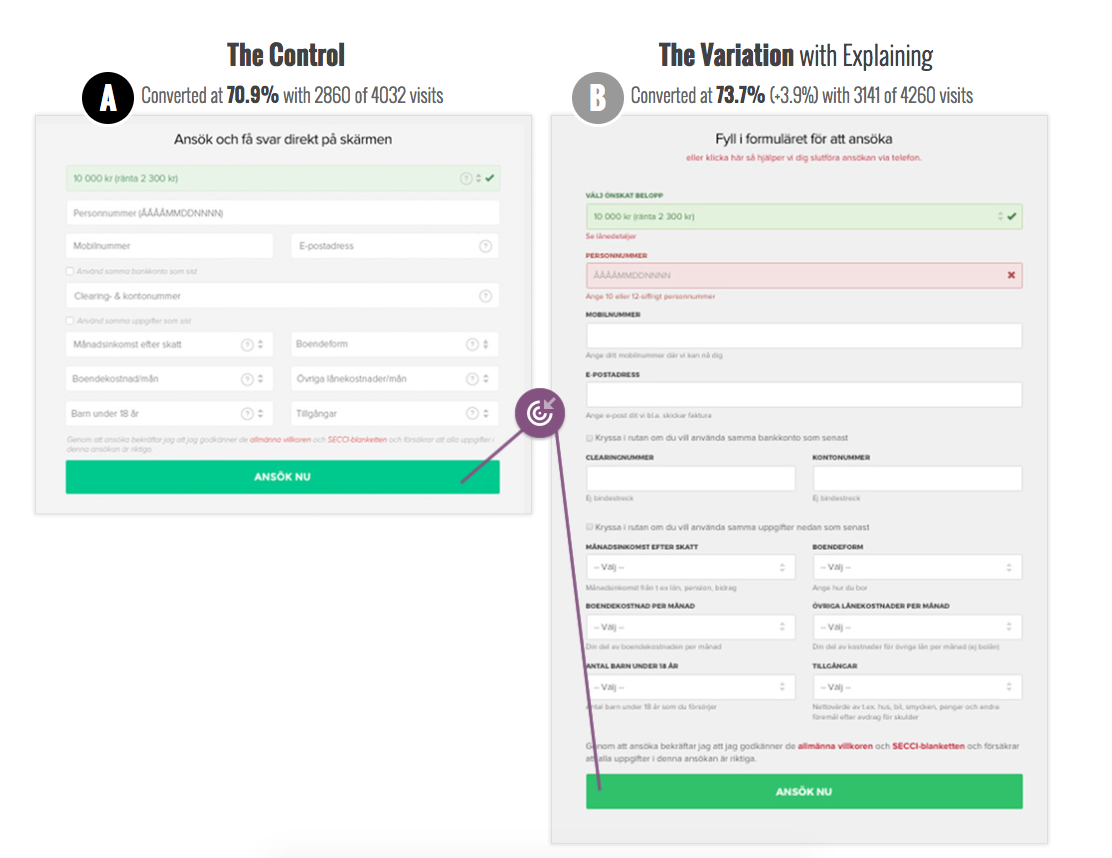
Their B variation, which had all the extra messages and labels ended up winning.
Although the A variation was visually shorter by using placeholders as the labels. still had the labels moved as placeholder text inside the input fields this did not equate to increased conversions.
For a form that requests fairly complex information, it can be incredibly frustrating to complete all the fields only to find out four are wrong AFTER you press the submit button.
Then, for every change you make, you need press the button again to discover if the information is correct. It’s all time consuming and can scare people off quickly.
The hints and labels may make the form appear visually busier, but they ultimately aid in notifying the user how to properly fill out the form the first time. Rather than guessing another five times.
4. Adding Testimonials
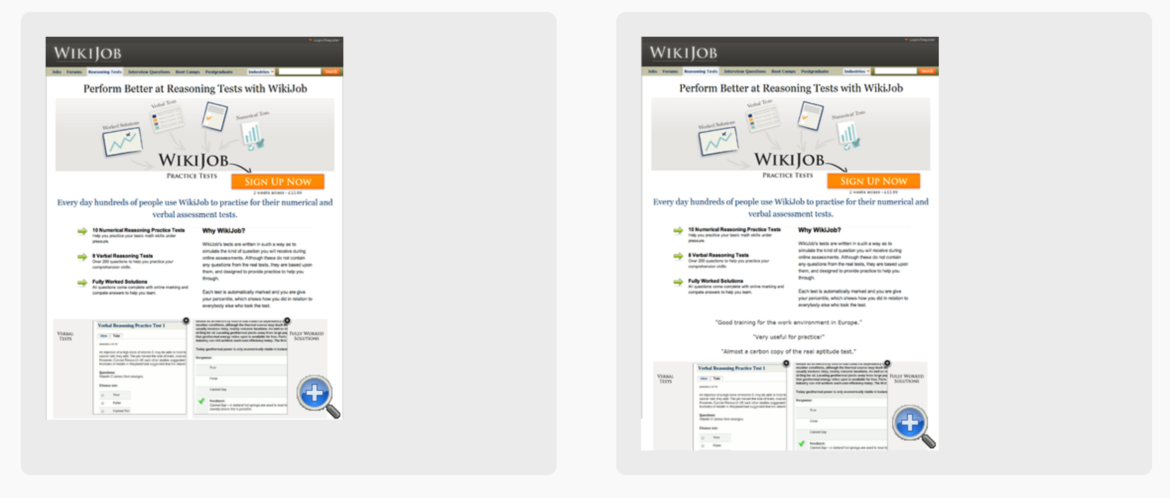
Although similar pages, a simple test of adding testimonials can go a long way in affecting how users behave. In fact, this change was enough to elicit a 34% increase in sales for all organic search traffic. Not too bad, huh?
Although Wikijobs may have increased the length of the page, the information was warranted, if not necessary. Social proof plays a critical role in product authenticity and reliability -- and ultimately earning conversions.
Keep in mind that the effectiveness of testimonials can vary based on their placement on the page. When including them, make sure they are above the conversion point so users are more likely to see them before deciding whether or not to convert.
Proper visual appearance, such as real names, photos, companies, logos, and comments, will also help drive home their credibility.
5. Pricing Models
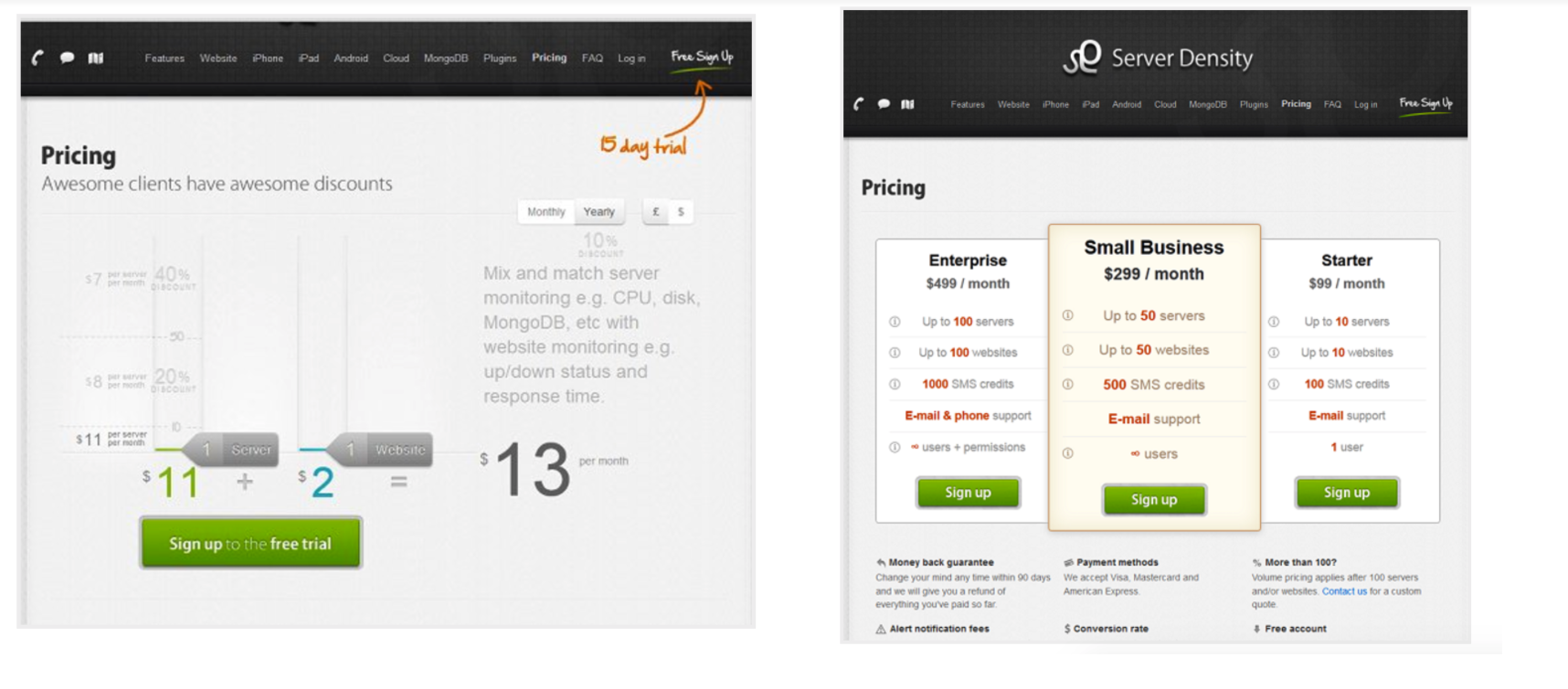
Pricing models have always been tricky territory for any company. They require you figure out the best way to highlight the selling points of your products, then, you need to explain those in a very short, concise, yet impactful manner. Combine those few things together, on top of a reasonable price, and you have a great pricing page. I’m exhausted just thinking about it.
The biggest challenge with pricing models is developing how to best display that information so users understand the value of your product. What better way to discover this than to do a test like Server Density ran?
Within their variations, they tested the impact of a custom pricing tool (the A variation) versus set package pricing (the B variation).
While they had a higher conversion rate on the A variation (6.92%), they made less revenue overall ($394). Their B variation left them with a 5.19% conversion rate, but a total revenue of $833.
Based on this, we can see that although giving control to the user to judge their pricing seemed nice, it did leave the company lower on revenue.
Before thinking of any pricing model, it's best to first understand how much value your users see themselves getting out of a product. Once this is understood, you can then begin to build a package pricing model that works for your audience that matches with the value they feel they receive.
How to Run A/B Tests
If you are looking to perform tests like this yourself, you’ll need to pick some conversion rate optimization tools to manage your tests. Pick tools that will create two or more test variations and also track analytics so you know exactly how users are responding to your tests.
Some tools this that, list such as Hotjar or Mouseflow, may not manage A/B tests, but are great ways for you to understand your users behavior on pages. Analyzing this will ultimately help you develop a more targeted hypothesis, better hone in on your pages weak spots more effectively the first time around, and drastically increase your conversion rates faster.
Free: Assessment