Subscribe now and get the latest podcast releases delivered straight to your inbox.
Atomic Design: How our creative team uses design systems to supercharge our workflow

By Joe Rinaldi
Nov 21, 2019

If there’s one thing we marketers and designers love, it’s our buzzwords.
I’m not afraid to admit it. Everyone’s got at least a couple go-to buzzwords they like to sprinkle into casual conversation.
In the past it’s been words like “disruptors,” “gamification,” “blockchain,” and “growth hacking.”
A couple years ago, I started hearing about a new design trend — “design systems.”
When I first heard the phrase I just shrugged it off as another buzzword that would eventually fade away. These design systems just sounded like glorified style guides.
However, I quickly realized I was wrong.
Over the next few months, I started to see major companies such as Shopify and Atlassian build out these amazing systems that aligned their design teams and empowered everyone to create designs that stayed true to their company’s brand.
I started to learn that designs systems weren’t a trend, but the next step forward in design.
These systems are more than just a simple style guide. They’re collections of reusable components all guided by clear standards to help keep designs consistent and high-quality.
That’s exactly why our creative team has spent the last year researching, building, and implementing our own design system.
Our first attempts were clunky and unorganized, but we still saw the immediate benefits of working in a design system state of mind.
We just needed to organize our components in a way that gave them meaning and made them scalable.
Enter Atomic Design.
What the heck is Atomic Design?
Simply put, Atomic Design is a methodology for creating design systems that designers can easily organize, maintain, and expand as time goes on.
Brad Frost, a Pittsburgh-based web designer, created the concept based on how atomic elements work in chemistry.
He relates how atoms and molecules combine to form complex organisms to how, if organized properly, we can combine different components in our design systems to form different website elements.
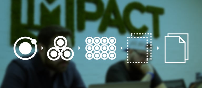
Based off of this idea, Atomic Design is organized into five different hierarchical levels:
1. Atoms
In chemistry, atoms are the smallest building blocks.
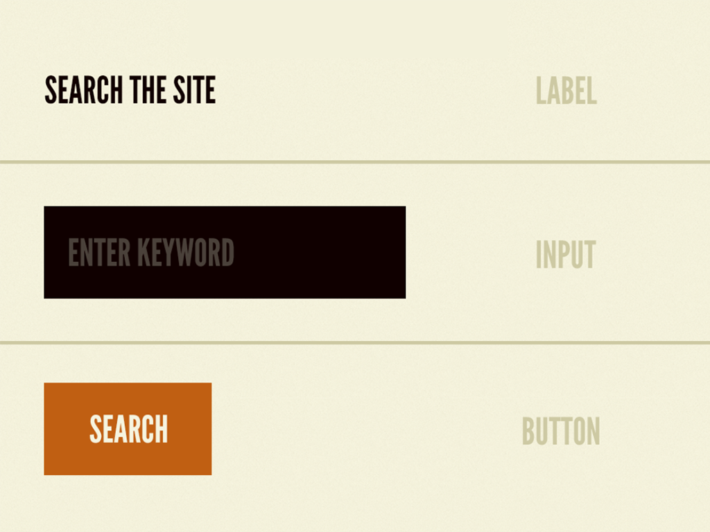
In terms of Atomic Design, atoms include all your foundational building blocks such as form labels, buttons, and type.
Looking at the image below you can see how these elements are the most basic elements of web design. These atoms can’t be broken down any further.

2. Molecules
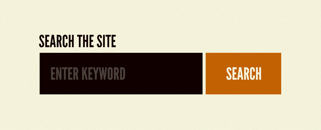
Molecules are relatively simple groups of atoms functioning together as one unit.
For example, a form label, a search input, and a button can come together to create a search form “molecule” as seen below:

3. Organisms
Organisms are the most complex components, composed of different atoms, groups of molecules, or even other organisms.
These organisms in Atomic Design form larger sections on a web page.
If we combine the search form molecule from the previous example with navigation links and a logo, for example, we could form a header organism.

4. Template
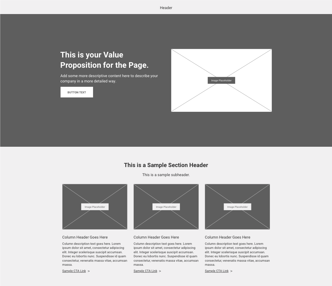
The template level of Atomic Design consists of groups of organisms working together to form the underlying structure of a page.
Think of this as the skeleton or a wireframe, similar to a template you would find in a website page builder.
It’s a tool you can use to plan the underlying direction of the future page and where we start to see pages take shape.
In the example below, you can see how the different organisms combine to start forming a page.

5. Pages
Pages are the final level of Atomic Design. This level is the most concrete stage that shows what templates look like with real content.
Not only is this the final design users will see, this level also shows how all the organisms used in the template level functions when real content is applied.
These five levels form the core of Atomic Design and work together to help you build scalable design systems.
How did IMPACT implement Atomic Design for our team?
Implementing Atomic Design into our design system was a full team effort.
Aside from the obvious first steps of reading the book (or if video is more your speed, I suggest checking out Brad Frost’s An Event Apart presentation) and getting a fundamental understanding of Atomic Design, there’s a few steps I recommend every team take to successfully implement the methodology.
1. Take an audit of current website assets
One of the first things our team did was get together and take an audit of the most recent websites we worked on.
During the audit, we looked for common website elements that we were using on different websites. This included things like headers, footers, and heroes.
Once we had compiled examples of our most frequently used sections, we began breaking those sections down into the smaller levels of atomic design —organisms, molecules, and atoms.
Going through this exercise gave us a good foundation to build off of for our design system.
2. Decide where you want your design system to live and how you want to build your atomic elements
Deciding on what tool you want to use to create your atomic elements (such as Sketch, Figma, Adobe XD) and where you want that system to live afterwards is a major decision.
You need to consider how your team works and find a solution that will work for everyone.
For example, if you’re on a team with multiple designers and developers who work remotely (like IMPACT), then having your design system live in a folder located on your desktop probably isn’t going to work.
Regardless of what you choose, the most important thing is having a single source of truth that’s always up-to-date that everyone on your team is able to easily pull from.
With this in mind, I recommend using a cloud-based option such as Invision DSM, Frontify, or Sketch Cloud.
After doing some research, we decided to make the switch over from Photoshop to Sketch to build out the atomic elements in our design system.
Our team, in turn, uses Sketch Cloud to store our master atomic elements library so our creative team can add that library directly to the Sketch app.
This lets us keep our main file up-to-date while also making it easy to push out updates to our entire team.
3. Dedicate the time to give a proper training on your design system
Before your team starts using your design system, make sure everyone is properly trained on it.
At the very least a training should make sure everyone on your team:
- Understands the importance of using a design system
- Understands how your design system is organized
- Knows where the design system lives and how they can access it
At IMPACT, we had small group trainings within each of the different job functions (i.e. project managers, developers, designers) on our creative teams to get initial feedback on the design system and discuss how this would help improve their workflow.
After we had the first version of our design system ready to go, we then held a larger training with our entire creative team.
During this training, we walked through the different pieces of the design system, how we would reference each element, and how these elements transferred over to development.
The biggest win, however, was that it got our entire team aligned and talking the same language.
This type of training really reinforces the importance of a design system and makes sure it becomes a way of life for you team rather than a tool that falls on the back burner and gets forgotten.
What benefits have we seen from atomic design?
Our creative team has been up and running with the latest version of our Atomic Design powered design system for about four months now.
Although our system is still in its infancy, we’ve still seen the major benefits. Some of those benefits include:
Next-level organization
Organization was one of the toughest things we struggled with initially. Design systems are only going to grow over time, and as you add more elements it becomes tougher to manage and see what you have to work with.
Atomic Design’s structure for organization, however, has helped us organize our components in a way where each component has meaning and is easy to find.
We’re no longer creating duplicate elements in design or code because we now have a better holistic view of everything in our system.
Quicker prototyping
The benefits of having an increased level of organization is we’re able to cut down on the amount of time we spend prototyping. We no longer have to start from scratch on every design. Instead, we have a library of elements we can easily sort through and start building with.
Full creative team alignment
During the audit phase we noticed that everyone had different names for the same sections on a website.
For example, a lot of our websites have a smaller navigation bar above the main header. Some members on our team would call this the admin bar, others called it the utility menu, and some just called it the top navigation.
This quickly gets confusing.
Switching over to Atomic Design has given us a consistent naming structure and aligned our creative team by getting everybody talking the same language.
More consistent designs
The increased level of organization has helped us improve the brand consistency and quality of our designs.
Before Atomic Design, we didn’t have a way to see what design components were already created.
This led to us re-creating the same element on different pages.
Every time we did that, the element had the risk of ending up looking slightly different from the others which then led to inconsistencies and a less unified user experience.
Our teams are now able to quickly see what design components we already have so we’re not unnecessarily re-creating elements.
It’s also much easier to stay on-brand by using our pre-existing atoms and molecules to build new organisms.
It also makes it easy to make sure all of our designs are delivering the same high quality.
Atomic Design gives your team a foundation to build on
Atomic design has proven to be an incredibly powerful tool for our team so far.
It’s organized our design system and given us a foundation to build off of rather than starting from scratch on every project.
This frees up our designers time and headspace to focus on the “why” behind their designs rather than the “how.” It’s pushes us to do some real design thinking.
It’s also improved the way we communicate as a team and helped align all of our members.
Implementing Atomic Design does require some work up front, but it is well worth it in the long run.
Not only will it help empower your team to create a design systems that’s able to grow and evolve with its needs, but also free up the time you need to get creative with less formulaic projects.
Free: Assessment