Subscribe now and get the latest podcast releases delivered straight to your inbox.
27 best about us page examples and how to create one

Aug 15, 2019

About Us Page Examples
- Tumblr
- MailChimp
- Ideaware
- 500px
- Salemtown Board Co.
- Giphy
- Bentley Motors
- Adidas Group
- Nerdery
- Chattanooga Renaissance Fund (CRF)
- Molecube
- Moz
- Yellow Leaf Hammocks
- FortyOneTwenty
- Simple as Milk
- Pulp Fingers
- Doberman
- NextSpace
- DoubleDutch
- National Geographic
- Rent the Runway
- Apptopia
- Cultivated Wit
- Marie Catrib's
- Gummisig
- Engage
Interactive
Getting to know people is hard, but getting to know people online, is even harder.
Human beings are not one-dimensional. We all sound, look, behave, and even smell differently, but these traits (some, thankfully) can't be experienced from behind a cold, digital screen.
No matter how advanced technology gets, there will always be a divide keeping us from truly knowing a person we've only spent time with online.
Unfortunately for marketers, the same difficulties could be said about brands. In fact, it's often harder to establish a personal connection with brands across the wide expanse of cyberspace.
Enter the about us page.
It doesn't matter if you're B2B or B2C, understanding and coming to trust a brand spurs from knowing more about them — and crucial component of this is the about us page.
There isn't an exact formula you have to follow -- you simply want your about us page to be interesting, informative, and personable. You want to give your prospects a reason to fall in love with your brand.
Creating an about us page that actually converts may include:
- Focusing on your buyer persona and the value they get
- Providing testimonials, case study data, and other facts that prove your value
- Making the page visually appealing with photos and videos
- Showing personality
But every business and buyer persona is different.
To help you build or redesign your about us page (and give your buyer's what they really need to know about your brand) here are 28 of the best about us pages we've ever come across.
1. Tumblr
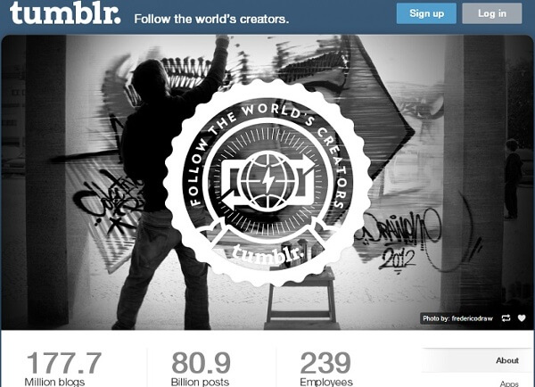
Tumblr's about us page fits seamlessly into the platform itself.
As a once-avid tumbl-er myself, I would think this was any other post in my newsfeed if I didn't know any better.
The hero image gradually transitions between several large, vibrant images that grab your attention without being too distracting, then as you scroll, it lists a few basic facts about the company, as well as some impressive real-time stats showcasing the popularity of their community.
Like any good inbound marketer, this page then continues the user journey, sharing some of the most recent posts at the bottom of the page.
2. MailChimp
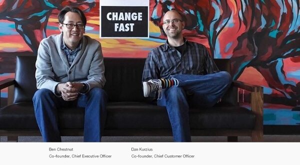
On its old about us page (seen above), MailChimp did an admirable job of personifying their team and business, while also sharing their story.
The top of the page featured a large friendly image of the company's founders and as you scroll, you find short details about it, the team, and its culture.
🔎 Related: 25 Best Contact Us Page Examples to Inspire Yours (Updated for 2020)
Along the way, MailChimp continued to share photos of its executives and other key team members, effectively humanizing its brand by putting several faces to its name.
The email company also did a great job of building trust by incorporating elements of social proof (i.e. media and user testimonials, partner logos, etc.).
3. Ideaware
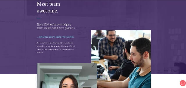
This page is what I like to call "delightful" design.
With its use of bold color, interactive elements, and subtle animations, this about us gets you actively engaged in Ideaware's story. It not only grabs your initial attention, it keeps you wondering what other little surprises lie ahead.
4. 500px
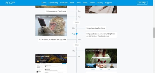
500px is a social network for photographers, so naturally, its about us page is loaded with striking imagery that does the talking for it.
After an initial introduction (sharing its unique value proposition), the network keeps its written description to a minimum.
Instead, 500px has a visual timeline showing the evolution of its brand, and highlighting major updates and milestones that have benefited its users.
This page also does a great job of providing "next steps" for users by including links to their latest blog articles at the bottom.
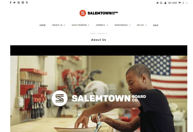
5. Salemtown Board Co.
Now, this is probably the best "storytelling" about us page on our list.
A B2C company, Salemtown Board Co. was started by two brothers with a passion for handmade skateboards. The video at the top of the page (see below) shows the duo and their two employees building and painting the skateboards, people enjoying them in the community, and talking about what the brand means to them.
Salemtown Board Co. from Salemtown Board Co. on Vimeo.
While this video is indisputably the star of the page, as you scroll, the brothers keep your interest with large, beautiful photos that highlight the attention-to-detail and value that their brand provides.
6. Giphy
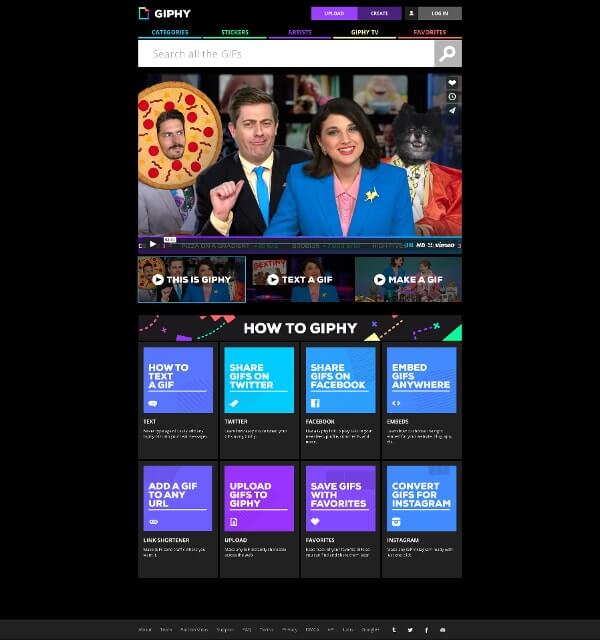
Giphy is website with a simple website with a simple purpose so its about us page is more of the same.
At the top of the page, the Giphy team shares three short videos; one that introduces the brand, and then two others that have hilarious descriptions of how to text or make a GIF.
From there, the meme machine wastes no time trying to sell itself to you. Instead, it shares eight bright icons linking to detailed guides on how to use and get the most out of the site.
7. Bentley Motors
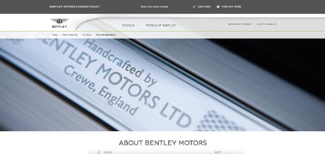
Bentley's elegant about us page matches the brand and highlights its key selling points through stylish imagery.
The renowned motor company knows its buyer persona is looking for more than a car -- it wants a luxurious experience and the brand has made sure even its website delivers that.
Bentley's about us page is actually laid out across several visual pages, each focusing on different pieces of their quality craftsmanship, rich history, and recent accolades.
8. Adidas Group
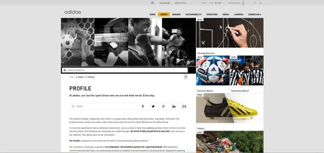
There's a reason that big, corporate about us pages don't usually make lists like this -- they typically suck.
Most are targeted towards shareholders and aren't interesting for their customers, but Adidas breaks the mold.
While most of the information is still geared towards shareholders, the athletic company's presentation is easily digestible and nicely organized.
9. Nerdery
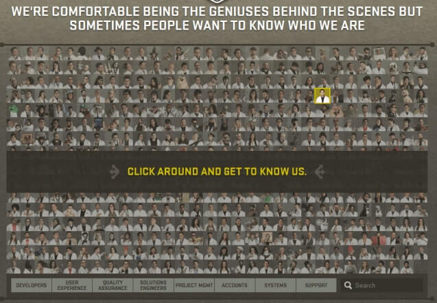
Nerdery is a production company for nerds, by nerds and that's made clear on its old about us page, it made this clear. In this unique design, Nerdery displayed its team photos almost like elements on the periodic table. Every team member got their recognition!
Then as you scrolled, you could read all about the company, its awards, skills, and culture.
10. Chattanooga Renaissance Fund (CRF)
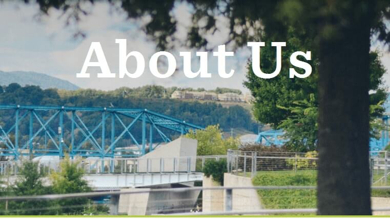
CRF does everything right with itsabout us page. It uses big images, focuses on the value it provides consumers, and it allows you to get to know the people behind the brand -- but those aren't even the most impressive parts.
Near the bottom of the page, CRF has a call-to-action for each of its buyers personas -- startups, investors, or third parties. These three little buttons, not only allow visitors to self-identify/qualify themselves, it helps personalize the experience that follows specifically to their needs.
Any inbound marketer would be proud!
11. Twitter
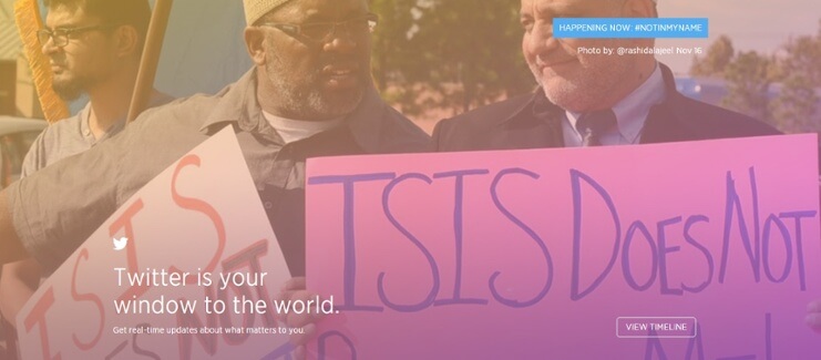
Like the platform itself, Twitter's about us page has gone through some big changes recently, but a few years ago, it took a colorful approach that was one of the best on social media.
The strength of this page was in its simplicity and how the platform let its content and accomplishments speak for itself.
🔎 Related: 42 Best Landing Page Examples to Inspire Yours in 2020 (Updated)
Above the fold, the page displayed changing images of trending events from the last month as well a powerful value proposition and call-to-action like most websites.
Then as you scrolled down, you'd see some of the most infamous events on Twitter from the previous year, as well as tweets from high-profile users.
Who needs a sales pitch on Twitter when you can see the real-life examples of the impact its had on our media and everyday lives?
12. Molecube
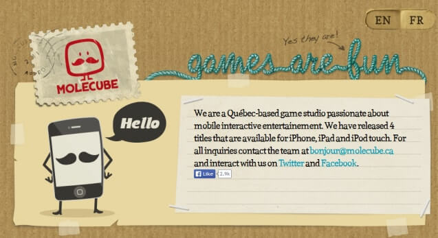
So, what if your about us page is your entire website?
Take a page out of Molecube's book! (But please return it, there's only one after all.)
This "about us page" starts with an introduction, showcases a few samples of their work and colorful cartoons of their team, then concludes with a call-to-action and contact form.
There are no frills or fuss, just a simple, creative representation of the team's culture and skill set.
13. Moz
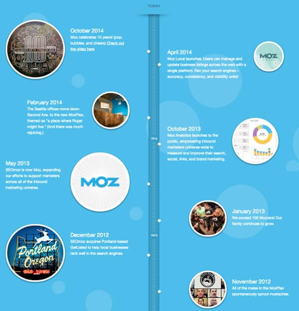
People naturally connect with stories. Having a unique story about your brand is a great way to get your persona emotionally invested in your company.
Below a simple hero image in this example, you see a vertical timeline that recounts Moz's story. Each milestone not only describes new products/services that the company created (informing you of what they offer), but also includes the benefits that customers have gained along the way. This celever approach successfully tells you where the company has been, but also frames it in context that explains what it means for you.
14. Yellow Leaf Hammocks
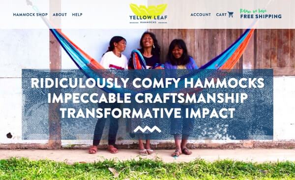
Speaking of storytelling, one type of story that people can really get behind is a story that involves a noble cause.
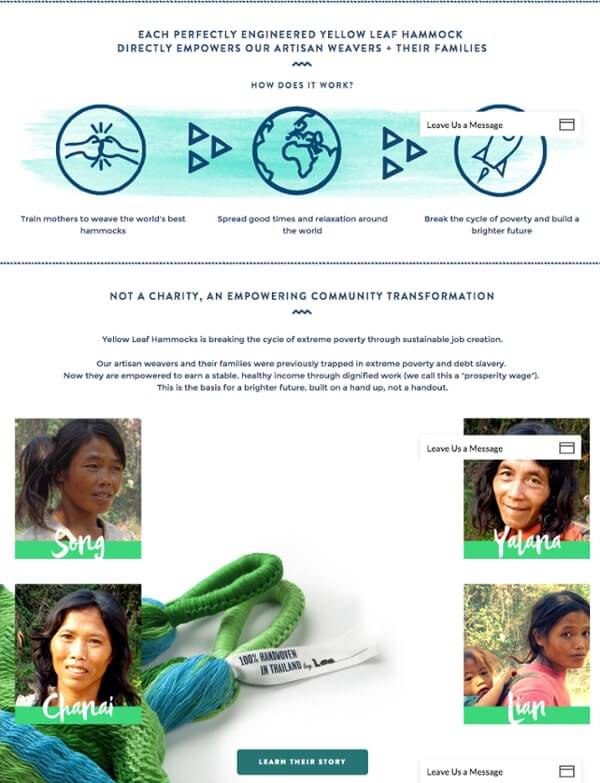
On its about us page, Yellow Leaf Hammocks does a fantastic job showing you how your purchase of one of its hammocks directly impacts the life of someone else -- the artisan weavers (and their families) who craft the hammocks.
What I love about this page is that it tells you what they are selling right away -- "Ridiculously comfy hammocks" -- then moves on quickly. The rest of the page is dedicated entirely to sharing the story of the artisan weavers.
Yellow Leaf Hammocks also makes it clear that it isn't a charity, but an organization about long-term sustainability and "community transformation." The use of real "employee" photos helps enhance this message and lets consumers see exactly who their purchase is impacting.
15. FortyOneTwenty
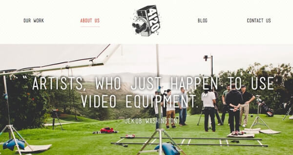
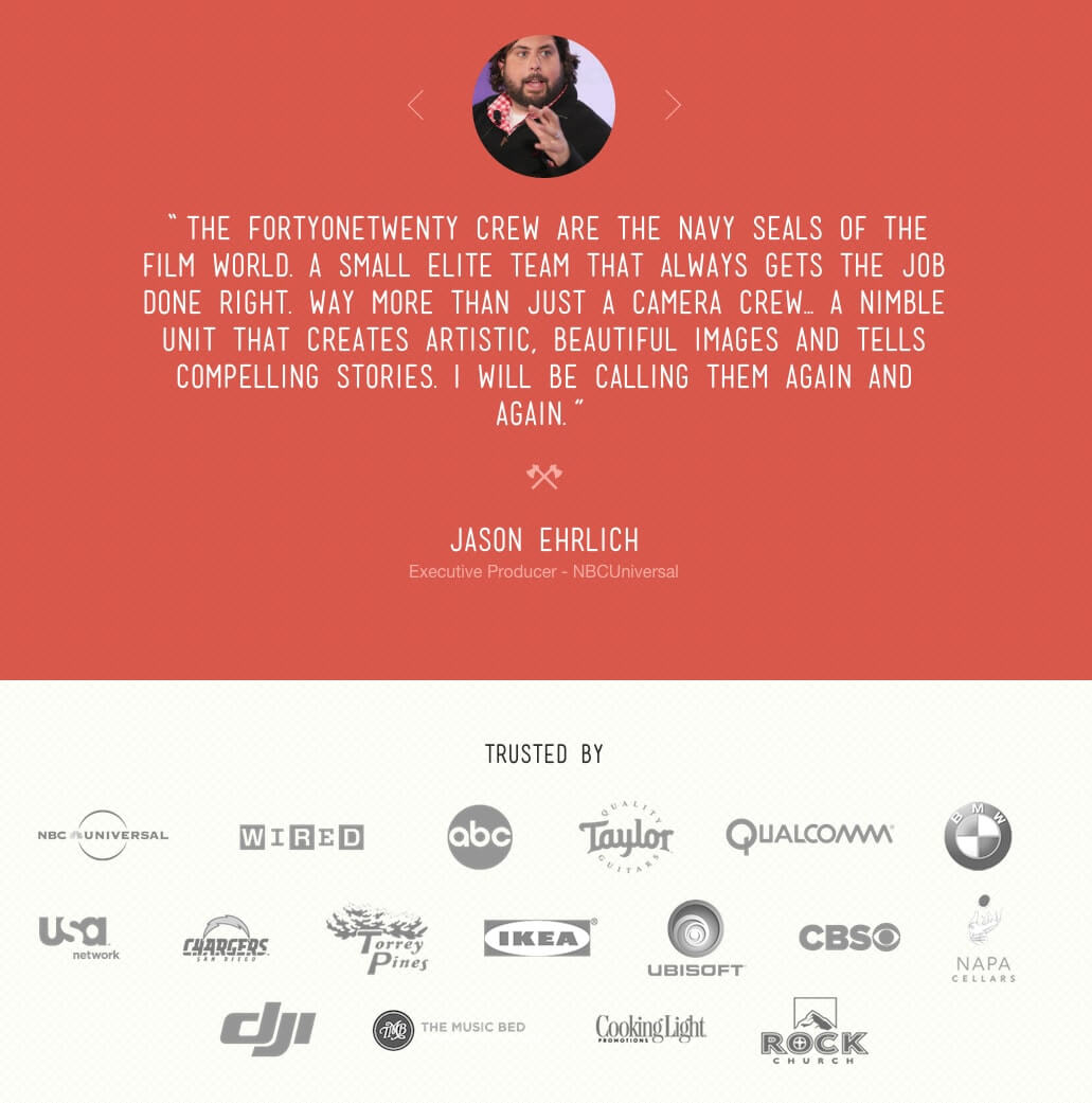
The team at FortyOneTwenty does everything right with its about us page. Right off the bat, it identifes its team as artists, which is what you want when hiring anyone for a creative endeavor.
Scrolling down you see a testimonial describing them as "the Navy Seals of the film world," followed by an impressive collection of big brand logos they've worked with.
16. Simple as Milk
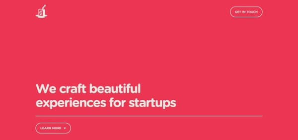
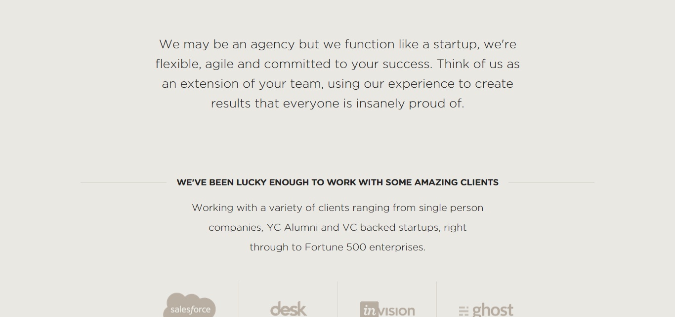
Though not a dedicated about us page, Simple as Milk uses its minimalist one-page design to make it clear what it does and who is it is.
Claiming to "craft beautiful experiences for startups," the direct, intuitive UX of this page and its strong social proof proves it. Furthermore, its use of friendly, warm copy, makes it clear that each of its team members is just "one of the guys."
17. Pulp Fingers
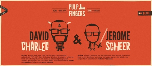
When you understand your buyer persona and you work in a creative market, you usually have the freedom to make your about us page as goofy as you want.
Even though Pulp Fingers (no longer active) used real pictures of its employees, it is highly relevant to its work and showed a great deal of personality. The page's descriptions did a perfect job of balancing a summary of the team's qualifications and personal notes that helped you get to know it.
The design also looked and felt like a mobile app, which was apt as app designers.
18. Doberman
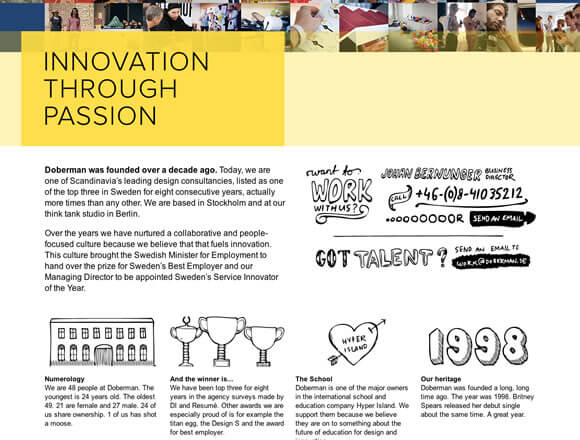
In this early iteration of its about us page, Doberman did an amazing job of emotionally connecting with its visitors. Above the fold, you saw a collage of people working and having fun, which matched the headline perfectly -- Innovation Through Passion.
Passion is contagious and many of us naturally prefer to work with people who love what they do. The addition of hand-drawn images also added a more unedited, human touch that you don't usually get online.
19. NextSpace
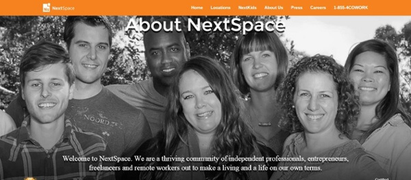
Stock photo smiles are cringeworthy, but smiles from members of your real-life team are welcoming and often unexpected.
In this past interation of its abous us page, NextSpace made a point to use the words "we" and "you" throughout the body of the page to show its co-working space was inviting, inclusive, and focused on others.
When detailing why it exists, NextSpace said: "We exist to help our members make a life and a living on their own terms." That's exactly how you make an about us page focused on the customer!
20. DoubleDutch
.jpg)
Above the fold, DoubleDutch has a short paragraph that clearly describes who it is and what it does, but then works on building trust.
It showcases a few stats and logos highlighting its position as a "leader" in its industry, shares a brief history, then goes on to introduce its entire team.
Overall this colorful page leaves no question as to who you are working with or what they will do for you.
21. National Geographic
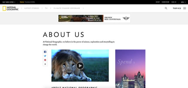
What should an about us page say when everyone already knows who you are?
Well, National Geographic shows you everything you probably didn't know about it.
The first thing you see is a video with stunning imagery (as its known for) that focuses on its conservation efforts and the global impact the company has had.
It's not until you've scrolled halfway down the page that it even mentions its media, such as their iconic magazine and television network.
This about us page makes you quickly aware that the brand is more than just a nature magazine, it is a powerful force in the global conservation effort.
22. Rent the Runway
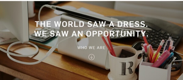
There's a lot to love (and learn from) about this about us page.
Great design, big images, a killer headline -- but one of the best elements is the section that features employee testimonials.
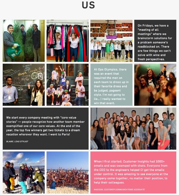
Employee testimonials are very effective when done right as they really can't be faked. We all know the difference between the smile you have when you're just doing your job and the smile you have when you're doing a job you love.
A company that treats its employees well is likely to be one that will treat its consumers well.
23. Apptopia
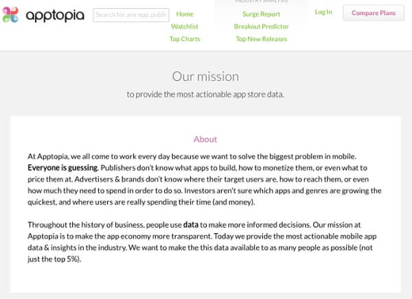
Nothing puts a reader to sleep faster than a long, jargon-filled mission statement that sounds more like a press release than a real mission.
Apptopia is a brand that gets it right.
What I love about its about us page is that it's refreshingly candid saying "Everyone is guessing."
This message says we don't have all the answers, but we're building the tools that will help everyone find the answers. Transparency and honesty are good qualities when you're selling data -- or anything for that matter.
24. Cultivated Wit
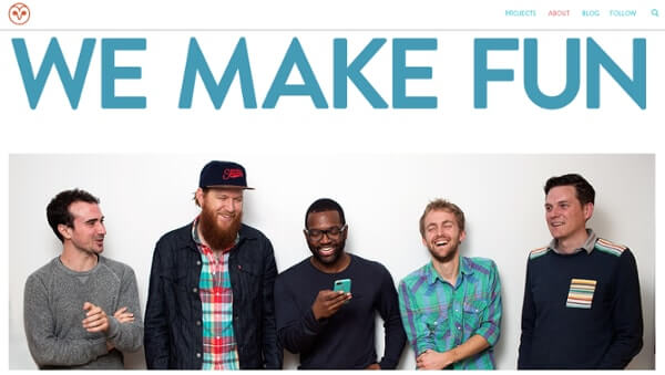
Here we have yet another great example of using real imagery to form a connection between persona and brand -- plus, can't really top a headline like "we make fun."
These guys look like they know how to have a good time, which is important because they are selling a combination of comedy and design.
Just in case you weren't sure whether to take them seriously or not, right below the fold they list several accomplishments that they've earned as a team, as well as personal accolades.
The bottom of the page also uses social proof by listing a ton of big-name clients and collaborators.
25. Marie Catrib's
If you've ever seen the documentary Jiro Dreams of Sushi, you understand people don't just wait for months to pay ridiculous prices for sushi -- they pay for the dining experience that only Jiro himself provides.
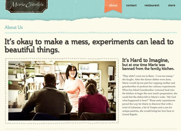
In a similar fashion, Marie Catrib's about us page tells the wonderful story of the chef behind its restaurant and paints a vivid picture of what you will experience when dining with her.
It also does a great job of grabbing your attention with its snappy, intriguing headline. This is copywriting 101 -- when you have an interesting story to tell, tell it in an interesting way.
26. Gummisig

Most people can't pull off the me-focused about us page, especially not in the third-person. Gummisig, however, shows how to do both right.
The first thing that makes this page work is a big, bold headline that piques your interest. Then right before he loses you, he dives into his story in a way that's more personable.
Lastly, near the bottom of the page, he lists several testimonials, just to let you know that he's not full of it.
27. Engage Interactive
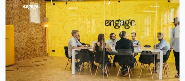
Engage Interactive does something different with its about us page. It doesn't have a headline or any text associated with the images, rather, it lets the pictures do the talking for them.
What I like about this page is that it focuses on one thing at a time. There's an image of the team working, then a brief description of what it does and the services it provides, followed by more images.
This might be too simple for most companies, but it goes to show that you can break the rules and still have an engaging about us page.
What's Missing From Your About Us Page?
So, what do you think? Looking at these examples, what's missing from your about us page? Share your thoughts, favorites, etc. in the comments below!
Free: Assessment
