Topics:
Email MarketingSubscribe now and get the latest podcast releases delivered straight to your inbox.
I wanted to open this article by saying email newsletters are making a comeback, but part of me also wants to say...
As the author of THE LATEST — our thrice-weekly email newsletter for digital marketers, business leaders, and sales pros — you might say I'm a little protective about the reputation of email marketing in general.
Yes, the love affair between digital marketers and email has ebbed and flowed over the years, with more than a few occasions where the death of email was prematurely declared.
Yet the flame has never been fully extinguished.🔥
So, today, my hope is to inspire all of you digital marketers out there with the following killer examples of email marketing newsletters that break the mold, do something different, and make inbox magic.
1. Statista Infographics Bulletin
Statista is a business data platform, and I am low-key obsessed with their data-driven approach to their email newsletter:
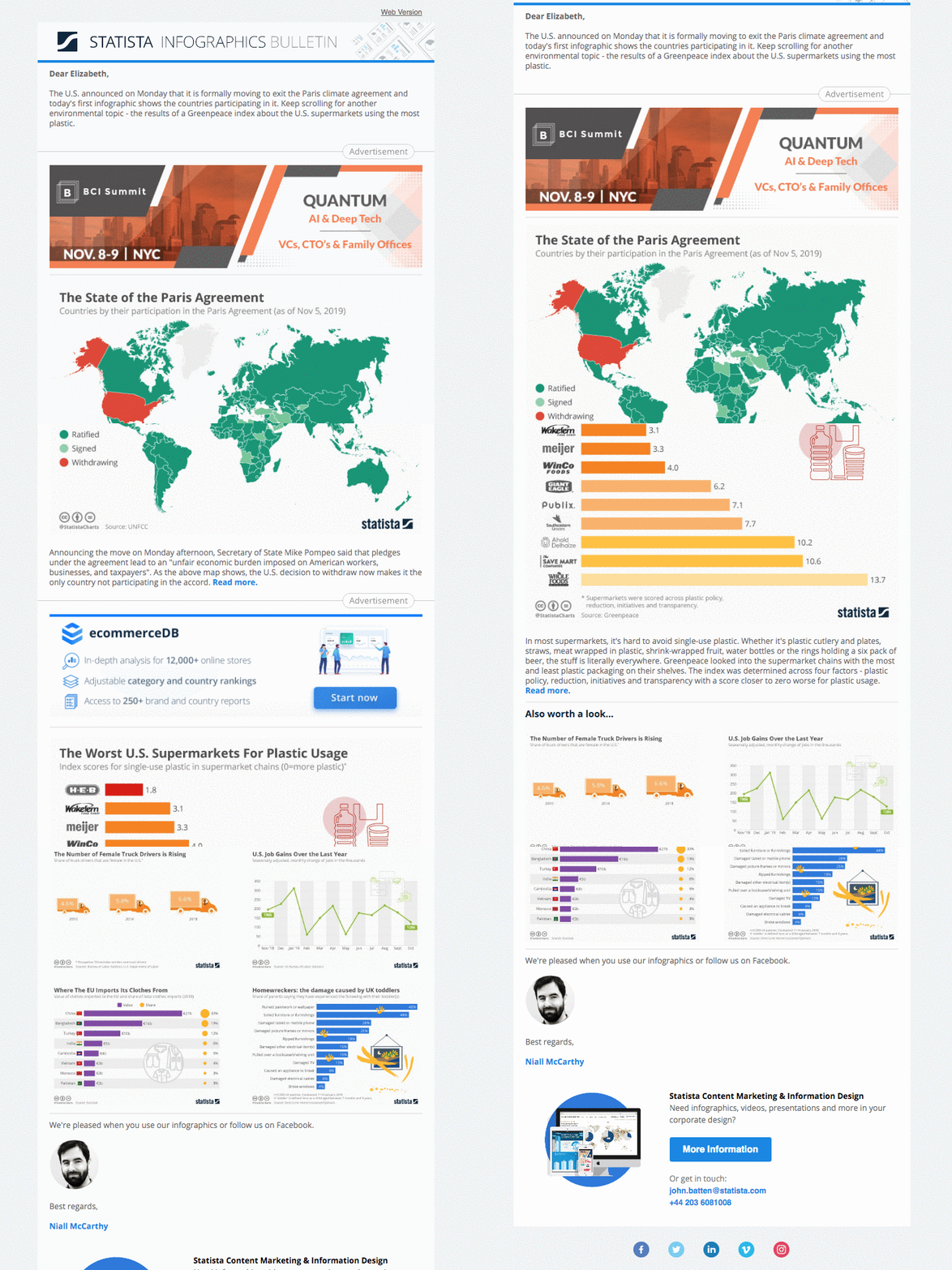
Business data could easily be boring, but the data visualization game Statista brings to each issue of their email newsletter makes it a must-open for me every single time it hits my inbox.
A data-based newsletter could have been really, really boring — but they took a unique approach in how they presented their information which makes them totally stand out. That's a lesson we can all learn from; sometimes it's all about finding a creative way to package the information you want to share.
2. Total Anarchy by Ann Handley
I know this isn't a surprise, because you will be hard-pressed to find an email newsletter roundup article without MarketingProf Chief Content Officer Ann Handley's perfectly titled virtual letter, but that's for good reason.
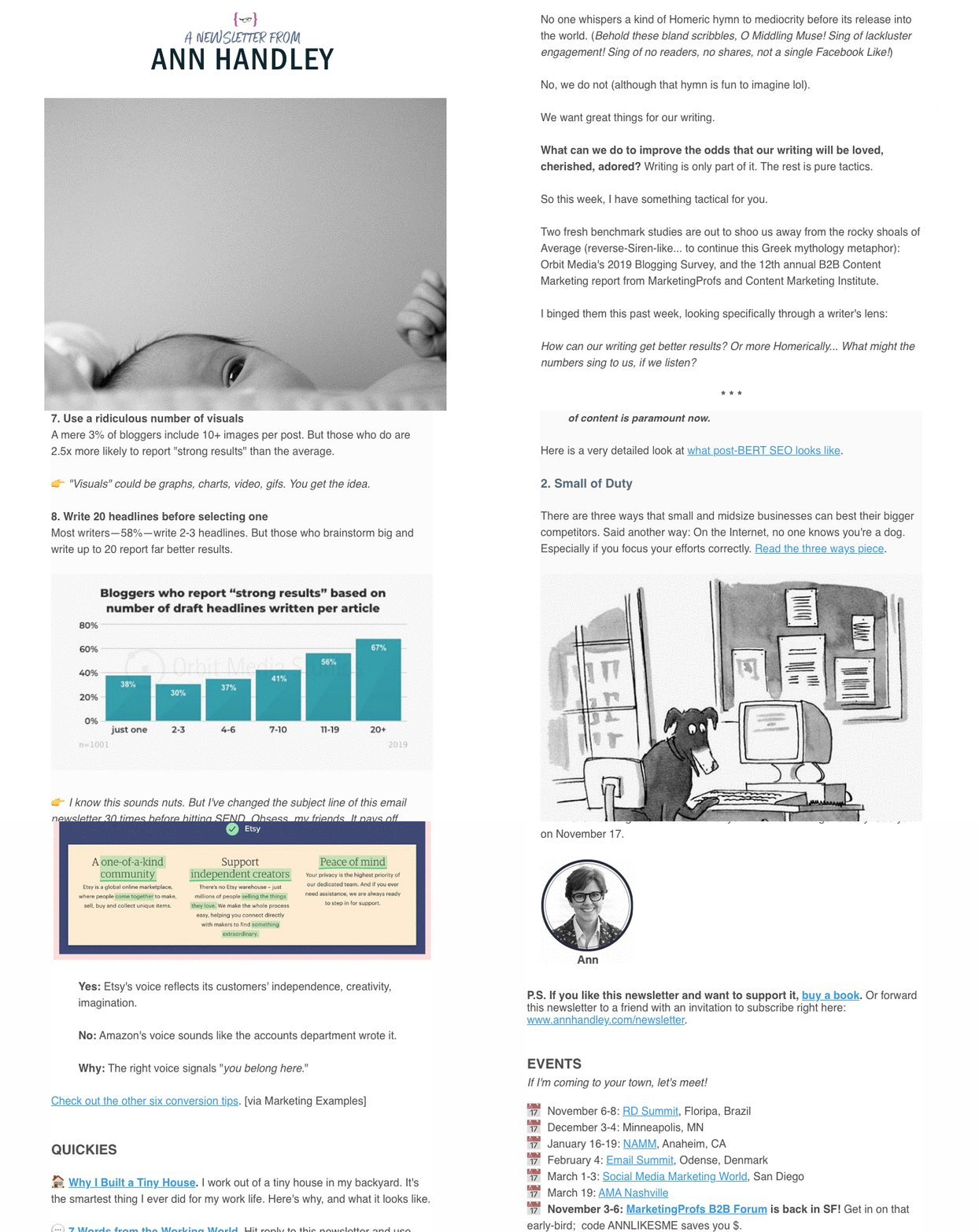
Not only is Ann a personal hero of mine, I would be lying if I didn't say she paved the way for many other digital marketers to take the hyper-human approach in their email newsletters — and I'm including myself in what I do for THE LATEST.
I know there are more than a few of you out there who think a person approach to your newsletter won't work for your industry, but there's a good chance you're wrong.
I would challenge you to think of ways to create a newsletter experience where you could still include a short personal note at the top with an anecdote. Also, we've seen email open rates increase when emails come from an actual human name instead of just "IMPACT."
Don't believe me? This next example shows how you can do human in a more streamlined, brand-forward way.
3. GatherContent newsletter by Rob Mills
Hi, we haven't met, but my name is Liz Murphy, and I'm absolutely obsessed with GatherContent. (And no, they don't pay me or anyone else at IMPACT to say that. It's just such a dreamy platform, I can't help myself.)
But we're not here to talk about their product; we're here to talk about their perfect little newsletter, which has been a delight in my inbox for a few years now.
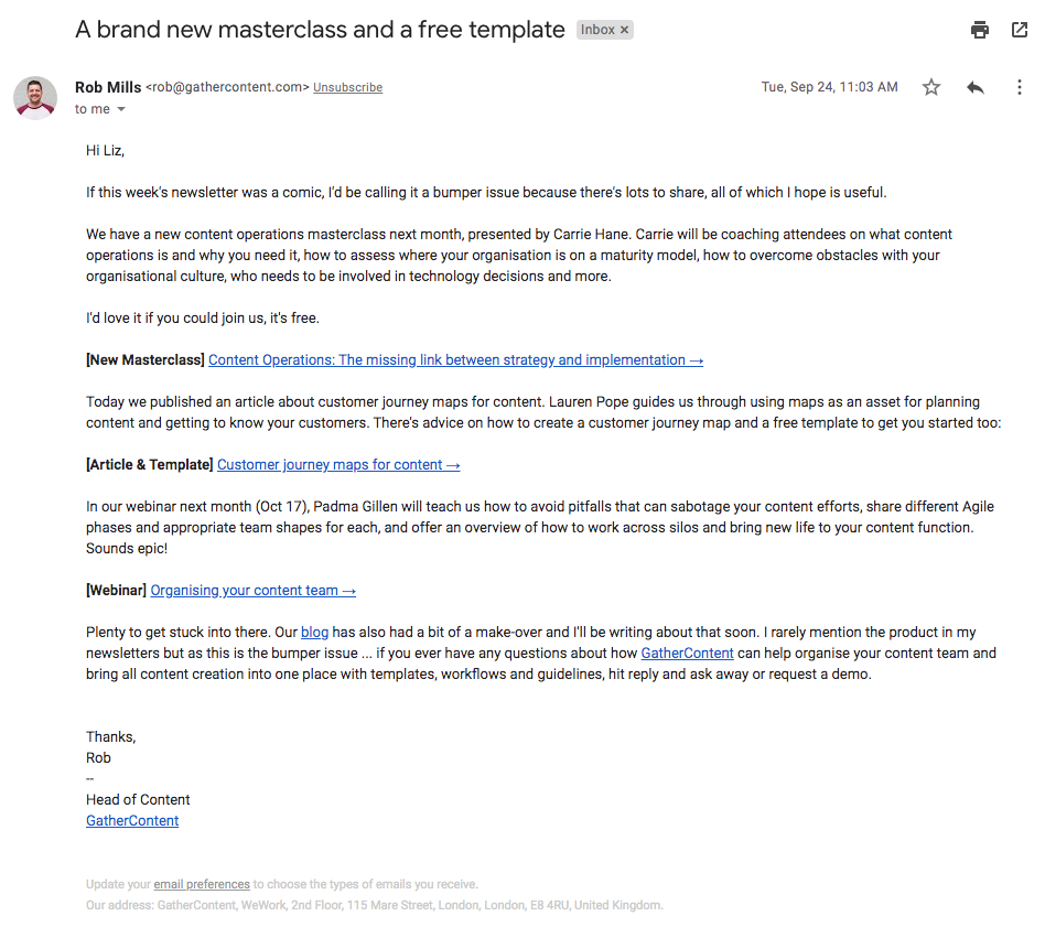
That's it. Really. And it's perfect.
It comes from a real human. (His name is Rob. He's delightful, and I actually interviewed him for Content Lab last year.) It gets straight to the point. It's branded content-focused. It's sublime.
As an end user and subscriber, I love it because I don't need to do a ton of skimming. It's super valuable and fits seamlessly into my day, which made it easy for me to build a habit with it.
Always ask yourself that when you're putting your newsletter together — how easy is it for your audience to build a habit with what you're sending?
4. Modcloth newsletter
Let's switch gears to the e-commerce space, shall we? Modcloth has a nasty little habit of taking my money off my hands on a regular basis, all thanks to their blissfully simple approach to email.
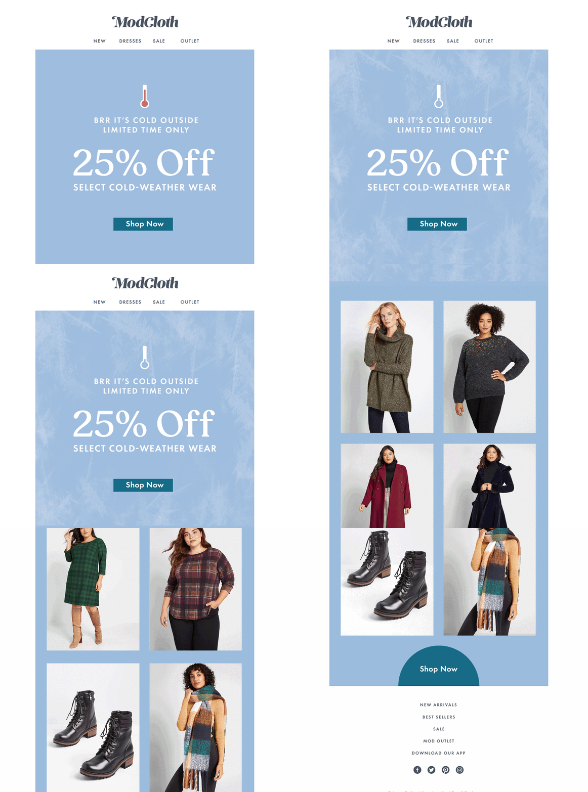
Too often, e-commerce brands go overboard with animations in their newsletters, but Modcloth gets it just right. It adds just a touch of personality in a purposeful way that is totally in-line with their brand. Classic, but quirky... without trying too hard.
5. Trello's newsletter from "Taco"
Trello, which is a user-friendly, web-based project management solution, has a delightfully simple newsletter. But there's one thing in particular I love about it, aside how simple and direct it is...
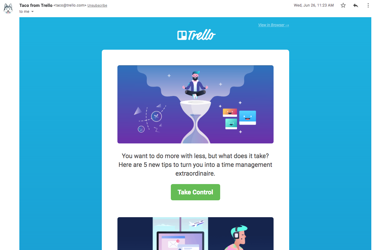
Take a look at the upper left-hand corner. You see it? Their emails come from "Taco from Trello," a delightfully adorable dog who acts as their mascot.
The newsletter itself is simply a roundup of their best content presented in a simple manner, but that little dash of personality is something that delights me every single time I open up my inbox.
6. "Magic emails" from Laura Belgray of Talking Shrimp
Laura Belgray is a masterful copywriter and, much like Ann Handley, her email newsletter is a hyper-personal and authentic extension of herself.
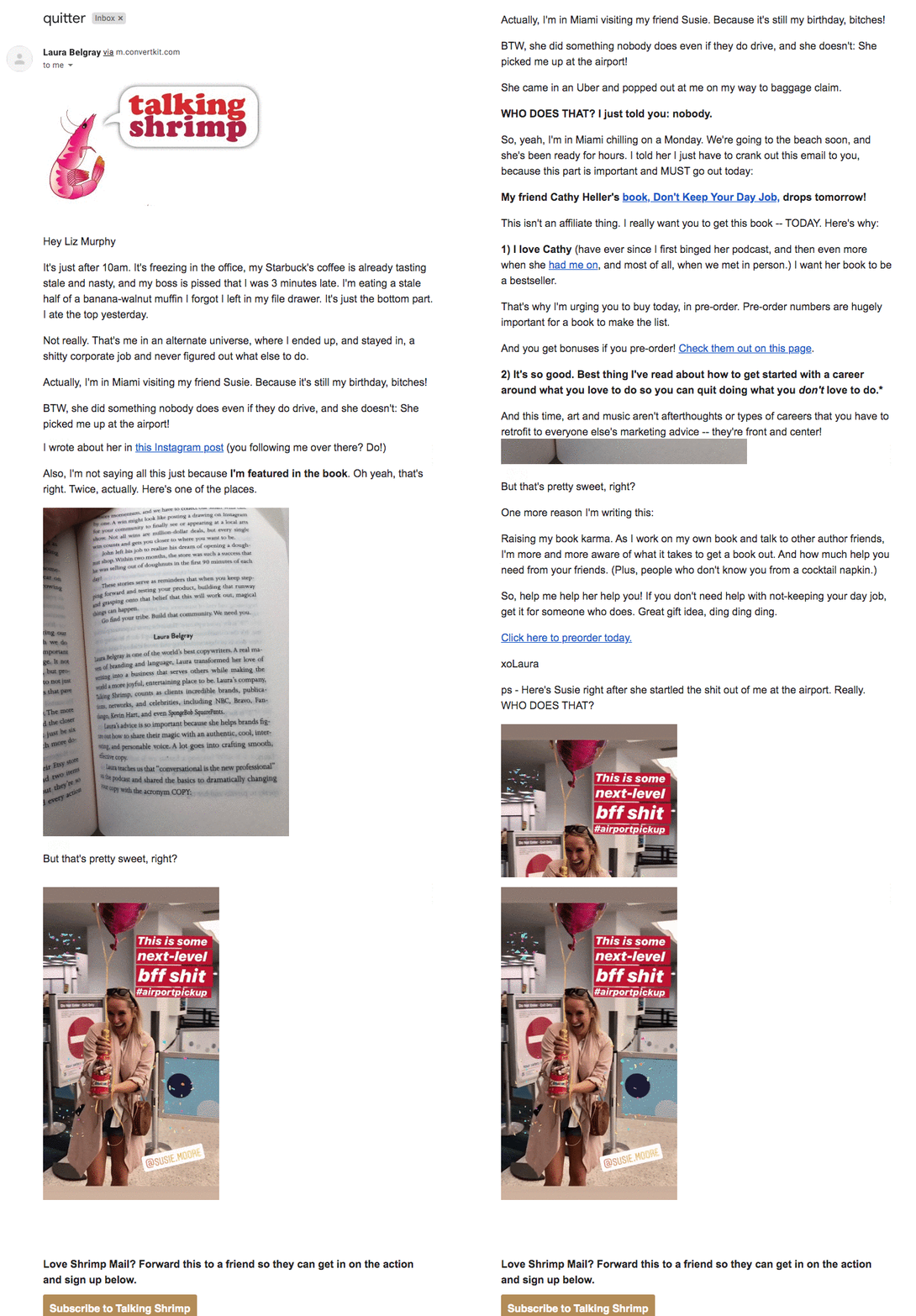
Her email newsletter breaks a lot of rules for some people, but it works. (Again, it comes back to your brand and what you want to accomplish.)
7. Morning Brew
Morning Brew's value prop is simple — "Become smarter in just five minutes."
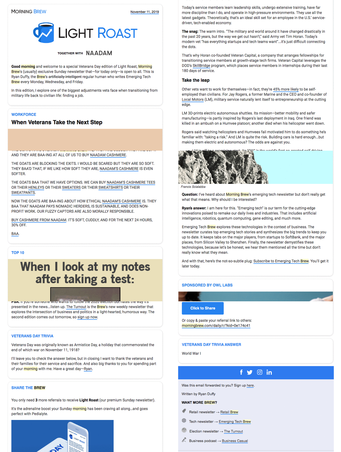
I love to share this example, because they do a great job of organizing and condensing a lot of information into a single email newsletter that makes you feel like an explorer uncovering a treasure trove of information.
What to keep in mind when creating your own email newsletter
As I shared in a recent article for ManagingEditor.com, your newsletter will be unique, as it should be. It should not be a carbon copy of anything you see here, although I invite you to draw inspiration and experiment with new ideas and email tactics.
So, as you're developing your strategy for your newsletter, ask yourself the following questions:
- How can I make our email newsletter more human?
- How can I make our email newsletter memorable?
- How can I make our email newsletter genuinely valuable?
Those answers will help you build the foundation of a truly remarkable email newsletter for your company.


Order Your Copy of Marcus Sheridan's New Book — Endless Customers!

