Subscribe now and get the latest podcast releases delivered straight to your inbox.
Best Team Pages: Check Out These 11 Examples (& Why They Work)

Aug 1, 2019

Best Team Pages and Examples
If you won an Oscar, who would you thank in your acceptance speech?
Your mom? Dad? Pet corgis, Django and Diego?
All of them are deserving, but when people are racing against the clock to wrap up their speeches, it always makes me happy to hear them thank the team behind the scenes.
Like in Hollywood, not all jobs in business come with the fame and attention they deserve, but truthfully, these are often the ones that make the whole operation possible.
Every movie, project, or company is only as good as individuals behind it, which is why the team page is such essential piece of any business' website.
Your team page is where people go to get a peek behind the curtain; to see who is making the magic happen in your organization, what makes them qualified, and most importantly, what makes them different.
Whether yours exists for recruiting new hires or simply introducing the world to your employees, your team page requires a strategy unlike any other on your website.
What do the best team pages have in common? Here are just a few of the characteristics I've come across:
- They're human and relatable. - They speak to the reader conversationally and let you get to know their team even outside of the office.
- They tell you who they really are. - The best team pages tell readers what their team brings to the table; the values they share, and what makes them different from others.
- They make their people accessible. - Whether it's an email address or social media profiles, don't lock your team away in an ivory tower. Open the lines of communication so people can reach out to them if need be.
- The use real team photos.
- They tell their story, but don't ramble on.
Still can't visualize it? Check out these 11 awesome team page examples that put them into action:
1. Kickstarter
Why it works:
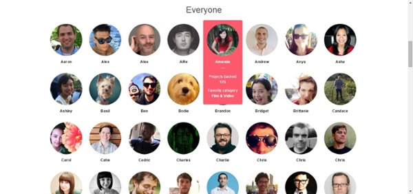
Kickstarter's team page grabbed my attention because, as it header states, it shows you everyone. Each member of the team gets their time to shine and when you scroll over their individual photos, you can see how many Kickstarter projects they have personally backed as well as their favorite category.
In addition to this tidbit, Kickstarter lets you filter through employees, not just by department, but by quirky labels like "D&D players," "singers," and "foodies" for an extra touch of personality.
🔎 Advanced Marketing Tutorial: How to Create a Content Style Guide for Your Brand (+ Free Content Style Guide Template)
Though simple, this team page shows Kickstarter's team members don't just work for the company, they personally support its cause and purpose and if you do too, there's a call-to-action (CTA) to their careers page waiting for you.
2. Etsy

Why it works:
Etsy's brand is all about being home or handmade by people passionate about their craft. The header image on the company's team page does a great job of driving home this sentiment, showing people smiling in a casual environment, looking like they genuinely enjoy what they do.
As you continue down the page, you are then introduced to the company's leadership team (and their full profiles) before being met by a large mosaic of the rest of the team and their names.
3. Khan Academy
Why it works:
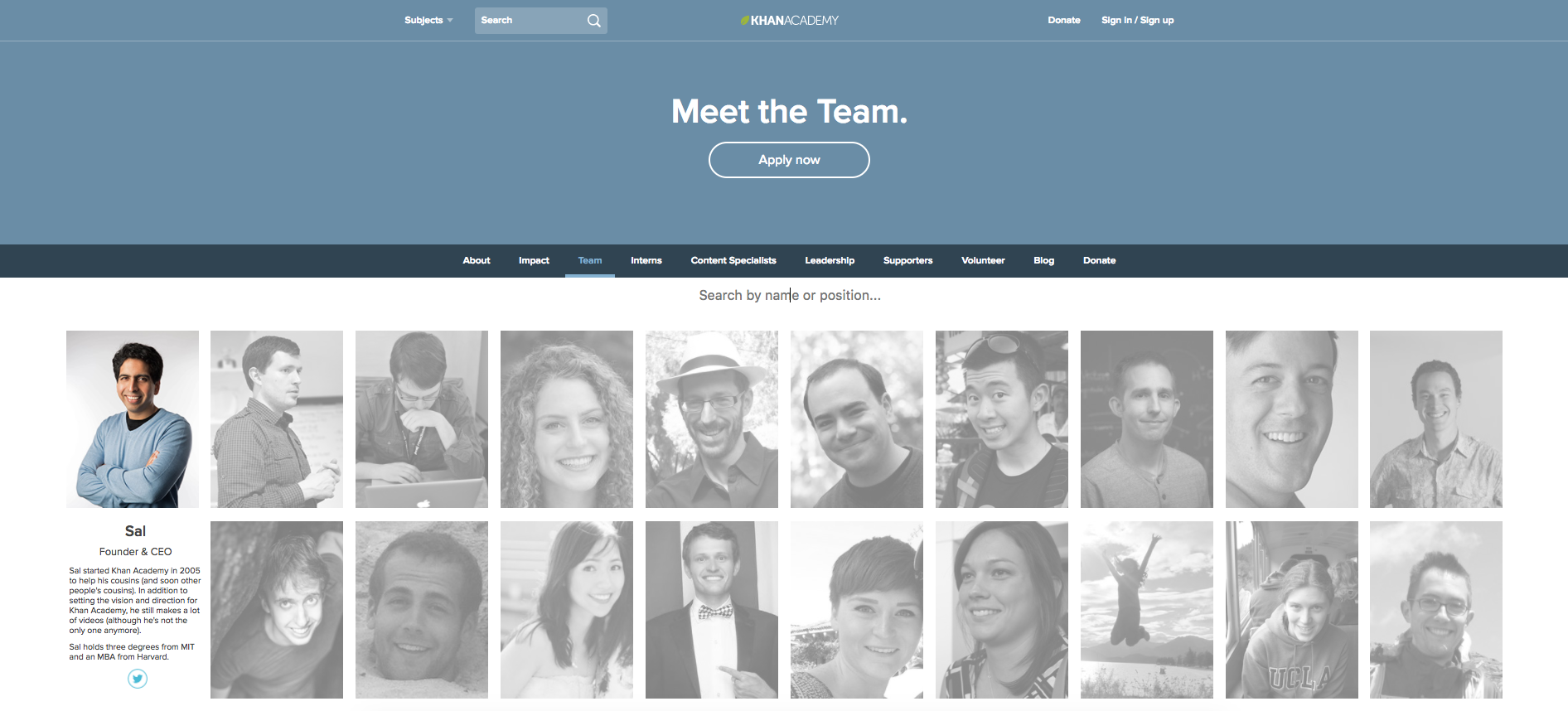
KhanAcademy's goal is to bring education and knowledge to the masses; making it more attainable and less intimidating. That is a feeling communicated well on its team page.
Showcasing every member of its team, KhanAcademy not only tells you who everyone is and what they do, it also gives you a glimpse of who they are outside of the office and how it gets in touch with them as well. These details make the team and the company and brand that much more relatable and friendly.
4. Big Spaceship
Why it works:
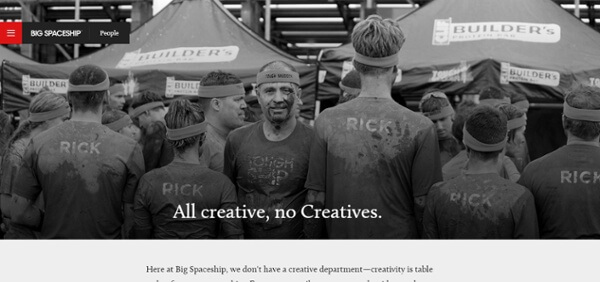
While Big Spaceship's team page has since been eliminated, its old design (shown above) set a great example.
With a hero image of the team competing in the Tough Mudder 5K, Big Spaceship's team page showed the team not only worked hard, but it played hard. The simple, yet powerful header made it clear everyone on the team was creative by nature, setting high expectations for the work it delivers as well as challenging (or enticing, depending how you look at it) potential new hires.
It delivers the perfect balance between recruiting and promoting.
5. Humaan

Why it works:
In this combination about and team page, Humaan lives up to its name, humanizing its brand and team through large, quirky, Wes Anderson-style photos, gifs, and fun facts. It effectively shares the professionalism of the team, while reminding us that they're "only humaan" with plenty of touches of playful personality.
6. Kayak
Why it works:
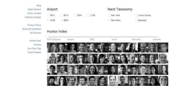
Kayak's team page stands out because it cleverly pays homage to the company's search engine's unique interface. Like you would search for flights or hotels, the page lets you sort through the entire team by characteristics like "humor index," "nerd taxonomy," or their "airport"/location.
7. Wanelo

Why it works:
With a simple design, the copy is what really shined on Wanelo's old team page. It began with a unique, playful headline, helping you visualize its workspace and inviting you into it.
From here, unlike many of the others on this list, Wanelo completely focused on showcasing the unique personalities and hobbies housed within its walls. The team members' headshots and bios are cheeky and candid just like their brand.
8.Wondermall

Why it works:
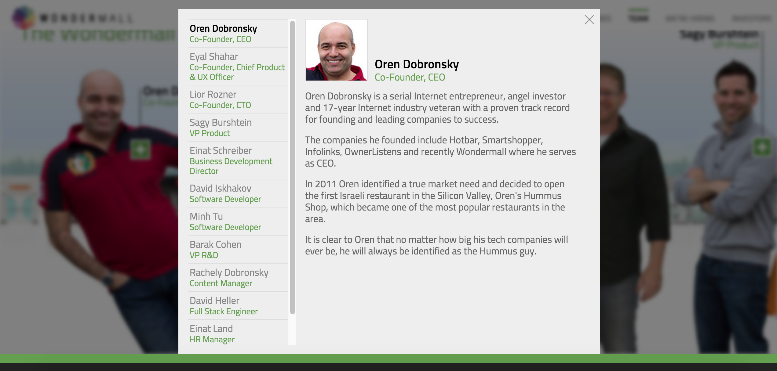
Wondermall's team page breaks away from the norm, introducing you to its employees not through boxy headshots, but through an engaging, multi-medium scene.
While some team members are carrying vector shopping bags, others are wielding credit cards or nerf dart blasters. The page grabs your attention with these lively visuals then keeps it by providing everything you need to know about their professional background on the click.
9. Electric Pulp
Why it works:
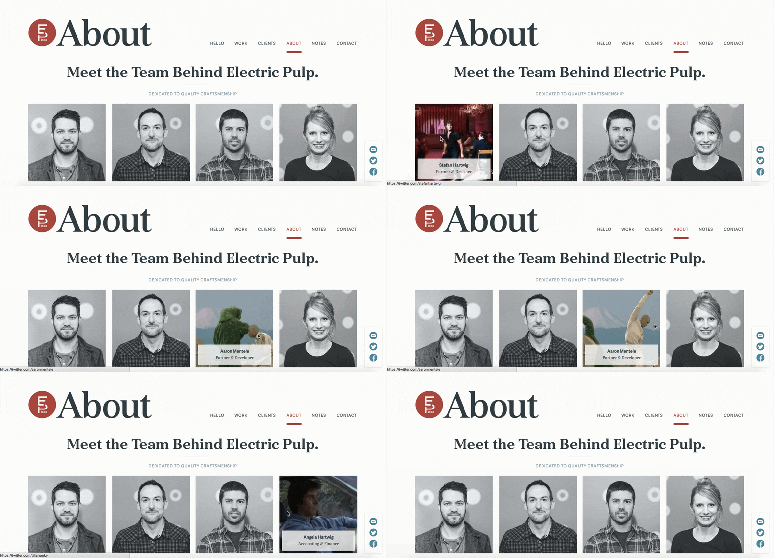
When you first land on this combination about-team page, it may not seem like anything special, but hover over any of the team photos and you're in for a surprise.
In lieu of traditional bios, when you scroll over an individual headshot, Electric Pulp reveals the team member's name, title, and a funny gif ranging from Patrick Swayze's iconic strut in Dirty Dancing to Keanu Reeves in The Matrix. They are unexpected and speak volumes about team's personality without making a peep.
10. The Status Bureau

Why it works:
While minimal in its design, The Status Bureau's team page does a great job of telling people how to get in contact with its staff. Along with a direct email address, the company links to Twitter, LinkedIn, Google+, and even Pinterest (in case you want a swap a recipe or two.)
11. Sparkbox
Why it works:
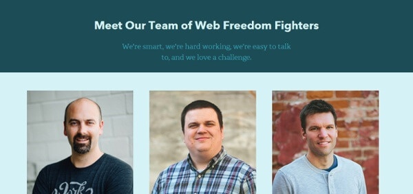
Our Core Values are important to us here at IMPACT and clearly they are over at Sparkbox too. In this clean, structured team page, the company cleverly places their core principles alongside their staff headshots and social links, making it clear to the reader what motivates their people and also making it easy to associate these values with them.
🔎 Keep Going: 42 Best Landing Page Examples to Inspire Yours in 2020 [Updated]
🔎 Or Maybe This One: 27 Best About Us Page Examples for 2020 & How to Create One
🔎 How About This? 25 Best Contact Us Page Examples (Updated for 2020)
🔎 This One Is Also Fantastic: 10 Examples of Company Profile Pages You Can Learn From (+ Free Template)
Free: Assessment