We all know how important content is to any marketing campaign.
The blog, for example, has become the cornerstone of any successful website; guiding users in with targeted, relevant, and engaging content and ultimately delighting with them so much they convert and subscribe to get more.
But what if your blog design is missing the mark?
The fact is, more users will enter your website (and find your brand) via your blog articles than ever your homepage, so your blog design should put your “best foot forward.”
That’s one of the main reasons we created our Blog Optimization Package, to quickly give you the ability to revamp your blog and optimize your user’s experience.
When it comes to blog design, there are a variety of different factors to look at, including font sizes, hierarchy, calls-to-action, and text width, among other things.
With so many things to take into account, it can be nerve-racking to take on a new blog design (but of course, we can help you with that).
That’s exactly why I wanted to compile some great examples of user-focused blog design inspiration to help best deliver your content and keep your readers coming back for more!
Author’s Note: All of these blogs are being viewed on a 13” Macbook Pro. What you view may change based on your screen size. But! It should be a consistent user experience screen to screen.
1. Wistia
The biggest piece of advice I can give when designing your blog for users
What do I mean by that? Simply put, legibility and digestibility. Use clean fonts, headings, and put the focus on the content.
Wistia does a great job of this on its blog.
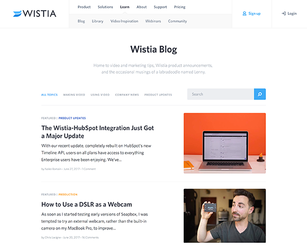
We’re introduced with a brief overview of new and featured pieces, as well as a short, specific topic list.
Notice how there are 4 topics --not 25. This streamlines the user experience and gets them the content they care most about easily and takes the guess work out of navigating.
I can’t tell you how many times I’ve gone to a blog, only to be greeted with tons of categories with one blog post in it. Why? There has to be a better way!
Wistia also gives you all the information you need to evaluate the post before clicking -- the category, a clear headline, plus a great excerpt that makes you want to read more.
It also highlights the author and when it was published, which may seem like a small thing but is actually very important. Users want to know what they’re reading isn’t outdated and that it was written by an expert.
The final piece that makes Wistia’s listing page great in my book, is its contextual feature images. These visuals really bring the excerpts to life and grab your eye.
Shoutout to Chris Lavigne for a great featured image and article (it’s actually super helpful, check it out!)
Wistia also has a super clean and legible article design that puts focus on the content and the content alone.
The use of font hierarchies to break up the sections makes it easier to skim and the lack of a sidebar really helps the visitor zero-in on the content, not get distracted.
2. Drift
Drift’s blog design is another that definitely hits the mark for readability.
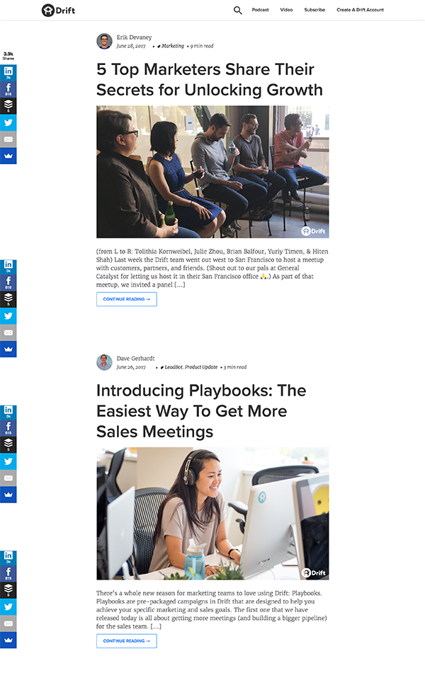
Its listing page is a minimal, single-column with big, beautiful imagery to really pique the user’s interest and get them reading.
The addition of an estimated read time is something that’s forgotten but can be absolutely critical to your users.
Have you ever come across an article you really wanted to read but didn’t think you had enough time and never did? Giving some guidance on the amount of effort your user will need to contribute is a great way to improve readership. This lets users know when they should bookmark an article, instead of reading a quarter and jumping to something else without finishing.
Drift’s actual article design is impressive as well.
Again, following the single-column route and eliminating distractions is a great way to encourage the reader to finish the full blog post and ultimately reach the conversion point you’ve strategically placed at the end -- or should’ve placed.
The team does well breaking up its posts with full-column imagery so the user isn’t met with a dreaded “wall of text.”
There’s no faster way to deter someone from reading your content than making it look like a daunting experience. Breaking up long posts with proper headings and great visuals is a surefire way to increase your readership and readability.
That’s exactly why I had to have Drift as an example of great user-focused blog design inspiration.
3. Sigstr
Another great blog listing layout can be seen at Sigstr.
The email signature company utilizes a “card” style layout, which can be done really well (in this case) or really poorly.
You’ll typically see three-column card style listing pages, which can make the content hard to digest. The Sigstr team, however, opted for a two column layout, which limits the number of options at hand and avoids sending too many messages at once.
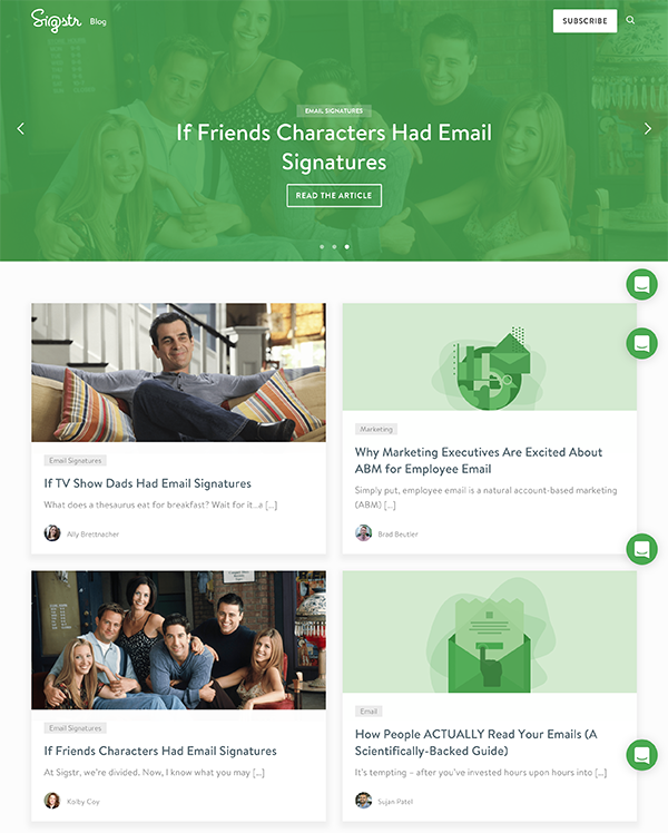
The use of featured images helps highlight each individual card and makes the user want to scroll through all of the content to see what else they can learn about.
The only update I would recommend you make would be to elongate the post excerpt to give the user a bit more insight into what the article will be about. With that tweak, you’ve got a real winner!
Looking at the inner article design, it’s extremely well put-together and focused on user readability.
The page’s font family and size choice is extremely easy on the eyes and helps to guide you down the page.
One of the main reasons I wanted to include Sigstr in my blog design inspiration list is due to the great use of proper line heights on their
By implementing a visually appealing line height you’re helping to give the content the breathing room it needs to be absorbed and retained.
4. InVision
InVision’s blog does a lot of things really well.
The biggest plus for me is its use of descriptive titles. Internally, this removes the need for full post excerpts which works very well with the featured post slider.
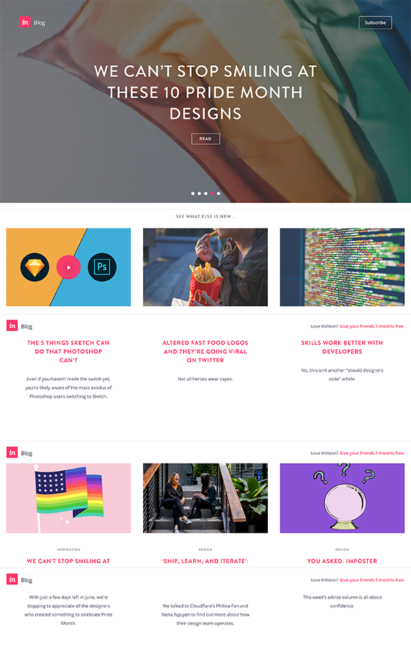
Normally I’m against sliders or carousels, but for this, it works with well with the blog titles and large featured images in the background.
Below the featured post slider, inVision also uses a 3-column layout with short and sweet excerpts, that are almost one-liner descriptions.
The strategic use of white space allows each post to “breathe” and helps the user focus on finding the content they care about rather than being bombarded by too many options all at once -- which is common with a 3-column look.
The actual article design, as with our other blog design inspiration sites, is
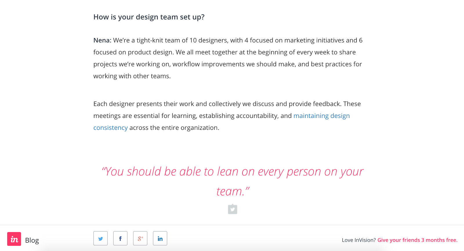
My favorite thing that InVision does is taking its social sharing buttons and main call-to-action (CTA) and placing them in a navigation bar that sticks at the bottom of the screen as the user scrolls.
That’s a great way to keep them front of mind and easy to access, without drawing attention away.
5. DigitalMarketer
More blog design inspiration can be found on DigitalMarketer.
The training organization opted for a similar layout to InVision, but without the slider/carousel. Because the top of the layout isn’t your typical blog listing page, it definitely piques the user’s interest and gets them reading.
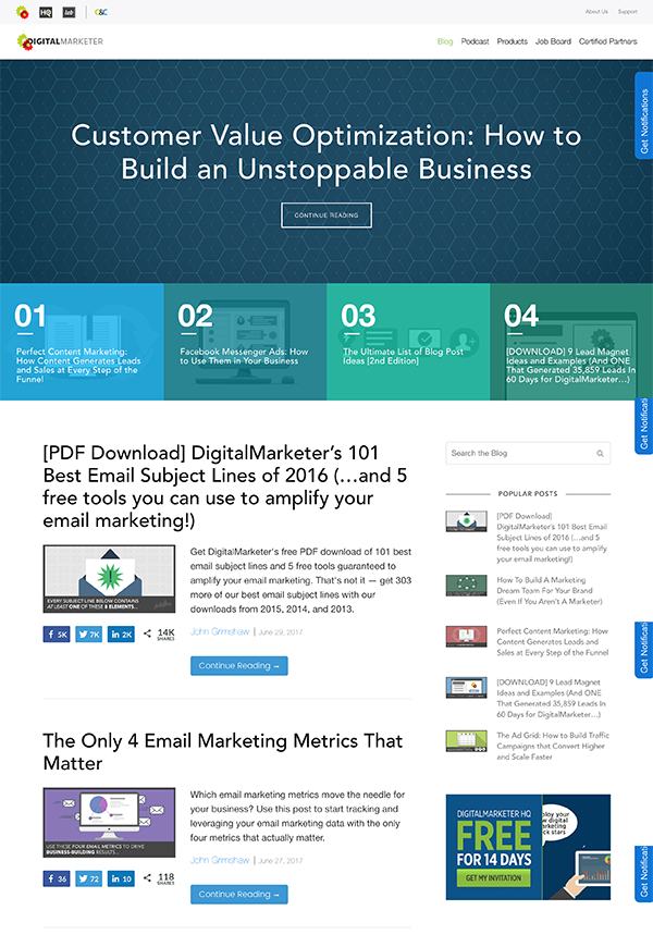
DigitalMarketer also highlights its featured post in the first section which, like others on this list, capitalizes on a descriptive title to captivate the user and get them to read more.
My favorite part of this layout is how the four most recent posts are displayed below the hero with numbers ordering them. It draws the eye, gives a sense of direction, and gets you reading the titles almost right away.
Below this “featured section,” you’ll get a more traditional blog layout with the post feed on the left and a sidebar on the right. The post feed uses excerpts to help give the user more context into what the article will be about and includes a prominent read more button that can’t be missed.
Overall, DigitalMarketer does a great job of not cluttering its sidebar with ads or CTAs.
The team chose to include a simple blog search, its most popular posts and a single, valuable offer CTA that follows you down the page.
6. Sprout Social
Next up is Sprout Social. I’m going to call it a "full-width" card layout; it’s blocked out but each individual blog post doesn’t fight for attention in the user’s eye.
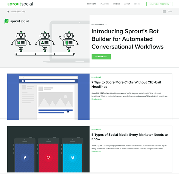
The blog’s large featured images give great visual interest and guide the reader’s eye to the title. This layout makes you want to scroll, or swipe, through numerous articles to see what else you can learn.
The layout’s typography and font hierarchy are also very clean, and as with the other examples, help to keep the reader engaged by making it easy to skim and actually digest the content.
One big thing to highlight that Sprout Social and others are doing well is not using full black as it’s font color.
Something I really enjoy is how Sprout Social fades out the social sharing icons that follow you as you read.
This takes the distraction element out of the equation but still gives the user to ability to share if they’d like.
7. Help Scout
Last, but not least, Help Scout’s blog uses another “card” style, but this time with a bold 3-columns.
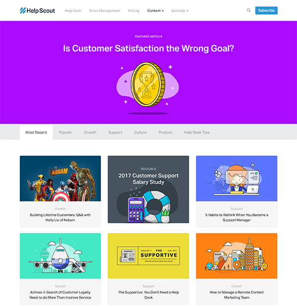
It starts off with a big beautiful featured post section that immediately engages the user with illustration, before displaying the bulk of content in the columns.
As mentioned earlier, 3-column layouts can easily become distracting, but Help Scout’s works. The cards don’t have large descriptions and they use bigger, more vibrant images to draw the eye and get them engaged.
Help Scout also cleverly incorporates “ads” alongside its actual content articles.
Now, by ads, I don’t mean paid banners, but relevant internal promotional items such as the 2017 Customer Support Salary Study.
This is a smart way of getting eyes on your premium content offers, without being aggressive or spammy.
The inner article design uses great line-heights and padding to make sure the content can breath and doesn’t feel too arduous to read.
I’m also a huge fan of the “Extra Reading” section. This is an easy way to continue the user journey onto other posts and increase on-page time.
Conclusion
Always think of the user first. Use this blog design inspiration to help guide them through your content and eliminate any distractions that may take them away from the goal at hand.
The most important part of any design is testing it with your specific users to make sure it’s the experience they want and the experience your company needs.
Need a jumping off point? Talk to us about our blog optimization package that can (and has!) delivered 3x the conversions and traffic for our clients.
Featured Image Created Using Placeit.net
Free: Assessment

