Subscribe now and get the latest podcast releases delivered straight to your inbox.
When you’re visiting a YouTube channel, what influences your first impression? Would you be willing to stick around and watch a few videos to determine if it’s valuable?
Probably not. I wouldn’t blame you either.
In fact, as a viewer, you probably give videos and channels mere seconds to compete for your attention.
If the value does not immediately present itself, whether entertaining or educational, you’ll move on, possibly never to return.
Brutal, I know -- but that may be happening to your viewers if you’re making some of these basic branding mistakes.
Although you may make incredibly valuable content, if your channel doesn’t communicate that at first glance, you’ll be missing out on subscribers and views -- And those missed opportunities are immeasurable.
1. Generic Channel Banner
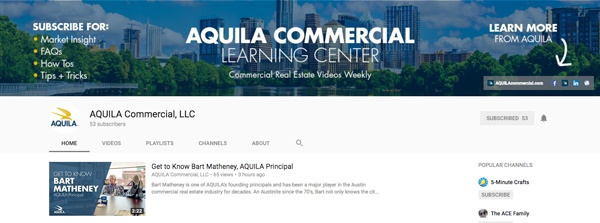
Your channel banner can do much more than simply show off your logo. This is prime real estate to start educating your viewers on what kind of channel you are, how often you upload, and share helpful links.
Adding this information helps the viewer to understand the value your channel presents, and in many cases, will be the difference between gaining or a losing a subscriber.
This is a great example from IMPACT client, AQUILA Commercial, showcasing a brief description, topics of interest, as well as quick links to other resources:

2. Inconsistent Thumbnail Design (or No Custom Thumbnails)
A basic strategy to get more views on your videos? Ensure viewers of each video end up watching more.
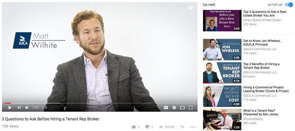
Thumbnails are one of the most important branding (and click/view) opportunities on YouTube for both search and suggested results. When you use a consistent thumbnail design, whether that be the same layout, color palette, or person in the thumbnail, it helps establish your brand and improves recognition in the suggested videos panel.
If you’re making really great (valuable) videos, viewers will want to watch more, and in many cases this strategy works very well.
Continuing with AQUILA Commercial, notice how they use consistent thumbnails to draw attention to their other videos in the suggestions:

3. No Channel Trailer
Imagine being able to personally shake the hand of every viewer who came to your YouTube channel for the first time. That would be cool, right?
Well, that’s not exactly possible, but you can give yourself one heck of an introduction with a Channel Trailer shown to viewers who haven’t subscribed yet.
Much like a movie trailer, your Channel Trailer is an opportunity to capture the attention of your viewers, explain your cause, and earn their buy-in.
While you must let your creativity flourish, a simple formula to follow would be: introduce yourself, the channel, what type of content you upload, and how often.
Check out the trailer of IMPACT client, Retrofoam:
4. No Lower Thirds
These virtual name tags once again give you a chance to increase recognition, as well as immediately provide production value where others sometimes fall flat.
Aside from restating the name of your subject, you could also use your lower thirds to include valuable information such as a job title, social media handles, website, or company name.
These elements can give more context to the viewer, establish credibility, and ultimately create a positive branding effect.
If you can’t design these yourself, purchase templates that you can modify as necessary.

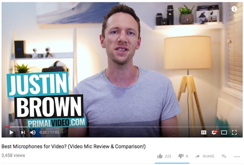
Above, Primal Video uses its lower thirds to not only boldy present his name and URL, but also highlight his brand colors.
5. Not Using a Logo Bumper
It may seem redundant to have your logo on your channel, in your avatar, and twice in your video, I know, however, you must consider that any one video of yours could be the first video a viewer might see.
A simple five-sec logo bumper is a really smart idea for every video you make, and should be placed in the beginning segments of your videos at least. These are VERY common amongst YouTube creators of all types, so viewers likely won’t mind the additional 5-sec plug.
This video from another client of ours, Burrells Jewellers displays a beautiful (and brand consistent) logo bumper at the :08 marker:
The Most Colossal YouTube Branding Mistake
All five of these elements help create a cohesive, branded experience.
They add production value (in turn, credibility), and give context in certain areas, but there is one major mistake you musn’t make with YouTube as a whole.
Do not treat your YouTube channel as a “bolt-on” to your other social media efforts.
YouTube is more than a search engine or video hosting platform; It is a thriving social media community centered around a visual experience.
In many cases, I recommend branding your YouTube channel as a separate community, apart from your Facebook page, Instagram, or even your website.
Call it a “Learning Channel” or “Learning Community” and make it feel special.
The most wildly successful channels I’ve worked with, and those that have the strongest brands on YouTube, have mastered this one fundamental branding philosophy. They have mastered...
“Community.”


Order Your Copy of Marcus Sheridan's New Book — Endless Customers!

![5 Branding Mistakes You’re Making on Your YouTube Channel [VIDEO]](https://www.impactplus.com/hs-fs/hubfs/branding-mistakes-youtube-channel-featured.jpg?width=768&height=400&name=branding-mistakes-youtube-channel-featured.jpg)