Topics:
Web DesignSubscribe now and get the latest podcast releases delivered straight to your inbox.
When you think of iconic logos, what brands come to mind?
Apple? Google? Starbucks? Pepsi?
What is it that makes these logos so iconic? and how have they remained so dominant for so long?
For one, it’s their ability to communicate their brand’s message in a simple yet clever way. Their logos are memorable and relatable making them timeless.
Secondly, these brands have figured out how to adapt and evolve their logos over time without jeopardizing the overall essence of their logo.
They understand what goes into a successful logo redesign.
And that’s no easy feat.
Whether you’re giving your logo a slight update or a major overhaul, your brand's reputation is at stake.
A logo does more than just tell people what your company name is; it visually embodies your brand and introduces people to what you stand for.
When a brand successfully redesigns their logo, people notice and feel even more connected to it. Unfortunately, when a brand botches a redesign people notice even more and that brand can face some harsh backlash (I’m looking at you, Gap.)
The good news is that we can always learn from our mistakes and, in this case, we have the benefit of learning from other companies' mistakes rather than our own.
If you’re considering redesigning your logo, check out these common mistakes that brands make when redesigning their logo and how you can avoid them.
1. Going too abstract
One of the most common mistakes brands make when redesigning their logo is that they try to do too much. They end up adding in too many different elements and trying to communicate too many different messages to the point that the brand is no longer recognizable.
This not only leads to an overly complicated logo, but actually makes it less memorable to people.
Think about the brands we mentioned earlier. What do these brands all have in common? Their logos are simple and easy to spot anywhere.
So when it comes to your logo redesign remember to K.I.S.S. - Keep it simple, stupid.
Aim to make your logo simple enough that anyone can easily draw an accurate version of it from memory.
This simplicity doesn’t necessarily mean it has to be boring and lacking personality.
Some of the strongest brand messages have been communicated in surprisingly simple ways.
Take a look at FedEx for example.
At first glance, they just have a simple text-based logo. Take a second a glance though, and you'll notice the arrow that forms in the negative space between the letters E and X.
This is an incredibly simple rendering, yet the arrow successfully communicates FedEx’s core values and service of getting your packages from point A to point B. They’re a company that operates with speed and precision.
2. Not considering a logo’s brand equity
Think of your brand equity as your brand's perceived value to a customer.
The more people interact with your brand, the more your brand equity either increases or decreases based on a customer’s experience during those interactions.
Your logo, as the frontman of your brand, plays a major role in leveraging that built up brand equity because people associate it with that value.
It’s the reason why we’ll pay more for Tylenol than store-brand acetaminophen even though they’re the same product.
We trust Tylenol as being a reliable brand.
If you’re planning on making some drastic changes to your logo, you need to first take stock of your current logo’s equity.
Is it a logo that people readily recognize and associate with your company? If so, you don’t want to just throw all the brand recognition out the window.
Instead, try to find a more subtle way to update your logo while maintaining its most recognizable features.
UPS is a great example of a brand that’s been able to redesign their logo over the years while keeping the brand equity of their logo intact.
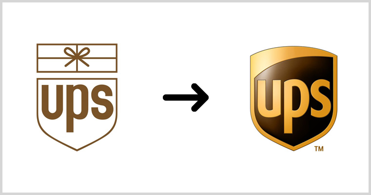
Notice the similarities between the two versions.
They were able to maintain the most important piece of their logo - the shield - all while updating it to show that they’re more than just a shipping company.
If anything, they’ve leaned more into the shield which represents their core values of safety, dependability, and integrity which will allow their logo to scale with the company as it grows to offer more services.
3. Being driven by trends
I can’t even count the number of articles I’ve read over the years about the latest and greatest design trends. In fact, I’ve written a few, but just because something is trendy doesn’t mean it’s right for you.
It can be tempting to see a new design trend and immediately start trying to work it into your logo redesign — I get it — but there’s a time and place to experiment with them and your logo is not one of those places.
The unfortunate thing about trends is they leave almost as quickly as they came, so when you design your logo based on one, you’re setting yourself up to be outdated within a few months.
When it comes to your logo, you want to design something that’s going to be timeless and will scale with your company as it grows over the years, not months.
Sure, you’ll probably need to do slight updates or facelifts as time goes on, but you shouldn’t need to do a major overhaul on your logo every couple years.
Instead of focusing on trends, focus on the message and feelings you want to communicate.
BMW is one of the more recent companies to fall prey to this mistake.
The luxury vehicle company recently redesigned their iconic logo to fit more into the trendy minimalist approach we see a lot of companies using nowadays.
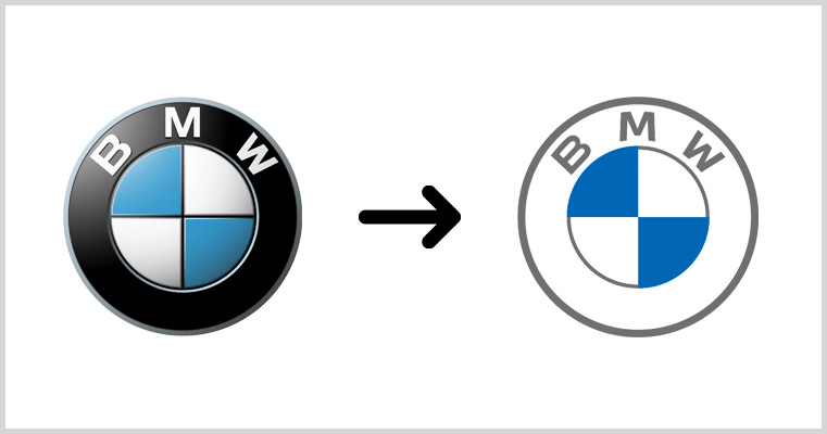
Unfortunately, the redesign was met with a lot of push back from car enthusiasts complaining that the company sacrificed its well-known identity in order to look more trendy.
In this redesign, they lost the feeling of elegance and luxury that they’ve been known for over the years and did some serious damage to their brand’s image with loyal fans.
4. Not designing with versatility in mind
Think about how many different places you see logos in your normal day to day life.
They’re everywhere! On websites, social media, stickers, clothing, even on some people's skin!
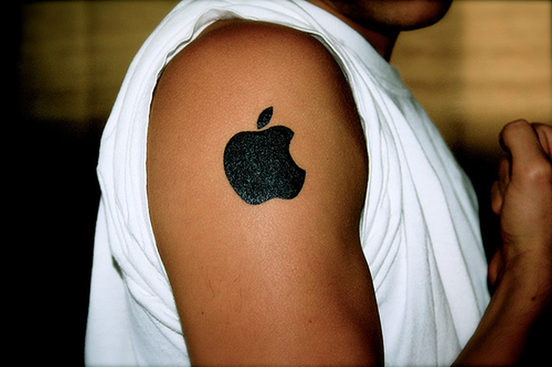
Photo Courtesy of Tattoos Book
While you probably don’t need to make sure your logo remains legible on someone's forearm, you do need to make sure it scales well to different mediums and sizes.
Your logo should always remain recognizable and legible regardless of where or how it is used.
During the redesign process, make sure you're regularly scaling your logo to a couple different sizes to make sure it remains cleaner and easy to read.
Most companies also offer their logos in a few different variations to ensure they render well on a number of different colors and mediums.
At IMPACT, for example, we have both a full color and white version of our logo.

We also adapt it for use on different platforms:
Planning for these different use cases will help ensure that your brand will be recognizable regardless of where the logo appears.
5. Creating a logo that relies on color
Your logo is only as strong as the concept it was built on.
In a similar vein to the last point, a logo that requires color to communicate a message is not strong.
Too often companies create these logos that look great when they’re used in full color on a simple white background, but when that same design is converted to grayscale or printed in single color, it loses all meaning.
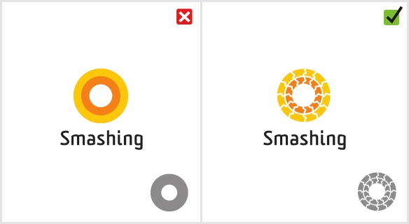
Take a look at the example below from Smashing Magazine.
Notice how the logo on the left relies on two different colors to see the different rings. When that logo is used in grayscale format it becomes completely unrecognizable.
The logo on the right however, is able to stand on its own regardless of the color.
It’s natural to want to dive right into adding colors during a redesign. Colors are always a big part of your branding, but I’m going to urge you to resist that temptation and start with simple black and white.
Working in black and white allows you to focus more on nailing down a unique concept and form of your logo which will give you a stronger foundation to build on when it does come time to add color later on.
6. Copying another company’s logo
As a designer, this is one that really grinds my gears and it’s definitely one of the cardinal sins of logo design.
You should never copy or duplicate another company’s logo.
There is a difference between using a logo as inspiration and completely copying it, but some companies blur that line a little too much.
Aside from the legal ramifications, copying another brand’s logo is just going to make your brand to blend in with everyone else.
You don’t want your logo to be confused for someone else’s. This could mean them getting credit for your work, or on the flip side, their poor qualities reflecting on you.
Slack’s redesigned logo is a recent example of this danger.s.
The original Slack logo embodied the company’s fun personality while featuring a logomark that featured a major part of their software.

However, last year the messaging company decided to redesign their logo to create something that was more versatile and scalable.
While the reasoning behind the redesign was solid, the execution left a lot to be desired.
The new logo looks like it was designed to match the trends of other software companies in the space (especially Google) thus sacrificing a lot of personality their last logo had.
Your logo should be unique to you and your brand's values. It should help you stand apart from your competitors and other organizations, not blend in.
Like I said earlier, it’s ok to look at other companies logos for inspiration, but when it comes to redesigning your logo, think about what you want YOUR message to be and what the best way is to communicate that.
So, what’s the secret to a successful logo redesign?
Just remember to keep it simple, be mindful of maintaining your existing brand equity, and always design with versatility in mind.
And at the end of the day, it’s all about using your brand’s values as your north star. When you look at your logo it should embody who you are as a company.
Free: Assessment

