Subscribe now and get the latest podcast releases delivered straight to your inbox.
4 Impressive Consultation Page Examples You'll Want to Steal Ideas From

By Karisa Hamdi
Apr 13, 2016

 Getting visitors to sign up for your services is the ultimate goal, right? That’s why creating a consultation page that converts should be one of your main company goals.
Consultation pages are here to let your visitors take the first step towards officially working with your company.
It lets them “raise their hand” for the opportunity to connect with your company, and discuss what you have to offer and what makes you better than your competitors.
It’s crucial for this one page to stand out by differentiating the company, having a strong value proposition, and a great design.
Here are four awesome consultation pages that you’ll want to steal a trick or two from:
1. Ramotion

Ramotion is a digital design company focused on helping startups. In a market flooded with choices, their consultation page is definitely one of the most unique I’ve seen.
While so many landing pages make filling out a form seem like work (creating friction), this one gathers all the need-to-know information (nothing extra) in a way that is engaging and almost makes the experience feel like a game.
This simple, yet effective design gives prospective clients a great example of the kind of design and user experience the team will bring to their project.
It also offers a rough price estimate of what prospects are looking for. This is a great way for sales ready leads to see if the project is within budget (self-qualifying).
Overall, Ramotion’s consultation page really speaks to their audience with this unique design and delightful experience.
2. Grain & Mortar
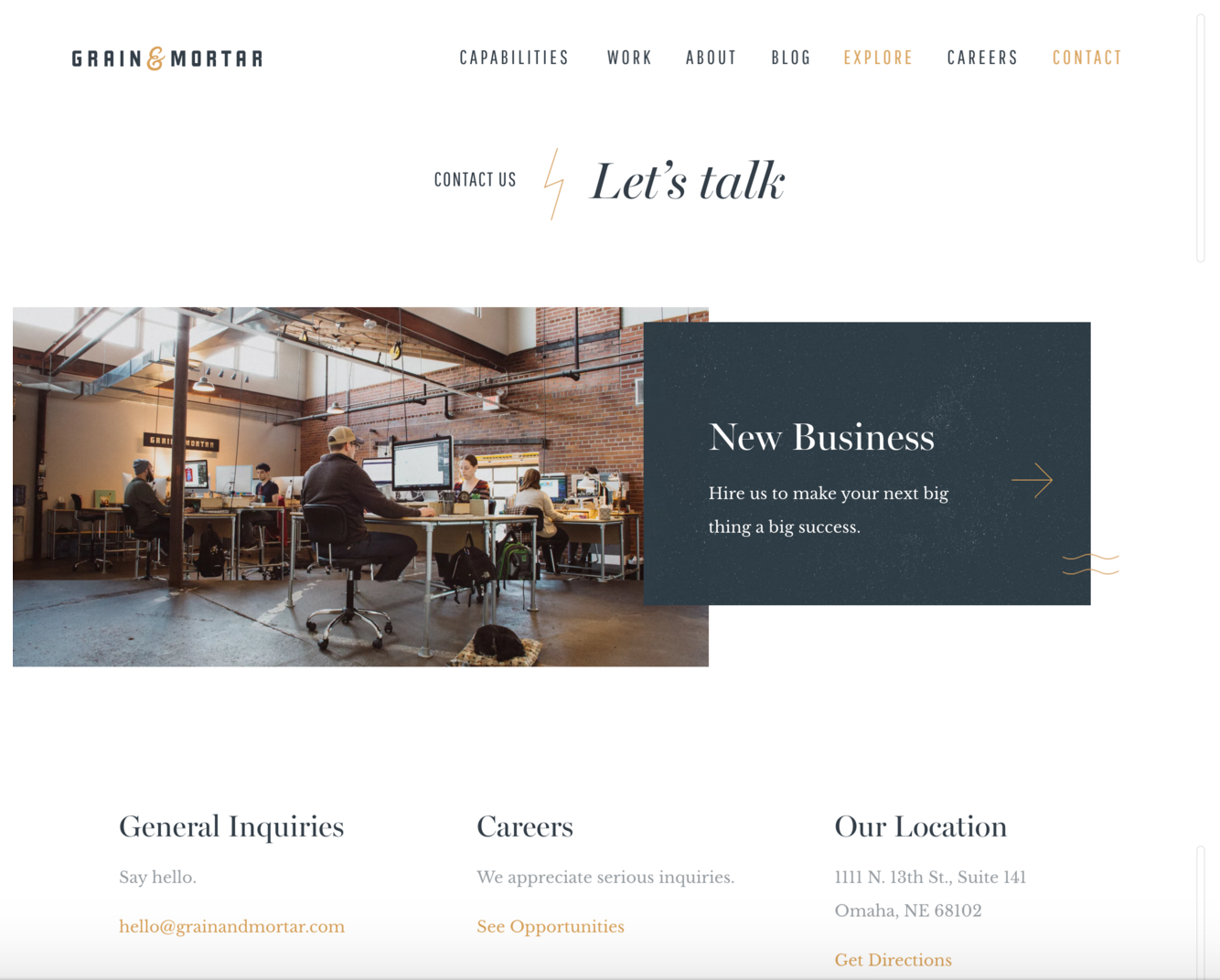
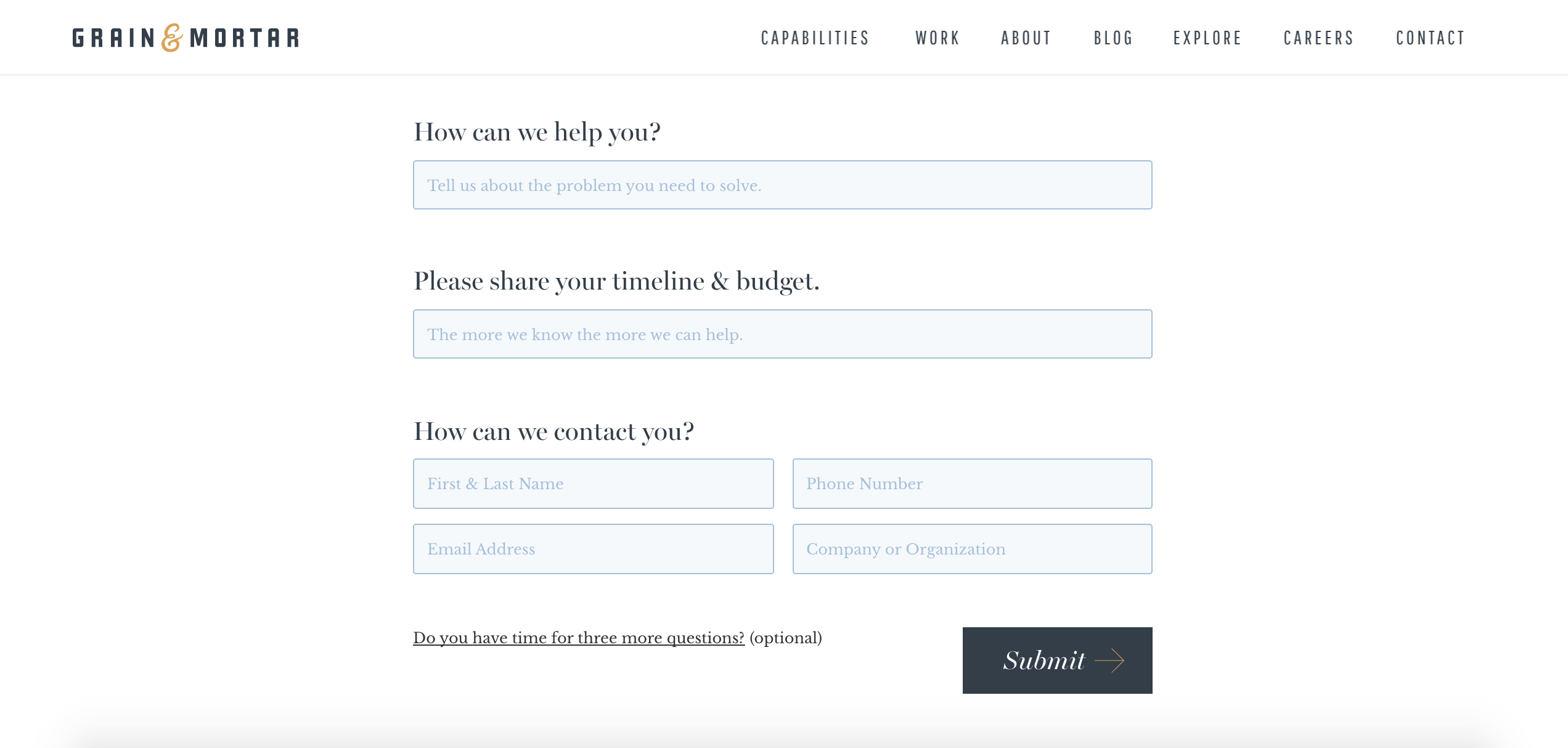
Grain & Mortar uses its designs to help businesses launch products, brands, and ideas. This consultation page features strong brand identity and makes the visitor feel important.
By including the imagery of their office and the simple layout of the page it feels true to the brand and sets realistic expectations.
For a design agency, the consultation page is one of the best places to showcase design capabilities and Grain & Mortar does this effortlessly.
The form copy makes the user know that Grain & Motor really wants to get to the heart of their customers problems. They phrase their questions as requests rather than being pushy and asking for your “budget or timeline.”
They’re asking for your main design problem so they can be the solution, as well as letting you know that the more information you give them the more they can be that solution for you.
The company also understands that its audience is busy and may be turned off by a long form so they keep three additional questions hidden unless the user feels the have the time to answer them.
Grain & Mortar’s consultation page shows you what the company is all about while making sure the audience knows they’re important to them, even before they’re a customer.
3. Focus Lab
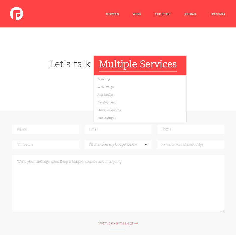
Focus Lab helps you create your brand identity then uses this information to design a full website or a mobile app. With its consultation page, the company focuses on creating a strong user experience.
This page keeps a clean, simple design to not distract the visitor and move them away from the page. It allows you to easily choose what you’re looking to discuss with the company, showing its main focus as a business.
Focus Lab also adds to the user experience by asking one fun question “What’s your favorite movie?” within the form.
This gives the user a second to take a break from filling out their information and feel more comfortable. It humanizes the brand.
Placing this question before the forms longest question, that requires the user to share the most about them and their business, allows them to open up.
Focus Lab’s consultation keeps it simple, while making the visitor feel comfortable sharing the information they need.
4. Unbounce
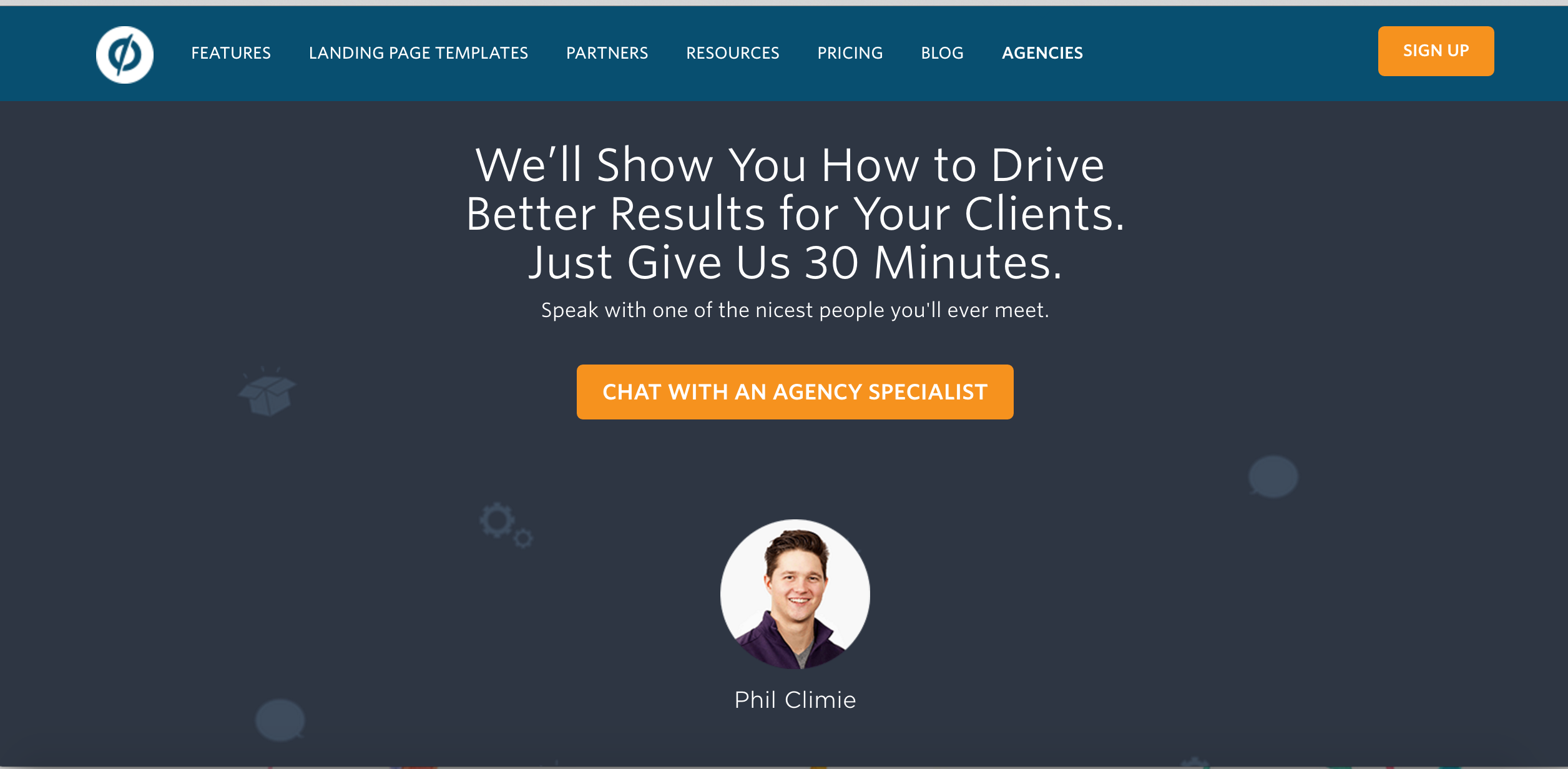
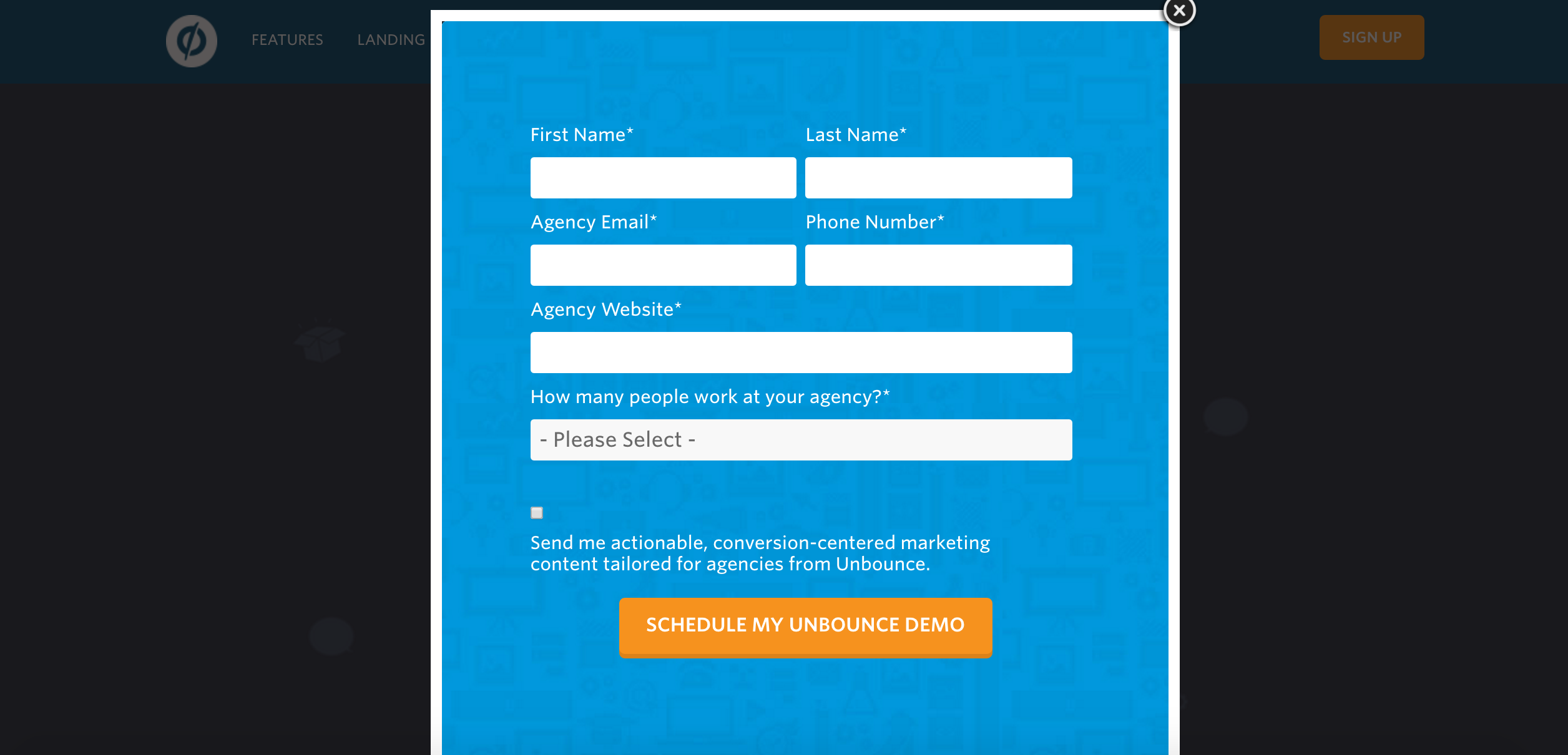
Unbounce is a landing page building platforms for marketing agencies. Its consultation page’s main focus is creating a personalized experience, while showing the potential customer the value in the company’s product.
The page immediately wants you to know that the company will get you the results you need for your clients. This is effective click-bait to get you to actually request a consultation.
Unbounce also wants to make sure you know that each experience is personalized by showing you exactly who you’ll be talking to and that it’s there to help.
The page makes the consultation more inviting by letting you know the name, face, and personality of the person who will be reaching out to you.
The only problem with this consultation page is the disconnect between the first call-to-action, “Chat with An Agency Specialist” and the button text on the form, “Schedule My Unbounce Demo.” It’s important to stay consistent with this messaging to make sure the user actually knows what they’re requesting.
Conclusion
The all important consultation page could make or break whether or not you get a lead to turn into a customer. Focusing on a great design, valuable copy, and a strong user experience is key when creating your consultation page.
Use these four examples to inspire you to create your own consultation page to start growing your business.
Free: Assessment