Subscribe now and get the latest podcast releases delivered straight to your inbox.
A content style guide is one of the most critical pieces of brand documentation you'll ever create. It's a documented set of guidelines and rules that break down your brand personality, and how it is (and isn’t) expressed through your content. It should be used by anyone on your team -- or freelancers who work with you -- who will be creating content for your brand.
Seems pretty straightforward, right?
Well, kind of.
After working with dozens of companies from around the world to help them create their own content style guides, we've learned that sometimes it's not always clear what that "documented set of guidelines" should include.
For example, should your content style guide also include your brand messaging strategy? What about notes on preferred visuals or branding guidelines? Those matter to your content, too, right?
That's what we're going to clear up today -- what exactly does and does not belong in your brand's content style guide. Because your content style guide will only be effective when it's not treated as if it's a "kitchen sink" catch-all for any and every rule pertaining to your brand.
So, What Should Be in a Content Style Guide?
Well, that depends on who you ask, considering what a content style guide looks like from brand to brand.
Generally speaking, however, the good ones include some form of all the following elements:
-
Brand personality traits. (“We’re fun and approachable!”)
-
Brand-specific copy rules, suggestions, and preferences. (“Don't use big words!”)
-
Basic editorial rules -- grammar, spelling, etc. (“We're an Oxford Comma family!”)
But what should your style guide include?
The 3 Essential Parts of a Content Style Guide
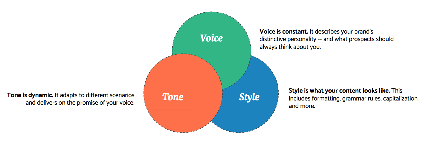
The style guide process and template we’ve built here at IMPACT -- the very same that gets us the best results for our clients -- has three distinct parts:

Voice, tone, and style each serve a particular purpose for your brand, but they are all very much dependent on each other to create the full effect of your brand’s content style.
-
Voice: These are all of the attributes of your brand’s personality; it’s what people should think about your brand as a reflex, without you having to spell it out for them.
-
Tone: This is a dynamic element. It’s how you deliver on the promise of your voice. Your tone will be situational and should be adapted to accommodate different scenarios.
-
Style: Finally, there’s your style. In this context, style refers to what your content looks like. Literally. So, formatting, grammar, and punctuation rules all fall under this category.
The benefits of this simple approach speak for themselves:

By design, your content style will prioritize what your ideal customers want -- not your team -- because it was developed for them, based on their preferences and what they need.
Internally, you’ll also be able to promote best practices with your team around how your brand should be portrayed and perceived, which means your brand presentation through content will be consistent, no matter who’s doing the typing.
(If you're still not convinced, the team at GatherContent does a great job of explaining why style guides are so important to ensuring that consistency.)
However, if you think certain ideas, rules, or preferences about your brand’s style should be “obvious,” you’re opening yourself up to a lot of risk by not discussing them, agreeing to them, and documenting them in a content style guide.
Instead, you’re making the assumption that individuals won’t have their own personal ideas about your brand’s personality and won’t make unique choices to express it.
Sadly, you probably won’t catch those discrepancies until someone does something either you, your leadership, or worse, a potential customer or current client doesn’t like...
Email vs email vs e-mail vs E-mail
Finally, at a high-level, your content will be better across the board and more effective at attracting the right people. That’s what it’s all about, right?
(Psst! We’re going to spill the beans on exactly how you run a content style guide workshop in the next chapter, so you can make sure your content style guide will do all of these things.)
What Doesn't Go into a Content Style Guide?
Given that a content style guide is essentially a tactical, instructive manual of how to write like a particular brand, it can be tempting to put everything in there.
Of course, you shouldn’t do that. That’s a bad thing.
Brand Messaging Is Not the Same as Content Style
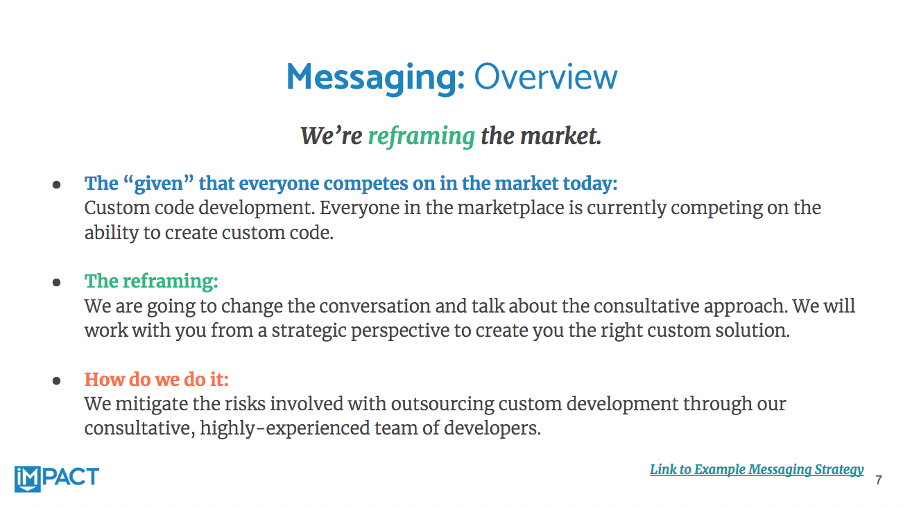
For example, at IMPACT, we do include a slide with a brand messaging strategy primer within the content style guides we create for clients:

Here's an adapted example of a brand messaging strategy primer slide from an IMPACT content style guide.
However, your content style guide should not be where your full brand messaging strategy lives.
As you can see in the image above, this is merely an excerpt that links out to a full brand messaging strategy, which is a massive document all by itself.
If a client doesn’t have one, we may put a few notes here but, more than likely, we won’t include it at all.
While messaging notes or a link to a full messaging strategy should absolutely be included as a reference in your style guide, you need to remember one thing:
Your brand's messaging strategy and your brand's content style are not the same thing.
That said, you really can’t have one without the other. Brand messaging and content style go together like peas and carrots. Or Han Solo and Chewbacca.

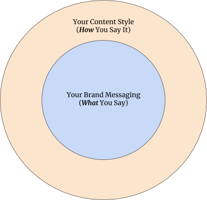
Going back again to that old adage of, “It’s not what you say, it’s how you say it,” your messaging strategy is the WHAT and your content style is the HOW.
Put another way, your style is the packaging and polish you put on your strategic messages, not the strategic messages themselves.
(That’s why we typically have our clients go through a messaging strategy workshop first. Then they go through a content style guide workshop.)
It’s kind of like when people look at the HubSpot marketing automation platform and expect it to be their inbound strategy, in addition to being the mechanism by which their strategy is executed. In reality, HubSpot is only the latter.
You still need to research and document your own buyer personas, develop a messaging strategy for each of those personas, create your own strategy for content, email, conversion offers, etc.
The same holds true for your content’s style.
Your content’s style isn’t your blogging strategy. It won’t tell you what your messaging should be -- again, that’s an entirely separate process. It also won’t tell you how to win the internet.
But having style is essential to executing an effective blogging strategy, guaranteeing your messaging is packaged for maximum impact, thus empowering you to win the internet.
What Else Shouldn't Go in Your Style Guide?
There are three other areas you may feel tempted to address in a style guide, but you shouldn't...
Visual Notes
While your contributors may often be responsible for choosing images for their own work -- we do that at IMPACT for our blog -- notes about visual preferences (like natural photography with bright colors or no text on featured images for blogs) should live in a visual style guide.
Branding Guidelines
Fonts, colors, and branding rules are, again, visual, so they should have their own home. Sometimes brands bundle this kind of information together along with visual notes like the ones mentioned above, but sometimes they’re separate.
Content Layout Best Practices
Some of you might disagree with us on this, and that’s okay. But obvious best practices like, “Don’t make your content look like a massive word wall; break up your text with headings, lists, etc.,” don’t really belong in a style guide.
However, if you have rigorous rules like, “paragraphs should never exceed X sentences,” or “We only use bullets for lists, never numbers,” you would put them into a content style guide.
Where the first example is something your writers should already know -- or, if they don’t, should be addressed through education at an editor-to-writer level -- the second two examples are hyper-specific brand preferences that no one would know intuitively.
University of North Carolina, Chapel Hill Gets It
As we’ve talked about already, your content’s style is only one piece of the brand storytelling puzzle.
So, how do you organize all of it, if you shouldn’t put it in a single document?
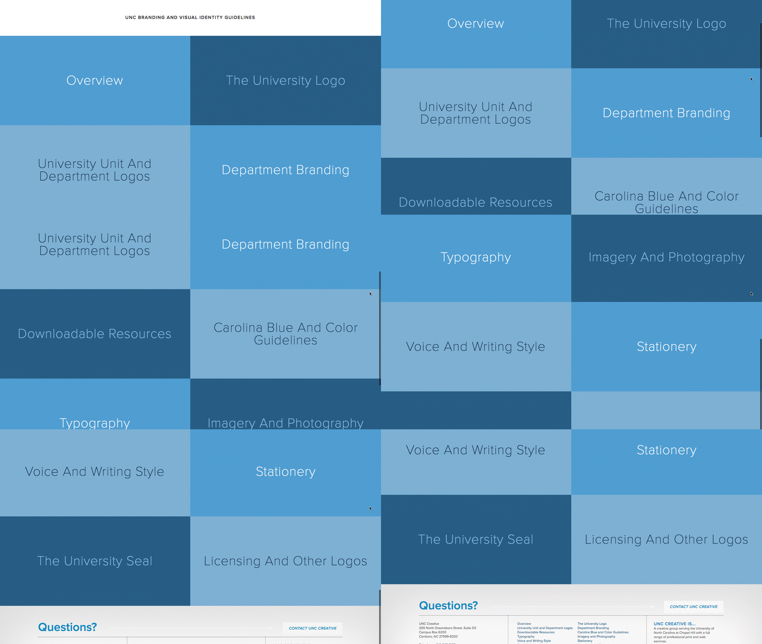
The University of North Carolina, Chapel Hill’s brand identity presentation is a great example of what you should do.

UNC-Chapel Hill Identity by UNC Creative
We love their approach.
Yes, the UNC Creative team developed exhaustive brand guidelines about everything -- logo, visuals, typography, stationary, color guidelines, content, etc. Given the complexity of their organization and its size, history, and tradition, however, that shouldn’t be a surprise.
You may not go into this level of detail, but what you should take note of is how they built a centralized home for all of those style rules that’s not only organized, it’s also compartmentalized.
So, while you may choose to keep your style confidential -- for example, stored on a company intranet or in an invitation-only Google Drive account shared by your team -- take note of how everything is segmented.
You could probably put all of these items into a single document, but no one will want to use it. Ever.
What Does IMPACT Include in a Content Style Guide?
In addition to two slides covering positive and negative voice attributes, and two to four slides defining what we call “tone pillars,” IMPACT content style guides include the following:
-
Messaging overview and a link to the messaging strategy (if applicable);
-
Formatting rules, which covers capitalization for titles, headings, and subheadings, as well as lists;
-
How words are visually emphasized using bold or italics;
-
Brand-specific copywriting preferences or quirks everyone should follow;
-
Exceptions to traditional AP Stylebook rules;
-
Common AP Stylebook rules and login credentials for a client’s AP Stylebook subscription (if available); and
-
Buyer persona profiles.
Depending on the unique needs of a client, we may also include other optional sections -- for instance, exceptions for social media, core values, how to handle competitor references, or examples of “best in class” blog examples or other types of content.
What's the Right Answer for You?
Ultimately, what should be included in your own content style guide will depend on the needs of your organization. However, I ask you to proceed with one word of caution in mind:
Do not, under any circumstances, give into the urge to create something overly complex for the sake of it.
Yes, that's so important, I had to highlight it in a different color.
In our experience, some brand teams and leaders are ultimately shocked by how much discussion is required to create a piece of documentation that may end up being fairly straightforward and “simple.” As a result, they try to over-engineer the final product by making it longer, because they equate complexity and length with importance.
In their eyes, if it’s “too short,” it’s probably not enough and/or must be a disservice to the nuances of their brand.
Wrong. This kind of thinking results in content style guides people will never want to use.
No one is going to want to read War and Peace every time they need to write a 900-word blog post, especially if it could have been shortened to the length of a press release and been just as effective in explaining what they needed to know about content style.
Instead, you need to be clear, concise, and direct in your content style definition and direction.
The end result may end up being quite substantial, like MailChimp’s. Or you might end up with a one-sheeter, like UNC-Chapel Hill.
Your content style guide should be as long as it needs to be -- no more, no less.


Order Your Copy of Marcus Sheridan's New Book — Endless Customers!

