Topics:
Lead GenerationSubscribe now and get the latest podcast releases delivered straight to your inbox.
 Whether you had one as a kid, or your kids have one now, everyone is familiar with the good, old "jack in the box" toy. You know, the one where you'd cautiously wind up the crank and wait in seemingly excruciating anticipation for the jester to pop out?
Sure, it's fun at first, but eventually, it's just plain annoying. (I mean, that jingle will literally drive you crazy.) And when it comes to actual popup advertisements, marketers have grown to feel that same irritation.
However, we think popups get a bad rap. After all, it's not necessarily the tool that's off putting, but rather the approach of the person using the tool that creates a problem, right?
So what if I told you that businesses have found a less intrusive way to use popups? Or if I told you that these said popups are helping them to reengage abandoning visitors?
Interested?
I thought so. Which is why we've put together all of the insight you need to know about exit-intent popups so you can start winning back your abandoning visitors today.
What is an exit-intent popup?
Exit-intent popups use mouse tracking data to display a relevant, targeted popup milliseconds before a visitor exits your website. This provides businesses with a second chance to engage their website visitors before they leave without converting.
It's important to note that these popups can consist of anything from a discount code to an opportunity for a visitor to subscribe to your business blog. It's entirely up to you.
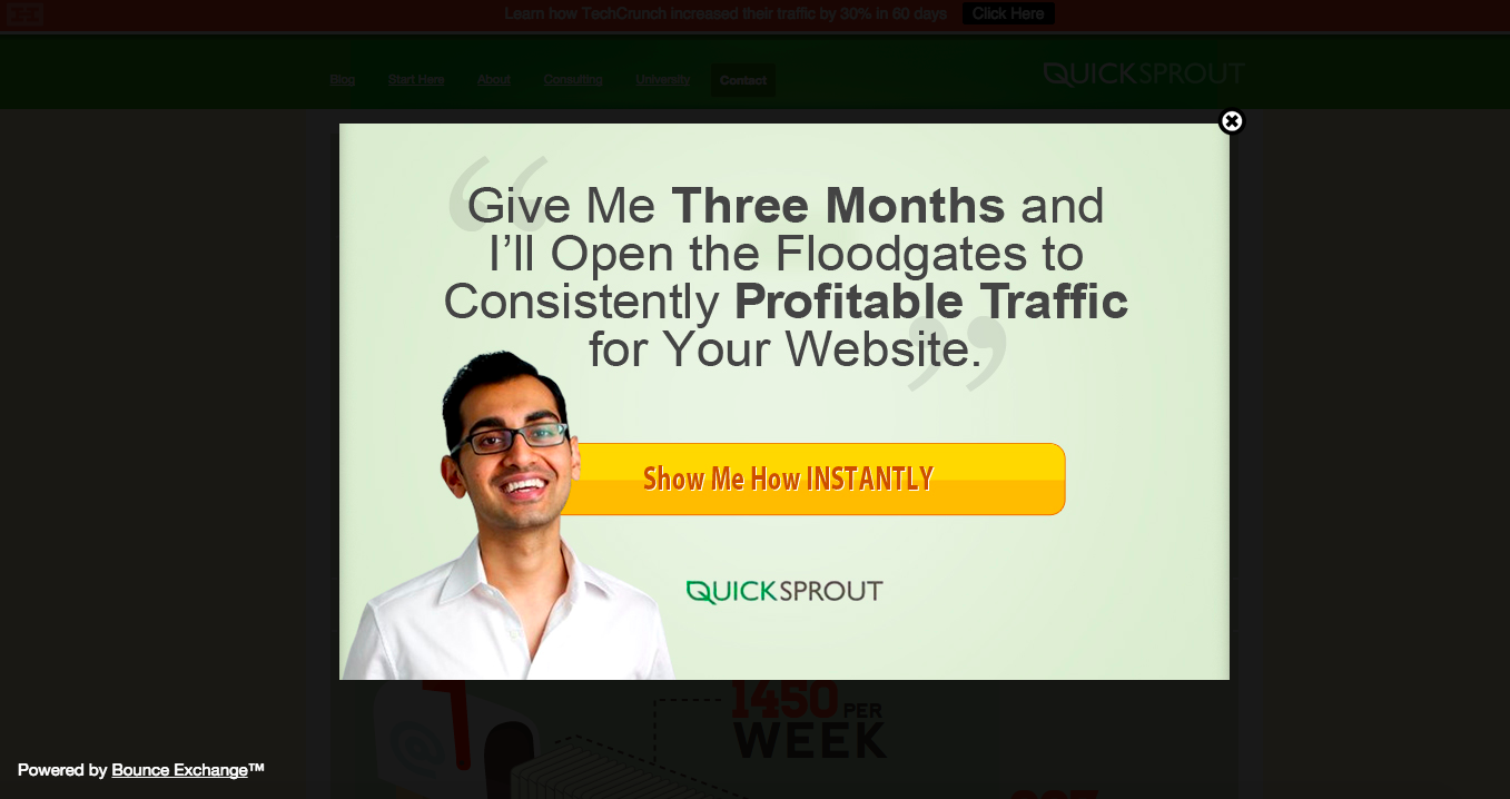
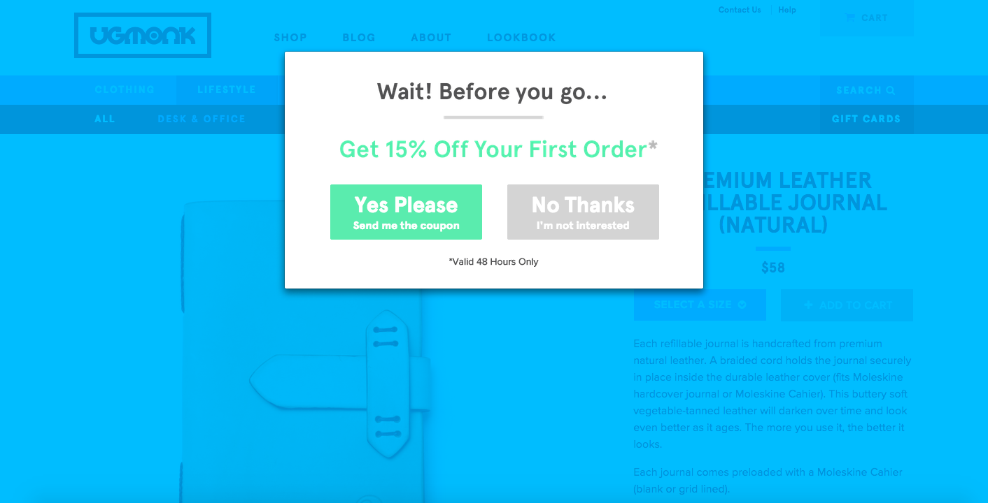
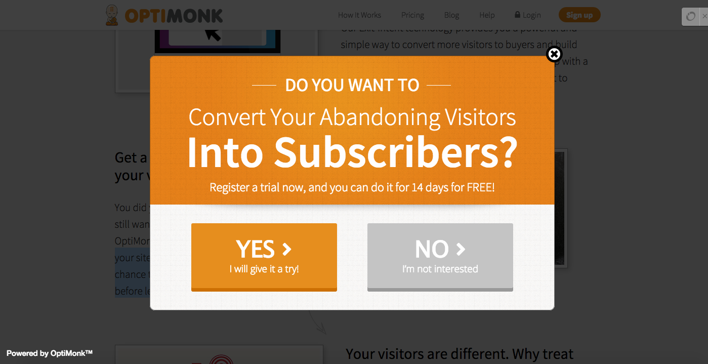
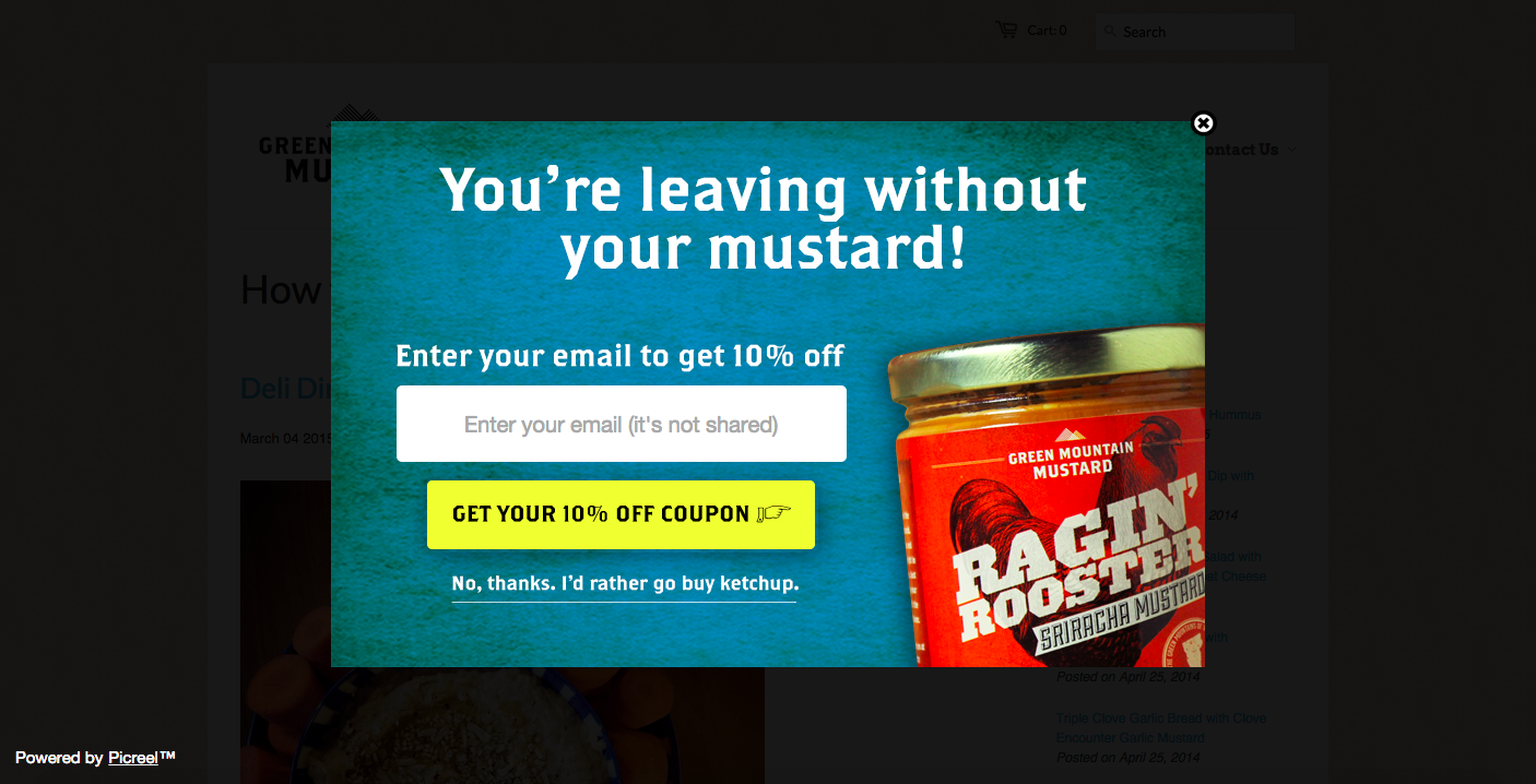
To give you a better idea of how they work, here are a few examples of exit-intent popups in the wild:
What about the user experience?
We've all been there.
You're innocently browsing the web and a massive, irrelevant, auto-play equipped popup appears out of thin air. Suddenly, the audio is blaring through your speakers and you find yourself scrambling to find the seemingly non-existent "x."
It's the worst.
The good news is, exit-intent popups don't commonly fall into this category, as they are often designed to be contextual enough to not offend the website visitor. For example, before exiting the UgMonk website (example shown above), a popup appears offering up 15% off of your first purchase. Unlike traditional, intrusive popups, this approach is both timely and valuable.
“NO ONE cared about the nano-second interruption. I’ve had the form on my site for almost a month now and no one has said a word about it,” urged Backlinko's Brian Dean when asked about his experiences with popup marketing.
3 tips for executing high-converting exit-intent popups
1. Address doubts
When a visitor prepares to leave your website, what's running through their mind?
Will the product/service live up to the hype? Is there a cheaper alternative? Is the product/service worth the investment? How will this make my life easier? What happens if the product/service doesn't perform as expected?
If a website visitor can't get their hands on enough information to alleviate their concerns, it's likely that they'll allow fear to guide them off the page. So what can you do about it?
In an effort to retain website visitors that would have otherwise been lost, consider presenting exiting visitors with a case study that demonstrates exactly what you are capable of.
2. Add value
I don't know about you, but I'm notorious for shopping cart abandonment. I'll add half a dozen items to my cart, make it half way through the checkout, and then decide that I don't really need six new pairs of shoes.
But what if those shoes we're 10% off? 15%? 20%?
In an effort to move visitors back to the point of sale, exit-intent popups can be used to provide them with a discount code to use towards their purchase.
Not an e-commerce business?
Use this opportunity to serve up an ungated resource, an exclusive piece of content, or an opportunity to subscribe to your blog and receive daily notifications aimed at moving them further down the funnel.
3. Create urgency
Too often visitors leave a particular page thinking that "it can wait" or they'll "come back later." To combat this, exit-intent popups can be set up to convey a sense of urgency.
For example, the QuickSprout popup (example shown above) takes advantage of the opportunity for reengagement by using carefully selected words to encourage visitors to take action now, rather than later.
By stating that he is capable of increasing a visitor's website traffic in just three months, it's likely that visitor's will feel compelled to act on the offering to expedite the results.
The emphasis on the word instantly on the yellow call-to-action also works to inspire visitors to move forward with their decision rather than waiting around.

Order Your Copy of Marcus Sheridan's New Book — Endless Customers!

