Topics:
Lead GenerationSubscribe now and get the latest podcast releases delivered straight to your inbox.
 I’ve always found it curious that, as marketers, our default mindset is always to do more.
More traffic. More leads. More tweets. More blog posts. More conversion opportunities.
At some point, however, the savvy marketer takes a step back and asks, “is ‘more' actually helping?”
Conversion rate optimization is far more complex than simply doing more of anything.
There are many factors at work. And sometimes these factors can work against each other, creating friction that negatively impacts your conversion rates.
And that's where our story begins...
Are your calls-to-action competing with each other?
Earlier this week – as I do pretty frequently – I measured the engagement our homepage receives using CrazyEgg.
CrazyEgg is a web analysis tool that allows marketers to measure click and scroll behavior on their websites.
(I re-upload our homepage into CrazyEgg pretty often, clearing any previous data, as any change to the page – no matter how slight – can greatly affect the results.)
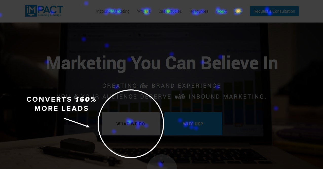
But this time I decided to measure if any of our homepage calls-to-action were competing with each other and hurting our conversion rates, most namely our “What We Do” and “Why Us?” buttons in the main header.
According to CrazyEgg, while the What We Do button receives 3% more clicks, the difference turns out to be negligible. So for arguments sake, we’ll call them even.

Next, I decided to check which of the two pages has assisted more leads this year.
Conversion assists are any pages viewed on your website by a prospect immediately prior to them converting to a lead.
Using HubSpot’s Sources tool I created a “recipe” to measure which of our pages convert the most leads.

Next, I pinpointed the two pages each of the main buttons in our header points to. While they receive almost the same amount of clicks, the difference in lead assists couldn’t be more pronounced.

The What We Do button assisted 885 leads, while our Why Us? button assisted 340.
So let’s rewind for a second. Our homepage features two prominent calls-to-action beneath the main value proposition to lead visitors to.
(After all, the main purpose of a homepage is to get people off the damn homepage.)
Our thinking was we wanted people to know what we do and why they should hire us to do it. Pretty simple.
But the What We Do button assists and converts 160% more leads.

Wow.
So why are we purposely dividing people’s attention between two buttons that convert at drastically different rates?
Our CTAs are essentially competing against each other. We’d be better served having only one call-to-action in the header and leaving the Why Us page listed in the navigation bar as it is now. (Stay tuned for that.)
Now you might be thinking, “wouldn’t this hurt the user experience? Why not let them decide where to go.”
Conversions are the biggest determining factor that the user is finding value in what they're viewing. Think about it, how willingly do you give out your email address? It’s the holy grail of online currency.
The fact that one page converts 160% more people means it’s providing greater value.
It’s a win-win. We need to get out of the way and direct people to the pages they’re finding greater value in, and in the process, increase our conversions.
…by doing less.


Order Your Copy of Marcus Sheridan's New Book — Endless Customers!

