Subscribe now and get the latest podcast releases delivered straight to your inbox.
Every now and again you probably stumble upon a 404 page.
In an ideal world, companies would love for their website visitors to never see a 404 error page. Unfortunately that never happens. On the off chance that it does happen, why shouldn't you showcase a creative way to let them know that the page cannot be found? Instead of a traditional page not found message.
The main goals of a 404 page is to alert visitors that the content is no longer there and offer a way for that visitor to re-engage with your website.
Thinking of developing a more creative 404 page? Here are the most important elements you should include.
Elements of a Creative 404 Page
You cannot just have an ordinary 404 page. How else are you going to keep your visitors on your site? Especially, that one time you happen to have a broken link?
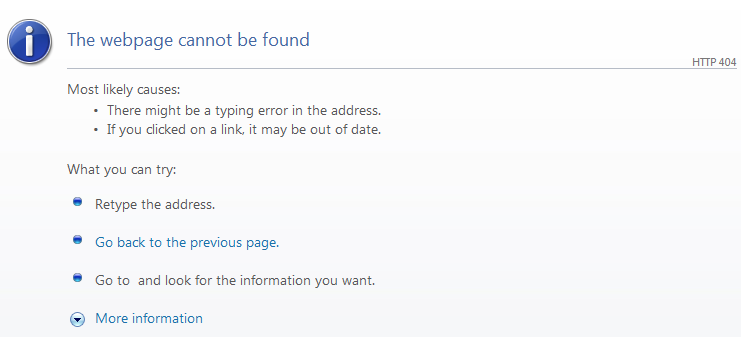
I'm going to be frank, you won't be able to if you have an error page like this. There are several reasons why your visitors received a 404 error. It could simply be due to a page being removed or the page was moved to a new URL.
While you might be careful to ensure the a 404 page never pops up, it will eventually happen and when it does provide those visitors with a worthwhile 404 page.
Add a Search Box
You visitor was looking for something particular on your site when they received the error. It would make sense to add a search box. Even though they didn't find it the first time, give them a second chance to find the information they're looking for.
 It can be frustrating when you land on a page and you cannot do anything but click the back button. There is no reason to make your visitors leave your site. Think of it this way. That visitor was looking for particular information they thought your company would have. Why would you want to send them away.
In a recent poll, "only 23% of visitors that encounter a 404 page make a second attempt to find the missing page. The rest 77% of visitors will not make any effort to find a missing page whenever they encounter a 404 error". Therefore, by customizing your error page, you will increase your chances of keeping those visitors on your site.
Include Navigation Bar

Give your visitors the opportunity to explore your site and look at other pages across your site. They cannot continue browsing or interacting with your company if you take the navigation bar away. The main challenge is going to try and keep those visitors on your site, considering that 77% of people won't try to find the information on your site they were looking for.
A good 404 page will:
- Be written in an apologetic tone
- Say what went wrong without admonishing the visitor
- Allow the visitor to go to other parts of the site by linking to homepage or showing popular offers or sections of the site.
- Provide a link to the sites support team, allowing you to report broken links
Have Fun
Have fun with your 404 page. Make it quirky. The page shouldn't just be about informing the visitor that the page they were looking for couldn't be found. Use a fun and creative approach to apologizing to your visitor for not being able to send them to that specific page.
Make sure your 404 page is:
- Branded
- Informative
- Useful
- Tracked
Top 11 Creative 404 Pages
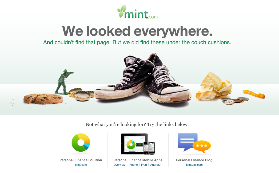
1. Mint
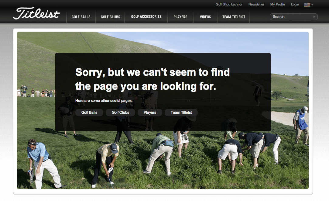
2. Titleist
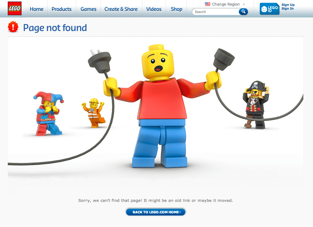
3. Lego
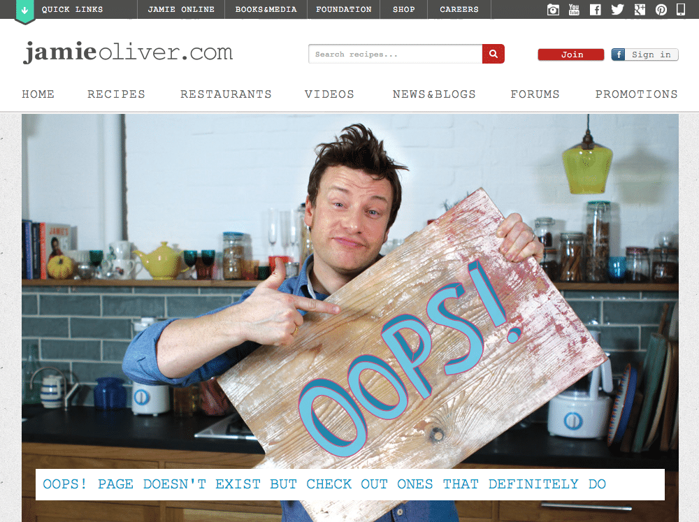
4. Jamie Oliver
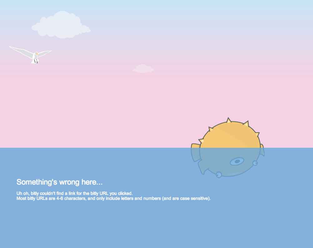
5. bitly
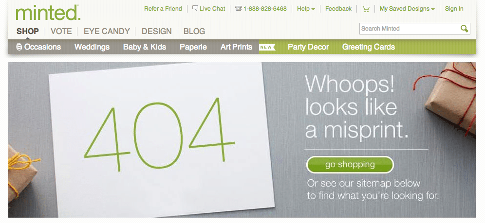
6. Minted
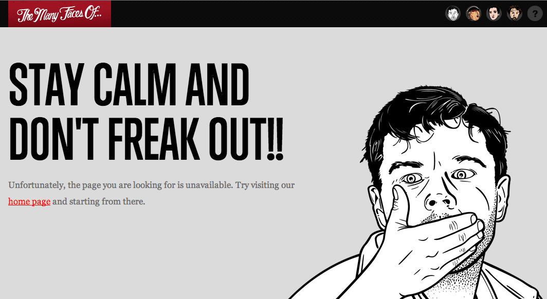
7. The Many Faces of ...
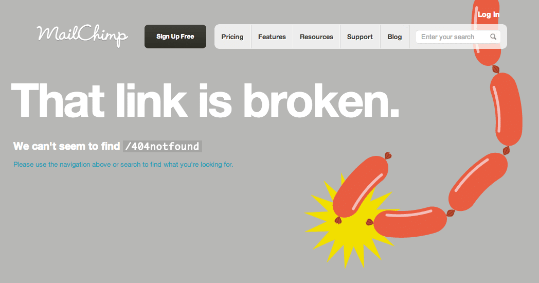
8. MailChimp
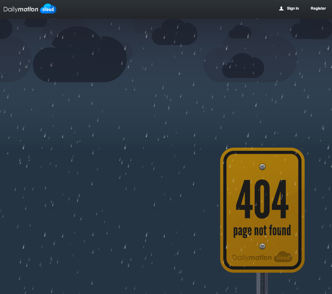
9. Dailymotion Cloud
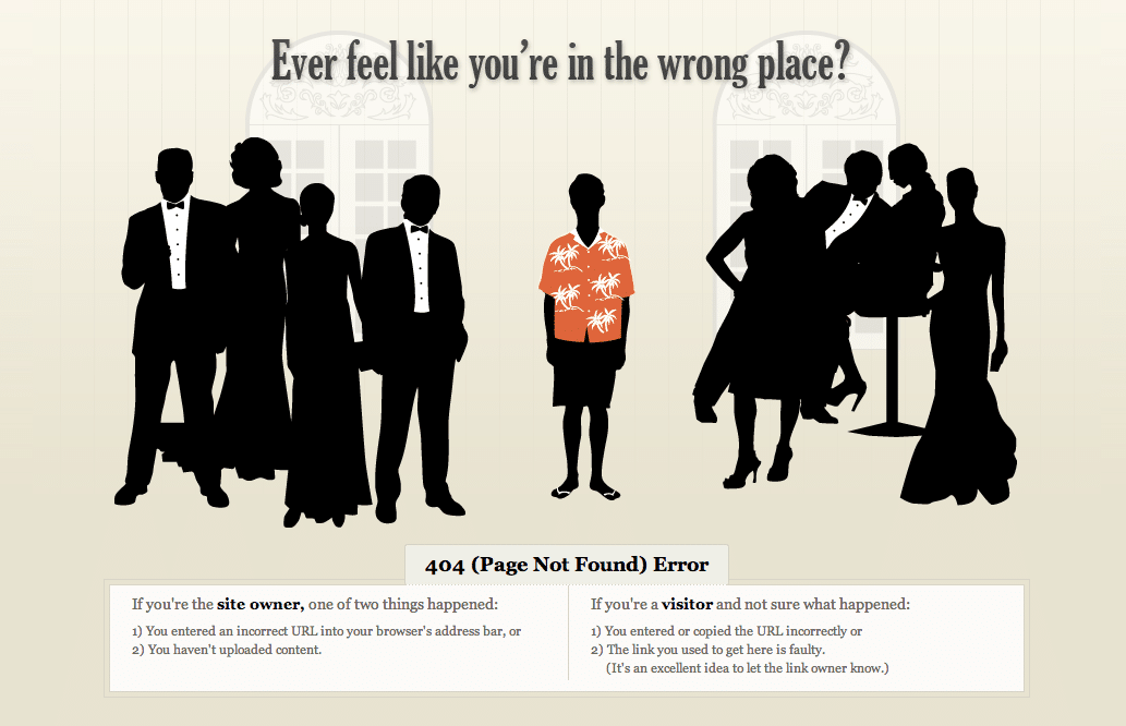
10. CBP
11. HubSpot
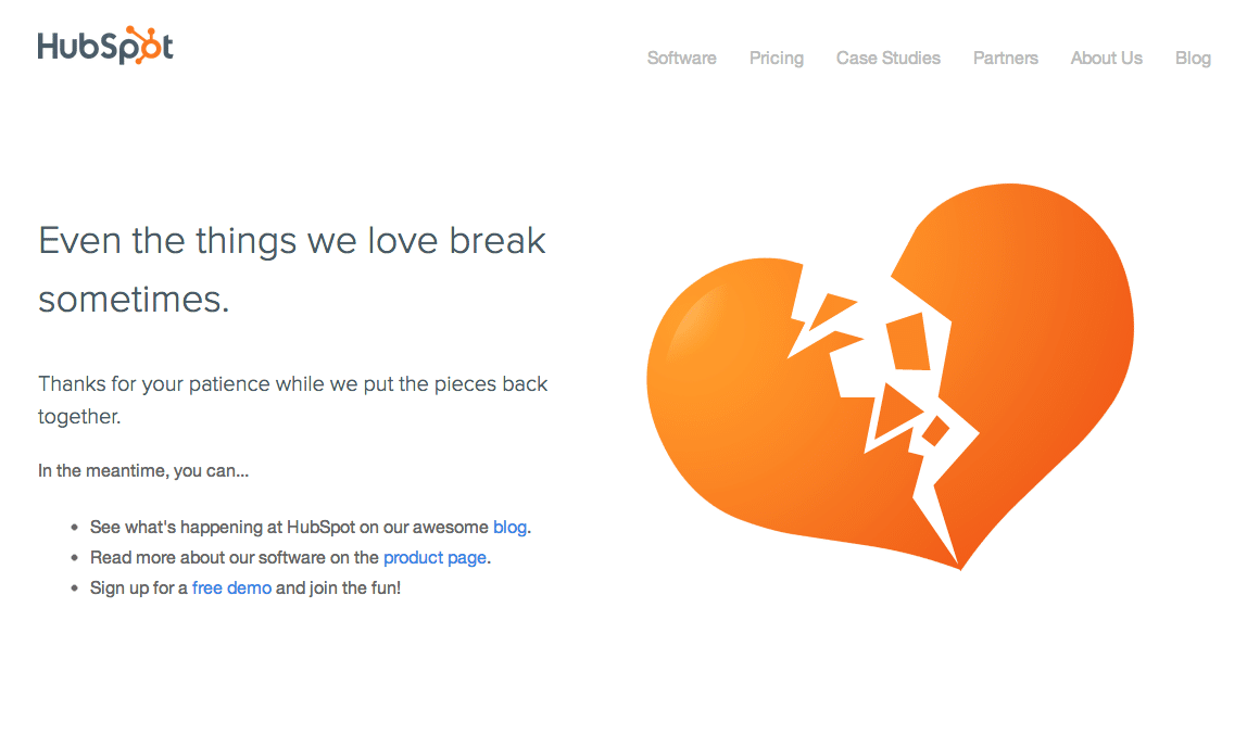


Order Your Copy of Marcus Sheridan's New Book — Endless Customers!


