Subscribe now and get the latest podcast releases delivered straight to your inbox.
 When you land on a business' website, what are you looking for?
It's likely that you have a problem that you're looking to solve, and you're seeking out some additional information, right?
Your website, if done correctly, should be one of the strongest pieces of persuasive material that you have for your business.
It should introduce you, combat objections, highlight your strong suits, and position you as the best option in your industry.
However, in order to do so, it's critical that your website's homepage can quickly and easily answer the following four questions. Without the answers to these questions readily available, you're missing out on an opportunity to increase leads, conversions, and sales.
Who would want to do that?
What do you do?
If a visitor can't define exactly what it is that you do within the first minute on your website, you're basically asking them to hit the back button.
Clearly articulating what the product or service is that you offer should be your first priority. You want visitors to know that they've landed in the right place.
Many businesses assume that the visitor already has a good idea of what you do when they land on your site based off what they input into the search engine. What they're failing to recognize is the people coming in from alternative traffic sources.
What you do shouldn't be a guessing game.
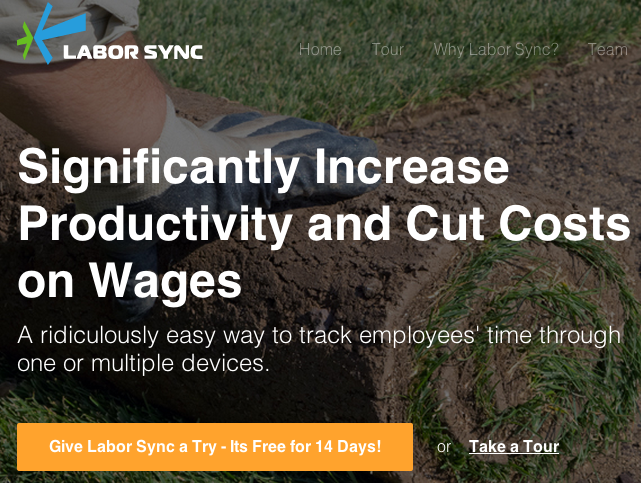
A strong value proposition can help you ensure that visitors have a clear picture of what to expect from you. Let's look at an example:

Labor Sync's value proposition requires no guesswork. It's easily understood through a quick glance that they offer a time tracking tool that can help you save time and reduce costs.
Well done.
How are you different?
Whether it's cost, a one-of-a-kind service, or a unique technology, it's important that you identify what makes your product or service different, and make it known to visitors.
The more effective you are in separating yourself from the competition, the more likely your website visitors will be to want to know more.
Here's where a great value proposition comes into play again.
Visitors aren't just looking for what you do, but how you do it differently than everyone else.
In an effort to put space between their product and their competitor's product, Layrite is quick to explain that while their product is a pomade, it holds like a wax and washes out like a gel:

They're successful in highlighting exactly what it is that's unique about their solution. If you want to stand out from your competitors, this is exactly what your business needs to be focused on doing.
Are you trustworthy?
When it comes to making a decision on whether or not to do business with you, visitors don't want to feel like a guinea pig.
Including testimonials, case studies, and social proof on your website's homepage will help you to convey a sense of credibility and trustworthiness.
Essentially this serves as a way to reassure visitors that other people have invested in this product or service, and seen great results. Check out the way it's done here:

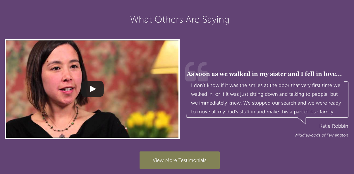
UMH's homepage features a large, high-quality video testimonial and a clear, compelling CTA to drive visitors to the testimonial library.
Often time including a photo, or in this case a video, alongside a testimonial helps to improve believeability. When a visitor sees that there is an actual person tied to the quote, it leads them to believe that what you're putting forth isn't just some faux-endorsement whipped up by your PR department.
How can I reach you?
If a website visitor is seeking your contact information, it's primarily a good sign.
If they're having trouble easily locating it on your website's homepage, that's probably not a good sign.
You want to be sure that you make your 411 easily seen and understood to ensure that your visitors don't have to search far and wide when they're ready to get a hold of you.
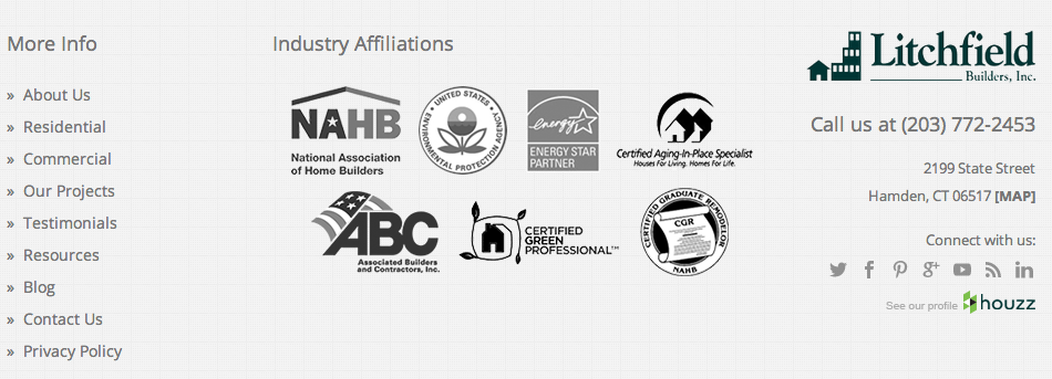
Litchfield Builder's does a great job of including their digits in both the header and the footer of their homepage:


Both of these locations are logical places for a visitor to look for this type of information, so including it in both areas will help to get them the information quickly and easily (and get you on the phone faster.)


Order Your Copy of Marcus Sheridan's New Book — Endless Customers!

