Subscribe now and get the latest podcast releases delivered straight to your inbox.
If you're using a platform like HubSpot Marketing, you already know that a high-performing landing page is critical to the success of your inbound marketing strategies. Like many professionals, however, you may not know essential landing page best practices just because you know they're necessary.
If you're aiming for higher conversion rates, incorporating these 11 key characteristics will help make your landing pages more engaging.
1. Know Your Goal
Is your goal of the landing page to generate leads? Or, is it a click-through from your landing page? If your goal is lead generation, you want a page designed to collect information from each visitor. If your goal is to convince the visitor to click-through, you want to entice your visitor to the next page. These are different desired outcomes and it is important to know which you want, for goal setting, creation and analysis.
2. Create the Landing Page with the Buyer's Journey in Mind.
Are they in the awareness stage, the consideration stage, or the decision stage? You don't want to go in for the offer when they're only in the awareness stage, but you don't want to miss the chance to encourage a decision when they reach the final phase of the process either. This ties in with point #1, know your goal.
3. Use Directional Cues
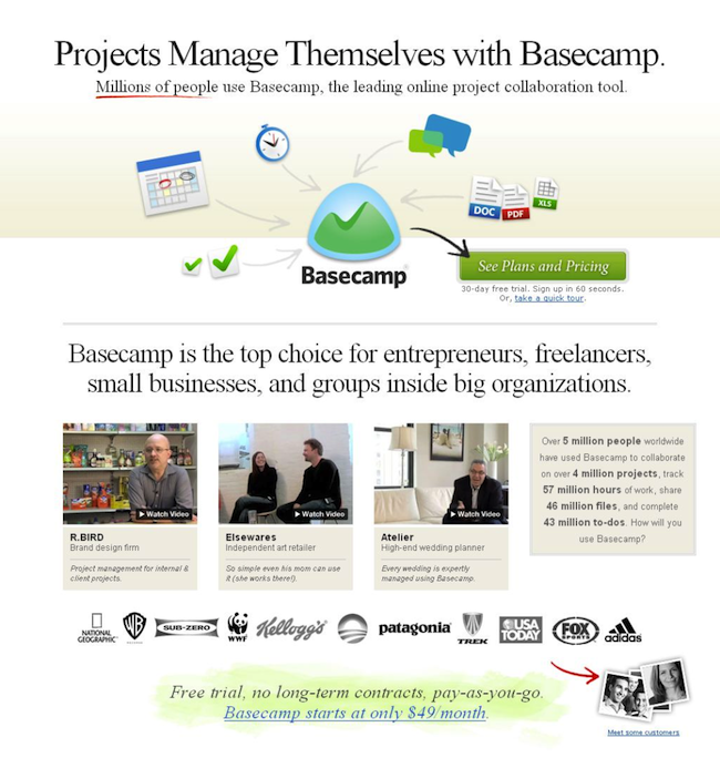
Aspects of the page can be designed to subliminally or more overtly point visitors to your call to action. Visual cues like arrows can make a significant impact on leading visitors to your CTA. Oli Gardner wrote a great article on how to use visual cues for a higher performing landing page. Instapage also has a great review of what makes Basecamp's design so strong (notice the directional cues...).
BONUS RESOURCE:
Looking for a stand alone landing page solution? One of our favorites is Instapage. If you prefer a more comprehensive landing page program that keeps all of your inbound marketing efforts in one place, we are strong believers in HubSpot.
4. Cut Down on the Extras
Don't include anything that isn't vital to the specific goal and message. If it doesn't add to the goal, remove it from the page. That means unnecessary images, text and navigation, which usually results in a distracting, confusing and/or overwhelming experience for people. Including more white space and keeping the text and images on the page simple and clear are important. A clear, uncluttered message and CTA are best.
🔍 Related: 5 Key Elements of a Winning Inbound Marketing Strategy
5. Offer a Compelling, Benefits Driven Headline and Supporting Copy
The landing page should be designed around describing the benefits your customers will get from your offer. Looking to gather information from users? Explain why it's worth their time to give it to you. Are you offering regular emails with discounts and coupons? Insider information? A resource guide or ebook? A free trial? The headline and the copy should reflect this information.
“A great #landingpage is created with clear goals and persona pain points in mind” TWEET THIS
6. Keep the Offer Simple
The offer shouldn't be too complex, nor should it be difficult for anyone to achieve the goals and acquire the offer. Make it easy for them to take the action you're asking for. Your landing page isn't the place for pop-ups that may confuse customers about what you're really seeking.
If your landing page is meant for lead generation, only ask people for the information you need. Generally speaking, the fewer form fields you have on a form, the higher the conversion. A good rule of thumb is to ask for information congruent with the value of the offer. The more valuable the offer, the more information you can ask for.
7. Include a Clear Call to Action
Your call to action should indicate exactly what you expect of the customer and exactly what they'll get out of it. If you are new to landing page design, make sure your CTA is above the "fold," or the part of the screen that's visible when your customer first visits the website, to ensure more visitors will see it and take advantage of it. Here's a great example from HubSpot.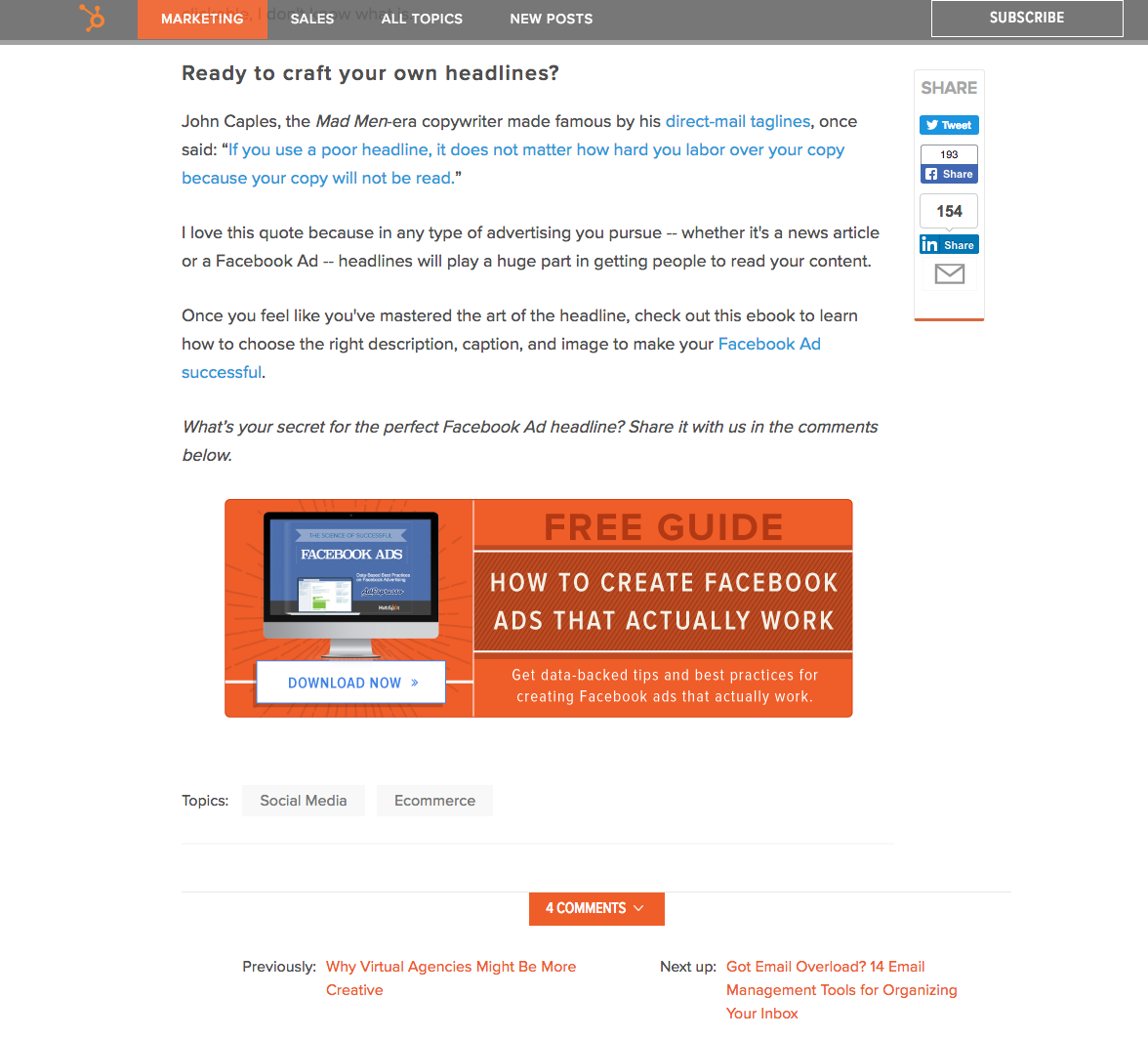
8. Add a "Thank You" Page
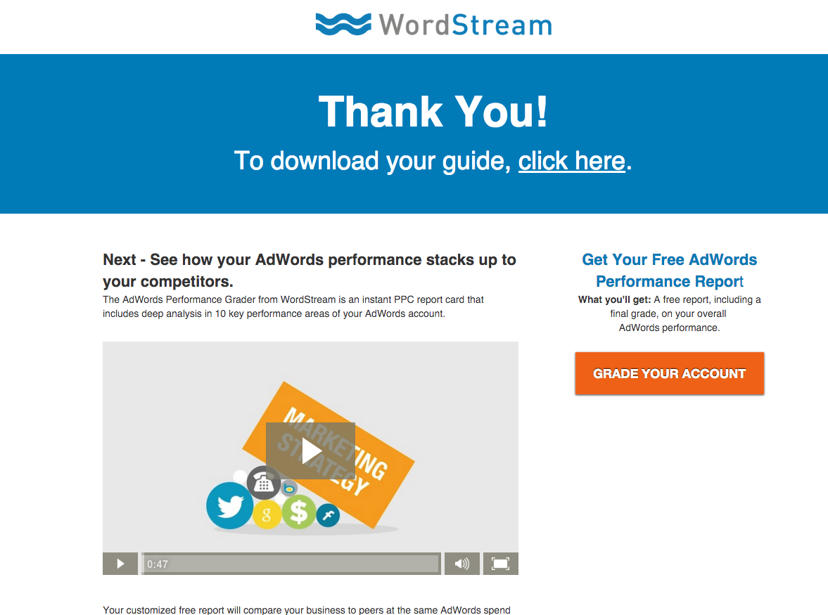
Visitors to your site like to feel appreciated and they like confirmation that their action has been completed successfully. Offer your thanks when they finish navigating the landing page. If you are not including a link to the additional information or to a download, let them know how and when it will be delivered. Below is an example from WordStream.
9. Provide Social Proof
Potential customers like knowing that others already use and support your business. When they see that others like you, they're more likely to join in! Provide social proof in the form of testimonials and usage statistics, as well as lists of satisfied customers or any positive mention that's been made of your company in the media. You can even use logos of similar customers or trust seals.
10. Make it Responsive
Keep in mind that more users are accessing the internet via mobile devices than ever before. A mobile-responsive landing page will ensure that everyone who visits it leaves satisfied with the experience.
11. Test, Refine, Repeat
A/B testing is one of the best, most effective ways to test the performance of your landing page. Learn exactly what best motivates your customers, then provide it to the best of your ability. Creating a landing page with the right criteria is only one step in getting it to perform at its best.
A winning landing page can be the difference between low conversion rates or customers who are thrilled to give you their information and those who click away and move on to another offer. If you want the best landing page you can create, try utilizing these 11 tactics to create landing pages that stand out from the crowd and positively influence your customers.
(Need more inspiration? Check out these great landing page examples.)

Order Your Copy of Marcus Sheridan's New Book — Endless Customers!
.jpg?width=50&height=50&name=Ali-Parm%20(1).jpg)
