Subscribe now and get the latest podcast releases delivered straight to your inbox.
Forget Trends -- These Are Design Essentials for 2018 and Beyond. [Infographic]

Apr 29, 2018
![Forget Trends -- These Are Design Essentials for 2018 and Beyond. [Infographic]](https://www.impactplus.com/hs-fs/hubfs/design-essentials-any-year.jpg?width=768&height=400&name=design-essentials-any-year.jpg)
If you own a business, I’m sure you know how important it really is to have a website or an online presence, but to be successful online these days, having just a website won’t cut it.
You need good content, SEO, a marketing plan, AND not just a website, but a clean, professional website.
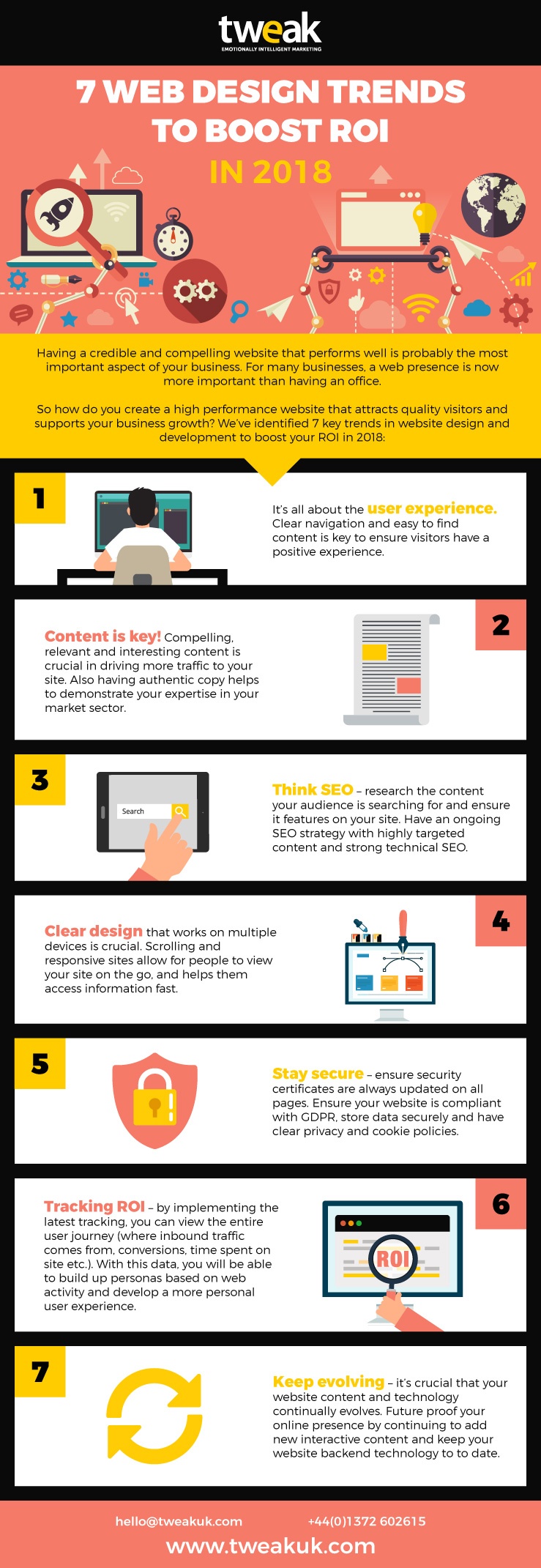
While doing some research on new inbound marketing trends for the year, I came across this infographic from Tweak UX that stood out and I wanted to share.
Before we continue, let me just say that while I do agree with the points made in this infographic, I don’t really look at these methods as trends. These are essentials, super important in any year, especially our first point --- User Experience. I cannot agree more with this one!
Being a developer, this one definitely hits close to home as that’s the goal as a developer; to answer the question, “how do I make this easy for the user?”
Having a website that is easy-to-navigate, clean, and gets to the point is super important. If your site is frustrating your users, then you are doing it all wrong.
The next trend discussed is Content, which makes sense, because that’s what makes up your website. Having great, unique content is what sets you apart from the competition, grabs a reader's attention, and keeps them coming back.
It is also huge for SEO, which is our third point.
SEO is not just about content; having a speedy, having a mobile-first site is also important and will help you rank better.
The number four trend is Clear Design, which in my opinion, goes hand-in-hand with user experience.
While having a flashy, animation-filled website can standout and may seem impressive at first, we need to take a step back and make sure it’s getting the message across and is easy for the user to navigate. Also, how will it act on mobile?!
In actuality, these elements could make your CSS or javascript files bulky, slowing the site down, especially on mobile.
Even I have been guilty of this. I thought flashy effects and parallax were the bee’s knees, but they can distract from your actual lead gen goal. These need to be used sparingly and very strategically. The fifth trend is Staying Secure, which is a no-brainer, especially in this day and age.
It seems like every day you hear of a huge data-breach and all your data has been compromised. If you are storing customer data, make sure it’s highly protected and secure and that you have a privacy policy detailed for your users - and get an SSL certificate!
At number six on the list is Tracking ROI, where platforms like HubSpot come into play and can be super helpful. Having the ability to track conversions and the buyer’s journey can be a huge advantage, but tools like Lucky Orange, combined with HubSpot can take things even further.
Lucky Orange is a tracking tool that takes recordings and heat maps of your visitors, so you can watch where they click, how far they scroll down a page, and how long they are staying on the page. Insights like this really help you evaluate your user’s experience and journey and identify places for improvement.
The last “trend” on the list for 2018 is to Keep Evolving.
The internet is always changing and evolving, and will not wait for you.
It’s important you keep up with the new tools, techniques, and trends. Just this year, Google announced it will be focusing on mobile-first indexing, so sites that are not mobile-friendly or responsive will be at a disadvantage.
Like I said before, I don’t like calling these trends, because they’re just guidelines of good design today.
Check out the full infographic below!

Free: Assessment