Topics:
Content MarketingSubscribe now and get the latest podcast releases delivered straight to your inbox.
By now you have probably heard the term pillar page and how important it is to consider it is in your 2019 strategy.
If not, here is a quick definition to help you get caught up.
While writing content for a pillar page is a journey of its own, deciding how to implement it onto an effective page is also something to consider in the early stages.
If you have started writing content for your pillar strategy and are looking for some excellent examples, check out this list we put together of pillar pages that we love!
What Makes a Good Pillar Page?
Before we start, it is important to understand what a good pillar piece includes and what it accomplishes.
At its core, a good pillar page must actually provide quality content that answers questions your users might have on a specific topic. They tend to be more of “complete guides” and feature a lot of content to be crawled and indexed by search engines.
Since that is the case, you want to make sure you break the page down by chapters and provide a way users to easily jump to the section they want to learn about. (This also helps search engines read the page.)
Also, with the amount of content you’re delivering, you want to make sure you provide a way for the reader to take the content with them with a downloadable PDF. (Also a valuable lead generation opportunity.)
Now, on to my favorite examples.
1. HubSpot: Marketing Content Strategy

When looking for great examples, why not start with the company that is the father of pillar pages.
This pillar page does a great job of pointing out all the basics that one should have.
-
Since pillar pages are rather extensive, it is always a great idea to allow the reader to download the information as a PDF. Not to mention, it is a great way to add a form of lead capture to the page. This pillar page does a great job of having that option in an unobtrusive manner.
-
Chapter links are a great way to allow the user to jump to the section that is most relevant to them. This page does a good job at communicating the different chapters and allows you to easily jump to that section.
-
Finally, HubSpot does a good job of making sure there is a relevant end of blog CTA to offer up more information to readers who want it.
2. GatherContent: Project Guide to UX Design
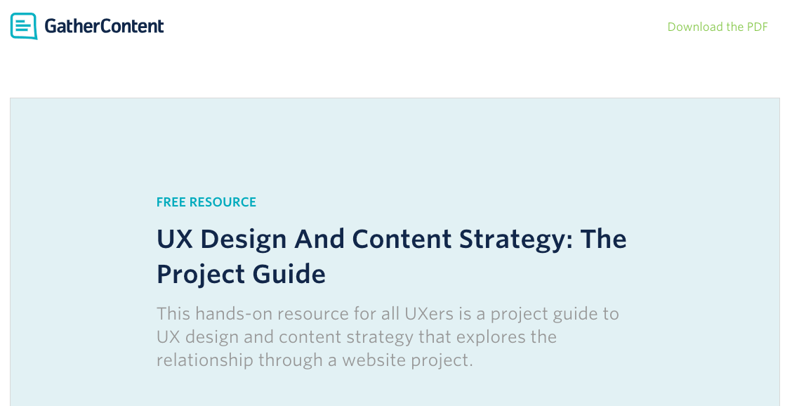
This pillar page is full of valuable content and is presented in a way that makes it easy for the ready to find what they are looking for:
-
Similar to HubSpot’s page, GatherContent offers a PDF of the page. However, I love their implementation of a sticky call-to-action (CTA) at the bottom of the screen. This lets you download the PDF at any part of the article.
-
The table of contents is very detailed and you know exactly what is on the page before you start reading. This is great to determine if the content is relevant to you and if you should continue reading.
-
The design of this pillar page is also very clean and visually pleasing. The layout makes the content easy to consume.
3. Typeform: Customer Success
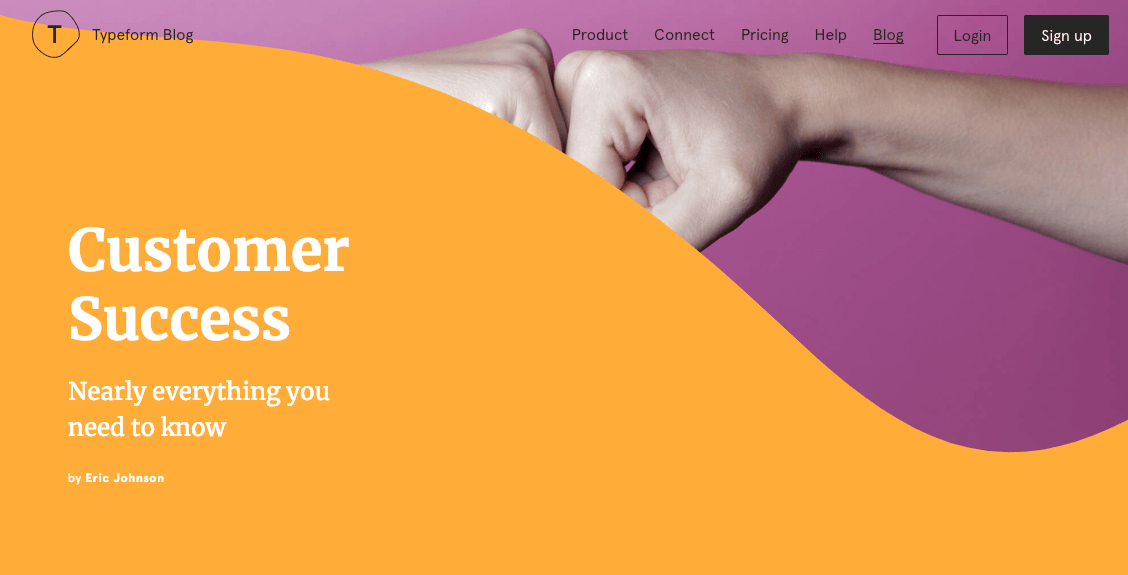
Typeform has created some of the best pillar pages in existence. They are beautifully designed and include some pretty handy UI elements. For example:
-
The progress bar on the top of the page allows the reader to see how far you are on the page and how much more you have to go. This is a great feature to determine if you have enough time to read the entire page, or if you just want to download the PDF for later.
-
This page also has sticky chapters on the side so you can always jump to the section you want.
-
I also love how Typeform did a great job of using color to break up chapters, quotes, and important information. With a lot of text on the page, it can look cluttered and sometimes be hard to read. This makes the content much easier to consume.
4. The Atlantic: Population Health
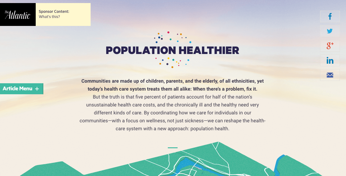
This pillar page relies heavily on visuals and it is gorgeous. However, it is not just the visuals I love
-
Not only does it give users tons of important information on the population’s health, but it ads visuals that make the content more engaging and frankly, less boring.
-
This pillar page includes a menu on the side that shows the reader other articles The Atlantic has produced in a similar format. This is a great way to keep your readers engaged! Speaking of those articles, The Atlantic also includes those recommended articles at the bottom of the page for when the reader is done.
-
Something that works well for this pillar page is the lack of clutter on the top and bottom of the page. Without navigation and footer, The Atlantic does a good job of allowing the user to focus on the content on the page.
5. IMPACT: Content Style Guide

-
This pillar page is great because it shows lots of examples and has templates that can be downloaded to start your own guide, making the content very helpful.
-
The page also does an excellent job showcasing what exactly the reader will learn and
who the content is designed for right at the top. -
Finally, I love how there are breaks in the content that allows the reader to get more context on what they are reading by jumping out to a relevant blog post.
6. HubSpot: Battle of the Bots
-
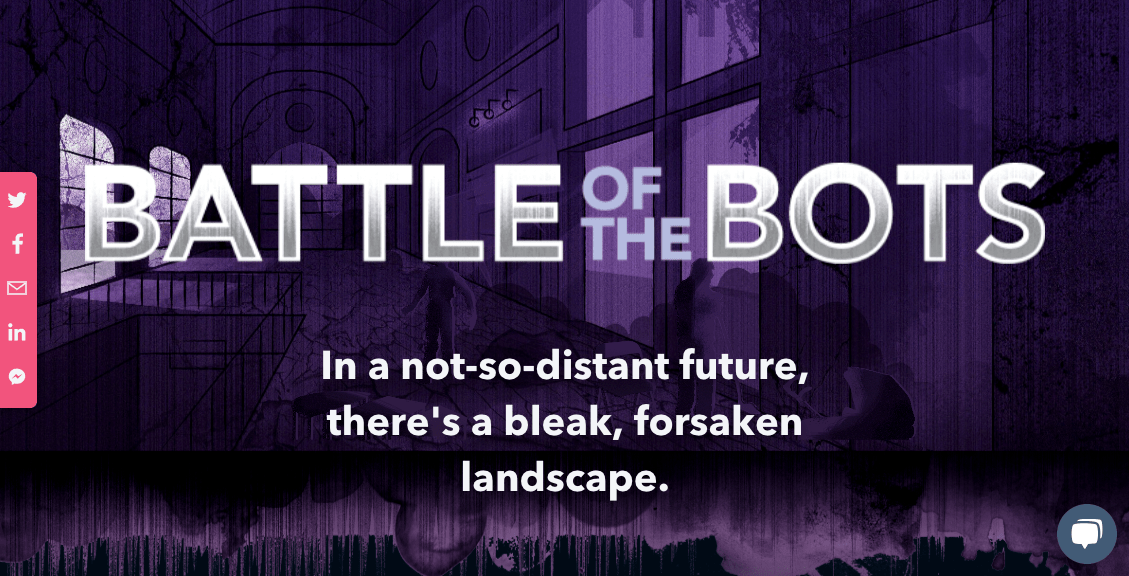
I love how there are no distractions on this page and it allows the user to completely focus on the content, similar to The Atlantic’s page. You have the ability to share or reach out to HubSpot, but that is it.
-
HubSpot did a great job at seamlessly adding videos into the content for the user to interact with.
-
The page’s art style is just gorgeous and really captivates the reader, similar to reading a graphic novel.
Pillars of Greatness
Not all pillar pages are created equal. Each one of these pillar pages is different, but we love each one for different reasons. When designing your own pillar page, be sure to keep in mind some of the important aspects that we highlighted in this article.
(Also, if you want more help creating pages that convert, we have an article dedicated to examples of pricing pages we love that you should check out.)

Order Your Copy of Marcus Sheridan's New Book — Endless Customers!

