Subscribe now and get the latest podcast releases delivered straight to your inbox.
One of the most vulnerable and nerve-wracking things a company can go through is a rebrand.
You can rebrand for all the right reasons, have a concrete branding strategy, go through all the appropriate steps, but in the end, you never fully know how it’s going to be received by people until you put it out there.
Companies like Slack and GAP have felt the harsh backlash from a rebrand gone wrong in recent years.
Firefox, the popular open-source web browser developed by Mozilla, is one of the most recent companies to raise the rebrand gauntlet.
The tech company’s rebrand would be no small feat. Anytime you touch a beloved brand with a logo that has as much brand equity as Firefox’s, you have to approach it really carefully.
Why redesign a logo with so much brand equity?

Since its development in the early 2000s Firefox’s logo has grown to become one of the most instantly recognizable logos on the web.
With over 250 million users a month, the company is best known for its open-source web browser, however, the company has grown to be more than just that.
They’ve created a family of products that are all connected and geared towards protecting users and their privacy online.
According to Tim Murray, Mozilla’s creative director, the old logo lacked “stretchiness,” The iconic fox couldn’t stretch to cover all of the products and services they were going to be releasing.
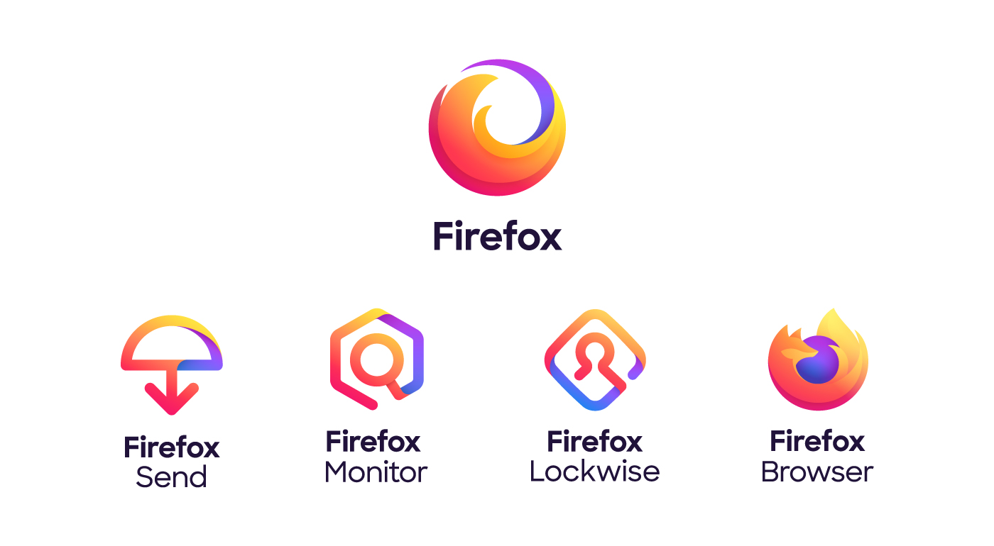
The rebrand this year aimed to unify the main parent brand with all of its child products and show users that their products go further than just the web browser we’ve all grown to love.
Inside the Firefox redesign
The rebrand was a team effort involving multiple consultants and agencies that began in 2018 when Mozilla’s in-house design team consulted with the branding agency Johnson Banks and Jon Hicks, the designer of the original Firefox logo.
The team created two possible options for the new brand and then released them to the public asking for feedback. (This was a great move considering some of the backlash brands like Slack received without market testing.)
Based on the feedback they received, Firefox was able to finalize the project with Ramotion, a brand agency in San Francisco, California.
After 18 months in the making, Firefox released their rebrand to the world.
This included an expanded color palette, a redesigned parent logo, new logos for all of Firefox’s child products, and an entirely new design system that would allow them to keep expanding their product line well into the future.

You can check out the video below to get a behind the scenes look at the rebrand:
Why the Firefox rebrand works
I think Firefox crushed this rebrand!
Conceptually, they put so much thought and purpose into every decision they made. From the new color palette to the evolved logo, every design decision was made with an overall goal in mind -- to build a brand that would allow for growth.
Aesthetically, I think the new sans serif typeface, bright colorful gradients, and rounded friendly appearance of their new design elements help bring the brand into the modern day.
This new and improved direction feels more reminiscent of the bigger tech companies like Google and Instagram.
The new branding also shows users that their company has grown to include an entire line of products that are all joined together in a much bigger ecosystem.
However, my favorite part of this rebrand isn’t the actual design; it’s how transparent and open they were throughout the entire process. Their approach was totally onbrand.
Typically, rebrands are done behind closed doors and people only see the final product.
Firefox, sticking to their open-source and transparent roots, involved users in the process by asking for their feedback on the two different concepts.
This helped the company start a conversation with people to see what was really important to them and how they could better communicate their brand message. Ultimately, I think this is what led to such a strong final product.
What can other brands learn from Firefox?
There are some key takeaways with the Firefox rebrand that we can all take into consideration the next time we find ourselves on the verge of a rebrand project.
Rebrand for the right reasons
The Firefox team made the decision to rebrand because they realized their current brand was no longer communicating the message they wanted to communicate as a company.
If your company is thinking about rebranding, make sure you’re doing it for the right reasons.
Some good reasons would be:
- Your company mission has changed. It’s common as companies grow to grow in a new direction that’s different from when they first started. Over time, the brand you started with may no longer reflect who you are as a company. If that’s the case, you need to realign your brand so it accurately reflects your company and its offerings.
- The needs of your customers have changed. Sometimes the needs of your customers change as well. Whether it’s due to a change in the way they shop or innovation in technology, you need to adapt and stay current with the needs of your customer.
Understand the importance of feedback and user testing
Firefox did something really unique that not many brands do during a rebrand;they asked for feedback from anyone who was willing to give it. That’s a bold move for a company of their size.
While they did get some pretty harsh feedback, they also got a lot of immensely helpful feedback that helped shape the final product.
During the feedback stage, they even learned that one of their concepts actually looked very similar to another tech company saving them from what would have been a disaster had they gone with that concept.
This just goes to show the importance of constantly collecting feedback from your users and prospects. Throughout any project, it’s easy to get tunnel vision so receiving that feedback from an outside source helps us validate the decisions we make.
Overall, I think Firefox’s approach to their rebrand delivered them a successful final product and set their company up for future success. Feel free to share your thoughts and opinions on the rebrand in IMPACT Elite!
Free: Assessment

