Topics:
Lead GenerationSubscribe now and get the latest podcast releases delivered straight to your inbox.
 Spoiler alert: not all traffic is created equal.
While you may find that you're driving a significant amount of traffic to your landing pages, it's important to note that traffic doesn't always equate to conversions.
After all, getting people there is only half the battle.
However, if you're getting the right people to the right pages and still not seeing any conversions, you're in trouble.
Aware that the key to turning lost conversions into steps in the right direction lies in the presentation of your landing page content, we've come up with a few tips to help you turn your efforts around.
Narrow your focus
Your landing page shouldn't take visitors here, there, and everywhere.
In order to appeal to a visitor's specific pain point, the subject matter must adhere to one focused goal.
To test this, ask someone removed (not your mom) to take a look at your landing page and define what they think the purpose is. In fact, you may want to ask a few people for good measure.
This is the best way to get into the mind of your visitors, as your perception of the page is often swayed due to your involvement in the creation.
Nix the navigation
Once you've got traffic to your landing page, the last thing you want to do is make it easy for them to leave.
We're not talking about a hostage situation here, but removing the navigation bar from the top of your landing pages will help to ensure that the visitors stick around long enough to convert.
In fact, our friends at HubSpot recently conducted a series of 5 A/B tests to test this theory. Here's what they found:

As you can see, removing the navigation lead to a 0-4% increase in TOFU landing page conversions, and more impressively as 16% and 28% bump in MOFU landing page conversions.
Worth trying? Definitely.
Break it up with bullets
One of the biggest struggles we see marketers face when it comes to landing page copy is how to convey value in very few words.
We've found that focused bullet points not only help to break up the copy and ease readability, but they also serve as a concise way to drive benefits.
When defining which bullet points to use on your landing page, you'll want to focus on the following:
- Actionable: Use verbs. You want people to walk away from your landing page knowing exactly what they can expect to be able to implement after receiving your offer.
- Clear: Steer clear of big words. Keep your points as simple as possible.
- Benefit-driven: Speak to their wants and needs. Defined benefits will help to persuade visitors to fill out the form.
(Did I just use bullets inside a section about bullets? Yes, yes I did.)
Strategically place the CTA
Your landing page's CTA is one of the most important elements on the page. Point being, this isn't something you want to slap on as an afterthought.
When applicable, you want to ensure that you are presenting your visitors with a clear, compelling CTA upfront.
This means selecting a color (orange and green are often highly recommended) that stands out against the color scheme of your page, as well as allotting enough white space to create contrast around the button.
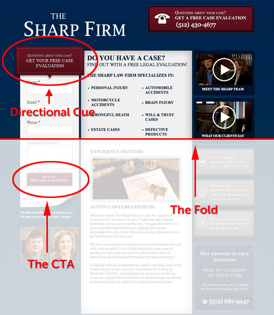
While many marketers will urge you to place it above the fold, there are ways to encourage visitors to scroll down if your CTA doesn't quite fit above the fold.
Check out this example detailed by Unbounce:

Serving as a directional cue, the copy and arrow above the form work to draw your visitor's eye down to the actual CTA.


Order Your Copy of Marcus Sheridan's New Book — Endless Customers!

