Subscribe now and get the latest podcast releases delivered straight to your inbox.
How to use Gestalt Principles for a more powerful business website [Infographic]

By Joe Rinaldi
Jun 20, 2020
![How to use Gestalt Principles for a more powerful business website [Infographic]](https://www.impactplus.com/hs-fs/hubfs/Blog-Header-2.jpg?width=768&height=400&name=Blog-Header-2.jpg)
You’ve probably seen this image before:
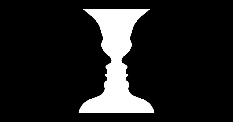
It’s known as the Rubin Vase and depending on which part of the image you focus on, you’ll see either an image of a vase or two faces looking at one another.
Careful, it gets kinda trippy if you stare at it for too long.
Have you ever wondered why this phenomenon works the way it does? What causes our brains to see these two different images?
It all comes down to how the brain is wired to perceive visuals.
Our brains are constantly trying to process information from the world around us by comparing what we’re currently seeing to our previous experiences. They're looking for common patterns that will help us fill in the gaps to make sense of the world around us.
These patterns of visual perception are better known as the Gestalt Principles and they play a critical role in graphic and web design.
They help us build better user experiences by knowing which design elements will work best for a particular situation and how to direct users' attention to different parts of a page.
The team over at Toptal created the infographic below that covers the main principles that make up the Gestalt Principles: similarity, continuation, closure, proximity, figure-ground, symmetry, and common fate.
Let’s take a look at each of them:
Similarity
The principle of similarity states that shared visual characteristics between objects automatically create relationships. Similarity can also be used to tie together elements that may not be right next to each other.
Navigation menus are a great example of using similarity.
As you can see in the following image, all of the links in the navigation menu share the same style.
This lets users know that these links all belong together and will function in the same way. This makes interacting and navigating through your site significantly easier.
Continuation
The principle of continuity states that the human eye will follow the smoothest path when following something and it will continue traveling in that direction until it encounters another object.
In web design, continuity is used to help users understand the direction they are supposed to follow through a page.

In this example from the IMPACT site, you’ll notice that each of these card style boxes are all the same size creating a nice straight line from left to right.
This makes it easier for the user to read one box and instantly move to the next one.
Closure
Closure is the idea that the brain will fill in the missing parts of an image to create something whole. As long as enough essential information is present, the mind supplies the missing pieces of an object.
Take a look at the USA Network logo, for example. Even though the “S” is technically missing from the logo, our brain is still able to fill in the missing letter based on the information around it.

Proximity
Proximity refers to objects that are close together being perceived as a group. When placed apart, objects are seen as separate.
If you look at the example below, you’ll notice that because each icon is so close to the text to the right of each one, we’re able to understand that these two elements go together.
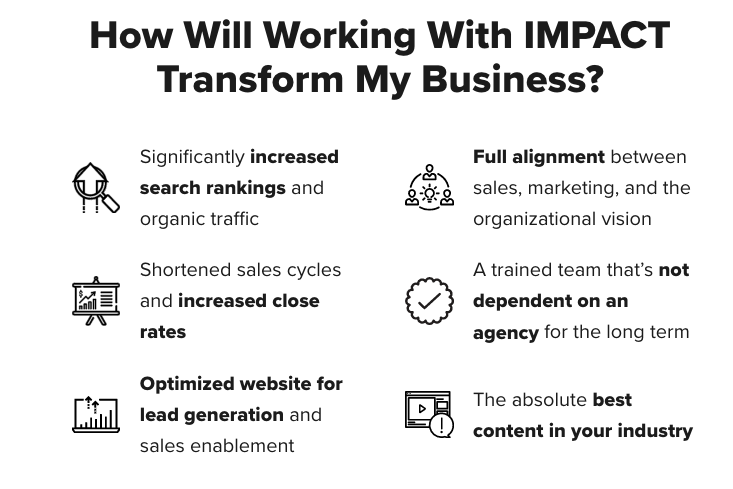
Figure-ground
The figure-ground principle is based on the idea that people instinctively see objects as either being in the foreground or in the background. We usually make this distinction subconsciously but it lets us know where we should be focusing our attention.
On the IMPACT site, we like to use the figure-ground principle by placing our forms on a white background that sits on top of a blue background.
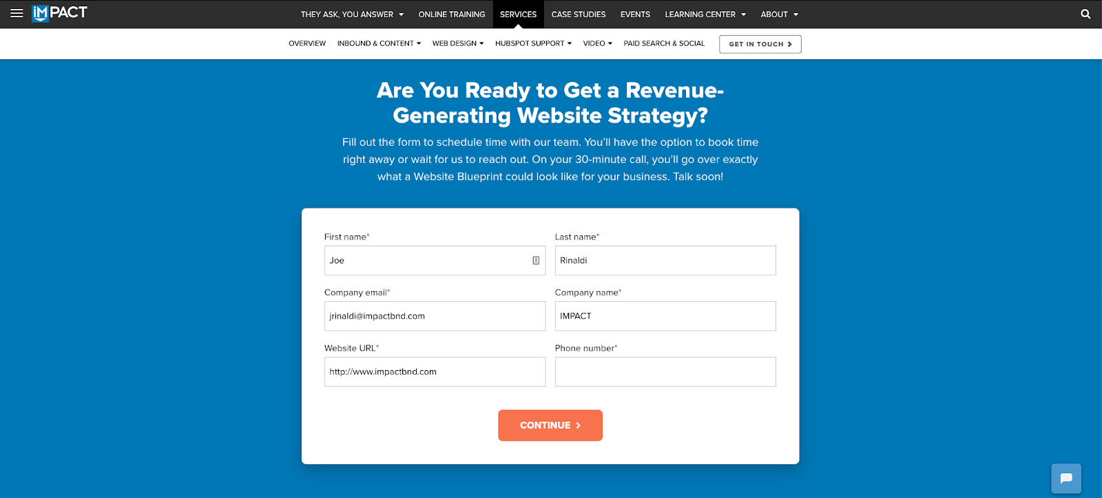
This pulls the form to the foreground letting users know this is where they should focus their attention.
Symmetry
Symmetrical elements are perceived as part of the same group regardless of their distance. Because our eyes naturally look for order and stability, symmetrical sections like the one below are effective ways to communicate information quickly. These elements give us a feeling of solidity and order.
In the example below you can see how the section is split perfectly in half giving it that symmetrical feel. This layout makes it easy for our brains to interpret the content on the left, then move right over to the image.

Common fate
This principle was not originally included in Gestalt theory, but has since been added. This principle states that people will group things together that point to or are moving in the same direction.
Take this FAQ section for example.
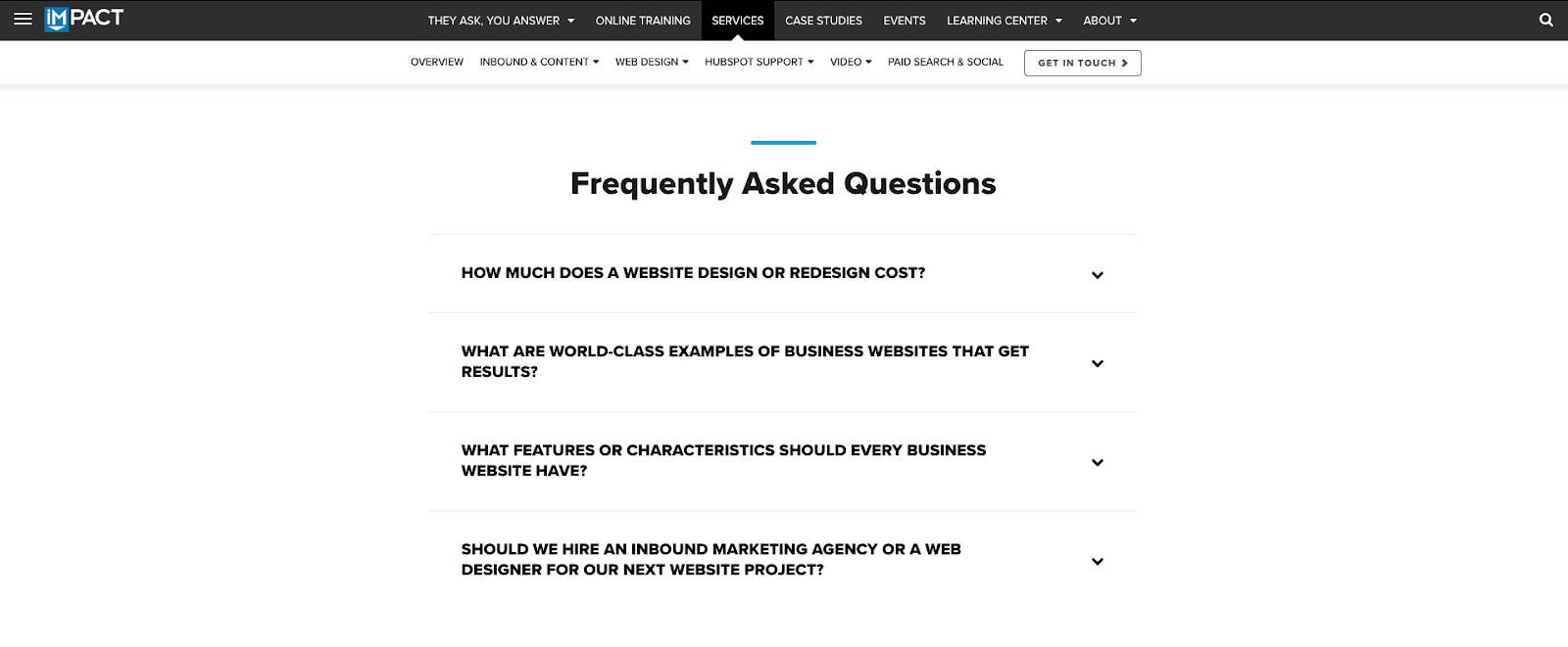
The downward facing arrows are all pointing in the same direction which lets us know these are grouped together. Because of this, we can assume that all of the arrows exist for the same reason and accomplish the same goal.
Check out the full infographic below to get a breakdown of all the Gestalt principles.
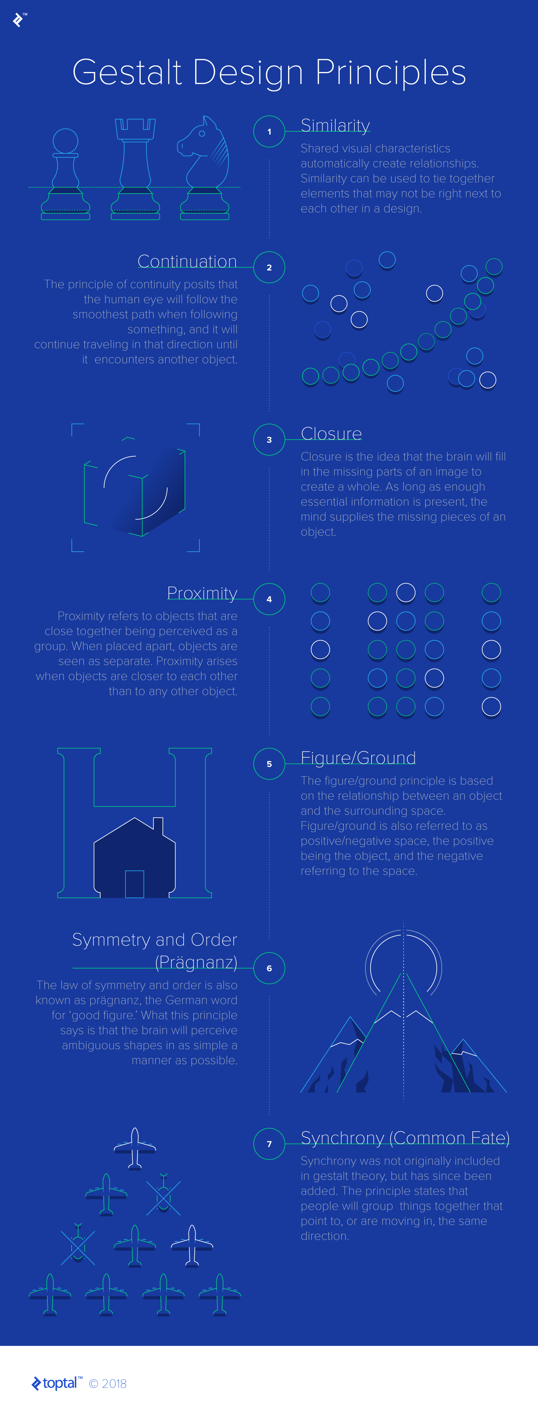 Infographic by Toptal
Free: Assessment