Subscribe now and get the latest podcast releases delivered straight to your inbox.
On Monday, January 13th, Google sent out a tweet announcing that it was going to fully roll out its new ads and organic search display on desktop searches. Google has had this new design across mobile search for the last several months and has decided to fully launch the new display.
Every time Google releases an update it likely causes a bit of fear because no one is 100% sure how the changes will affect their site traffic. However, it’s important to keep in mind that Google's stated purpose is to make the search experience better for its users.
Remember that when users have a good experience, they’re more likely to engage positively with your company.
These new ad and organic search updates are no different. Google is trying to create a better overall experience for users.
But we should still dive deeper into what this can mean for your business.
Ad changes
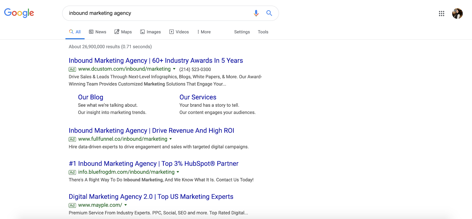
If you’re used to searching on your desktop, then you’re used to seeing ads displayed like this:

Notice how the ad call-out is the same color as the URL, making it a bit hard to tell what’s an ad and what isn’t. The little green "Ad" box is somewhat camouflaged, hiding in plain sight.
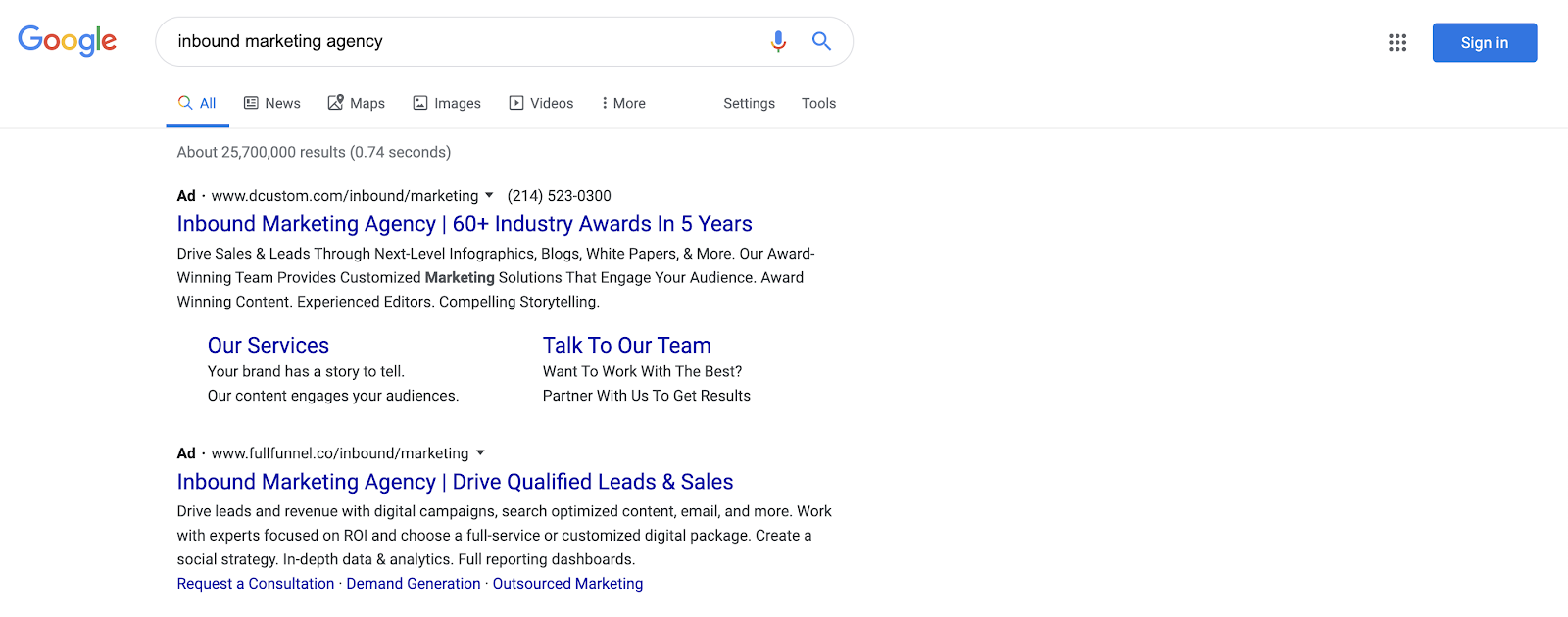
However, with the new update, the ad call-out will now be black, making it a bit easier for searchers to quickly distinguish between an ad and the first search result. Note that the URL is now black as well, but that "Ad" appears prominently in bold.

After reviewing mobile testing results, Google is confident that this change is ready for desktop because “a majority of users found it easier to identify websites and more than two-thirds said it was easier to scan results more quickly.” Google is confident desktop users will feel the same.
The change does make the ads stand out a bit more, but also provides a cleaner look by removing additional colors, like green, and keeping everything black and white besides key information like the page title, which is still in blue.
Organic search changes
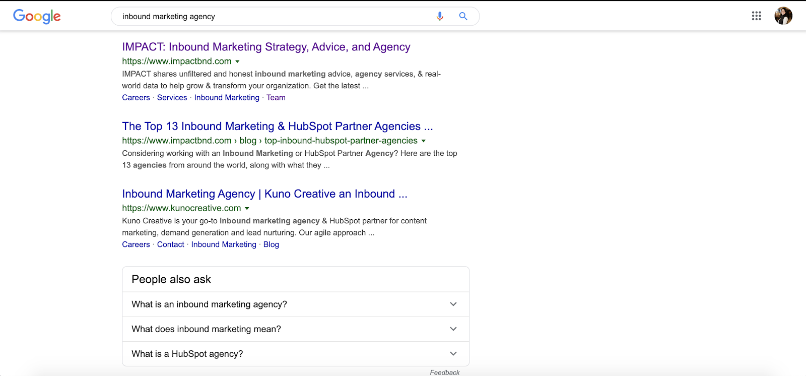
Google’s update to desktop search didn’t stop there. Organic search results are also getting a makeover. Rather than looking like this:

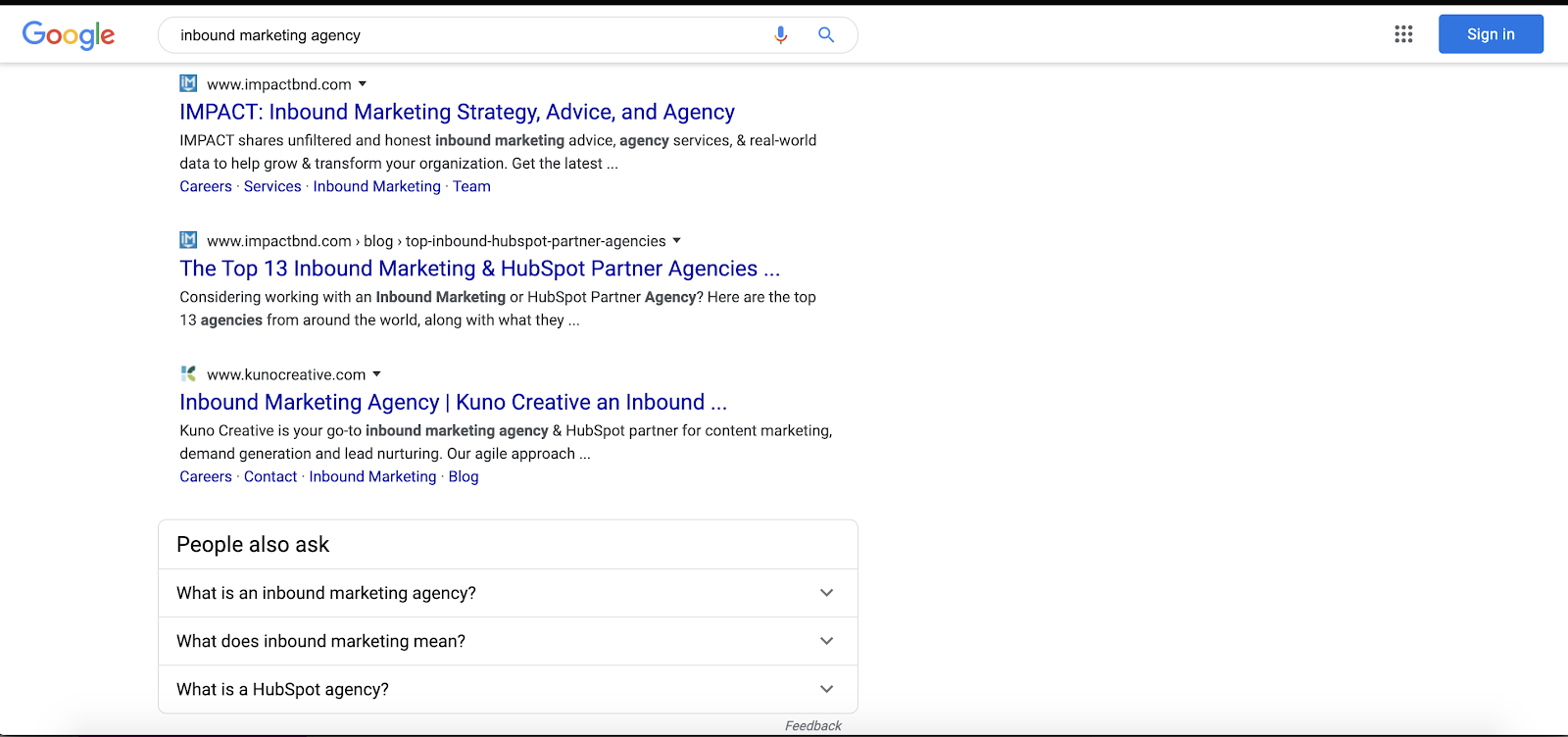
Search results on desktop will now have a favicon next to the page title.
If your site already has a favicon, then Google will pull that, but if you need to add one, Google lays out exactly how you can choose what shows next to your search result.

Google explained that the favicon helps “anchor each result.”
With this addition, searchers will be able to quickly identify brands based on an image they’re used to seeing — or they may be more drawn to a brand based on the favicon.
Should I change anything?
If you’re looking to increase traffic to your website with ads, it’s possible the new ad call-out could affect your traffic, but right now it’s too early to tell. Searchers still need to adapt to the change.
They also need to adapt to seeing the favicon icon next to brand names, and it’s not clear if this will help increase brand recognition, which may increase traffic, or if it will confuse people at first.
However, while both of these changes should have gone into effect earlier this week, right now I can only see them when I go incognito, which means that the change may not have even hit everyone just yet.
At this moment, don’t be too quick to make a change. It’s best to see how searchers react, gather some data, and then decide if any changes are needed — but still be sure you have a favicon selected for the roll-out!
Free: Assessment

