Subscribe now and get the latest podcast releases delivered straight to your inbox.
As the leading search engine, Google is always exploring new ways to provide the best possible answers to its users.
This week, Google was spotted testing a new feature that not only provides the page with the best answers, but also highlights the section of the page that best answers the user’s query.
Back in December, Google started testing a similar functionality for mobile search, and it appears that it’s started expanding these tests to desktop browsers.
From a user perspective, this feature presents a great way to get the answers you’re looking for as quickly as possible.
For marketers, it’s slightly more complex. While there are ways site owners can certainly benefit from this change, there are some important considerations to keep in mind as Google expands this test further.
How does it work?
This feature was first publicized by Twitter user Glenn Gabe, who shared several examples of what he was seeing in a thread of tweets.
So, Google started linking featured snippets to highlighted text on a page (for AMP urls) back in December 2018. Well, I just started seeing that test for desktop! I've never seen that before. And it's using the targetText Chrome functionality that was written about in February. pic.twitter.com/qNwyUv7xB9
— Glenn Gabe (@glenngabe) August 23, 2019
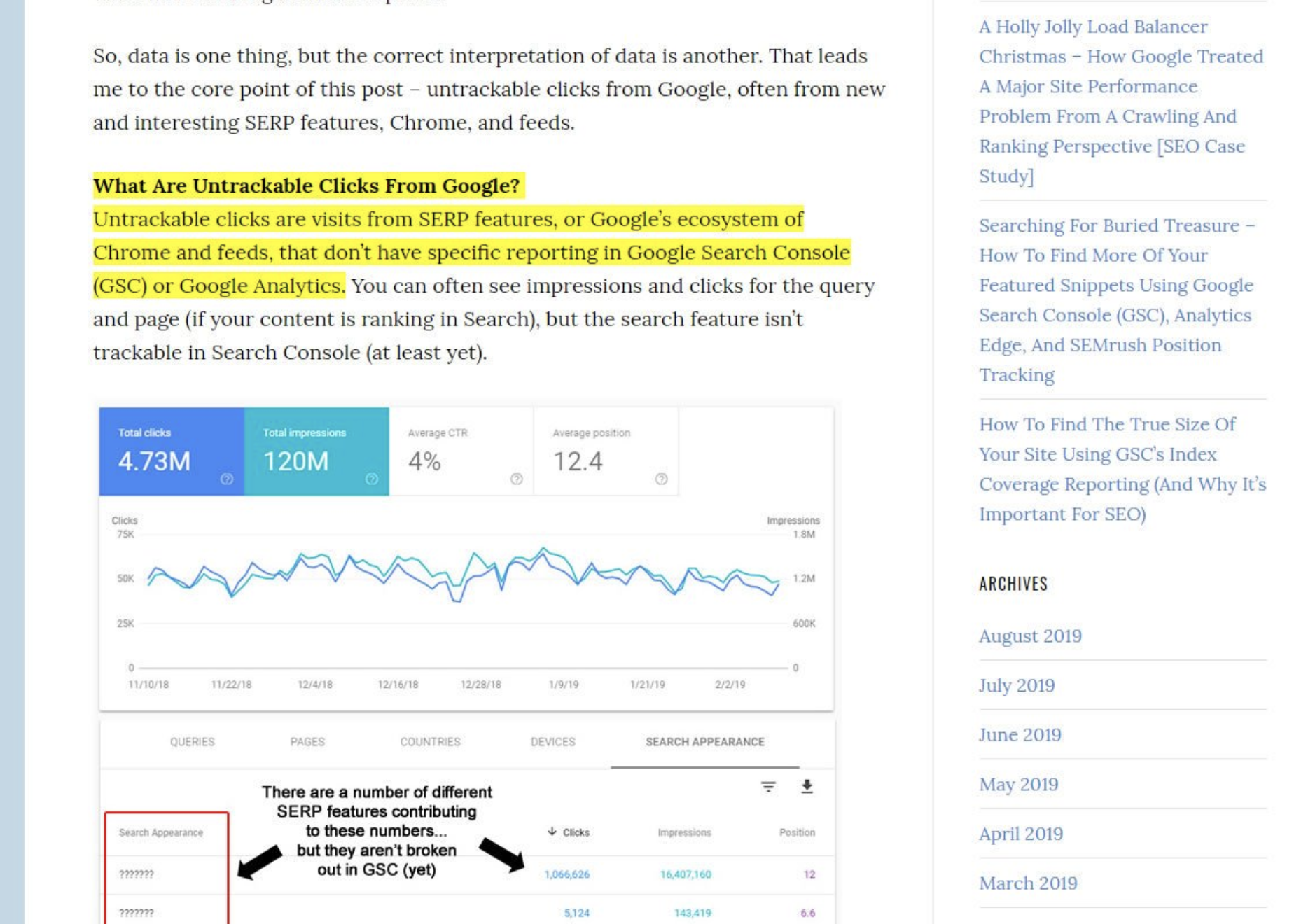
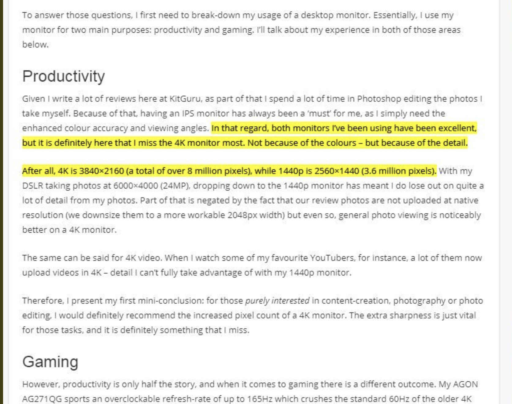
Gabe’s test showed that when he clicked on a query in SERP listings, Google took him to the exact place on the page where his question was answered, highlighting the content as well.
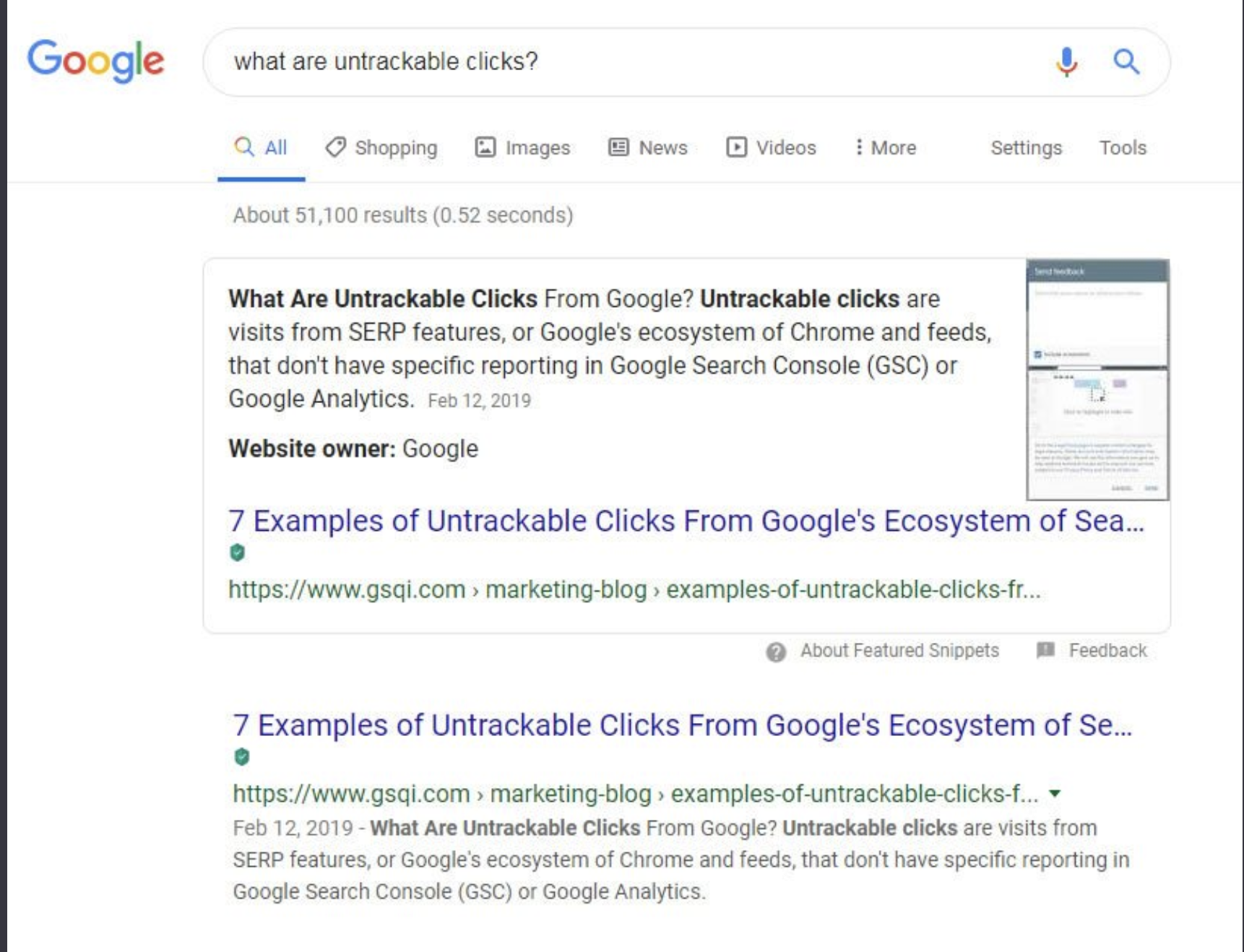
For example, when you search “What are Untrackable Clicks,” the top listing is an article titled “7 Examples of Untrackable Clicks from Google’s Ecosystem of Search”

When you click, you’re brought to the exact location where your question is answered:

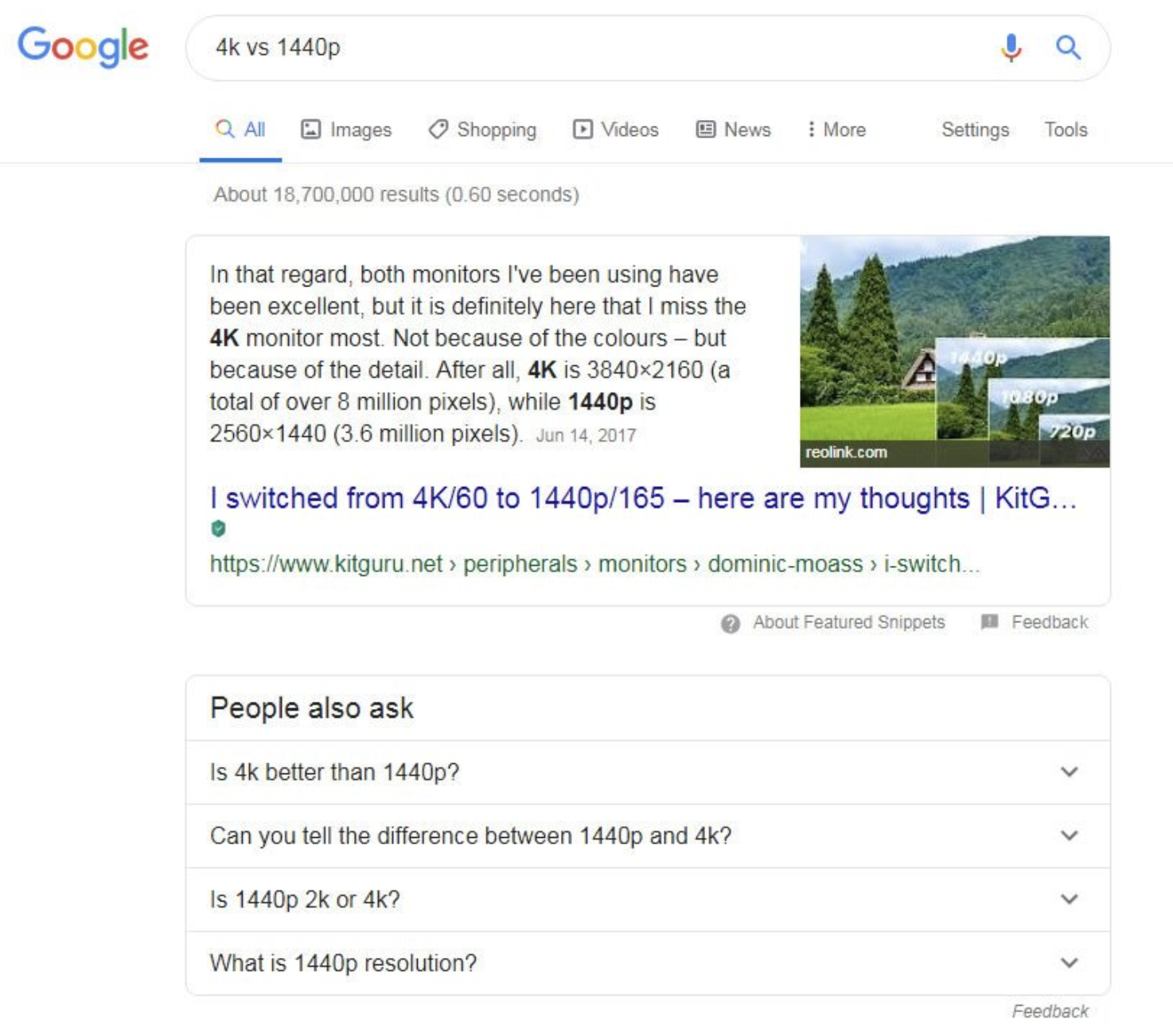
It also seemed to work when the answers were not as straightforward, like this query for “4k vs 1440p”


All of Gabe’s tests showed this functionality working specifically with featured snippets, but he didn’t specify if this feature was expanded to other SERP listings or not.
It appears that this feature utilizes targetText Chrome functionality, something Google has been working on throughout 2019 that links specific text to jump users down the page when clicked.
And for anyone interested in targetText Chrome functionality, here's the explainer document from February. I cannot force this in my test browser window, but Google is using it to jump users to a specific part of the text (and highlight that text). https://t.co/gMOkqqhAVe pic.twitter.com/v2qwwjPZy7
— Glenn Gabe (@glenngabe) August 23, 2019
Google confirms ongoing tests
To shed light on the news, Google Chromium Engineer David Bokan stepped in to confirm the ongoing tests.
Google Search is currently running an origin trial for ~5% of WebAnswers results so it's kind of random whether you get opted into it or not.
— David (@david_bokan) August 23, 2019
You can enable the feature on the client-side though using chrome://flags/#enable-text-fragment-anchor
According to Bokan, Google is testing out this feature — but only on 5% of users (I checked. Sadly I’m not one of them).
So, with only 5% of all users getting the test, it’s safe to assume that this desktop feature is still in the early stages of testing.
However, like Bokan suggests, users who want to play around with the targetText feature can enable it in Chrome using: //flags/#enable-text-fragment-anchor. This will not turn on the search result test for you, but it will enable you to create your own targetText URLs and test.
What does this mean for marketers?
One thing that’s important to note is that this feature has been utilized on mobile (for AMP pages) since December — so if your website traffic is primarily mobile, you may not notice a huge shift if this feature is expanded more broadly on desktop.
Still, it does come with some important considerations for digital marketers.
On one hand, you want your users to find the most relevant information on your website as quickly as possible, and this feature does help you accomplish that without having an additional guardrail in place.
However, most website design strategies assume that the user will be arriving at the top of the page, not somewhere in the middle.
If Google starts normalizing this targetText style, you may need to go in and re-evaluate your website design. Could users be missing CTAs, ads, branding, or other important website elements?
This can be hard to evaluate given the selective audience and uniqueness of queries, but marketers can start out by looking at any pages that have featured snippets, checking heat map data, and seeing if the amount of activity at the top of the page has gone down while mid-page activity increased.
Additionally, marketers can notice if any other metrics like time on page, click-throughs, or other actions have changed to see if the page may have to be restructured for users to see key conversion elements.
Because things like session time, pages per session, and back button clicks are ranking factors in SEO, it’s possible that sites could potentially have negative SEO consequences if the user reads the highlighted section and immediately backs out of the page.
Overall, it’s too early to make any concrete predictions — but marketers should make sure they keep the above criteria in mind as they evaluate this quarter’s metrics over historical data.
Free: Assessment

