Subscribe now and get the latest podcast releases delivered straight to your inbox.
If you’re like me, you’ve spent hours digging into what makes a website stand out.
You have your preferences when it comes to colors, design elements, the right and wrong use of video. Lately, however, I’ve been taking notice of a very different type of company and their websites.
Yes, that's the plural.
Multi-brand companies have a unique challenge when it comes to their web presences -- How to feature all of their brands in a way that provides a great user experience.
It’s hard enough to promote a single brand, so how are companies engaging audiences across their brands?
The challenges
Let’s start by looking at the specific challenges that multi-brand companies have.
Awareness
First and foremost is the reality that the average consumer may not even aware that a company has multiple brands.
If they are aware of the individual brands, they likely have no idea that they are part of the same corporate family. The challenge here is, very simply, awareness.
Cross-brand loyalty
Another challenge is engaging loyal customers and enticing them to extend their brand loyalty throughout the company.
It’s great to have a customer who shops at your high-end retail division a few times a year, but it would be even better if they also shopped at your price conscious division for their more frequent shopping sprees.
Cohesion
It can also be difficult to showcase multiple brands in a cohesive way, especially if those brands are geared toward different consumer demographics. Companies have to find a way to differentiate, but also seamlessly transition their audience from one brand to another.
These are daunting challenges for companies to overcome, but there are quite a few who have found creative and intuitive ways to do so.
Is any company mastering multi-brand websites?
When I think about some of the websites I’ve visited with multi-brand strategies, the retail fashion world quickly comes to mind.
These days, most clothing companies have multiple brands under their umbrella.
It seems as though this industry has managed to successfully create websites that create awareness of their multiple brands, but also creates a seamless user experience when it comes to exploring and shopping across them.
Furthermore, while retail fashion does seem to lead the pack when it comes to multi-brand websites that work, there are some notable companies outside of that industry that are making impressive strides.
5 Companies winning multi-brand websites
Of course, talking about "great" websites is certainly subjective. However, the five examples I am about to provide are sites that stood out to me for their ability to overcome the challenges listed above.
1. Gap Inc.
Gap may be the most recognizable multi-brand company to the average shopper.
For one, it seems to be that most people are aware of the fact that Gap Inc. owns not only Gap but Banana Republic and Old Navy — as well as Athleta.
Much of this brand awareness can likely be attributed to some key features on their websites.
For instance, regardless of what brand website you visit, you are always met with the same navigation on the top left of your screen, highlighting all of the Gap Inc. brands.
.jpg)
Another area where Gap Inc.’s website is great at handling its multiple brands is in the overall user experience when it comes to buying the products.
Not only can you toggle between each brand page, but you can add items to your shopping cart across brands, making for a much more convenient checkout experience. They even offer cross-brand promotions.
2. American Eagle Outfitters
Like Gap, American Eagle is a clothing brand in itself, but in recent years, its other brand, Aerie, has gained momentum, offering a more comfort-based line of apparel, geared toward the "athleisure" trend.
AE.com has done something similar to Gap Inc., featuring both of their brands in the top left navigation of the website.
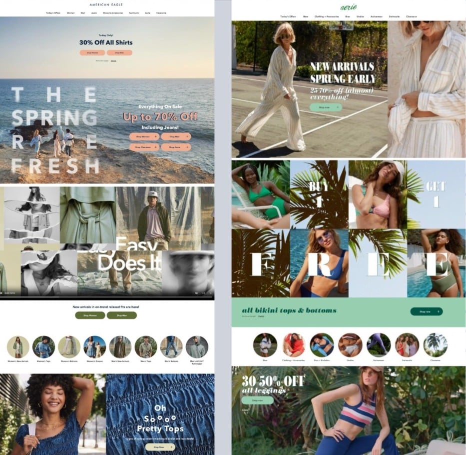
However, while each Gap brand website looks different, AE has utilized similar structures, color themes, and features that highlight each brand’s uniqueness while making it clear that they are related.
Below, we're got AE on the left and Aerie on the right. Notice the similar layout and design themes.

3. Pottery Barn
Pottery Barn is a company that is taking multi-brand to another level.
Within the Pottery Barn brand there are four sub-brands, PB Apartment, Pottery Barn Kids, PB Teen, and Pottery Barn Dorm
On top of that, they also have six other brands that make up the Williams Sonoma organization, Williams Sonoma, WS Home, West Elm, Rejuvenation, GreenrRow, and Mark and Graham.
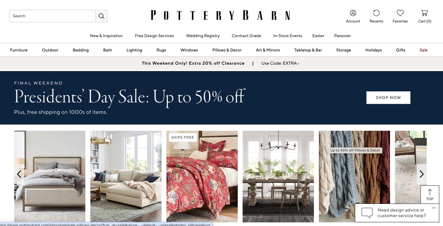
When it comes to a multi-brand website, Pottery Barn has managed to highlight all of the brands in the WS family in the site navigation.
![]()
Plus, it does so in a way that ensures the visitor is recognizing that while the parent organization has many brands, Pottery Barn itself has brands for the entire family.

4. Max
As the Streaming Wars intensify, platforms are competing to offer more complete entertainment options. On one side you've got Disney+ adding ESPN and Hulu. Max has swallowed up HBO, Warner Brothers, HGTV and others into a super stream.
It's hard to organize this much content, but Max does it well.
Obviously, as a media company, they have plenty of engaging content to work with, but it is in how they feature this content from their various brands that

The website lets its popular and critically-acclaimed shows shine, but also makes sure you know which brand within the organization it comes from with some subtle branding.
Incorporating the individual logo or channel name into featured box ensures that visitors know where to tune in to watch.
This is powerful because it addresses the many brands while maintaining the overall message that all of this amazing, diverse content comes from Max.
5. EA (Entertainment Arts)
EA is a video game company that is not a multi-brand company in the traditional sense, but what gains them a spot on this list is how they handle their catalog of popular games, which some may argue are each a brand on their own.
With titles including Madden, FIFA, The Sims, and the Mass Effect series, each game “brand” has its own loyal fans and even culture.

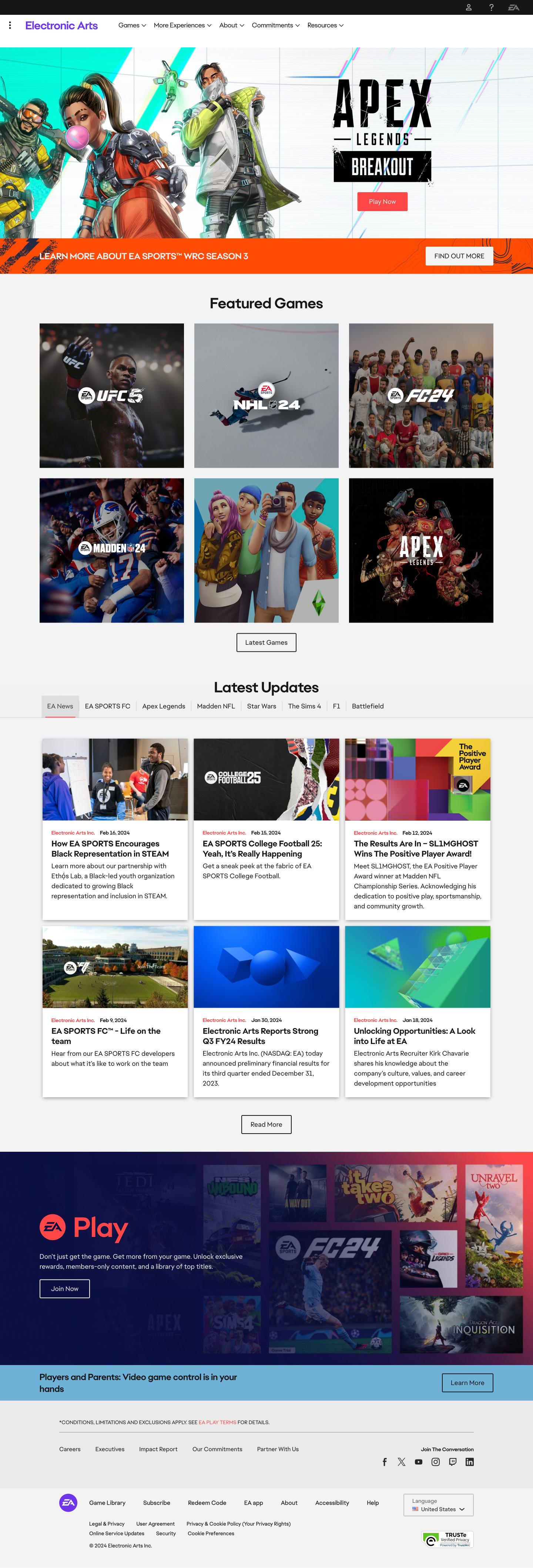
Where EA utilizes the top of the page for their featured game, the rest of the site focuses on the various game brands, with content targeting each brand’s fans.
The content targets the specific audience while highlighting other games in a way that could generate interest from someone unfamiliar with the entire EA catalog.
A great multi-brand website is within reach
When it comes to creating a great website for a multi-brand company, these are great examples to look to, but, creativity and individuality goes a long way.
Keep these key things in mind when developing your own, unique multi-brand website strategy:
-
Feature your brands in one place, such as the navigation, so that everyone knows about them.
-
Ensure that the cross-brand user experience is easy and intuitive. If you're selling products across brands, let your users check out in one place.
-
Where appropriate, create engaging cross-brand content, that can be attributed to the individual brand without taking away from the brand family.
Want to talk to our experts about your website needs? Book a free call to see what's possible.
Free: Assessment

