Topics:
Web DesignSubscribe now and get the latest podcast releases delivered straight to your inbox.
I want to ask you a question that is the driving point to this entire article:
As a consumer, when you land on the home page of a website, what do you want to achieve? In other words, what’s your immediate goal?
Really, think about this question for a second before continuing. What is it that makes a great home page vs. one that frustrates you and leaves you wanting?
Although many answers could be given to this question, I submit we all share one central desire:
To find what we’re looking for IMMEDIATELY…without having to think too hard to get it.
It used to be, and still is for many companies, that a website’s home page was loaded with text—stuffed with every keyword possible and enough messaging to practically write a book. In fact, as I've worked with dozens of clients over this past year with their web marketing strategies, one of the most common problems is cluttered and confusing home page design.
But in 2012 and beyond, the principle of “Less is More” has never been stronger when it comes to effective web design and lead generation as "funnel marketing" (as I like to call it) appears to be the choice for many of the industry's leading conversion authorities. Let’s look at a few examples of companies doing it right:
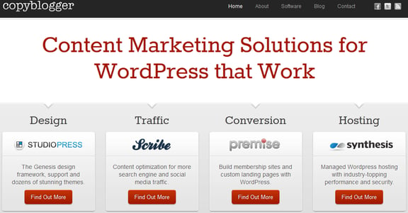
Copyblogger:
Always known for their incredible focus on design and conversions, Copyblogger's most recent home page design manages to perfectly allow the viewer to quickly and easily choose a funnel based on their needs. Although not shown in this image, the rest of their home page continues this theme with a strong newsletter opt-in and then their latest blog article.
Convince and Convert:
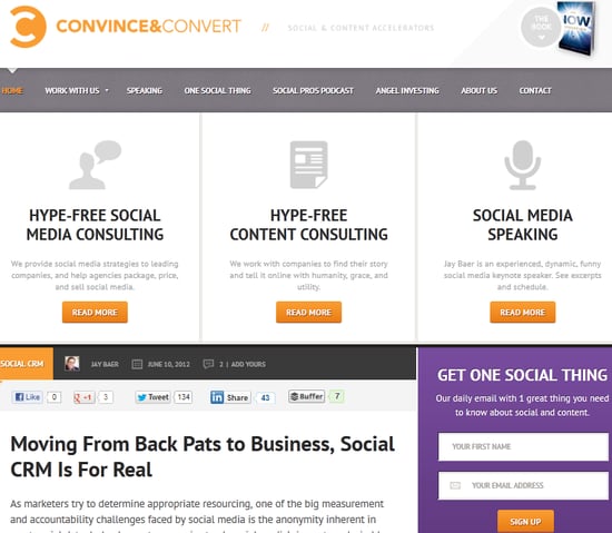 With 3 prevalent funnels showing, viewers can easily land on Jay Baer's site and find what they're looking for, or simply opt-in to his newsletter as well.
I'm a huge fan of what Jay Baer recently did with his website's homepage, as it in many ways is the ultimate "How to" example of setting up a site built to convert traffic into leads but also allow viewers to quickly find what they're looking for. Because Jay's two main business are speaking and consulting, they show prevalently at the top but there is also a strong call-to-action with his newsletter opt-in box at the bottom right.
River Pools and Spas
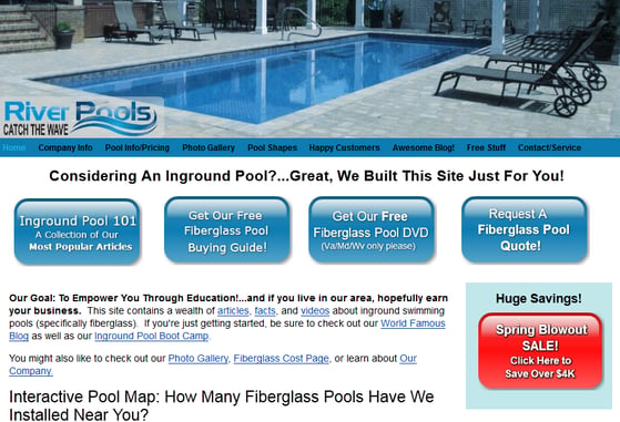 Going from left to right, the 4 funnels take the prospect further and further down the buying funnel of a fiberglass swimming pool.
Over the years, I've experimented again and again and again with my swimming pool company's homepage, but as far as increased lead conversions go, my current design has proven very effective. In fact, if you look at the four main funnels, going from left to right, you can see each addresses a "stage" in which a consumer may currently find him or herself in the buying process.
For example, if you're just getting started with researching pools, you're going to visit "Inground Pool 101." If you're starting to get more serious with your research but you're still not ready to meet with someone, you'll likely download an eBook or order our DVD. And finally, when you've researched enough of our products and you feel you're ready to take things to the next level, you'll call us for a quote.
As you truly understand your buying personas as an organization, the process of knowing what funnels to offer web viewers will get easier and easier.
HubSpot
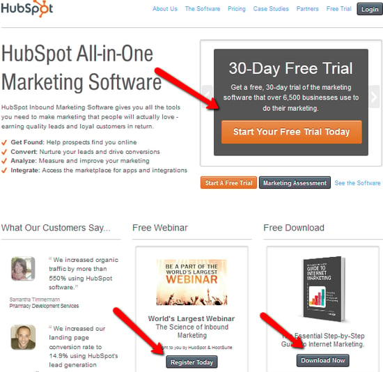 With 3 main funnels and a touch of social proof, HubSpot shows why their database grows by the hundreds every day.
Similar to Copyblogger, HubSpot demonstrates the "less is more" technique clearly on their homepage with 3 main call-to-action funnels-- (A free eBook, a free webinar, or a free trial)-- all of which are set up to get prospects into a buying funnel and commence one of HubSpot's now practically famous lead-nurturing campaigns.
SEOmoz
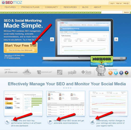 4 funnels and a little social proof help SEOmoz lead their visitors perfectly down whichever funnel they choose.
It's no surprise the leading search engine optimization site on the web is also one of the leading lead-optimization sites as well. Similar in scope to the HubSpot design, SEOmoz quickly gives viewers the ability to start a free trial of their impressive software as well as learn the 3 main components of what makes the software so effective with the bottom call-to-action funnels.
KISS
We've all heard the model of KISS, or Keep It Simple Stupid, but never has the phrase been more prevalent when it comes to effective home page design to generate leads, traffic, and sales. In essence, if you're looking to enhance your company's homepage to make things easier to navigate and also increase leads, here are some tips for review:
- Don't go nuts on the amount of text. People don't want to invest in heavy reading until they dig further into your website.
- Make your services pop, preferably with visible images, buttons, and calls-to-action.
- A little social proof is a good thing.
- An opt-in box where the prospect can easily subscribe to further articles/information (see Jay Baer or Copyblogger) from your company should be prominent.
Your Turn:
A couple of quick questions folks. Have you noticed this trend of more simple home pages combined with less text and more prevalent marketing funnels? Also, how would you describe your company's current home page design and where do you feel it's falling short? What have you done that has proven effective? Jump in folks, I'd love to hear your thoughts.
Free: Assessment


