Topics:
Marketing StrategySubscribe now and get the latest podcast releases delivered straight to your inbox.
How Canva Tripled Its Audience in Less Than A Single Year

Dec 15, 2015

Let’s talk design!
I’m not talking about all the technical design jargon -- I don’t know about you, but I’d be in way over my head -- but rather, a web application that has made design easier for everyone, even the non-designers.
Let me ask you a serious question: What do you do when you need to create a quick social media graphic, email header, blog image or even a SlideShare? I’ll give you a minute to think about it.
If the designers on your team are stretched past their capacity, getting any type of graphic created could take some time. You’re either left waiting for them to become available or rolling up your sleeves and diving head first into InDesign, Photoshop ,or even illustrator.
The latter seems like a daunting task, and if you’re like me, you probably have no idea where to even start. Thankfully, there’s Canva.
I know that we talk about Canva, a lot, but, frankly, they deserve it. I’m not sure what I would do without them. Their templates and platform make it easy for any first time or seasoned designer to create amazing designs.
Now, I might not be their first user, but as user number 371,192, I’m happy and excited to see all of the great things they’ve done.
Within 2 years, they were able to grow their user base to over 6 million and even expand to a premium service with Canva for Work. But how did they do it?
Here are the 4 major factors behind their booming success.
#1 They Understand Their Audience
Canva is all about empowering the world to design.
Whether you know absolutely nothing about design or you just don’t have access to the software, their platform makes creating visual content a walk in the park.
One thing I love about how they were able to grow their blog by 226.47% is that they didn’t jump in feet first.
They actually took the time to research their audience and competitors to identify what would make them stand out from every other design blog and actually be helpful and relevant to their audience.
In an article featured on Buffer, Canva’s Growth Marketer, Andrianes Pinantoan, talked about how studying their competitors and understanding their market helped them distinguish between what they thought their readers wanted and what they knew their readers were demanding.
Andrianes stated, “We gained a clear understanding of all the content being produced in the design space. We took what we learned from our competitors and applied it to a different audience – our unique target audience: business owners, marketers, others professionals and non-designers in general.”
Once they put their research into practice they saw overwhelming results within 60 days.
By understanding their audience, they were able to:
- Focus on providing educational and how to articles that touched upon those individuals who had no idea what alignment, contrast, and other design principles. Their audience wouldn’t be searching those types of keywords.
- Improve their users’ experience, simplifying the design process, lowering the learning curve, and letting them be more efficient.
By continuing to learn about their users, they were also able to identify that not only were non-design savvy individuals using the platform, but also a number of marketers, designers, and social media teams who wanted to create beautiful marketing materials.
That’s where “Canva for Work” comes into play. Canva for Work is all about helping you work smarter not harder. Who doesn’t want to do that?
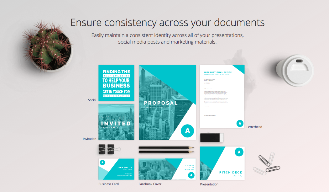
If you haven’t heard about their newest addition, here’s a quick overview of it. Using their drag and drop editor and platform, you have the ability to create on-brand marketing materials and graphics by setting up your brand kit. Through the brand kit (only available on Canva for Work) you’re able to save your brand’s colors, logos, and fonts so they’re always on hand.

They’re also promoting collaboration among you and your team by allowing you to provide them access to branded templates and photos.
#2 They Shared Their Expertise Through Content
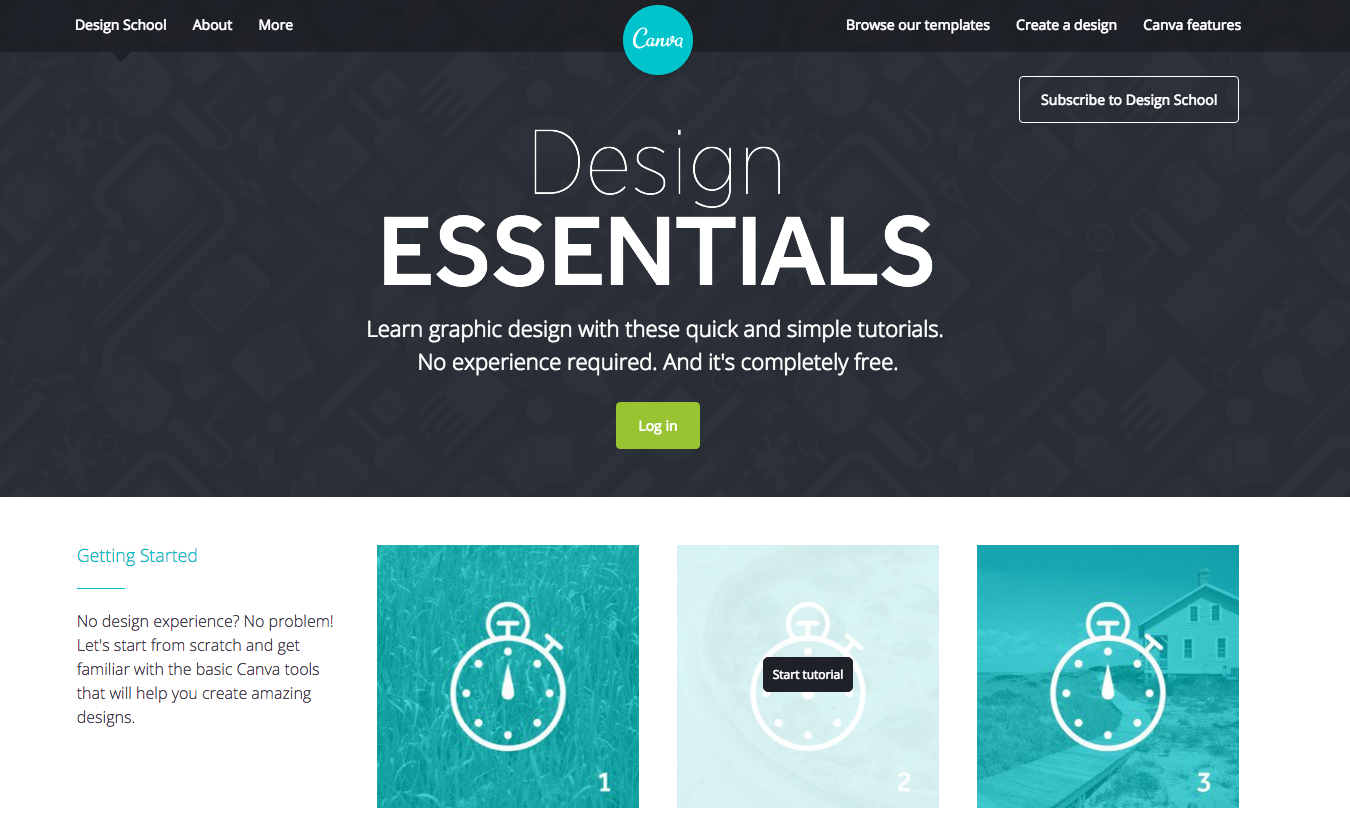
Honestly, I know absolutely nothing about design. Ask me what fonts go well together and I’ll draw a blank, but, with Canva’s Design School, you can quickly learn the basics just by reading a few articles, walking through their simple tutorials, or using a template.

In their Design School, Canva will teach you all about choosing the right fonts, effectively using color, how to enhance images for a greater impact, how to utilize white space to even building, and even how maintain brand consistency.

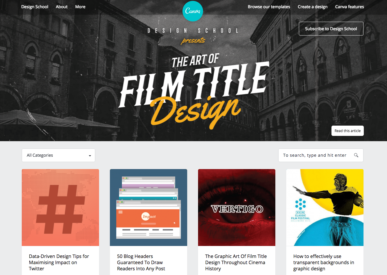
Not only do they teach you all of that through their Design School, but they also use their blog to educate and provide tips and how tos.
Their audience isn’t necessarily looking for technical design tips, but rather inspiration as well as free fonts and images.
With this in mind. They made some major tweaks to their content, including:
- Longer posts
- Inspirational posts
- Varied content types
- Free resources
Looking for a great list of design resources? Then you should definitely bookmark this page!
#3 Building Relationships With Influencers
When you have a great product or platform, people are going to talk about it on social media and if you’re lucky they might even write a blog post about your success.
Influencers are individuals within the industry your audience trusts, and they tend to go to them for industry related questions and research.
In an article on Forbes, Canva CEO, Melanie Perkins, stated their product and evangelists have been their best marketing.
“Finding people who love the product has been the best marketing we could have,” she explained. “Some of our users have created video tutorials, written blog posts, and in some cases even taught classes on how to use Canva.”
For instance, Did you know that Guy Kawasaki is their Chief Evangelist?
Who wouldn’t want someone like him spreading the word to his audience about how much he enjoys using Canva to create social media graphics?
Another influencer Canva was able to build a relationship with is HubSpot. Together, they published a free resource on how you can design email, social media, landing page graphics that will help improve conversions.
With the launch of Canva for Work, they’re able to leverage this relationship to get in front of their audience (HubSpot users, agencies, marketing teams, marketing professionals, etc.) and build awareness.
If you haven’t, you should definitely check out this great resource.
#4 Nurturing Visitors Into Subscribers & Users
As we mentioned earlier, a great way to introduce visitors to your company and what you can do for them is to blog about relevant topics that would be interesting and helpful for them. -- But what do you do once they’ve read the post and they’re getting ready to leave the page?
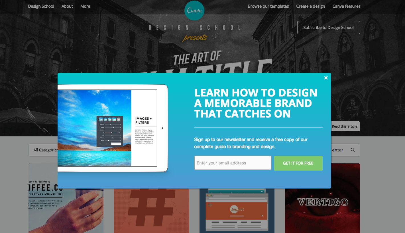
An element Canva implemented across their blog that would help convert abandoning visitors into subscribers is an exit-intent popup.
This is a great tactic many companies have started to implement to re-engage users before they’re gone.
In this example, Canva isn’t just asking you to subscribe, they’re actually giving you a free resource in exchange.

They’ve also skillfully adapted this tactic for certain articles.

In the popup above, Canva used the content they were publishing to not only talk / answer design questions a visitor might have, but also they draw users back to the product. In other words, they perfectly aligned their content with a related offer.
Considering that they’ve increased their blog traffic by over 200%, implementing this CTA was a great technique for helping to convert those new visitors into users.
Key Takeaway
Success doesn’t always come overnight (in Canva’s case it’s been 7 years since Melanie’s dream was developed), but when you have a vision to change the way the world sees and creates digital design the right business and marketing strategy can make all the difference.
And, a great user experience doesn’t hurt either.


Order Your Copy of Marcus Sheridan's New Book — Endless Customers!