Subscribe now and get the latest podcast releases delivered straight to your inbox.
How to Plan a Killer Pricing Page (No Matter How “Custom” Your Product or Service)

By Stacy Willis
Jul 15, 2019
Every business website needs to talk about pricing. Yes, every website. Even yours.
Now, I’m not talking about e-commerce websites right now. The entirety of an e-commerce website is about price, so they are exempt from this particular rant, but the rest of you aren’t.
Right now you are probably saying “I can’t talk price!” using one of the following excuses:
- My pricing is too complex to put on a page!
- I’m afraid my competitors will learn about my prices!
- I’m afraid customers won’t understand the value of my service and be scared away!
- My industry just doesn’t do that!
Stop right now.
You are falling victim to the BIGGEST mistake you can make as a business. You are viewing your website from your perspective not from your customer’s perspective.
Let’s change your perspective for a second.
The last time you searched for something you were considering purchasing, what did you look for? Did you look for information about price? If you didn’t see a pricing page on the website, did you say to yourself “Oh, I bet they are a value-based business,” or “That’s ok, it isn’t standard practice in their industry”?
Heck no. You got frustrated.
As a buyer, we inherently understand the want and need to have our questions answered, particularly those about pricing, but, when we view our own website as a business, for some reason we completely forget.
So, let’s quit lying to ourselves. Instead of causing frustration for your visitors, be the breath of fresh air that answers their questions honestly. Talk about pricing.
First, we’ll explore a few different kinds of pricing inspiration pages to familiarize ourselves with the most common pricing page structures, then we will break down the process for how to tackle your very own pricing page!
You don’t have to give an exact price
So, let's start by dispelling the myth that a pricing page has to tell someone an exact price.
It 100% absolutely does not have to do that; it just has to educate your visitor on pricing and give them as much detail as possible about how it is determined.
If you can give an exact price, or a range, by all means do it, but, if your pricing depends on many factors, that’s ok too.
Instead of thinking your page has to provide an exact price, approach it as a page that educates users on the following:
- The process by which you arrive at your price.
- The key factors that influence price (up or down).
- Common questions that come up about your pricing.
Now, let’s dive into the most common types of pricing pages and look at some examples for inspiration!
The most popular types of pricing pages
Pricing tiers
This is the type of pricing page you are probably most accustomed to seeing.
It is very common with software products or subscription-based services where it’s easy to break down price into a few major categories.
Pricing tiers are usually set by some measure of volume (or features) and the page gives the user the ability to easily compare the categories and decide which they fit into.
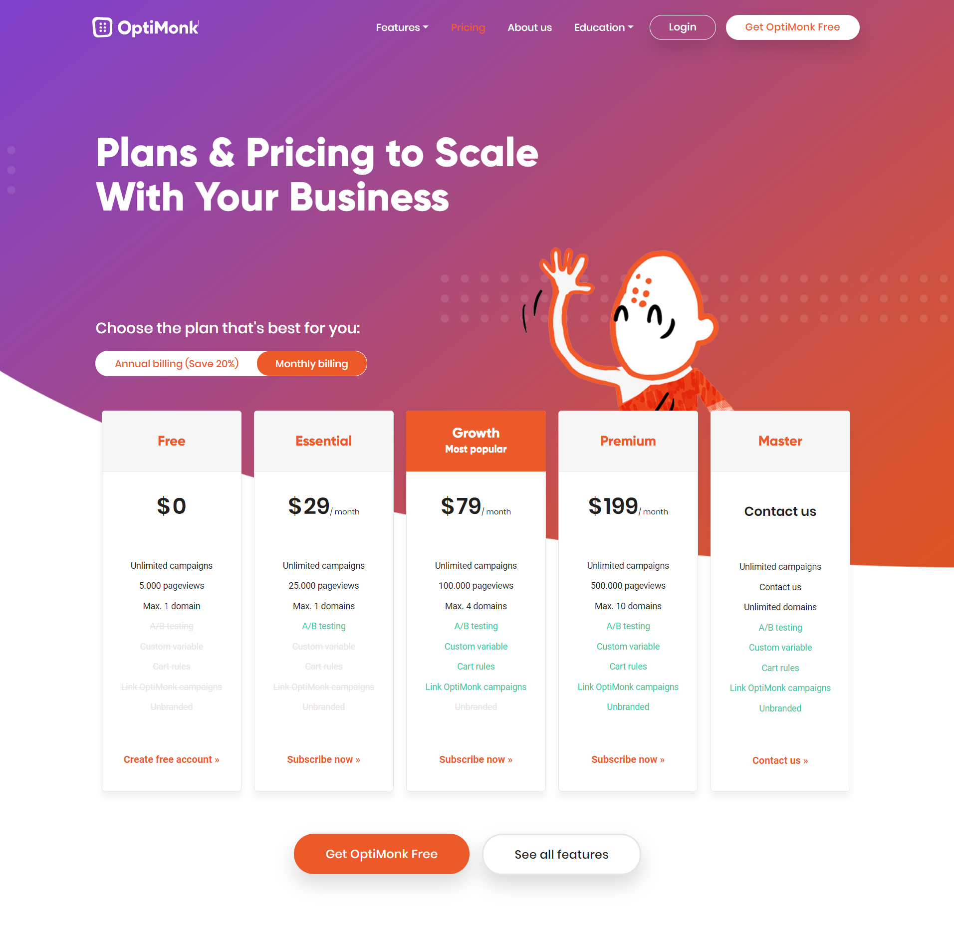
Here is a great example by OptiMonk which allows users to see what the different price levels and what they each include. It even has a “Contact Us” tier for those that will need customized pricing.
Wistia also does a great job of showing what features are included at each level to help users understand the increased value that comes with higher prices.
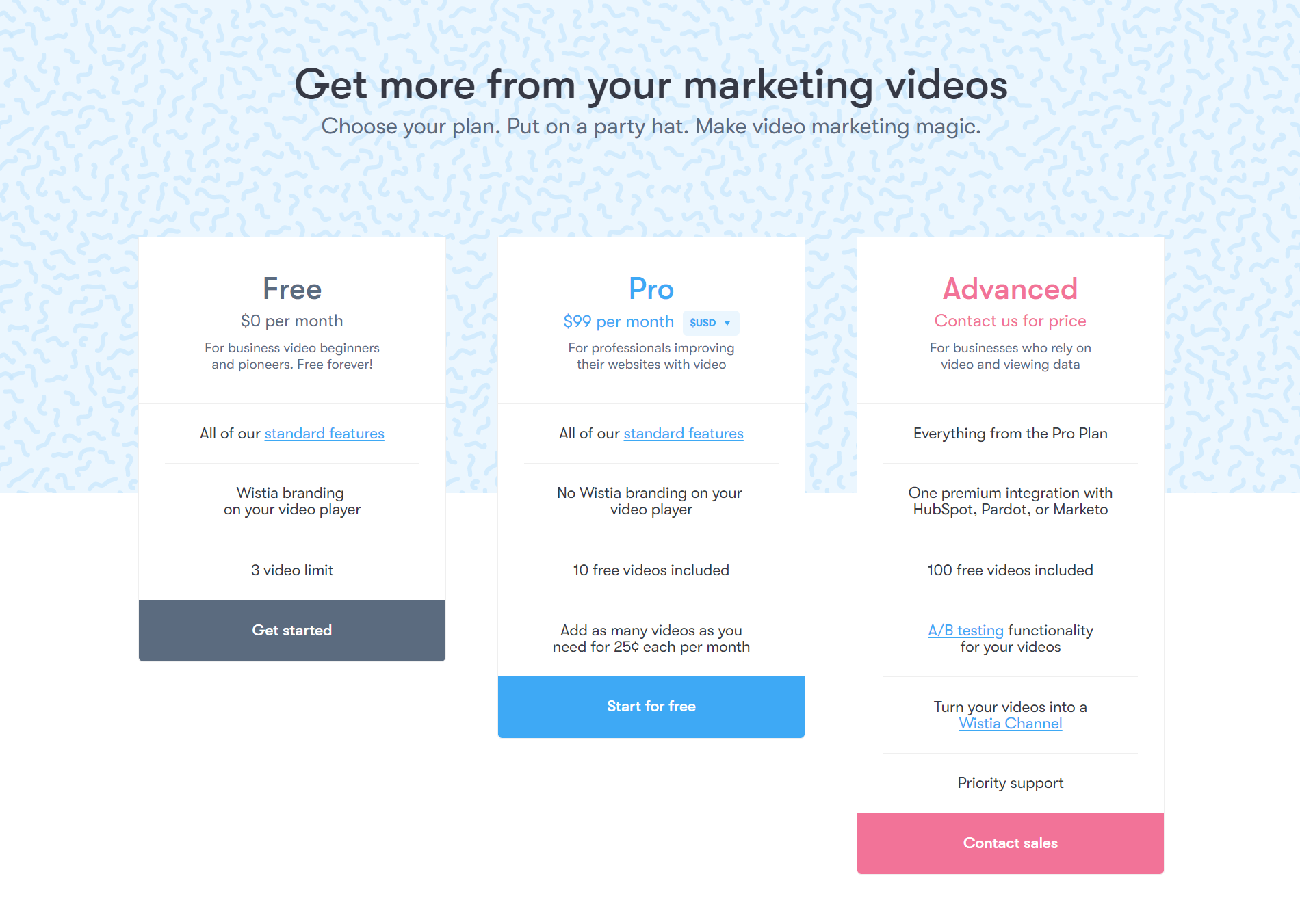 They even cleverly make the list of features get longer to visually emphasize that you get more with each price increase.
What you’ll also notice if you travel to each of those pricing pages, is that they don’t stop at the pricing table. They give a ton of great information to provide as much education and detail to the reader as possible.
The other sections of the pages that are important to note:
- Detailed breakdown of features
- Frequently asked questions
- Testimonials and social proof
Pricing guidance
This type of pricing page is perfect for anyone who said “My pricing is too complex to put on a page,” earlier.
If you don’t have a nice simple way to tier prices, this might be the kind of pricing page for you!
This is also the most open-ended type of pricing page.
It is literally a “Guide to Pricing” and your goal here is to simply provide as much education as you can about how your pricing works.
Doesn’t sound so intimidating anymore, does it?
In this case, the sky's the limit! You can find a way to display pricing as a series of steps like this great example from Thoroughcare.
This page does an exceptional job of breaking down the exact method by which the company arrives at a final price. It really helps the user to learn where they might fit and start to answer for themselves initial questions about what their price range might be.
Or, you can literally write out the kinds of things that influence pricing in written form like this example from River Pools and Spas.
In this case, it is obvious that it is borderline impossible to really understand price until you determine exactly what you want in terms of options. This guide does a fantastic job of allowing the reader to understand all of the different options in front of them and clearly see how their choices will affect their final budget.
Now, the first comment you probably have is “Who is going to read all that?”
Again, let’s revisit your experience as a buyer.
If you are considering making a purchase (especially a big one that doesn’t have set pricing), will you have any problem reading a little bit to learn about how that product is priced?
As a business, you will find time and time again that a page like this is worth its weight in gold.
Not only will people be willing to read it, but they will flock to it and sell or disqualify themselves so that your sales team doesn’t have to do all the work.
We have seen it happen hundreds of times, and conversely, we’ve watched the teams and websites that fail to do this provide lackluster results in terms of conversion and return on investment (ROI).
We notice, similar to the pricing tier example pages, that these pages don’t end with just a breakdown of pricing. They also go out of their way to cover the most common questions relating to pricing that a customer would have. This shows how honestly you are willing to cover the subject of pricing completely, building a deep well of trust with prospects (before you’ve even spoken to them!).
Calculation
Now, if you are an overachiever (and I hope you are), you can go for the full monty with a price calculator.
Building out a pricing calculator that allows the user to input their specifics and calculate their own personalized quote, creates the ultimate pricing experience.
Services like Uber, Spotify and Netflix have created an expectation of customization for consumers. We love it when someone else does the work to customize an answer for us that is unique to us (because we all think we are special). Custom pricing calculators do this, and make it so the user has to do very little work to get that custom answer.
You can go two routes with calculation: you can provide a single number (which is usually difficult) or you can provide a range.
Either way, the information is often very helpful to the user and provides a more custom experience (which, as we know, is incredibly important).
This is a great example by Moltin which uses a simple slider to allow a user to calculate their correct price with very little effort.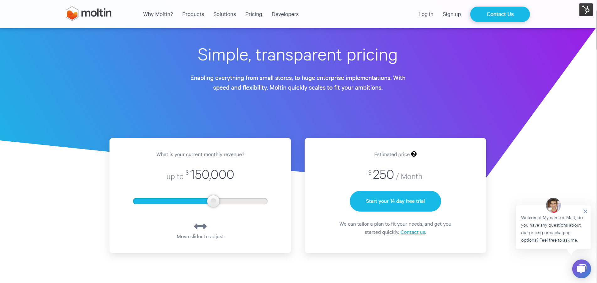
The page shows a fabulous example of how to give someone an exact price by doing nothing more than sliding a bar. It is the pinnacle of simple for the user, but still provides an exact price.
This example by LucidChart, actually combines the tiers with an exact price calculation.
The user can input the number of users they want to more accurately calculate their final price.
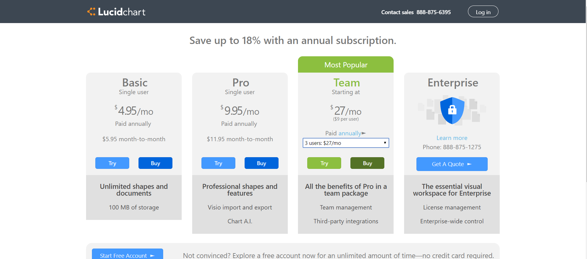
This example is a great way for users to play with different options for a number of licences and see immediately how much it affects their final price.
And, for the ultimate in “it depends” style pricing, we have Venture Pact which asks users a series of pointed questions to arrive at a range you can expect for a project to build a custom app.

This is that ultimate example we talked about. The answer that I arrive at is completely custom to my project. It provides the experience of having spent time speaking to an expert who truly took the time to understand my project and provide me with a quote, but it took only minutes.
Again, when building something like this, you should be looking to answer any common questions about pricing when the user is done calculating.
Providing this information will help build trust and make the user feel more confident clicking the button to talk to a sales person with those questions addressed.
How to start planning your pricing page
Now that we’ve looked at so many great pricing page examples for inspiration, the question is how should you start?
I always recommend doing the following to start diving into your own pricing model.
Step 1: Break down pricing steps
Work with your sales team to break down the high level steps they go through when working with a prospect to determine pricing.
Write them down and make sure you understand what is happening in each step.
This is usually really easy to get by interviewing a member of the sales team and recording it so you can return to it later.
Step 2: Identify the factors that influence pricing
List out all the factors that can drive price either up and down.
This can include things like company size, number of users, access to specific features, number of hours of support, and current level of maturity, among other things.
The easiest way to tackle this is to work with sales to understand what the qualification process is and break it down into specific factors.
Step 3: Collect the most common pricing questions
Work with your sales team to gather all of the most common questions that come up from prospects about pricing. As mentioned earlier, you want to make sure you address these concerns so that by the time someone gets to your sales rep, they have little to no objections.
It should be relatively easy to crowd-source all of this information across a variety of sales reps.
Step 4: Execute
You’ve done the hard part! You have all the content needed to build a pricing page. Sooner is better than later to start answering your visitor’s pricing questions. So, take the content you’ve just collected, write it up as a blog article titled “How Much Does X Cost?” and publish it as quickly as you can.
Then take a look at all the information and determine what the best layout is for a pricing page.
Look through some inspiration examples (like the awesome ones above) and decide what the best way is to visually display the information in a way that will make it as digestible as possible.
This step is also when you look at your budget and resources to see if you could build a calculator or self-configuration tool that allows for a user to completely customize their price, which is the ideal end state!
Need help planning your pricing page or even a full website redesign? Talk to us!
Free: Assessment